White Space in Web Design: Boost Clarity, UX, and Conversions
- Baslon Digital

- Dec 27, 2025
- 15 min read
Ever heard of white space in web design? It’s also called negative space, and it’s basically all the unmarked areas around and between the stuff on your page. No, it doesn't have to be "white." Think of it as a powerful, active tool that makes your website look professional, feel uncluttered, and actually improves how well people can read it.
What White Space Really Is and Why It Matters
Let's get one thing straight: white space isn't just 'empty' space on your website. It's a deliberate design choice.
Imagine walking into two different shops. The first is a jumble sale, a chaotic mess with things piled high and barely any room to move. It’s overwhelming. Now, picture a high-end boutique. A few select products are displayed with tons of space around them, making each one feel special and important.
That boutique experience? That’s exactly what white space in web design does for your site. It’s the breathing room that guides a visitor's eye, makes your content easier to digest, and stops their brain from feeling overloaded.
The True Purpose of Negative Space
At its heart, white space has a few critical jobs that directly affect how people see and use your website. It’s not about leaving areas blank just because; it's about making smart choices to improve the user's journey. The main goals are to create clarity and hierarchy.
When everything on a page is screaming for attention, nothing gets heard. White space is like a quiet director, creating a natural flow and telling visitors where to look first. It groups related things together and pushes unrelated things apart, bringing a sense of order and logic to your layout. That kind of organisation is vital for building trust.
"Whitespace is to be regarded as an active element, not a passive background." - Jan Tschichold, Typographer
From Clutter to Clarity: A Simple Analogy
Think of the content on your webpage as actors on a stage. If you cram all the actors into one tiny corner, their individual performances get lost in the chaos. The audience has no idea where to look.
But what happens if you put a single actor in the centre of the stage, under a spotlight? Their every move becomes significant. The empty stage around them—the white space—cranks up their presence and demands attention. That's exactly how you should treat your most important calls-to-action (CTAs), headlines, and images. By surrounding them with negative space, you’re basically putting a spotlight on them, making them impossible for your visitors to miss.
This strategic use of space gives your business some serious perks:
Improved Readability: Good spacing between lines and paragraphs can boost reading comprehension by as much as 20%. People will actually read what you write!
Increased Focus: It draws the eye straight to the important bits, like your "Buy Now" buttons or contact forms.
Enhanced Sophistication: A roomy design just looks and feels more professional and high-quality, which elevates how people see your brand.
Honestly, getting the hang of white space is one of the most effective things you can do to improve your website's user experience, especially on a Wix site. It turns your website from a boring wall of information into a pleasant, guided journey that actually gets you conversions. Ready to see how it's done? Let's dive into the different types and what they do.
Understanding Micro and Macro White Space
To really get a grip on white space, you need to know it operates on two different levels: the big picture and the tiny details.
Think of it like setting up a physical shop. You’ve got the wide, airy walkways that guide people between departments—that’s one level. Then you have the smaller, deliberate gaps on each shelf that make individual products stand out. Both are absolutely crucial, and they have to work together.
The same idea applies directly to your website. We call these levels macro white space and micro white space. They might sound a bit technical, but the concepts are actually simple and incredibly powerful once you see how they shape your visitor’s experience.
Macro White Space: The Big Picture
Macro white space is all about the large, intentional gaps between the main chunks of your webpage. It’s the "breathing room" that separates your menu from your main hero image, divides different sections on a page, and creates the margins that frame your entire layout.
This is the white space that sets the overall mood and structure of your website. A generous amount of macro space often gives off a vibe of quality and sophistication. It tells visitors you’re confident in what you’re offering and you aren’t afraid to let your content shine. By creating clear visual breaks, you make your site’s layout feel intuitive and effortless to scan.
The image below shows just how these different elements come together to create a better user journey.
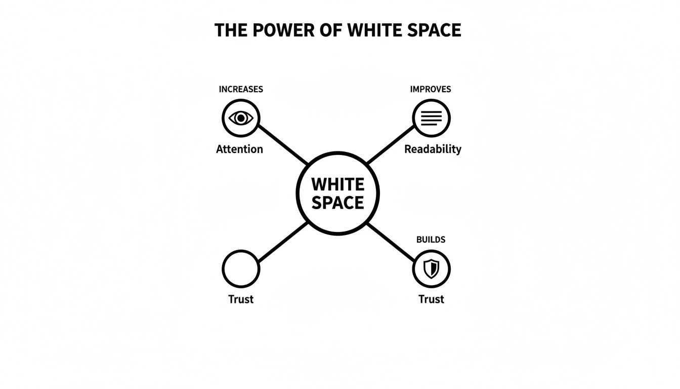
As you can see, white space isn't just "empty"—it's an active tool for guiding attention, making things easier to read, and building a sense of trust with your audience.
Micro White Space: The Finer Details
If macro is the big picture, then micro white space is all about getting the small things right. This is the space inside your content elements. We're talking about the spacing between letters (kerning), the gaps between lines of text (leading), and the padding you put around images and buttons.
These tiny tweaks have a massive impact on how comfortable and easy your content is to read. When text is all squished together, it feels like a chore, and people will just give up. Good micro white space, on the other hand, makes your paragraphs feel inviting and easy to digest. It’s vital for making sure your message actually gets across.
By carefully managing the space between lines, letters, and list items, you remove friction from the reading process, which directly builds user confidence and keeps them engaged with your content longer.
The right balance here is also closely tied to your font choices. If you want to dive deeper into creating an accessible and comfortable reading experience, check out our guide on choosing easy-to-read fonts for your website.
Micro vs Macro White Space in Practice
To help you visualise this on your own site, here’s a quick comparison of where each type of white space comes into play. Think of this as a cheat sheet for applying these concepts to your Wix website.
Element | Micro White Space (The Details) | Macro White Space (The Big Picture) |
|---|---|---|
Paragraphs | Adjusting line height so text isn’t cramped. | The space between the entire paragraph block and an image next to it. |
Navigation Menu | The spacing between each menu item (e.g., Home, About, Contact). | The total empty space separating the entire menu from the page's main title. |
Buttons | The padding inside the button, around the text like "Learn More". | The empty area around the button, separating it from other elements on the page. |
Image Gallery | The small, uniform gaps between each photo in a grid. | The margins around the entire gallery section, setting it apart from the text above and below it. |
Ultimately, you need both macro and micro white space for a winning design. Macro creates the calm, organised structure, while micro makes sure the details within that structure are clear, legible, and easy to interact with. Getting both right is the secret to a website that not only looks professional but works brilliantly too.
How White Space Drives User Engagement and Conversions
Good design isn’t just about making things look pretty; it's about turning visual choices into real business results. And one of the most direct ways to improve how your site performs is by getting strategic with white space in web design. It works by cutting down on something called cognitive load.
Think of cognitive load as the mental gymnastics a visitor has to do just to figure out your page. A cluttered, chaotic layout forces their brain into overdrive, which usually ends in frustration and a swift click of the 'back' button. In contrast, a design with plenty of breathing room feels calm and intuitive, letting people process information without feeling overwhelmed.
That immediate sense of clarity has a direct impact on your key metrics. When visitors feel comfortable and can easily find what they're looking for, they stick around longer. This means better visit durations and, just as importantly, lower bounce rates—which tells search engines your site is actually a valuable place to be.
From Engagement to Conversion
Beyond just keeping people on your page, white space is a powerful tool for nudging them towards your conversion goals. Its main job here is to create a clear visual hierarchy, basically shining a spotlight on your most important calls-to-action (CTAs).
When a "Book Now" or "Add to Cart" button is surrounded by generous negative space, it pops. There are no other elements fighting for attention, creating a straight, unambiguous path for the user to follow. This isolation gives the CTA visual weight and importance, practically begging users to click.
This is a crucial principle, but it’s amazing how often it gets missed. In the competitive UK web design scene, a staggering 84.6% of small businesses are making the critical mistake of having crowded, overwhelming designs. This poor use of white space clutters layouts, spikes bounce rates, and absolutely kills conversions. It seems to be a common habit for small businesses to cram too much onto their sites, and it leads directly to user frustration. You can see the full picture by exploring these UK small business web design statistics.
By decluttering the space around your key conversion points, you aren’t just tidying up the design. You are actively removing friction from the sales process, making it effortless for a casual browser to become a customer.
Practical Steps for Improving Conversions
Putting this into practice is pretty straightforward. First, identify the single most important action you want someone to take on each page. Then, take a hard look at the space around it.
Isolate Your Primary CTA: Make sure your main button has more breathing room than anything else on the page. Use padding and margins to push other content away from it.
Group Related Information: Use white space to visually tie related things together, like a product image with its description and price, while separating them from other products.
Simplify Forms: Increase the spacing between fields in your contact or checkout forms. This simple trick makes them look less intimidating and much easier to complete, which helps reduce form abandonment.
These tweaks are fundamental to turning your website into a machine that actually sells. For a deeper dive into this area, we've put together a guide with 8 powerful conversion rate optimisation tips for 2025 that builds on these ideas.
Ultimately, effective white space in web design is about creating a deliberate, easy journey for your users. And if you're serious about getting your website performing at its peak, exploring comprehensive conversion rate optimization best practices can give you even more valuable insights. By clearing the path and highlighting the destination, you make it easy for visitors to take the exact actions that grow your business.
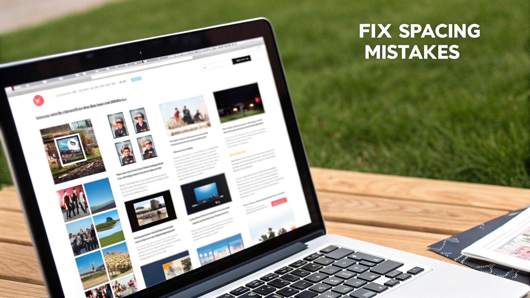
Common White Space Mistakes to Avoid on Your Website
Mastering the art of white space is often about knowing what not to do. So many small businesses accidentally sabotage their own websites with simple but costly spacing mistakes. These slip-ups can make a site feel cluttered, amateurish, and just plain hard to use, actively pushing your visitors away.
By learning to spot these common pitfalls, you can do a quick health check on your own site and make some seriously impactful improvements right away. Let's look at the biggest offenders and how to fix them.
Cramming Too Much Above the Fold
There's a persistent myth in web design that everything important must be squished "above the fold"—the part of the screen you see without scrolling. Frankly, this idea is ancient history and leads to chaotic, overwhelming layouts where nothing actually stands out.
When you try to make everything a priority, you end up with no priority at all. Instead of a clear message, visitors get hit with a wall of competing text, images, and buttons. It's confusing, causes decision paralysis, and completely defeats the purpose of a landing page.
The fix is simple: trust the scroll. People today are hardwired to scroll. Use that prime real estate above the fold for one compelling headline, a killer image, and a single, clear call-to-action. Surround it with plenty of macro white space to let it breathe and do its job.
Using Inconsistent Margins and Padding
Ever landed on a site where things just feel… off? Maybe elements are practically kissing the edge of the screen in one spot but have massive gaps somewhere else. That visual mess is usually down to inconsistent margins (the space outside an element) and padding (the space inside an element).
Inconsistency screams unprofessional. It makes your layout look like an accident rather than a deliberate, thoughtful design, which can chip away at your brand's credibility.
To fix this, create a simple spacing system and stick to it. For instance, decide that all your main page sections will have 60px of padding at the top and bottom, and all content columns will have a 30px gap between them. Tools like the Wix Editor make it incredibly easy to set these values and reuse them across your site for a clean, organised look.
Failing to Group Related Elements
Another classic blunder is not using white space to create logical groups. This happens when the space between related items (like a photo and its caption) is bigger than the space separating them from totally unrelated content.
This breaks a fundamental design rule called the principle of proximity. Our brains are wired to see elements placed close together as a single, related unit. When your spacing is all over the place, you shatter those connections and make users work way too hard to figure out what goes with what.
Look at how the spacing in well-designed templates clearly defines sections. It makes the layout feel intuitive and ridiculously easy to scan. That's proximity in action.
Forgetting About Mobile Spacing
And finally, the big one. A design that looks perfectly spaced out on a big desktop monitor can become a cramped, unreadable disaster on a mobile phone. Those nice, airy text blocks turn into intimidating walls of text, and easy-to-click buttons become tiny targets that are impossible to tap.
Ignoring how your white space translates to smaller screens is a guaranteed way to annoy a huge chunk of your audience.
Boost the line height: Give your text more breathing room between lines to make it easier to read on narrow screens.
Chop up long paragraphs: A paragraph that looks fine on a desktop can feel like an endless scroll on mobile. Break it up.
Give buttons space: Make sure there's plenty of empty space around your buttons and links to prevent "fat finger" mistakes.
Avoiding these common mistakes will instantly elevate your website's design. It'll look more polished, feel more professional, and be a whole lot nicer for your visitors to use.
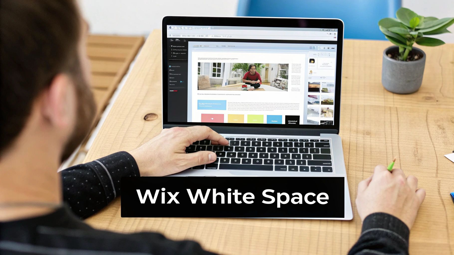
Practical Ways to Implement White Space in Wix
Theory is great, but let's get our hands dirty and translate these ideas into real, tangible actions you can take inside the Wix editor. Applying the principles of white space in web design isn’t some abstract art class; it’s about making specific, intentional tweaks that immediately improve how your site looks and feels. The goal here isn't to leave things empty, but to make deliberate choices that create balance and clarity. Simple as that.
This guide will walk you through the essential settings you can adjust today to give your website a much more professional and user-friendly vibe.
Master Your Layout with Strips and Columns
One of the most powerful tools in your Wix toolkit for controlling the big-picture white space (macro space) is the strip. Think of strips as the main building blocks of your page, like floors in a building. By adding a strip, you create a distinct horizontal section where you can place your text, images, and anything else.
But here’s where the magic happens: adjusting the padding within these strips. Instead of letting your content crash right into the edges, give it some breathing room. A consistent top and bottom padding of 60 to 80 pixels for each strip creates a wonderfully calm and organised rhythm as visitors scroll down the page.
Inside each strip, you can then add columns. This is your secret weapon for stopping your content from sprawling across the entire screen—a common mistake that makes sites look amateurish on big monitors. By using a two or three-column layout, you naturally create vertical gutters of white space that guide the eye and keep your content neat and digestible. For those ready to level up their layouts, our guide on getting started with Wix Studio dives deeper into structuring more complex pages.
Fine-Tune Readability with Text Spacing
Now, let's zoom in on the small stuff—the micro white space. These are the tiny details that make your text a pleasure to read instead of a chore. If you ignore these settings, you end up with dense, intimidating blocks of text that visitors will just skip right over.
Inside the Wix text settings panel, you have precise control over two critical elements:
Line Spacing: This is the vertical gap between each line of text. For your main body paragraphs, a good starting point is a line spacing value between 1.5 and 1.7. This gives each line enough room to stand on its own, and studies have shown it can improve reading comprehension by up to 20%.
Character Spacing: This is the horizontal space between individual letters. You won’t need to mess with this often, but a tiny increase (like 0.01em) can sometimes make certain heading fonts feel more open and premium.
Remember, the goal of micro white space is to reduce friction for the reader. Small, thoughtful adjustments to your text spacing are one of the fastest ways to make your entire site feel more polished and professional.
Build a Clear Visual Hierarchy
Good white space is all about guiding your visitor's attention. You want to create a clear path that leads them from your main headline to your supporting content and, finally, to your call-to-action (CTA). It's that simple.
Use white space to create visual priority. The more empty space you put around an element, the more important it will seem. Your main CTA button should be the best example of this. Don't crowd it with other links or text; give it a generous amount of room so it stands out as the obvious next step.
Here’s a quick checklist you can use to apply these concepts right now:
Review Section Padding: Go through each strip on your homepage. Is the top and bottom padding consistent?
Check Your Columns: Is your text stretching the full width of the screen? If it is, pop it into columns to make it easier to read.
Adjust Line Spacing: Click on a paragraph of body text and try increasing the line spacing to 1.6. See how much easier it is to scan?
Isolate Your CTA: Find your most important button. Is it surrounded by enough negative space to make it the undeniable focal point?
By methodically working through these practical steps in Wix, you can transform your site from cluttered to clean, turning white space into your most valuable design tool.
So, Ready to Transform Your Website?
Let's quickly recap. White space isn't just an empty patch on your website; it's a powerhouse of a design tool. It's what brings clarity, focus, and a professional sheen to everything you're trying to say online. Honestly, embracing a 'less-is-more' vibe doesn't just make your site look better—it actually helps it perform better, which means happier visitors and, ultimately, better business results. A cluttered, chaotic website? That's a surefire way to send potential customers running for the hills.
You've now got the core concepts down to make some seriously impactful changes. If you’re keen to dig a bit deeper into how all the pieces of the puzzle fit together, exploring the fundamentals of understanding layout design is a great next step. It builds perfectly on everything we've talked about here.
Getting that balance right between what's on the page and what's left empty is how you turn a simple website into an intuitive, high-performing machine that guides people exactly where you want them to go.
This smart use of white space in web design is what really separates an amateur site from a pro one. It’s that final bit of polish that builds trust and gets you those all-important conversions.
Your Burning Questions About White Space, Answered
Even after seeing all the benefits, plenty of business owners get a bit nervous about actually using white space on their own websites. It feels a bit like throwing away valuable space, right? Let's tackle some of the most common worries so you can start using it like a pro.
Will Too Much White Space Make My Website Look Empty?
This is the number one fear, but honestly, no—not if you're using it with a purpose. There's a huge difference between an "empty" site and a "focused" one. Think of it like this: an unfinished, bare room feels empty. A minimalist art gallery, on the other hand, uses wide-open spaces to make every single piece of art pop. That's what we're aiming for.
An "empty" vibe usually comes from a messy layout or no clear hierarchy, not from having too much breathing room. When you use white space correctly, it gives your site a sense of calm and sophistication. It tells your visitor's eyes exactly where to look instead of hitting them with a wall of chaos. It's all about balance.
How Does White Space Affect My Website on Mobile?
On a tiny screen, white space isn't just a "nice-to-have"; it's an absolute necessity. A design that feels roomy and relaxed on a desktop can turn into a cramped, stressful mess on a phone. Text becomes a solid block of doom, and buttons are so close together you need the fingers of a toddler to tap the right one.
Good mobile spacing is your secret weapon for a great user experience. It keeps your text readable and gives links and buttons enough space to avoid those frustrating "fat finger" mistakes. This one simple thing is key to making a responsive design that actually works for everyone, no matter what device they’re on.
A well-spaced mobile design is the difference between a happy visitor and a bounced one. It shows you've actually thought about their experience, and that's a massive trust-builder.
Is There Such a Thing as Too Much White Space?
Oh, absolutely. While it’s a brilliant design tool, you can definitely go overboard. When white space is used randomly or excessively, it can make your page feel broken and disconnected. If you put too much of a gap between things that belong together, you shatter their visual relationship.
For example, if your product photo is miles away from its price and description, you’re forcing the user to scroll around and piece the puzzle together themselves. That’s extra work nobody wants to do, and it can completely derail their journey.
The trick is to be intentional with every bit of space:
Group related things: Keep elements that belong together nice and snug.
Separate unrelated things: Use bigger gaps to signal a change of topic or section.
Create a spotlight: Surround your most important button or message with the most space to make it impossible to miss.
Nailing this balance is what turns a decent website into a seriously effective one. It’s about making every pixel count—whether it's filled with something or intentionally left clear. Get this right, and you're already way ahead of the game.
Ready to stop guessing and start building a professionally designed website that actually converts? The experts at Baslon Digital are masters at crafting stunning, strategic Wix websites for businesses just like yours. Contact us today for a consultation and let's create a site that doesn't just look good, but gets results.
Comments