7 Inspiring Mega Menus Examples to Elevate Your Website in 2026
- Baslon Digital

- Jan 8
- 15 min read
Struggling to fit all your important pages into a clean, intuitive navigation bar? You're not alone. Standard dropdowns often hide valuable content, creating a frustrating experience for visitors and forcing them to hunt for information. This is where a well-organised mega menu comes in, offering a powerful solution for displaying complex navigation structures clearly and elegantly. They guide users exactly where they need to go without overwhelming them.
When the current navigation proves inadequate, a broader re-evaluation might be necessary, as outlined in a strategic guide to website redesign. However, for many sites, optimising the menu is the key. In this guide, we'll explore seven fantastic mega menus examples, breaking down the strategy behind why they are so effective. We will analyse what makes each one work and how you can apply these principles to your own website.
You'll find detailed analysis, actionable takeaways, and specific implementation tips, particularly for Wix users. Our goal is to show you how to transform your website's navigation from a cluttered list into a strategic asset. By the end, you will understand how to build a mega menu that boosts user engagement and drives conversions. Let's dive in.
1. Awwwards: A Gallery of Elite Design Inspiration
Awwwards isn't a single example but rather a meta-resource: a curated gallery of award-winning websites where you can find some of the most innovative and visually stunning mega menus examples on the web. It's the ultimate starting point for anyone serious about design inspiration, moving beyond static templates to see what’s possible at the highest level of web development.
What makes Awwwards essential is its powerful filtering system. Instead of aimlessly browsing, you can navigate directly to their 'Elements' collection and select the 'Mega Menu' tag. This instantly populates a feed of live, vetted websites that feature exceptional navigation design. You're not just looking at screenshots; you're interacting with real-world applications crafted by top-tier agencies and developers.
Strategic Analysis: Why Awwwards Works
The primary strength of using Awwwards for research is the sheer quality and diversity of the examples. You can dissect how elite designers handle complex information architecture, micro-interactions, and brand integration within their navigation.
Real-World Application: See how mega menus function on live sites, revealing animation timings, responsiveness, and user flow in a way static images cannot.
Trend Spotting: Quickly identify emerging trends, such as full-screen menu takeovers, animated iconography, and unconventional grid layouts.
Categorised Inspiration: The platform’s tagging allows you to find specific styles. For instance, you can cross-reference 'Mega Menu' with tags like 'Minimal', 'Colourful', or 'E-commerce' to find hyper-relevant inspiration.
Key Takeaway: Awwwards moves you from theoretical design concepts to practical, award-winning executions. It's a tool for understanding why certain designs are effective, not just what they look like.
Practical Tips for Using Awwwards
To get the most out of the platform, approach it with a clear goal.
Start with the 'Elements' filter: Head straight to the 'Mega Menu' collection to save time.
Analyse, don't just copy: Pay attention to how the menu supports the overall user journey. Does it guide users to key products or content? How does it adapt to mobile viewports?
Inspect the code: Use your browser's developer tools to see how animations and layouts are built. This provides invaluable insight for your own implementation.
Access to Awwwards is free for browsing the nominated sites. A Pro account offers more advanced filtering and collections, but the free version is more than sufficient for gathering top-tier mega menu ideas.
Ready to see what the best designers are building? Explore the Awwwards Mega Menu collection for your next project.
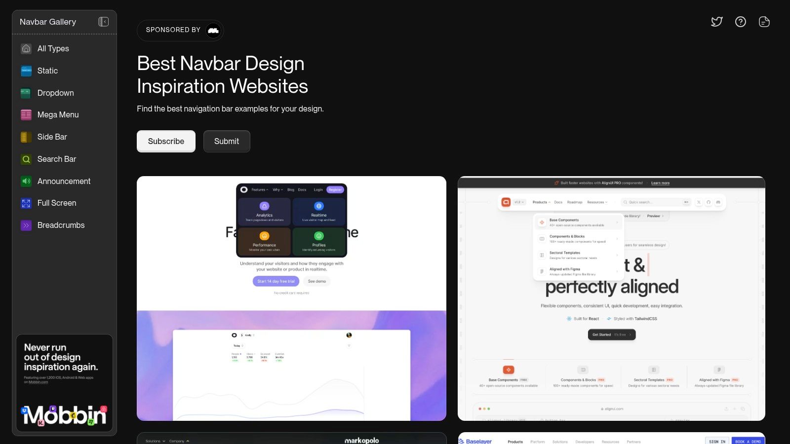
2. Navbar.gallery: A Specialist's Toolkit for Navigation
Navbar.gallery offers a hyper-focused alternative to broad design galleries. It's a curated collection dedicated exclusively to website navigation patterns, making it an invaluable resource for anyone researching mega menus examples. By stripping away all other design elements, it allows you to concentrate purely on the architecture, layout, and user experience of navigation systems.
This specialisation is its greatest strength. The platform features a dedicated 'Mega Menu' category, enabling you to instantly filter for relevant designs without the noise of a general-purpose gallery. You get a clean, direct feed of inspiration built specifically for the task at hand.
Strategic Analysis: Why Navbar.gallery Works
The core value of Navbar.gallery lies in its efficiency and focus. Instead of sifting through entire websites, you get straight to the point, analysing how different brands organise complex navigation and present vast amounts of information clearly.
Niche Focus: The entire collection is centred on navigation, ensuring every example is relevant. This saves significant time during the research phase.
Direct Comparison: The standardised format allows for easy side-by-side comparison of different mega menu layouts, from simple multi-column dropdowns to complex, image-rich designs.
Live Implementations: Each example links directly to the live site, allowing you to interact with the menu, test its responsiveness, and understand its behaviour in a real-world context.
Key Takeaway: Navbar.gallery is a tool for precision. It helps you solve specific navigation challenges by providing a concentrated, easily searchable library of high-quality, real-world mega menu patterns.
Practical Tips for Using Navbar.gallery
To maximise your time on the platform, approach it with a specific research question.
Use the 'Mega Menu' Tag: Start by filtering the gallery to see only examples that fit your immediate needs.
Study Layouts and Grouping: Pay close attention to how information is categorised. How do designers use columns, typography, and imagery to create a clear hierarchy?
Analyse Mobile vs. Desktop: Use the platform’s previews to see how the mega menu transforms into a mobile-friendly navigation system. Note which patterns translate most effectively to smaller screens.
Access to Navbar.gallery is completely free, making it an essential and accessible tool for designers, developers, and marketers alike.
Ready to find the perfect navigation pattern? Browse the Navbar.gallery collection for focused inspiration.
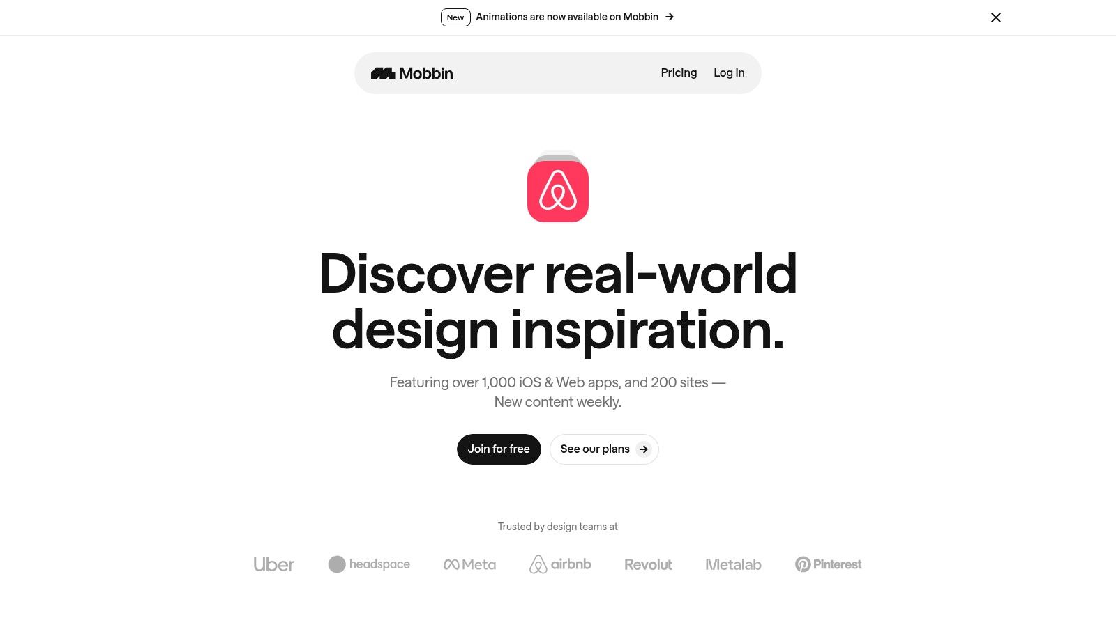
3. Mobbin: The UI Pattern Library for Serious Research
Where Awwwards offers live inspiration, Mobbin provides a comprehensive, static library of user interface patterns from the world's leading apps and websites. It's an indispensable resource for product designers and UX researchers looking to deconstruct how top-tier companies organise complex navigation, including some of the most effective mega menus examples available.
Instead of browsing live sites, Mobbin gives you high-resolution screenshots of specific UI flows, meticulously tagged and categorised. This allows for a focused, analytical approach. You can study the entire user journey of a navigation system, from the initial hover on a top-level link to the final click within a multi-column dropdown, all without leaving the platform.
Strategic Analysis: Why Mobbin Works
Mobbin’s strength lies in its forensic approach to UI/UX research. It saves you countless hours of manual screenshotting and allows you to compare different design solutions side-by-side with incredible efficiency. It’s less about artistic inspiration and more about strategic system design.
Pattern Recognition: By viewing dozens of mega menu examples from established brands like Asana, Miro, and Notion, you can quickly identify recurring patterns in information architecture and layout that are proven to work at scale.
End-to-End Flow Analysis: Mobbin captures entire user flows, so you see not just the open state of a mega menu but also how users get there and where they go next. This context is crucial for understanding usability.
Efficient and Focused Research: The platform’s curated and tagged library removes the noise of browsing the web. You can zero in on desktop navigation patterns and build a collection of best-in-class examples in minutes, not hours.
Key Takeaway: Mobbin is a workflow accelerator for evidence-based design. It lets you learn from the multi-million-pound research and development budgets of major tech companies by dissecting their finished products.
Practical Tips for Using Mobbin
To leverage Mobbin effectively, treat it like an academic library rather than a gallery.
Search by App, Not Just Pattern: Look up companies in your industry or those known for exceptional UX (e.g., Stripe, Shopify) and analyse their entire navigation system.
Create Collections: Use the collections feature to group different mega menu styles (e.g., ‘Multi-column with Icons’, ‘Product-focused Dropdowns’) for your projects. This helps in presenting findings to your team.
Analyse Information Hierarchy: Pay close attention to how items are grouped, labelled, and prioritised. Note the use of typography, iconography, and negative space to create a clear visual hierarchy.
Access to Mobbin’s full library requires a paid plan, with pricing available upon signing up. They also offer discounts for students and educators, making it an accessible tool for learning.
Ready to base your design decisions on proven patterns? Explore desktop navigation patterns on Mobbin to inform your strategy.
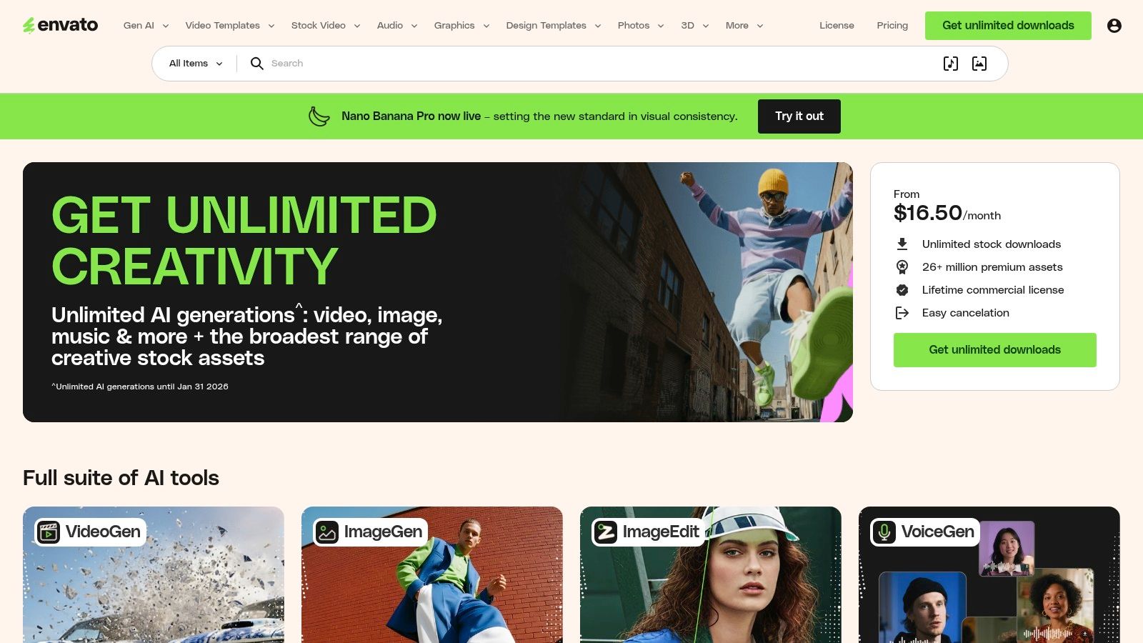
4. Envato Elements: A Toolkit for Rapid Prototyping
Envato Elements is not a single live example, but an extensive marketplace of downloadable assets. It serves as a practical resource for designers and developers looking to accelerate their workflow with pre-built UI kits and templates. For anyone building a website, this platform offers a vast library of mega menus examples available as customisable design files for Figma, Adobe XD, and even ready-to-deploy components for WordPress.
Instead of starting from scratch, you can download a professionally designed mega menu UI kit and adapt it to your project’s specific needs. This approach is invaluable for rapid prototyping, client presentations, and projects where time is a critical factor. The platform provides a foundation that you can then customise, saving countless hours in the initial design and wireframing phases.
Strategic Analysis: Why Envato Elements Works
The core strength of Envato Elements is efficiency. It provides the building blocks to construct sophisticated navigation systems without reinventing the wheel. This allows you to focus on customisation and user experience rather than foundational design work.
Accelerated Workflow: Dramatically reduces development time by providing ready-made, editable assets for platforms like Figma and Elementor.
Design Consistency: Using a UI kit ensures that your mega menu's typography, spacing, and iconography align with established design standards.
Commercial Viability: The single-subscription model includes a commercial licence, making it a cost-effective solution for freelancers and agencies building sites for clients.
Key Takeaway: Envato Elements is the ideal resource for moving from concept to a high-fidelity prototype quickly. It's a tool for execution, providing tangible assets that can be directly implemented and modified.
Practical Tips for Using Envato Elements
To maximise the value of the platform, it's best to have a clear design direction before you start browsing.
Filter by Tool: Use the search filters to find assets compatible with your software (e.g., 'Figma UI Kit Mega Menu' or 'Elementor Mega Menu').
Check for Updates and Reviews: Favour assets that are regularly updated and have positive user reviews, as this often indicates higher quality and better support.
Customise Heavily: Use the templates as a starting point. Change colours, fonts, and layouts to ensure the final design is unique to your brand and doesn't look generic.
Access to Envato Elements requires a subscription, which grants unlimited downloads across its entire catalogue of millions of assets. There is no option to purchase items individually.
Find the perfect starting point for your design. Browse the Envato Elements collection for your next project.
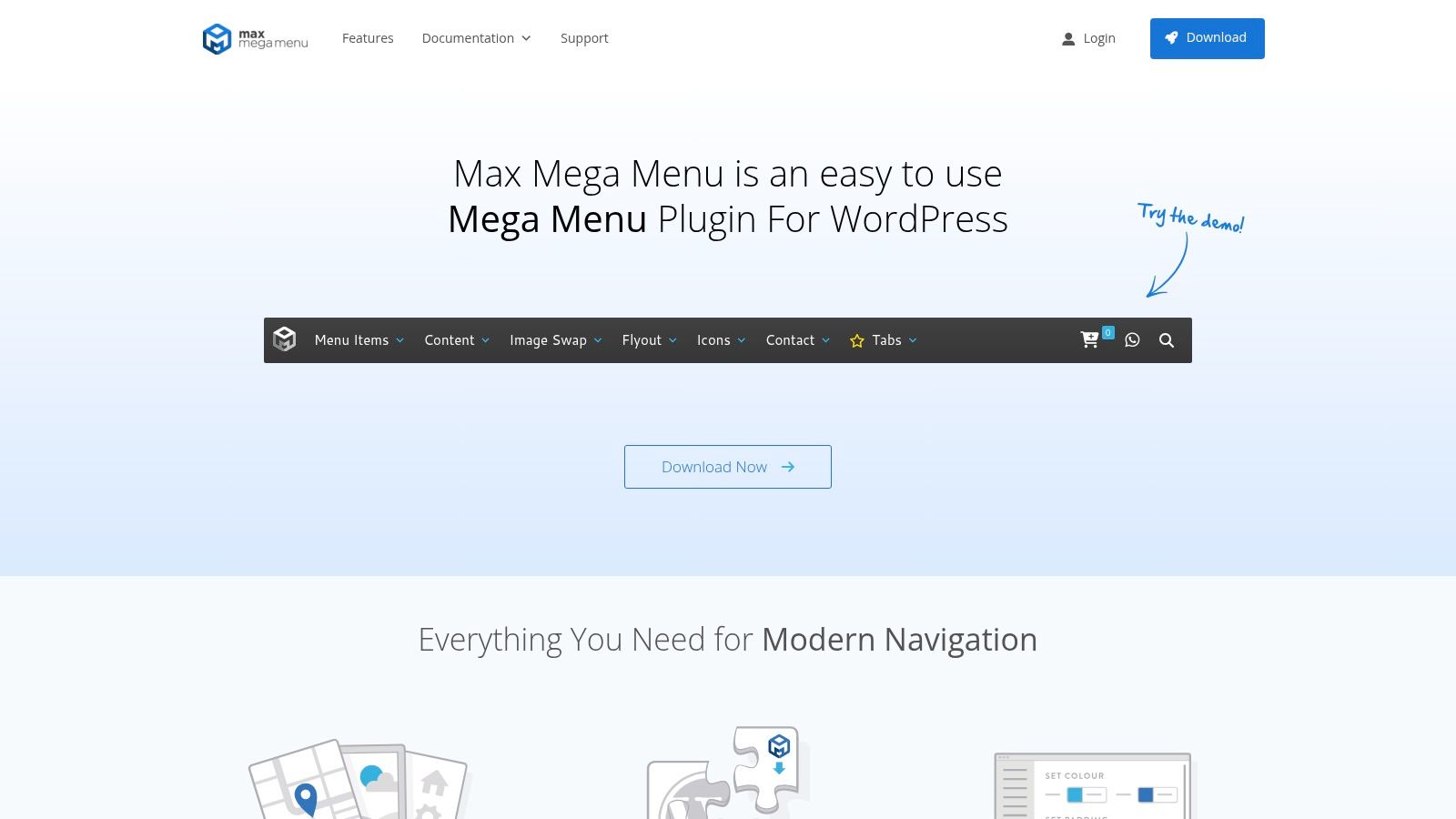
5. Max Mega Menu: The Go-To WordPress Plugin
For those building on the WordPress platform, Max Mega Menu isn't a single example but a powerful tool to create your own. It's one of the most popular and mature plugins dedicated to transforming standard WordPress menus into touch-friendly, accessible, and feature-rich navigation systems. This tool shifts the focus from finding inspiration to direct implementation.
Rather than coding from scratch, Max Mega Menu provides a drag-and-drop builder that integrates directly into your WordPress dashboard. This allows you to add any WordPress widget into your menu, create multi-column layouts, and style everything to match your brand's aesthetic without deep technical knowledge. It's a production-ready solution for adding professional mega menus examples to your own site.
Strategic Analysis: Why Max Mega Menu Works
The key strength of Max Mega Menu is its accessibility and ease of use for the world's most popular CMS. It democratises advanced navigation, making it achievable for small businesses and solo developers who need a robust solution without a custom development budget.
Accessibility First: The plugin is built with accessibility in mind, supporting keyboard navigation out of the box and aligning with Web Content Accessibility Guidelines (WCAG).
Deep Integration: It works seamlessly with the existing WordPress menu system and popular themes, including those built for WooCommerce, making it ideal for e-commerce sites.
Cost-Effective Power: The free version offers substantial functionality, while the Pro version unlocks advanced features like sticky menus, custom icons, and a search box for a one-time fee.
Key Takeaway: Max Mega Menu is the practical choice for WordPress users. It bridges the gap between ambitious design ideas and real-world implementation by providing a structured, powerful, and user-friendly toolset.
Practical Tips for Using Max Mega Menu
To get the best results, leverage its native WordPress integration.
Start with the Free Version: The core plugin is highly capable. Test it thoroughly to see if it meets your needs before considering an upgrade to Pro.
Use Widgets Creatively: Don't just add links. Embed a search bar, recent posts, product images, or even contact forms directly into your menu to create a dynamic user hub.
Check Theme Compatibility: While it works with most themes, always test it on a staging site first to ensure there are no conflicts with your theme's default navigation styling.
The core plugin is free to download from the WordPress repository. The Pro licence offers more advanced features and is available with different pricing tiers for single-site or multiple-site use.
Ready to build your own accessible and powerful navigation? Install Max Mega Menu on your WordPress site to get started.
6. Webflow: Cloneable Production-Ready Menus
Webflow’s “Made in Webflow” showcase is an interactive goldmine for designers and developers, offering free, cloneable mega menus examples built by the community. Unlike inspirational galleries where you can only look, Webflow allows you to find a production-ready menu, clone it directly into your own project, and customise it within minutes. It’s a powerful shortcut for implementing sophisticated navigation without starting from scratch.
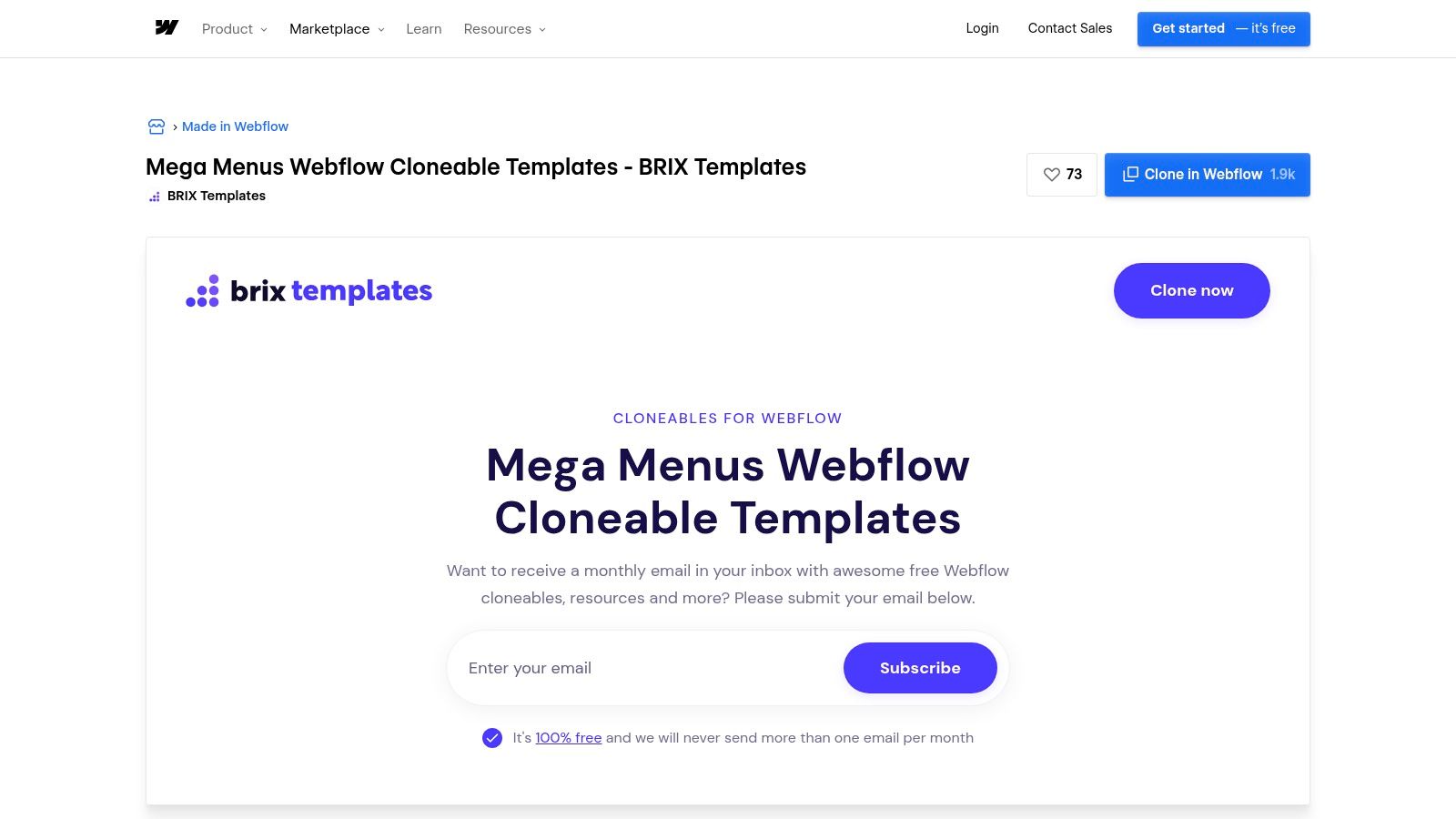
The platform is particularly valuable for its focus on interaction and responsiveness. You can find mega menus with complex opening animations, multi-level dropdowns, and integrated imagery that are already optimised for different screen sizes. This hands-on approach demystifies the technical side of menu creation, making it accessible even for those with limited coding knowledge.
Strategic Analysis: Why Webflow Cloneables Work
The key advantage of using Webflow cloneables is the immediate jump from inspiration to implementation. You are not just observing a good design; you are acquiring its entire functional structure. This dramatically accelerates development and provides a practical learning opportunity.
Learn by Deconstructing: By cloning a project, you can reverse-engineer how advanced interactions, responsive settings, and animations are built, providing invaluable insights into professional website design practices.
Speed and Efficiency: Implementing a complex, animated mega menu from zero can take days. With a cloneable, you get a fully functional and tested foundation in seconds.
Quality and Variety: While quality can vary, top creators like Brix Templates offer highly polished, pixel-perfect menus that follow best practices for user experience and accessibility.
Key Takeaway: Webflow transforms mega menu design from a purely theoretical exercise into a practical, hands-on process. It empowers you to build with ready-made components, saving time while learning from the structures created by expert designers.
Practical Tips for Using Webflow
To make the most of the “Made in Webflow” library, approach it strategically.
Filter by "Cloneable": Always use the "Cloneable" filter in the showcase to find projects you can use immediately.
Inspect the Navigator: Once cloned, study the Navigator panel to understand the element hierarchy. See how divs are nested and how interactions are targeted.
Customise Branding: Immediately update fonts, colours, and link content to match your brand guidelines. A cloneable is a starting point, not a final product.
Access to clone and use these templates is completely free with a Webflow account. The quality of community-provided assets means you can achieve a premium result without the associated cost.
Ready to find a menu you can use today? Explore the Made in Webflow mega menu showcase and clone your next navigation system.
7. Wix Help Center: The Official Blueprint for Wix Builders
While not a gallery of finished designs, the Wix Help Center is an indispensable resource for anyone building a website on the platform. It provides the official, step-by-step documentation for implementing mega menus examples directly within the Wix Editor and Wix Studio. This is less about inspiration and more about execution, offering a practical blueprint for turning a design idea into a functional feature on your Wix site.
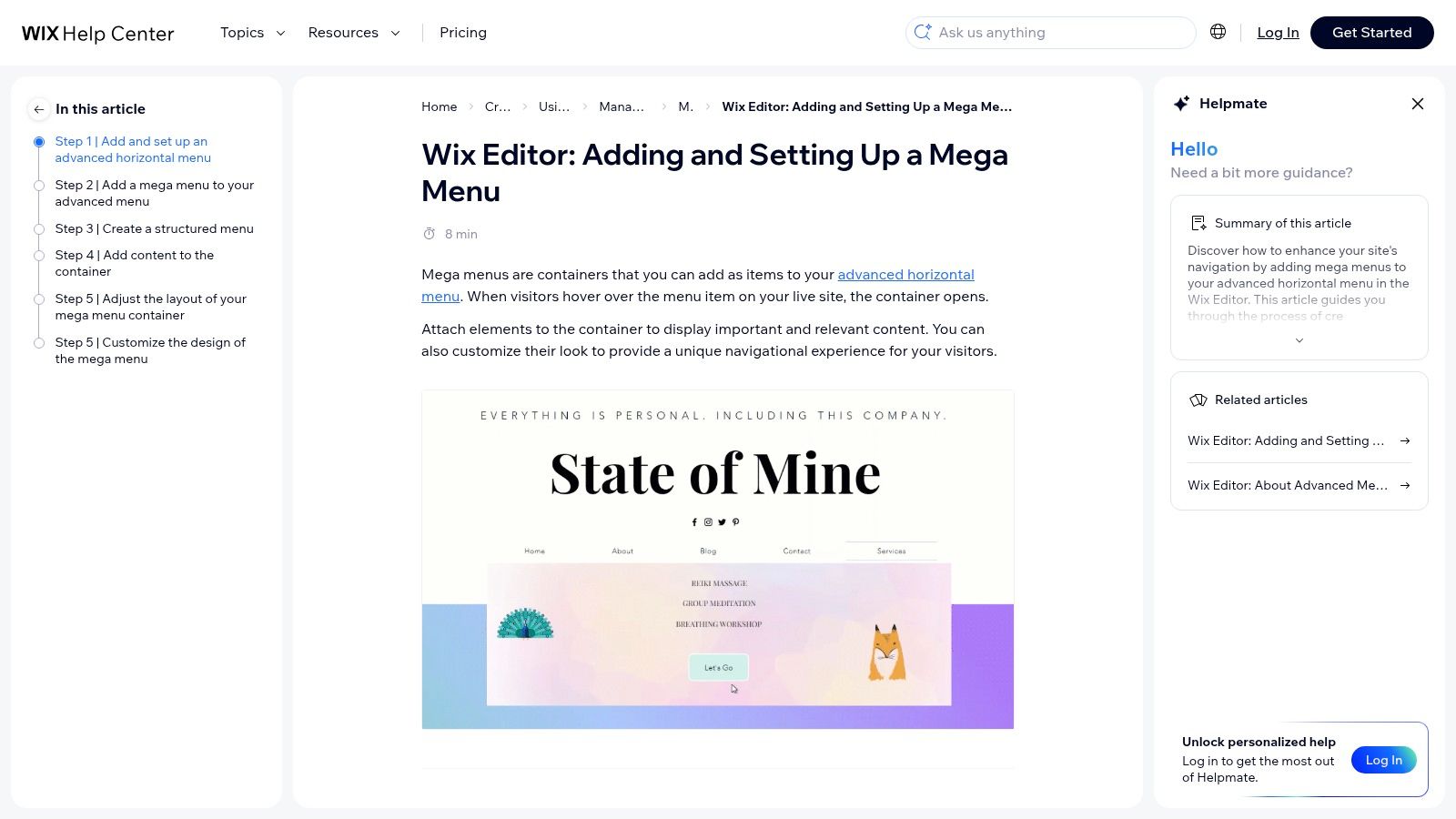
Unlike other resources that showcase what’s possible on any platform, the Wix Help Center focuses entirely on what is achievable within its ecosystem. It details the specific tools, design controls for containers and submenus, and platform limitations you need to be aware of. This direct approach saves developers and DIY business owners countless hours of trial-and-error.
Strategic Analysis: Why the Wix Help Center Works
The strength of this resource lies in its authority and specificity. It demystifies the technical process, empowering users to build complex navigation without writing code. For those considering which platform to use, understanding these capabilities is crucial; our UK guide to website builders offers more comparisons on this topic.
Platform-Specific Instructions: Provides exact steps for adding and customising mega menus in both Wix Editor and Wix Studio, eliminating guesswork.
Clear Constraints: By outlining limitations, it helps you design realistically from the start, avoiding features that the platform doesn't support.
Focus on Usability: The guides are written for a non-technical audience, making a sophisticated feature like a mega menu accessible to everyone.
Key Takeaway: The Wix Help Center is the ultimate practical guide for implementation. It bridges the gap between seeing a great mega menu example and actually building one on your own Wix website.
Practical Tips for Using the Wix Help Center
To get the most out of these guides, use them alongside your design inspiration.
Choose Your Editor: The process differs slightly between Wix Editor and Wix Studio. Ensure you are following the correct guide for your environment.
Design First, Build Second: Sketch your ideal mega menu layout before entering the editor. Use the Help Center to confirm which elements (galleries, buttons, forms) you can add.
Check for Updates: Wix frequently updates its platform. Always refer to the latest documentation to access the newest features and controls.
Access to the Wix Help Center is completely free and is an essential companion for any Wix user aiming to enhance their site’s navigation.
Ready to build a powerful menu on your Wix site? Explore the official Wix Help Center guide to get started.
Mega Menu Examples — 7-Site Comparison
Resource | Complexity 🔄 | Resources & Cost ⚡ | Expected Outcomes & Advantages ⭐📊 | Ideal Use Cases 💡 |
|---|---|---|---|---|
Awwwards | Low — browse-only inspiration | ⚡ Free browsing; optional paid Creative Pass | ⭐ High-design-quality examples; 📊 Wide variety of real-world patterns (no code) | 💡 Ideation, cross-industry layout/interaction research; inspect live sites |
Navbar.gallery | Low — focused gallery with filters | ⚡ Free to browse; smaller catalog than general galleries | ⭐ Highly targeted nav examples; 📊 Quick pattern discovery (no assets) | 💡 Fast lookup for navigation patterns and comparisons |
Mobbin | Medium — account + workflow features | ⚡ Paid plans for full access; team seats & discounts | ⭐ Curated product screenshots; 📊 Strong research/workflow support for teams | 💡 Team research, benchmarking, saved collections for UX studies |
Envato Elements | Low–Medium — download & adapt assets | ⚡ Subscription (unlimited downloads) | ⭐ Editable UI kits/templates; 📊 Rapid prototyping and production-ready assets (quality varies) | 💡 Rapid prototyping, visual QA, client deliverables needing licenses |
Max Mega Menu | Medium — plugin install & configure (WP) | ⚡ Free core plugin; Pro features require license | ⭐ Production-ready, accessible menus; 📊 Deep WP/WooCommerce integration | 💡 Implementing accessible mega menus on WordPress sites |
Webflow (Cloneables) | Low — one-click clone and edit | ⚡ Free/within Webflow; creator quality varies | ⭐ Fast interactive prototypes; 📊 Learn-by-cloning production-ready interactions | 💡 Quick implementation or study of responsive interactions in Webflow |
Wix Help Center | Low — step‑by‑step platform docs | ⚡ Free official documentation | ⭐ Authoritative, platform-specific guidance; 📊 Clear constraints and setup steps | 💡 Building/configuring mega menus on Wix Editor or Studio |
Ready to Build a Mega Menu That Wows Your Visitors?
We've explored a diverse landscape of inspiration and practical tools, from the award-winning designs on Awwwards to the technical blueprints in the Wix Help Center. Across all these mega menus examples, a core principle emerges: an effective mega menu is a powerful strategic asset, not just a list of links. It organises complex information, enhances the user journey, and actively guides visitors toward your most important content.
The journey from concept to creation involves several critical stages. You've seen how platforms like Mobbin and Navbar.gallery provide invaluable insights into user flow and component design from leading brands. These resources are crucial for understanding established conventions and user expectations before you even begin to design.
Key Takeaways for Building Your Own Mega Menu
As you move forward, keep these central strategies in mind. The best mega menus don't just show everything; they curate the user's options, making choices feel intuitive rather than overwhelming.
Prioritise Clarity Over Quantity: The goal is not to cram every page into the menu. Instead, focus on creating a logical hierarchy that reflects your site's structure and your users' primary goals. Group related items under clear, concise headings.
Embrace Visual Hierarchy: Use typography, icons, and even subtle background colours to create visual distinction. As demonstrated by many examples, highlighting key pages or calls to action within the menu can significantly boost engagement and guide user behaviour.
Design for All Devices: A mega menu that shines on a desktop but fails on a mobile device is a failed mega menu. Always plan for a responsive design from the outset, ensuring the experience is seamless and accessible, regardless of screen size. Use tools like Webflow's cloneables to see how experts tackle responsive navigation.
Choosing Your Tools and Getting Started
Your choice of tool will depend on your technical comfort and platform. For WordPress users, a plugin like Max Mega Menu offers a straightforward, code-free path to a functional menu. If you're building on Wix, leveraging its built-in features and the comprehensive guides in the Help Center will be your most direct route to success.
Ultimately, the most successful mega menus examples are those that are thoughtfully planned and meticulously executed. They strike a delicate balance between providing comprehensive options and maintaining a clean, uncluttered interface. By applying the principles of strategic organisation, visual clarity, and responsive design, you can transform your website's navigation from a simple directory into a compelling and effective user experience. The inspiration and tools are at your fingertips; it's time to start building.
Feeling inspired but need an expert to bring your vision to life? At Baslon Digital, we specialise in creating stunning, high-performing Wix websites with flawless navigation tailored to your business goals.
Let us help you build a website with a mega menu that not only impresses your visitors but also drives tangible results. Speak with us by booking a meeting slot on our website calendar

Comments