A Guide to the Process in Designing a Website for UK Businesses
- Baslon Digital

- Feb 14
- 17 min read
Designing a website that actually works goes way beyond just picking pretty colours and cool fonts. It’s a strategic deep dive that starts with discovery and planning. This is the crucial groundwork—defining your goals, getting inside your audience's head, and mapping out your site's structure before you even think about design.
Laying the Groundwork for a Winning Website
Before you get lost in the fun world of Wix templates and colour palettes, we need to do the most important work first. This strategic foundation is what separates a website that just exists from one that performs like a champ. Getting this right from the start ensures your site is built to attract, engage, and convert visitors, turning it into a real business asset rather than just a digital brochure.
This initial phase is all about asking the right questions. What's the main goal here? Are you trying to get more leads, sell products, or show off your amazing portfolio? And who, exactly, are you trying to talk to? Nailing these answers now saves you from expensive and frustrating do-overs later.
Define Your Goals and Audience
First things first, you have to decide what "success" actually looks like for your website. Is it a 20% bump in online bookings? Maybe it's cutting down customer service emails by 50% with a killer FAQ page? Your goals need to be specific, measurable, and realistic.
At the same time, you need to get crystal clear on your ideal customer. I'm talking about creating detailed user personas—think of them as fictional characters representing your target audience. This helps you step into their shoes and understand their needs and frustrations. For example, a London-based consultancy might target "Marketing Managers at UK startups" who are short on time and need quick, no-fluff advice. That single insight changes everything about your site's content and layout.
A website without clear goals is like a ship without a rudder. It might look impressive, but it’s not going anywhere meaningful. This planning phase is your opportunity to set a clear course for digital success.
The flowchart below breaks down how this foundational process works, moving logically from setting goals to mapping out your site.
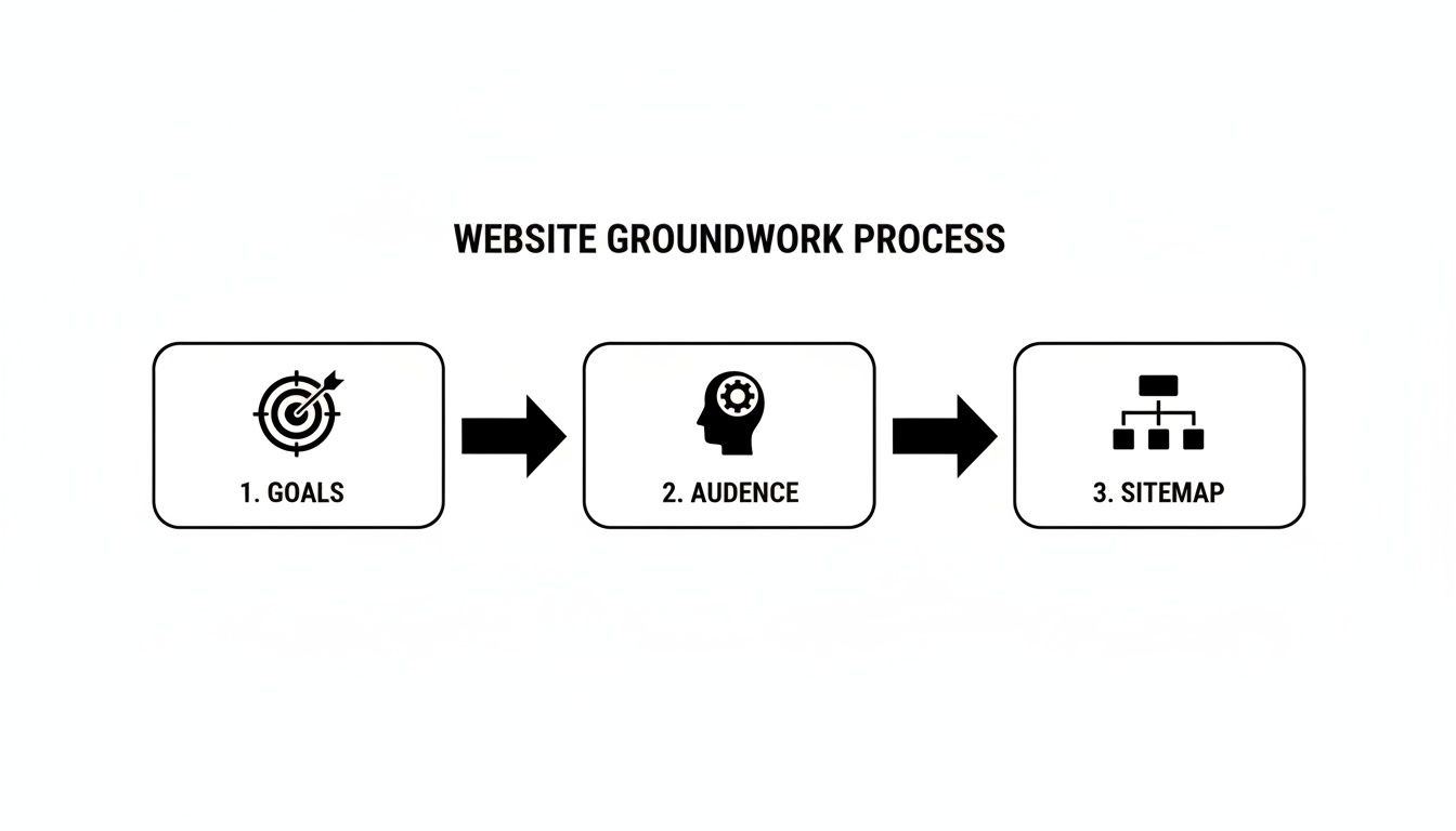
See how each step builds on the last? It’s a simple but powerful flow that makes sure your sitemap is perfectly aligned with both your business goals and what your audience is looking for.
Structure Your Content with a Sitemap
Once you know your why and your who, you can create a sitemap. Think of it as the architectural blueprint for your website. It’s basically a hierarchical list of all the pages you plan to have and how they all connect.
A typical sitemap for a small business might look something like this:
Home: Your digital front door.
About Us: Your story, your team, your mission.
Services: A detailed breakdown of what you do.
Case Studies/Portfolio: The proof in the pudding.
Blog: Your space to share expertise and attract visitors.
Contact: Clear instructions on how people can get in touch.
This kind of structure creates a logical journey for your users, making it dead simple for them to find what they need. For a more in-depth look, check out our guide on how to write a website brief, which really gets into the nitty-gritty of defining your project needs.
The table below summarises the core components of this discovery phase. It's a quick reference for what you should be focusing on right at the start.
Core Components of the Discovery Phase
Activity | Objective | Key Outcome for Your Business |
|---|---|---|
Goal Setting | Define clear, measurable business objectives for the website. | A focused website strategy that aligns with your bottom line. |
Audience Research | Understand the needs, pain points, and behaviours of your target users. | Content and design that truly resonates with your ideal customers. |
Sitemap Creation | Map out the website's structure and page hierarchy. | An intuitive user journey that makes navigation effortless. |
Competitor Analysis | Identify what your competitors are doing well (and not so well). | A competitive edge and opportunities to stand out in the market. |
Essentially, getting these four things right before you move on is non-negotiable for building a website that delivers results.
This discovery phase isn't just a nice-to-have anymore; it's critical. For small businesses working with agencies, this initial planning can take up 20-30% of the entire project timeline. It involves deep dives, audits, and user persona workshops. In fact, UK firms report that 73% of clients now push for a mobile-first strategy from day one. Investing properly at this stage isn't a cost—it's a massive advantage, potentially leading to 375% better search visibility within just three months of going live.
This strategic groundwork sets the stage for everything that follows, making the design and build phases smoother, faster, and far more effective.
Mapping Your User Experience With Wireframes
Right, you’ve got your strategy sorted. Now it’s time to create the blueprint for your website. This is where we get into wireframing—translating your sitemap and what your users actually need into a simple, functional layout. Forget about fancy colours and fonts for a moment; this is all about mapping out the user journey.
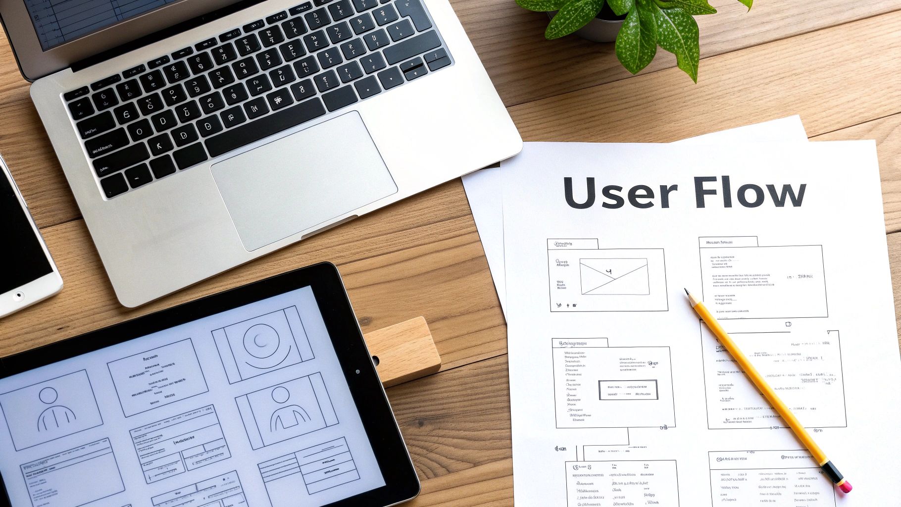
Think of it like an architect's floor plan. You wouldn't let them start building walls without first deciding where the rooms, doors, and windows should go. A wireframe does the exact same thing for your website, focusing purely on structure, hierarchy, and how things work.
Starting With Low-Fidelity Sketches
The whole process usually kicks off with low-fidelity (lo-fi) wireframes. These are just quick, simple sketches—sometimes literally on a napkin or a whiteboard—that outline the basic structure of each page. They’re meant to be rough and unpolished.
The magic of lo-fi sketches is that they’re fast and there’s zero commitment. You can rattle through a dozen layout ideas in minutes without getting bogged down in tiny details. This is the stage to answer the big questions:
Where should the main menu sit?
What’s the most important thing on the homepage?
How does someone get from a services page to the contact form without getting lost?
This stripped-back approach makes it ridiculously easy to spot problems in the user flow early on. Fixing a navigation issue on a piece of paper costs nothing. Fixing it after the site is already built? That’s a proper headache.
Evolving to High-Fidelity Prototypes
Once you’re happy with the basic bones of the site, you can move on to high-fidelity (hi-fi) wireframes, or prototypes. These are more detailed, digital versions that often have some interactivity baked in. They still won’t have the final branding, but they look much closer to a finished website.
Hi-fi prototypes include more precise placement of elements, actual text (or at least realistic placeholder copy), and clickable buttons. This lets you simulate the user experience, clicking through the site as if it were live. Honestly, this step is invaluable for testing usability and getting feedback before you’ve committed to a final design.
A well-structured wireframe ensures that form follows function. By focusing on the user’s journey first, you create an intuitive experience that guides them effortlessly toward their goal—and yours.
Imagine a freelance photographer in Manchester wanting to get more online bookings. Their first idea was a complex, artsy menu that just confused visitors. By sketching out simple wireframes, they mapped a much clearer path:
Homepage: A brilliant hero image with a single, clear call-to-action: "View Galleries".
Galleries Page: A simple grid, organised by category (Weddings, Portraits, etc.).
Booking Page: A dead-simple form that clients could fill out in under two minutes.
Testing this flow with a clickable prototype showed that people could find what they needed and send an enquiry in half the time. That simple structural change, figured out during wireframing, led to a real, noticeable jump in bookings after the site went live. If you want to get into the nitty-gritty of this, our article offers a practical, step-by-step guide on how to create a wireframe for a website.
This structured approach stops you from having to do costly redesigns later and makes sure your final website isn't just pretty, but also incredibly effective and easy to use.
Ready to start planning the blueprint for your own standout website? The team at Baslon Digital specialises in crafting user-focused designs on Wix. Contact us today to discuss your project and see how we can bring your vision to life.
Crafting a Visual Identity That Connects
Right, this is where the real fun begins. You've got the solid blueprint from your wireframes, and now it's time to breathe some life and personality into your website. The visual design phase is all about transforming that functional skeleton into a compelling user interface (UI) that actually connects with your audience.

We're moving beyond simple boxes and lines to create an experience that feels like your brand. And it’s not just about making things look pretty; a staggering 94% of first impressions are tied directly to your site's visual design. No pressure, then!
Starting With a Mood Board
Before you even think about picking colours, the first thing you need to do is create a mood board. Think of it as a collage that captures the exact vibe you want your brand to give off. It's your collection of images, textures, fonts, and colour palettes that visually nail down your brand's personality.
For instance, a London-based eco-friendly cleaning service might pull together a mood board filled with images of nature, earthy green and brown tones, clean minimalist fonts, and textures like wood and linen. This visual guide becomes your creative North Star, ensuring every design choice you make from here on out is consistent and on-brand.
A mood board isn’t just a pretty collection of pictures; it’s a strategic tool. It ensures that your visual identity is cohesive and emotionally resonant, building a foundation of trust and recognition with your audience from their very first visit.
This bit of creative exploration at the start stops your design from feeling random or disjointed. It gets everyone on the same page (even if it's just you) about the visual direction before you commit to a final look.
Choosing Your Core Visual Elements
With your mood board as your guide, you can now confidently pick out the core elements of your visual identity. These are the building blocks that will make up your website's entire look and feel, and consistency is absolutely everything.
Your main visual elements include:
Colour Palette: Don't just pick your favourite colours! Choose a palette that triggers the right emotions. For a financial advisor, blues and greys might suggest trust and stability, whereas a children's toy shop would naturally lean towards bright, playful primary colours.
Typography: The fonts you choose say a lot about your brand. A traditional serif font can feel classic and reliable, while a clean sans-serif font often comes across as modern and approachable. Pick a primary headline font and a secondary body font that are easy to read and complement each other.
Imagery Style: Decide on the kind of visuals you'll use. Will it be professional photography, custom illustrations, or high-quality stock images? Whatever you settle on, make sure the style is consistent across your entire site. It’s what gives it that polished, professional appearance.
These elements all work together to build a recognisable brand. When a visitor lands on your site, the consistent use of these visuals immediately tells them they're in the right place.
Sourcing and Creating High-Quality Visuals
Your website is your digital shopfront, and poor-quality visuals are like a dirty window—it immediately tanks your credibility. Investing in high-quality imagery is non-negotiable if you want to make a strong impression and stand out from the crowd.
Luckily, you don't need a Hollywood budget. There are fantastic resources for sourcing professional visuals, such as Unsplash for free high-resolution photos or Canva for creating custom graphics and social media assets with ease. Wix itself offers a huge library of free media you can use directly within the editor.
The visual design stage is a huge part of any website project. In the UK's competitive market, a custom website can cost anywhere from £8,000 to over £30,000, with the design and development stage taking up 40-50% of the project time. For small businesses, using a platform like Wix lets you achieve that high-end look without the enterprise-level price tag.
Since first impressions are so design-driven, focusing on a clean, minimalist, and mobile-first approach—a strategy adopted by 73% of UK companies—is a seriously smart move. You can learn more about UK web design agency trends to see how the pros approach it.
By carefully selecting your colours, fonts, and images, you're not just decorating your wireframes; you're building a powerful, cohesive brand identity that connects with your audience and gets you results.
Ready to translate your brand's personality into a stunning Wix website? The team at Baslon Digital specialises in crafting visual identities that captivate and convert. Get in touch with us today to start your design journey.
Right, you’ve got your designs, your branding is sorted, and you’re feeling good. Now for the fun part: actually building the thing. This is where we stop dreaming and start doing, transforming those static mock-ups into a real, live, interactive website on Wix.
But here’s the thing—we’re not just building a pretty website. We're building a smart one. From the very first element we drag onto the page, we'll be thinking about Search Engine Optimisation (SEO). It's like building a house with good plumbing already installed, not trying to rip up the floors to add it in later. Getting this right from day one gives you a massive head start.
From Static Design to Interactive Pages
Time to jump into the Wix Editor and bring your vision to life. This means building out each page—your Homepage, About page, Services, Contact, the lot—using Wix's drag-and-drop interface. You’ll be adding your colour palette, setting your fonts, and uploading all that gorgeous imagery we talked about. The goal is a pixel-perfect recreation of the visual design you’ve already signed off on.
As you build, think about what you want people to do. A website isn't a static brochure; it needs to be interactive. This is where you add the functional bits that turn visitors into customers.
A few must-haves for most businesses include:
Contact Forms: Make it ridiculously easy for people to reach out. No one wants to hunt for an email address.
Booking Systems: If you’re a service-based business, let clients book appointments directly. It’s a game-changer.
E-commerce: Selling products? This is where you’ll build your shop, complete with product pages, a shopping basket, and a smooth checkout process.
Getting your forms right is crucial. Paying attention to web form design best practices can be the difference between a lead and a lost visitor.
Baking in Foundational SEO
I can’t stress this enough: SEO isn’t an afterthought. It’s baked into the cake from the beginning. Getting these fundamentals sorted now helps Google understand your site from the moment it goes live, saving you a world of headaches down the line. Luckily, Wix gives you all the tools you need to do this without getting too technical.
First up, your page metadata. This is the little snippet of text that shows up in Google search results and on browser tabs. Get this right, and you're already ahead.
Page Titles (Title Tags): Every page needs a unique, descriptive title. Keep it punchy, around 50-60 characters. Something like, "Bespoke Garden Design Services | London | GreenLeaf Gardens" works perfectly.
Meta Descriptions: This is your 150-character sales pitch on Google. Write a compelling summary of what the page offers and why someone should click.
Next, let's talk about structure. You need to use headings (H1, H2, H3) to organise your content properly. Think of it like a newspaper article—there's one main headline and smaller subheadings to break up the text. Your website should be the same. One H1 tag per page, and that's it. This is your main page title. Then use H2s and H3s to create a clear hierarchy.
Think of on-page SEO as giving Google a perfectly organised filing cabinet. Each label (title, heading, alt text) is clear and accurate, making it incredibly simple for Google to find, understand, and rank your content for the right audience.
Optimising for Speed and Accessibility
Nobody waits for a slow website. Page speed is a massive factor for both user experience and your Google ranking. The biggest culprit for slow sites? Massive images. Always, always compress your images before you upload them to Wix. It’s the single most effective thing you can do to keep your site running fast.
Finally, don’t skip the image alt text. This is a short, descriptive sentence for every image on your site. It’s vital for two reasons: it allows visually impaired users using screen readers to understand your content, and it gives search engines more context about what your images show. For a photo of a garden, good alt text would be: "Lush London garden with a stone pathway and colourful flowerbeds."
By weaving these development and optimisation steps together from the start, you're not just building a site that looks the business—you're building one that performs like a champ. Curious to learn more about the platform itself? Check out our guide on what Wix is and how it works.
Need a hand turning your designs into a high-performing, SEO-optimised Wix website? Contact Baslon Digital today and let our experts build a site that gets you noticed.
Your Pre-Launch Quality Assurance Checklist
The finish line is in sight. You've poured your heart and soul into the strategy, design, and build, and now it’s almost time to show your new website to the world. But hang on a second—launching without a final, thorough check is like a chef sending out a dish without tasting it first. This is the quality assurance (QA) phase, and trust me, it’s what separates a professional launch from an embarrassing one.
This isn’t just a quick once-over. It’s a meticulous, systematic review to make sure everything works exactly as it should before your first visitor lands on the page. Getting this right means you can hit that "publish" button with the confidence that your new site is polished, professional, and ready to go from day one.
Comprehensive Functional Testing
First things first: you need to test every single interactive element on your site. Don't assume anything works just because it looks okay. You need to click every button, fill out every form, and follow every link to make sure they all work as intended.
A simple checklist can be a lifesaver here:
Navigation Links: Go through every link in your main menu, footer, and within your page content. Are there any dead ends or links sending people to the wrong page?
Contact Forms: Submit a test entry on every single form. Does the submission actually go through? Do you get the notification email? You’d be surprised how often this step is missed.
Buttons and CTAs: Check every call-to-action button. Does it download the file, scroll to the right section, or add a product to the cart? Test them all.
When you're doing your pre-launch checks, it’s helpful to know the difference between alpha and beta testing. Alpha testing is what you do internally (with your team), while beta testing means letting a small, select group of real users try out the site for feedback before the big reveal.
Cross-Device and Browser Compatibility
Your website might look perfect on your laptop in Chrome, but what about on an iPhone using Safari? Or a tablet with Firefox? A huge chunk of your audience will be visiting from different devices, and you need to guarantee a seamless experience for every single one of them.
Try to manually test your website on as many physical devices as you can get your hands on—desktops, laptops, tablets, and various smartphones. Pay close attention to how the layout adapts, whether the text is readable without having to pinch-and-zoom, and if all the buttons are easy to tap with a finger. Browser developer tools are also fantastic for quickly emulating different screen sizes.
A broken mobile experience isn't just an inconvenience anymore; it's a deal-breaker. Meticulous cross-device testing shows your visitors you care about their experience, no matter how they find you.
Content and SEO Final Review
With all the technical bits sorted, it’s time for one last content sweep. Proofread every single word on every page. Typos and grammatical errors can instantly make you look unprofessional. It’s always a good idea to get a fresh pair of eyes to look over everything, because you’re often too close to the content to spot your own mistakes.
This is also your last chance to double-check your foundational SEO settings:
Confirm every page has a unique and compelling title tag and meta description.
Verify that all your images have descriptive alt text (good for SEO and accessibility!).
Make sure your heading structure (H1, H2, H3) is logical and implemented correctly.
This final testing phase is a massive part of UK website design, often taking up 20-30% of the entire project timeline just to get everything perfect. With the graphic design industry valued at a whopping £4.2bn, this level of detail is simply the standard. For small business owners, this means rigorous checks on site speed and accessibility—an area where nearly 20% of firms budget between £2,501 and £5,000 annually just for upkeep.
Feeling a bit overwhelmed by the final checks? The team at Baslon Digital can provide the expert eye you need to ensure a flawless launch. Contact us today for a pre-launch audit and launch your website with complete confidence.
From Launch to Long-Term Growth
Right, your website is live. Pop the champagne, do a little happy dance, but don't kick your feet up just yet.
Going live isn’t the finish line; it’s the starting pistol. The real graft of turning your website from a static online brochure into a dynamic growth engine begins now. This is where you stop guessing and start listening to what real-world data tells you.
Your first port of call? Analytics. Tools like Google Analytics are about to become your new best friend, offering priceless insights into how people find and interact with your site. You can track everything from your most popular pages to how long visitors stick around. This data isn't just a bunch of fancy numbers; it’s a roadmap pointing directly to what’s working and what needs a serious rethink.
Monitoring Performance and Gathering Feedback
Once that sweet, sweet data starts rolling in, you can begin keeping an eye on the key performance indicators (KPIs) you set way back at the start of this whole adventure.
Track Your Search Rankings: Use a tool to see where you’re ranking for your target keywords. Are you climbing the ladder or sliding down a snake? This is the clearest sign of whether your SEO strategy is actually paying off.
Analyse User Behaviour: Heatmaps are brilliant for showing you exactly where users are clicking, and session recordings literally let you watch their journey unfold. You might be shocked to find a button everyone ignores or a section they just can't get enough of.
Collect Direct Feedback: Don't be shy—just ask for opinions! A simple survey or a feedback form can give you blunt, honest insights you'd never get from analytics alone.
A website is a living, breathing thing, not a one-off project. Regularly tuning in to what your data and your users are telling you is the only way to make sure it keeps delivering results long after launch.
Keeping your site secure, relevant, and effective is all about ongoing maintenance and a solid content strategy. This means running regular updates to keep everything secure and pumping out fresh content to keep your audience engaged and the search engines happy.
If this constant cycle of monitoring, analysing, and tweaking sounds like a bit much to handle on your own, you're not alone. The team at Baslon Digital is here to help you navigate your post-launch journey and lock in that long-term success.
Your Burning Questions, Answered
Jumping into a website project can feel a bit like staring at a giant puzzle. You know what the final picture should look like, but figuring out where all the pieces go can bring up a lot of questions. This is especially true for UK small business owners dipping their toes into the world of Wix for the first time.
Let's clear the air and tackle some of the most common queries we get.
So, How Long Is This Actually Going to Take?
This is the classic "how long is a piece of string?" question, but I'll give it a go. The timeline for a website build really hinges on how complex your project is.
A straightforward, slick-looking brochure site with just a handful of pages? We could be looking at a breezy 2-4 weeks from our first chat to launch day. But if you're dreaming bigger—say, an e-commerce shop with loads of products and some fancy custom features—you'll want to set aside 8-12 weeks, maybe even a little longer.
Honestly, the biggest variable is you. How quickly can you get back to us with feedback? Do you have your text and images ready to go? Most delays happen when we're waiting on content or approvals, so the more prepared you are, the faster we can move.
A website is a team sport. The more you bring to the table during those early discovery and content stages, the smoother the ride will be for everyone.
Okay, Let's Talk Money. What’s The Damage?
Just like the timeline, the cost is all about the scope of the work. For a small business here in the UK, a professionally designed and built Wix website typically falls somewhere in the £1,500 to £5,000+ range. That price usually covers the whole shebang: strategy, design, the actual build, and getting your basic SEO sorted.
What pushes the price tag up?
Selling online: Setting up an e-commerce shop is a bigger job, plain and simple.
Custom bells and whistles: Need to integrate a specific booking system or have a unique function built? That’s extra development time.
Words and pictures: If you need us to write your copy or source your images, that's an extra investment.
Try to think of it less as a cost and more as an investment in what will become one of your most valuable business assets. It's your 24/7 salesperson, after all!
Will I Be Able to Update the Site Myself Later?
Yes, absolutely! And you'll love it. One of the best things about building on a platform like Wix is how ridiculously easy it is to use once everything's set up.
After we've done the heavy lifting of professional design and development, we hand the keys over to you. You'll have full access to make simple updates yourself—things like tweaking text, swapping out an image, or publishing a new blog post. It’s a total game-changer for keeping your site fresh and current without having to call a developer for every little thing.
Ready to kick off the Baslon Digital process and build a website that doesn't just look pretty, but actually gets results? We create stunning, hard-working Wix websites for UK businesses just like yours.
Comments