A Guide to Designing a Powerful Footer for Website
- Baslon Digital

- Feb 12
- 14 min read
Updated: Feb 14
So, you've spent ages perfecting your website's header, agonizing over the homepage hero image, and crafting killer content. But what about the very bottom of the page? Too often, the website footer gets treated like an afterthought—a digital dumping ground for stuff that doesn't fit anywhere else.
Let's change that.
What Is a Website Footer and Why It Matters

Think of your website footer as the friendly concierge in a hotel lobby. After your visitors have explored the main attractions (your pages), they might end up back in the lobby looking for final directions, quick help, or some essential info they missed along the way. That's your footer.
It’s the place people instinctively scroll to when they can't find what they're looking for up top. This makes it a massively valuable piece of digital real estate, not just a design box to tick. By putting key information here, you head off visitor frustration and create a much smoother experience.
The Strategic Value of the Footer
A good footer does more than just fill empty space; it actively helps your business. It's the perfect spot to reinforce your brand's credibility and give users a clear final nudge towards taking that next step. A well-thought-out footer can:
Build Trust: Slapping links to your Privacy Policy, Terms & Conditions, and contact details down there shows you're transparent and have nothing to hide.
Improve Navigation: It’s a second chance for users to find important pages they might have scrolled right past in the main menu.
Generate Leads: A simple newsletter sign-up form or a bold link to your contact page can be surprisingly effective at capturing visitors right before they bounce.
With so much web browsing happening on the move, a functional footer is more important than ever. In the UK, as of December 2023, a staggering 66.02% of all web traffic came from mobile devices. This reality means that for small businesses in London, getting your mobile site right is non-negotiable, which is why partnering with an agency like Baslon Digital to create mobile-first Wix websites is so critical. You can dig into more UK web traffic statistics from this study.
A footer isn’t the end of the page; it’s the start of a continued conversation. It reassures visitors that even at the very bottom, help and information are always within reach.
Ready to turn your website’s most overlooked section into a powerful asset? Let's dive into how a professionally designed footer can boost your site's performance and build genuine customer trust.
Core Elements of a High-Performing Footer

Alright, so we’ve established the footer isn't just filler space. But what actually goes into one that works hard for your business? A top-notch footer isn't a random jumble of links; it’s a thoughtfully curated collection of essentials, each with a specific job to do.
Think of it like packing your handbag before you leave the house. You’ve got your keys, phone, and wallet—the absolute must-haves. For your footer, the non-negotiables are your core contact details.
This means your business address, a phone number, and a direct email. If you're a local business, this is pure gold. It builds immediate trust and makes it dead simple for nearby customers to find you and get in touch.
Table: Core Components of an Effective Website Footer
To break it down even further, let's look at the key parts of a footer that really delivers for a small business or freelancer.
Element | Purpose | Importance for Small Businesses |
|---|---|---|
Contact Details | Provide easy ways for customers to reach you. | Builds local credibility and makes it effortless for potential clients to connect. |
Navigation Links | Offer a secondary 'map' to important pages. | Helps lost visitors find key info like services or pricing, improving user experience. |
Legal Information | Display links to Privacy Policy and T&Cs. | Shows transparency and professionalism; it's also a legal requirement in the UK. |
Social Media Icons | Connect users to your social profiles. | Grows your community and offers another channel for engagement and brand storytelling. |
Call-to-Action (CTA) | Encourage a specific action, like a newsletter sign-up. | A final chance to capture a lead and build your marketing list before a visitor leaves. |
Each piece plays a role in creating a footer that's not just an afterthought, but a strategic asset.
Essential Navigation and Legal Links
Beyond just contact info, your footer should pull double duty as a secondary navigation menu. It’s the perfect spot for links to important pages that don’t quite belong in the prime real estate of your main header.
A well-organised footer is a massive help for both users and search engines, acting as a mini-sitemap at the bottom of every page. If you want to dive deeper into site structure, it's worth understanding how professionals go about engineering a blueprint for information architecture & site navigation.
Consider adding links to pages like:
About Us: For visitors who want to know the story and people behind the brand.
Services or Pricing: A direct path for people who are ready to see what you offer.
Blog or Resources: Shows off your expertise and gives visitors more reasons to stick around.
FAQs: A smart way to answer common questions and cut down on repetitive emails.
Just as crucial are the legal bits and bobs. In the UK, you absolutely need links to your Privacy Policy and Terms & Conditions. This isn't just good practice; it's a legal must-have that signals you're a trustworthy and transparent business.
Your footer serves as a clear, organised map to the rest of your digital presence. It assures visitors that no matter where they are on your site, help, answers, and next steps are just a scroll away.
Building Trust and Driving Action
Last but not least, a great footer leverages trust signals and a clear call-to-action (CTA) to nudge visitors toward engagement. Trust signals are little visual cues that bolster your credibility and make potential customers feel safer handing over their details or money.
These can include things like:
Awards and Certifications: Got any industry logos you can show off? Pop them in here.
Payment Method Icons: If you’re an e-commerce site, seeing familiar logos like Visa or PayPal works wonders for conversion rates.
Social Media Icons: Linking to your profiles helps build a community and gives users another way to keep up with you.
The final piece of this puzzle is a compelling CTA. This is your last shot to capture a lead. One of the most effective footer CTAs is a simple newsletter sign-up form. It's a low-commitment way to build your email list so you can continue the conversation long after they've left your site.
Designing for User Experience and Accessibility

Having the right ingredients in your website footer is a great start, but how you present them makes all the difference. A footer designed with user experience (UX) and accessibility in mind isn’t just a nice touch—it’s a fundamental part of creating a site that feels professional and welcoming to every single visitor.
Think of your footer’s design as its internal signposting. Without a clear structure, it just becomes a confusing jumble of links. This is where visual hierarchy comes into play. By using headings, bold text, and logical groupings, you guide your visitor's eye to the most important information first, making the footer scannable and way more effective.
Creating a Clean and Clear Layout
A cluttered footer is a real turn-off. It can overwhelm users, causing them to give up and leave your site in frustration. The key to avoiding this is simplicity and a smart use of space. Legible fonts and plenty of white space are your best friends here; they create breathing room around text and links, making everything much easier to read and digest.
Here are a few practical tips for organising your layout:
Use Columns: Group related links under clear headings like "Our Company," "Services," or "Legal." This organises the content logically and helps people find what they need in a flash.
Prioritise Readability: Pick a font size that’s easy to read—a good rule of thumb is no smaller than 14px. Steer clear of overly decorative fonts that sacrifice clarity for style.
Embrace Simplicity: Resist the urge to cram every possible link you can think of into your footer. A curated selection of the most vital links is far more useful than an exhaustive, messy list.
A well-designed footer for a website anticipates what a user needs. It doesn't just provide information; it presents it in a way that is intuitive, organised, and effortless to navigate, no matter what device someone is using.
Ensuring Accessibility for All Users
Beyond just looking good, a truly great footer is one that everyone can actually use. This means building it with accessibility in mind from the get-go. Following the Web Content Accessibility Guidelines (WCAG) not only helps users with disabilities but also improves the experience for all visitors and can even give your SEO a nice little boost.
If you're new to this, it’s worth checking out a guide on website accessibility to get your head around the core principles.
Here are the key accessibility points to consider:
Sufficient Colour Contrast: Text has to stand out clearly against its background. There are plenty of free tools online to check if your colour combinations meet the minimum contrast ratio of 4.5:1.
Descriptive Link Text: Your links should make sense on their own. Instead of generic phrases like "Click Here," use descriptive text like "Read Our Privacy Policy."
Responsive Design: Your footer absolutely must adapt seamlessly to smaller screens. Multi-column layouts should stack neatly into a single, tappable column on mobile phones to avoid those tiny, frustratingly hard-to-press links.
By focusing on these design and accessibility principles, you’ll create a footer that not only completes your site's look but also serves its purpose perfectly.
Ready to see how these ideas look in the real world? Let’s dive into some practical footer examples you can adapt for your own business.
How a Strategic Footer Boosts Your SEO
Most people think of a website footer as a design afterthought, a place to dump copyright info and call it a day. But what if I told you that little strip at the bottom of your page is actually a secret SEO weapon? While it might not get the spotlight, a well-thought-out footer plays a massive part in telling search engines like Google what your site is all about and why it deserves to rank.
Think of your website like a building. Your homepage is the grand lobby, and the links in your footer are like a network of internal corridors. These corridors help spread authority—what the pros call 'link equity'—from your most powerful pages to all the other important rooms. This tells Google which pages you think are important, giving them a much-needed boost. If you want to see how this fits into the bigger picture, our guide will help you master website optimisation for search engines.
Strengthening Local and Trust Signals
For local businesses, the footer is pure gold. Consistently displaying your business name, address, and phone number (NAP) in your footer sends powerful, clear signals to Google about where you operate. This isn't just a small detail; it's a cornerstone of local SEO that helps you pop up in those coveted local map packs.
On top of that, a few key links in your footer act as major trust indicators for search engine crawlers. Linking to your Privacy Policy and providing a sitemap shows that you’re running a legitimate, well-organised website. Google absolutely loves this kind of transparency because it signals a safer, better experience for users—and it rewards you for it.
Your footer isn't just for visitors; it’s a constant, silent communicator with search engine crawlers, telling them what your site is about, which pages matter most, and why you should be trusted.
Building a Foundation for SEO Success
At the end of the day, a strategic footer underpins your entire SEO effort by creating a solid internal linking structure. It ensures that search engine crawlers can find and index all of your crucial content, from your main service pages right down to your latest blog post. Without it, some pages might just get lost in the shuffle, never contributing their full potential to your site's authority.
To really get the most out of your footer, you need a good handle on what is search engine optimization and its moving parts. Once you understand the basics, you can transform the bottom of your page from a forgotten space into a real engine for organic traffic.
If you’re ready to put these ideas into practice and make sure your website's footer is pulling its weight, our team is here to help. Get in touch with Baslon Digital today for a professional review of your Wix website.
Practical Footer Design Examples to Inspire You
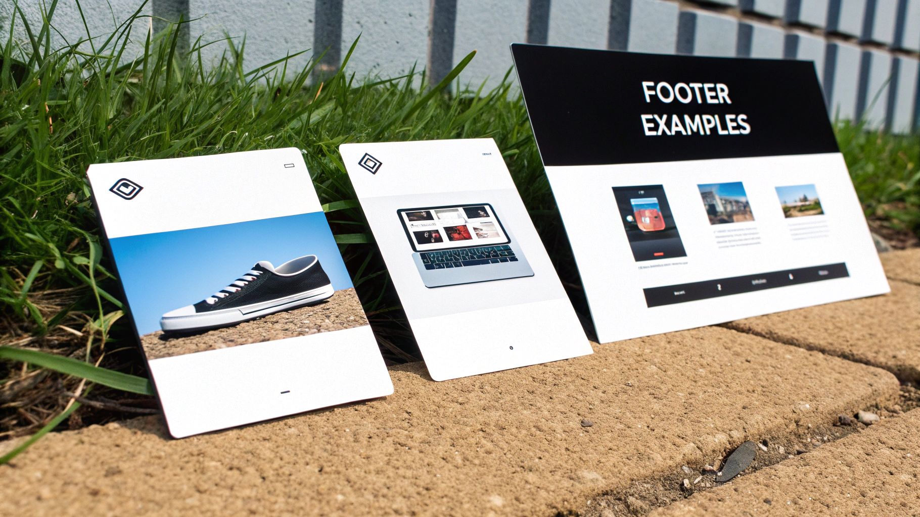
Theory is great, but seeing these principles in action is where the lightbulb moments happen. To help you picture the perfect footer for your website, let’s break down three real-world examples designed for different types of businesses. Each one has a specific job to do, whether it's building local trust or showing off creative genius.
Think of these less as templates and more as strategic blueprints. By getting inside the thinking behind each layout, you can cherry-pick the ideas that make sense for your own business. The goal is to make your footer work just as hard as the rest of your site.
Example 1: The Local Service Business
For a London-based plumber, electrician, or decorator, the footer has one main job: make it ridiculously easy for a local customer to get in touch. Trust and speed are everything here.
This footer is all about the core contact details. You can't skip the business address and phone number—that’s non-negotiable for local SEO. Tossing in clear opening hours is also a smart move to manage expectations and stop you from getting non-emergency calls at midnight.
To really hammer home their local focus, this footer could include:
An Embedded Map: A little Google Maps widget showing their location gives people instant visual proof that they're in the right service area.
"Areas We Cover" Links: A simple list of linked neighbourhoods or boroughs helps both users and search engines understand exactly where they operate.
Emergency Contact Info: A bold, can't-miss-it call-out for "24/7 Emergency Service" with its own dedicated number can be an absolute lead magnet.
Example 2: The Freelance Creative
A freelance graphic designer, writer, or photographer needs a footer that screams "hire me!" The focus shifts from a local postcode to showcasing raw talent and building a personal brand.
Here, the goal is to funnel potential clients toward their best work and social channels. The footer acts as a final, confident nod to their skills.
A freelancer's footer is their digital business card, portfolio, and networking tool all rolled into one. It’s the last chance to leave a lasting impression that says, "I'm the creative professional you need to hire."
Key elements would include:
A Bold Portfolio Link: A clear, unmissable link to their portfolio or "My Work" page is the most important thing here. No exceptions.
Social Proof: Icons linking to professional networks like LinkedIn or visual platforms like Instagram are essential for showing off their work and letting their personality shine through.
A Simple CTA: A straightforward call-to-action like "Let's Create Something Together" linking to their contact page feels personal, not pushy.
Example 3: The E-commerce Store
For an online shop, the footer needs to soothe customer anxieties and build the confidence needed to click "buy". It’s all about removing friction and answering questions before they’re even asked.
This footer design would be packed with trust signals. Accepted payment method icons (Visa, PayPal, etc.) offer immediate reassurance. Clear links to customer service policies are vital for making people feel safe shopping with you. Basically, the footer becomes a hub for all the boring-but-important stuff, ensuring customers feel secure from start to finish.
This design should feature:
Customer Service Links: Direct paths to Shipping Information, Returns Policy, and FAQs are an absolute must.
Newsletter Sign-up: Offering a 10% discount for signing up is a classic, proven tactic to grow an email marketing list.
Trust Badges: Popping in logos for secure payment gateways or industry awards helps build credibility in a flash.
These examples show how a well-thought-out footer for a website isn't just an afterthought—it’s a powerful tool tailored to specific business goals.
Feeling inspired but not quite sure where to begin with your own design? The team at Baslon Digital specialises in creating custom Wix websites with perfectly optimised footers. Contact us today to see how we can help your business shine.
Bringing Your Footer Design to Life in Wix
Right, theory and examples are one thing, but now it’s time to get your hands dirty. Putting everything you’ve learned into practice is surprisingly straightforward with the right tools. Thankfully, the Wix Editor gives you total control to build a brilliant footer for your website without ever needing to look at a single line of code.
This quick tutorial will walk you through the important bits, showing you how to turn those design ideas into a real, working part of your site. The whole process is super intuitive—it’s all about dragging, dropping, and tweaking elements until they match your brand’s style perfectly.
Adding and Arranging Your Footer Content
First things first, open your site in the Wix Editor. Scroll right down to the bottom of any page, and you’ll find the dedicated footer section. This area is "global," which is just a fancy way of saying any change you make here will pop up on every single page of your site. Simple.
To start adding your elements:
Click the '+' (Add) icon on the left-hand menu.
Pick the element you want, whether it's 'Text', a 'Button', or a 'Social Bar'.
Just drag and drop it straight into the footer.
Once everything is in there, you can click and drag your elements around to get the layout just right. For a tidy, organised look, think about using strips or containers to group related items together—like popping all your legal links into one neat little box. You can get a better handle on arranging elements by understanding the Wix Studio Editor in our detailed guide.
Think of your Wix footer as a canvas. As you place each element, consider balance and visual hierarchy. You want to make sure the most important info is dead easy for visitors to spot at a glance.
Adjusting for a Flawless Mobile View
Here’s a classic mistake: creating a footer that looks fantastic on a desktop but turns into a jumbled mess on a phone. Wix makes it dead simple to dodge this problem by letting you switch over to a mobile editor view.
Just click the little mobile phone icon at the top of the editor. In this view, you can rearrange and resize everything specifically for smaller screens without messing up your desktop design. For example, a three-column layout that looks great on a big screen should be stacked vertically into a single, scrollable column for anyone on their mobile. This little trick ensures your footer for a website is perfectly usable for every single visitor.
Feeling good about the process but want a professional eye to make sure it’s perfect? Get in touch with the Baslon Digital team. Let’s build a stunning, results-driven Wix website together.
Alright, let's wrap this up. We've covered a lot of ground, and now it's time to boil it all down into a simple, no-nonsense checklist. Think of this as your final pre-flight check before launching a footer that actually does its job.
A great footer isn't about cramming in every last link you can think of. It’s about clarity, purpose, and giving your visitors exactly what they need, right when they're looking for it. Before you hit that publish button, give your footer one last look-over with these points in mind.
Your Essential Go-Live Review
Run through this quick list. Does your footer tick all the right boxes?
Is It Clutter-Free? Be honest. Have you only included the absolute essentials? If a link doesn't serve a clear purpose, it’s just noise. Stick to key contact info, primary navigation, and the legal bits.
Is It Easy to Use? Look at it with fresh eyes. Is there a clear visual hierarchy? Enough white space? Your font size should be easy to read (think 14px or larger), and links should be obviously clickable. No one likes a guessing game.
Is It Mobile-Friendly? Grab your phone and check. Seriously, do it now. Does your multi-column layout stack neatly into a single, easy-to-tap column? Or is it a jumbled mess that requires surgeon-like precision to click anything?
Does It Help Your SEO? Have you included your business Name, Address, and Phone number (your NAP)? This is a huge signal for local search. Are your internal links pointing to your most important pages? Don't miss this easy win.
Is It Accessible? Can everyone read it? Check that your text has enough colour contrast against the background. And please, make sure your link text is descriptive. "Click here" tells a screen reader absolutely nothing.
A footer isn’t just a digital junk drawer for leftover links. It’s a strategic tool. It's your last chance to build trust, help someone find what they're looking for, and guide them to the next step.
Nail this checklist, and you’ll have a footer that doesn't just look professional—it’ll be one of the hardest-working parts of your website.
Ready to transform your website with a footer that’s designed to deliver? The team at Baslon Digital specialises in creating stunning Wix websites that get real business results. Let us turn your vision into a powerful online tool that works as hard as you do.
Get in touch with us today and let’s build something brilliant.
Comments