How to Create a Wireframe for Website: A Practical Step-by-Step Guide
- Baslon Digital

- Jan 18
- 17 min read
Updated: Jan 19
Before you even think about picking a colour palette or a fancy font, you need a plan. A really solid one. That's where a wireframe comes in. Think of it as the architectural blueprint for your website—a simple, skeletal framework that maps out where everything goes and how it all works.
Honestly, it’s the crucial first step that separates a successful website from one that ends up needing a costly, soul-crushing redesign later on.
Why Wireframing Is Your Website's Most Critical Blueprint
You wouldn’t build a house without a blueprint, right? So why would you build a website that way? Rushing straight into the pretty stuff—the colours, the images, the fonts—without a structural plan is a recipe for disaster. You often end up with a site that looks lovely but completely fails to meet what your users need or what your business is trying to achieve.
Wireframing forces you to forget the visuals for a minute and just focus on the nuts and bolts. It’s all about functionality, content placement, and user flow.
Getting Your Business Goals and User Needs on the Same Page
The real magic of wireframing is that it forces you to get crystal clear on what you’re actually trying to do. It makes you answer the big questions before a single line of code is written or a design element is chosen:
What’s the main point of this page? (Are we trying to get a lead, sell a product, or just share info?)
Where does the most important stuff need to go? (Hint: probably not buried at the bottom).
How will people get from A to B?
What do we actually want visitors to do here?
By focusing on the layout and hierarchy first, you make sure every single element on the page has a job to do. This is where you map out those all-important customer journeys and figure out how to guide people toward a sale or a sign-up. To really see why this is a non-negotiable step, it helps to understand where it fits into modern website development processes.
A wireframe acts as a common language between you, your designer, and your developer. It’s a tangible thing everyone can point to, discuss, and agree on, making sure the whole team is on the same page from day one.
Save Yourself Time, Money, and a Major Headache
Let’s be real: making changes to a simple black-and-white sketch is quick and cheap. Trying to change a fully designed and coded website? Not so much. That can get complicated and expensive, fast.
A wireframe lets you spot potential problems—like confusing navigation, awkward user journeys, or missing features—at the earliest, easiest stage to fix them.
This isn't just theory; it's how the pros work. UK web design agencies, for instance, lean heavily on wireframing to slash the number of expensive redesigns. By spending time upfront on a detailed wireframe, they prevent costly revisions down the road. It’s a strategic move that pays off big time.
Ultimately, getting the structure right first means you’re building on a solid foundation. And that foundation is what supports a final website that’s both user-friendly and effective.
Essential Wireframing Tools for Any Budget
You don't need a fancy, expensive subscription to get started. There are fantastic tools out there for every budget, from free and simple to powerful and professional. Here’s a quick rundown of a few favourites:
Tool | Best For | Key Features | Price Point |
|---|---|---|---|
Figma | Collaborative, all-in-one design | Real-time collaboration, vector editing, prototyping, huge community plugin library. | Free for up to 3 files; paid plans for teams. |
Balsamiq | Quick, low-fidelity sketches | Hand-drawn, sketchy feel to keep focus on structure. Drag-and-drop elements. | Starts around £7/month. |
Whimsical | Visual collaboration & brainstorming | Wireframes, flowcharts, mind maps, and docs all in one place. Super intuitive. | Free plan available; paid plans start around £8/month. |
Pen & Paper | The absolute beginner | No tech required! Fast, easy, and forces you to focus purely on layout. | The cost of a notebook and pen. |
Whether you go digital or stick with old-school paper, the important thing is just to do it. These tools make the process much smoother and help bring your ideas to life visually before committing to a full design.
Ready to turn your vision into a stunning, high-performing website? The team at Baslon Digital is here to help. Contact us today to discuss your project and see how we can bring your blueprint to life.
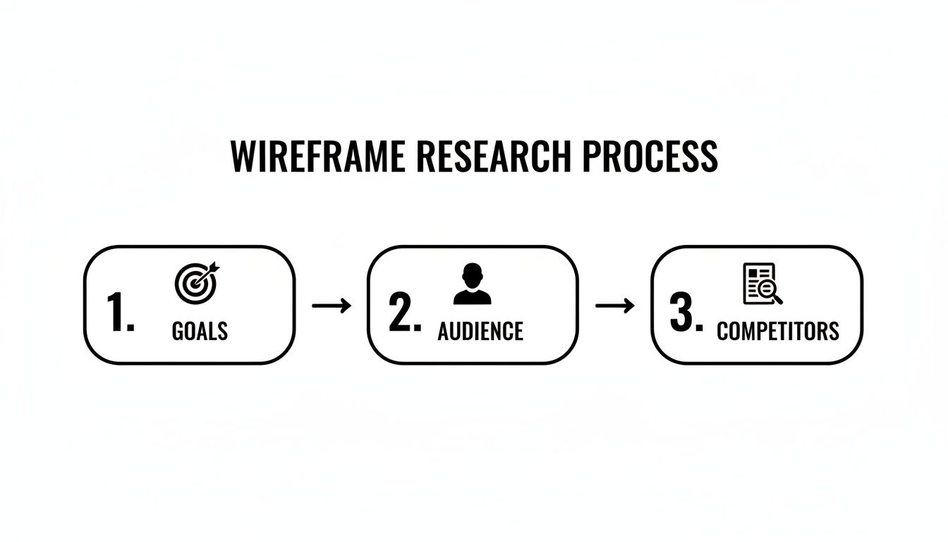
Laying the Groundwork with Research and Clear Goals
Look, a great wireframe doesn't just appear out of thin air. It doesn’t start with a fancy design tool or even a pencil and paper. It starts with asking the right questions. Before you dream of sketching a homepage, you absolutely must get to grips with the ‘why’ behind your website.
Skipping this part is like trying to bake a cake without a recipe—you’ll throw some stuff in a bowl, but the result will probably be inedible. A website without a clear goal is just a digital business card lost in the vastness of the internet. So, your first job is to nail down what you actually want this thing to do.
Define Your Website's Core Purpose
What’s the number one, most important action you want someone to take on your site? Seriously, this isn’t a trick question. The answer will dictate almost every decision you make from here on out.
Are you running an online shop? Your main goal is pretty obvious: making a sale.Are you a consultant offering services? You’ll want visitors to book a consultation.Are you a photographer showcasing your work? You need people to view your portfolio and get in touch.
Once you’ve got that primary goal locked in, you can think about secondary ones, like getting people to sign up for your newsletter or download a freebie. This simple hierarchy helps you figure out what gets prime real estate on the page and what can take a backseat.
Get Inside Your Audience's Head
Let's be blunt: you're not building this website for yourself. You're building it for your customers. To design something that feels natural and genuinely helpful to them, you need to understand who they are, what they’re looking for, and what headaches they're trying to get rid of. This is where user personas come into play.
A user persona is just a simple, semi-made-up character that represents your ideal customer. It’s a brilliant way to stop thinking like a business owner and start seeing things from their point of view.
Who are they? Think about basic details like their age, job, and where they live.
What are their goals? What are they actually trying to do when they land on your site?
What are their pain points? What's frustrating them that your website could solve?
You don’t need to write a ten-page biography. Just a few well-researched personas can give you an incredible amount of direction. For a more detailed walkthrough, our guide on how to create user personas that drive results has everything you need.
A wireframe designed without the user in mind is just a collection of boxes and lines. A wireframe designed with a clear user persona becomes a strategic tool for solving a real person's problem.
This approach is the difference between building a site that feels genuinely useful and one that just leaves people confused.
Analyse What Your Competitors Are Doing
Finally, it’s time for a little bit of snooping. Your potential customers are already out there, browsing your competitors' websites. This means they already have certain expectations about how a site like yours should look and work. A quick competitor analysis isn’t about copying what they do; it’s about learning from their wins and their mistakes.
Pick three to five of your closest competitors and have a good look at their websites. Ask yourself:
What are they nailing? Is their navigation a dream to use? Is the checkout process super smooth? Take notes on what makes for a good experience.
Where are they dropping the ball? Is it impossible to find contact information? Does the site look a mess on your phone? These are your opportunities to shine.
What features are just standard? Do they all have a big search bar, customer reviews, or a detailed FAQ page? These are the things your audience will likely expect to see.
This isn’t cheating; it’s research. It gives you the context you need to make informed decisions. By combining your own business goals with a deep understanding of your users and a bit of competitor intel, you’re building a solid foundation for a wireframe that’s set up for success from the get-go.
Now that the groundwork is sorted, you're ready to start mapping it all out. If you'd rather move straight from research to reality, the team at Baslon Digital can help translate your strategy into a beautiful, high-performing website. Get in touch with us today to start the conversation.
Mapping Your Website From Sketch to Prototype
With all your research done and your goals pinned down, it's time for the fun part—turning those abstract ideas into a real, tangible structure. This is where you build your website's skeleton, moving from a simple, rough sketch to a much more polished and interactive blueprint. And don't worry, you don't need to be an artist. The focus here is all about structure, flow, and function.
The whole wireframing journey starts with a solid foundation: knowing your goals, your audience, and what your competitors are up to.
Before you even think about drawing a single line, your plan has to be rooted in strategy. It’s the only way to build something that actually works.
Starting With Low-Fidelity Sketches
Believe it or not, your best wireframing tool might just be a pen and paper. Seriously. Low-fidelity wireframes are quick, rough sketches that are all about layout and user flow. They’re meant to be fast, messy, and totally disposable. This lets you brainstorm a bunch of different ideas without getting stuck on tiny details.
Think of it as doodling with a purpose. At this stage, you’re just using simple shapes to represent different parts of your site:
Boxes stand in for images or big visual elements.
Horizontal lines represent paragraphs of text.
Circles or simple buttons are your calls-to-action (CTAs).
The goal is to figure out the hierarchy of information on your key pages. For a local bakery, a homepage sketch might have a massive box at the top for a hero image of freshly baked bread. Below that, three smaller boxes for "Our Bakes," "Catering," and "Find Us." It’s all about deciding what’s most important and where it needs to live. Nothing more.
Moving to Digital Mid-Fidelity Wireframes
Once you have a few paper sketches you’re happy with, it's time to bring your ideas onto the screen. This is where you create a mid-fidelity wireframe using a digital tool like Figma, Balsamiq, or Whimsical. These wireframes are way cleaner and more structured than your scribbles, but they still skip distracting details like colours, fonts, or actual images.
This stage is about refining the structure you’ve already mapped out. You’ll create more precise layouts, establish a clearer visual hierarchy using different text sizes (like bigger text for headlines), and nail down the placement of every single element. You’re building a much more accurate representation of the final layout.
For example, that bakery homepage wireframe would now show a properly sized header with a logo placeholder and navigation links. The "Find Us" section would have specific placeholders for a map, address, and opening hours. This level of detail gives everyone on the project a much clearer blueprint to follow.
A mid-fidelity wireframe is the crucial bridge between a rough idea and a functional design. It forces you to think critically about spacing, alignment, and how elements relate to one another—the absolute fundamentals of a great user experience.
Getting this structure right is everything. To dig deeper into how these elements should work together, exploring a complete guide to website design layout can give you some brilliant insights into creating intuitive and effective page structures.
Introducing High-Fidelity Prototypes
Finally, you can move on to a high-fidelity prototype. This is the most detailed stage before you get into the actual design and development. Here, you start adding more realistic elements like placeholder images, real button text ("Book a Consultation" instead of just "Button"), and maybe even some basic branding like a specific font or colour scheme.
The biggest leap at this stage is adding interactivity. A high-fidelity prototype is often clickable. You can link pages together so that clicking the "Services" button in the navigation actually takes you to the services page wireframe.
This lets you simulate the real user experience. You can properly test the user flow you mapped out earlier and see if it actually feels intuitive. Does the journey from the homepage to the contact form make sense? Are the calls-to-action obvious and easy to find? This is your chance to catch awkward navigation or confusing layouts before a single line of code is written, which will save you a massive amount of time and effort down the road.
By moving through these distinct stages—from a messy sketch to a clean digital layout to an interactive prototype—you make sure your website is built on a solid, user-focused foundation.
Designing for Every Device with a Mobile-First Mindset
It's time for some real talk: designing a pretty desktop website and then squishing it onto a mobile screen just doesn’t cut it anymore. That game is over. Your starting point, your number one priority, has to be the smallest screen. This isn't just a trendy idea; it's a fundamental shift in how successful websites get built.

Adopting a mobile-first mindset when you create your website wireframe forces you to be absolutely ruthless with your priorities. You’ve got limited space, so you have no choice but to focus on what’s essential for the user. The result? A cleaner, faster, more focused experience that scales up beautifully to tablets and desktops.
Why Start with the Smallest Screen?
Starting your wireframe with the mobile view makes you answer the tough questions right away. What’s the single most important action a user needs to take here? What content is completely non-negotiable? By stripping away all the clutter from the get-go, you build a much stronger core experience.
Honestly, this constraint is a massive favour to yourself. It stops you from adding shiny features or content that might look good on a huge desktop monitor but just create noise and confusion on a phone. The goal is clarity and speed, not cramming everything in.
The data backs this up, big time. For UK businesses, mobile-first is a must, with research showing 53% of mobile users will abandon a website if it takes more than three seconds to load. A snappy, minimal design built for mobile can slash your bounce rates and seriously improve conversions.
A mobile-first approach isn’t about limiting your design; it’s about refining it. By solving the user's needs on the most restrictive device first, you create a more powerful and efficient experience for everyone, everywhere.
Practical Steps for Your Mobile Wireframe
When you sit down to sketch out your mobile wireframe, your brain needs to switch from thinking about clicks and cursors to taps and scrolls. The physical way a user interacts with the device changes everything.
Here’s what you need to obsess over:
Touch-Friendly Navigation: Buttons need to be big enough for a thumb to hit easily. Forget tiny, clustered text links. Think chunky, finger-friendly buttons and a simple menu, like a classic "hamburger" icon that expands neatly.
Vertical Layouts: People scroll on their phones. Vertically. Your wireframe needs to embrace this. Organise your content into a single column that flows logically from top to bottom, putting the most critical info and calls-to-action right near the top.
Prominent Calls-to-Action (CTAs): Your main CTA button should be impossible to miss. It needs to pop off the screen and be easy to tap without any awkward zooming or excessive scrolling.
Planning for Responsive Design Early
Thinking mobile-first sets you up perfectly for responsive design—the art of making your website look and work perfectly on any screen size. When you plan for this at the wireframing stage, you save yourself from a world of pain later on. You’re not creating three separate designs (mobile, tablet, desktop); you're building one flexible, intelligent system.
This is where you start thinking about things like fluid grids. Instead of designing with fixed pixel widths, you use a flexible grid where elements resize proportionally based on the screen. Your wireframe can show this by illustrating how columns might stack on mobile versus sitting side-by-side on a desktop. This kind of forward-thinking is key to a seamless user experience. If you’re curious about the mechanics, our guide explains in detail what responsive web design is.
By the time you move from your mobile wireframe to the tablet and desktop versions, your job is so much easier. Instead of cutting things out, you’ll be thoughtfully adding them back in or expanding the layout. You’ve already got a solid, focused foundation to build on, guaranteeing a consistent experience no matter how someone finds your site.
Testing and Refining Your Wireframe with Real Feedback
Creating a wireframe in a vacuum is a one-way ticket to a website that just doesn't work for your users. You’ve spent hours mapping out what feels like a perfectly logical user journey, but until a real person tries to use it, you’re essentially just guessing. This is where testing comes in, and trust me, it’s the step that separates a good idea from a great website.
You don't need a fancy lab or a massive budget to get priceless feedback. The whole point is to find the confusing bits and friction points now—before you’ve sunk money into design and development. Think of it as a constant loop: get feedback, tweak the wireframe, and test again. This is how you build something people will actually want to use.
Conducting Simple Usability Tests
Honestly, the best way to see if your wireframe makes sense is to watch someone try to break it. It doesn't need to be a formal affair. Grab a colleague, a friend, or even a family member who fits your target audience. The only rule? Find someone who hasn’t seen it before. Fresh eyes are everything.
Give them a simple, specific task to complete using your clickable prototype. And then, the hard part: don't help them. Just watch.
For an e-commerce site, you could say: "Imagine you're buying a birthday present for a friend who loves coffee. Can you find a medium-roast coffee blend and add it to your basket?"
For a service business, try this: "You need to book a consultation for next month. Show me how you'd find the different services offered and schedule an appointment."
Your job is to be a quiet observer. Notice where they pause, where they click the wrong thing, or where they look completely lost. These moments of hesitation are gold. They're showing you exactly where your layout or navigation falls flat.
Asking the Right Questions for Actionable Feedback
Once they’ve finished (or given up), it’s time for a debrief. Whatever you do, don't ask, "So, did you like it?" That question is a black hole for useful feedback; you’ll just get polite nods. Instead, you need to dig for specifics that will help you improve the structure.
Here are a few questions I always use to get the ball rolling:
"What was the very first thing you looked at on this page?" This tells you if your visual hierarchy is actually working or if people are getting distracted.
"Was there anything you expected to see that wasn't there?" A brilliant question for uncovering missing information or features your users consider essential.
"At any point, did you feel unsure about what to do next?" This one gets right to the heart of any confusion in the user flow.
"If you were looking for [X], where would you have clicked first?" This is a great way to test how intuitive your navigation labels and overall structure really are.
Remember, the feedback you’re gathering here isn't about whether they like the colour scheme (it’s a wireframe!). It’s about pure usability. Look for patterns. If one person gets stuck, it's an interesting observation. If three people get stuck in the exact same spot, you’ve found a problem that needs fixing.
This structured, practical approach is how you move from just making a wireframe to creating one that genuinely serves its users.
Presenting Wireframes to Stakeholders
Getting feedback from stakeholders—like clients or your boss—is a slightly different beast. Your main goal is to keep the conversation laser-focused on the big picture: structure, flow, and hierarchy. Not fonts and colours.
When you present, repeat this phrase like a mantra: "This is a blueprint, not the final design. All colours, fonts, and images are just placeholders." Seriously, say it more than once. It’s the only way to stop the meeting from spiralling into a debate over their favourite shade of blue.
Walk them through the user journeys you've designed and explain why the layout supports key business goals. Frame your questions around strategy. Ask things like, "Does this layout prioritise the most important action we want customers to take?" or "Does this flow make sense for guiding users towards a purchase?"
Nailing the structure at this stage has huge financial implications. Poor user experience isn't just frustrating; it's expensive. An estimated £260 billion in online sales are abandoned in the US and EU simply because of a confusing checkout process. On top of that, a staggering 88% of users are less likely to return to a site after a bad experience. You can dig deeper into how design impacts behaviour in this detailed report on web design statistics.
Ready to turn your tested and refined blueprint into a website that delivers results? The team at Baslon Digital specialises in transforming wireframes into stunning, high-performing Wix websites. Let's build something brilliant together.
From Blueprint to a High-Performing Website
Right, you’ve got your polished, tested wireframe in hand. What now? This isn't just a sketch anymore; it's the single most important document for turning your vision into a real, working website. It’s the bridge between all that planning and the final execution.
Having this blueprint dramatically cuts down on guesswork and confusion. When you hand this over to a designer or developer, they know exactly what the structure and functionality should be from day one. There's no ambiguity.
Think of it this way: your visual designers know precisely where to apply the branding and make things look stunning. Your content creators know exactly what text and images are needed for every single section. It’s the ultimate project foundation.
A well-tested wireframe isn't just a plan. It's a communication tool that saves a ridiculous amount of time, prevents expensive re-dos, and keeps the entire team pointing in the same direction.
Once you've tested and tweaked your wireframe to perfection, the next step is the actual website design and development process. This is where your skeletal framework gets its skin and muscle. It evolves from a simple plan into a beautiful, functional reality that actually serves your users and, more importantly, gets you real business results.
Ready to turn that carefully crafted wireframe into a website that not only looks great but performs even better? The team at Baslon Digital specialises in just that.
Got Questions About Wireframing? We’ve Got Answers.
Even after you’ve mapped out a plan, a few questions always seem to pop up right when you’re ready to start. Let’s clear the air and tackle some of the most common queries I hear about website wireframing.
What’s the Point of a Wireframe, Anyway?
At its heart, a wireframe is a communication tool. Simple as that. Its main job is to set out the basic structure, content hierarchy, and how things will work on a webpage before a single drop of colour or a fancy font is chosen. It’s the blueprint that gets everyone—from stakeholders to developers—on the same page about the layout and user flow.
Focusing on structure first saves a shocking amount of time and money down the line. Trust me, it’s a whole lot easier (and cheaper!) to move a few grey boxes around in a wireframe than it is to recode a fully built website.
Do I Need to Be a Designer to Create a Wireframe?
Absolutely not. In fact, sometimes coming in fresh without a design background is a huge advantage. Wireframing is all about logic and structure, not your artistic flair. You’re focused on how the site works, not how it looks.
You don't need fancy software. A pen and paper are perfect for getting started. The goal is just to get your ideas down in a clear, logical way. If you can draw a box and a line, you’ve got all the technical skill you need for a solid low-fidelity wireframe.
How Much Detail Should I Put in?
The level of detail—or fidelity, as we call it—really depends on where you are in the project and what you’re trying to achieve. It’s a natural progression.
Low-Fidelity: Always start here. We’re talking rough, back-of-the-napkin sketches. Simple shapes, basic blocks—the focus is purely on brainstorming the core layout without getting distracted by the small stuff.
High-Fidelity: Once you’ve nailed down the basic ideas, you can move to a more detailed digital version. This might include more accurate spacing, some placeholder text (instead of just squiggly lines), and clear labels for buttons and navigation.
Here's the key: add just enough detail to get the point across at each stage. Start simple. Only add complexity once everyone agrees on the fundamental structure. This stops you from getting bogged down in tiny details way too early.
Wireframe vs. Mockup: What’s the Difference?
Ah, the classic question. It's a crucial distinction because they serve completely different purposes in the design process, and the wireframe always comes first.
Aspect | Wireframe (The Blueprint) | Mockup (The Visual Design) |
|---|---|---|
Focus | Structure, layout, and functionality | Visuals, colour, typography, and branding |
Fidelity | Low to mid; black, white, and grey | High; looks like the finished product |
Purpose | To plan and agree on the skeleton | To showcase the final look and feel |
Think of it like building a house. The wireframe is the architect’s blueprint that shows where the walls, doors, and windows go. The mockup is the interior designer’s mood board showing off the paint colours, furniture, and fancy light fixtures. You absolutely need the blueprint before you start decorating.
A solid wireframe is the first, most crucial step in building a website that truly works. By mapping out your structure and user journey before you get lost in design details, you set your project up for success.
Ready to turn that blueprint into a reality? The team at Baslon Digital specializes in transforming thoughtful wireframes into stunning, high-performing websites. We handle the design, development, and strategy so you can focus on your business.
Comments