A Guide to Website Design Layout for Superior User Experience
- Baslon Digital

- Jan 11
- 15 min read
Updated: Jan 12
This guide to website's design layout isn't just about making things look pretty. Think of it as the architectural blueprint for your entire digital space. It’s the smart arrangement of everything—text, images, buttons—that guides your visitors, shapes their experience, and nudges them towards taking action. Get it right, and you create a smooth, intuitive journey. Get it wrong, and you've got a recipe for confusion and missed sales.
Your Blueprint for a High-Performing Website Layout
Imagine your website's layout is the floor plan of a real shop. A good one puts the most popular items right at the front, has clear aisles so you don't get lost, and sticks the checkout counter somewhere you can't possibly miss it. The whole experience feels effortless.
That's exactly what an effective website layout does. It's not just about aesthetics; it's a strategic tool that directs what people do. It creates a visual hierarchy, screaming "look at me first!" for the important stuff and showing visitors what their next step should be. This structure is the bedrock of a successful customer journey.
The Strategic Importance of Structure
A well-thought-out layout does more than just keep things tidy. It builds trust from the second someone lands on your page. For small businesses, that first impression is everything. A clean, logical structure quietly tells visitors you’re credible and you care about the details.
The key benefits of getting your layout right are huge:
Improved User Flow: It carves out a natural path for visitors, guiding them from that first "hello" to a final conversion without any frustrating bumps in the road.
Enhanced Engagement: An intuitive site keeps people clicking around for longer. This slashes your bounce rate and gets them to explore more of what you offer.
Increased Conversions: By placing your calls-to-action in obvious, sensible spots, you make it ridiculously easy for people to do what you want them to, whether that's buying a product or booking a consultation.
In the UK's bustling online market, these aren't just fluffy concepts—they have a real impact. With online retail expected to hit a staggering £286 billion in 2025, even tiny improvements to your layout can make a massive difference to your bottom line. For a deeper look into the art and science of building a visual world for your visitors, check out this practical guide to website interface design.
From Blueprint to Business Growth
At the end of the day, your website's layout is directly tied to its success. The structure you pick determines how people see and absorb information, which in turn affects their experience and whether you hit your business goals. Understanding how to plan a website structure for SEO and UX is the crucial first step in building a site that truly works for you.
A great website design layout is invisible. It works so well that the user never has to think about where to go next—they are simply guided by intuitive design that feels completely natural.
Ready to build a website layout that not only looks incredible but also brings in real results for your business? Contact Baslon Digital today for a free consultation and let's build your digital blueprint together.
The Secret Sauce of a Great Website Layout
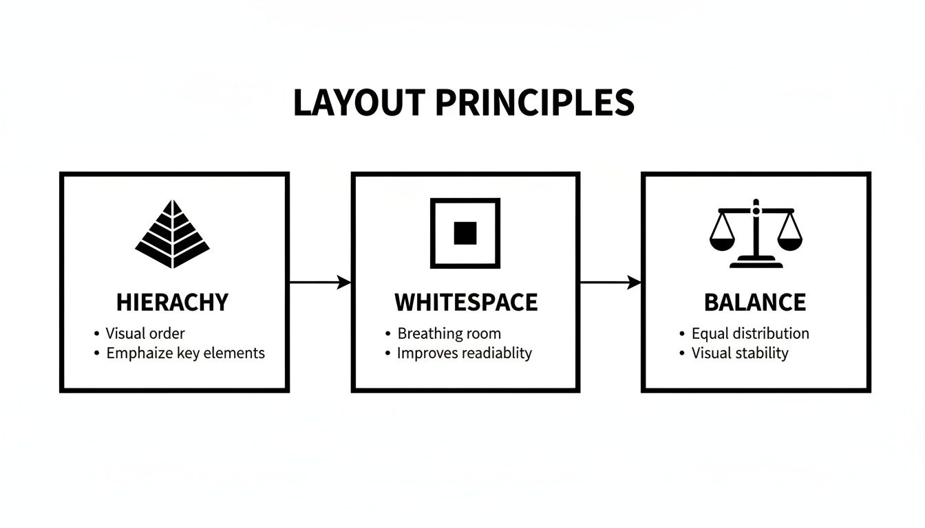
A brilliant website layout isn't just luck. It’s built on a handful of design principles that stop a page from feeling like a jumble sale and turn it into a clear, intuitive experience for your visitors. These rules are what separate a professional, trustworthy website from one that screams amateur hour.
Think of these principles as the grammar of web design. Without them, you’re just shouting words into the void. Master them, and you’ll create a website that not only looks fantastic but actually gets the job done for your business.
Creating a Clear Visual Path
First up, the big one: visual hierarchy. This is just a fancy way of saying you need to arrange things to show what’s most important. Imagine a newspaper's front page—the massive headline grabs your eye first, then the smaller sub-heading, and finally the article text. Your website needs to do the exact same thing.
By playing with size, colour, and where you put stuff, you can literally create a path for your visitor's eye to follow. The most critical information, like your main pitch or that all-important "Book Now" button, should be the loudest thing on the page. It’s not about being obnoxious; it’s about providing effortless guidance. A solid hierarchy means visitors instantly get what your page is about and where to look next. No confusion, no chaos.
The Power of Doing Nothing (with Whitespace)
One of the most underrated but powerful tools in any designer’s kit is whitespace, or negative space. This is the empty area around everything on your page—the margins between paragraphs, the space around your images. It’s not wasted space; it’s breathing room.
A layout without enough whitespace is like a room crammed with furniture. It’s cluttered, overwhelming, and you can’t figure out where to even walk. Good use of space, on the other hand, feels calm, organised, and seriously high-end.
Whitespace does a few key jobs for you:
Makes things readable: It stops your text from looking like a dense, intimidating wall that no one wants to climb.
Creates focus: By leaving space around a call-to-action button, you’re basically putting a spotlight on it. Studies even show that good whitespace can boost user comprehension by nearly 20%.
Looks professional: Lots of whitespace is a signature of modern, premium design. It signals quality before a visitor even reads a single word.
Bringing Balance and Order to the Chaos
Finally, let’s talk about balance and proximity. These two principles work together to create a sense of order and stop your page from feeling like it’s about to tip over. Balance is all about how visual weight is spread out. You can have symmetrical balance (where everything is mirrored neatly) or asymmetrical balance (where a big image on one side is balanced out by a few smaller bits of text on the other).
Proximity, meanwhile, is just common sense: group related things together. When you put an image, a heading, and a paragraph close to each other, our brains automatically assume they belong together as one unit. It’s a simple trick that helps you organise information logically, making your content way easier for visitors to digest.
Get these core principles right, and you'll craft a layout that feels natural, guides users where you want them to go, and builds the trust you need to turn visitors into actual customers.
Ready to put these principles into practice on your own website? Book a consultation with Baslon Digital, and let our experts design a layout that delivers clarity, professionalism, and results.
Common Website Layout Patterns and When to Use Them
Instead of staring at a blank screen and hoping for inspiration, you can lean on proven website layout patterns. Think of these as familiar road maps for your visitors; they know how to follow them because they’re based on years of established online behaviour. This makes getting around your site feel natural and easy.
Choosing the right structure isn't just about making things look pretty—it’s about matching your website's design to what you want to achieve as a business. A layout that works wonders for an e-commerce shop could be a total disaster for a local service provider. Let's break down the most effective patterns and figure out when they really shine.
Following the Reader's Eye
Some of the most reliable patterns come straight from eye-tracking studies that show us exactly how people scan web pages. The two big ones are the F-Pattern and the Z-Pattern.
The F-Pattern is a godsend for content-heavy sites like blogs or news portals. People don’t read every word online; they scan. Their eyes typically move across the top of the page (the first bar of the 'F'), then down the left side, scanning across in shorter bursts as they find something interesting. To make this work for you, place your most critical info—logo, navigation, and main headline—across the top, with key points or subheadings stacked down the left.
The Z-Pattern, on the other hand, is perfect for simpler, less text-heavy pages, like a landing page begging for a sign-up. A user's eye naturally zips from the top-left to the top-right, cuts diagonally down to the bottom-left, and finally shoots across to the bottom-right. This creates a golden path: pop your logo in the top-left, a secondary call-to-action in the top-right, your key benefits along the diagonal, and your main call-to-action button right in that bottom-right corner where their journey ends.
Organising Diverse Content
Got a lot of different things to show off without making your site look like a jumble sale? Grids and cards are your best friends. They bring a clean, organised vibe to visually rich websites.
A Grid Layout is the backbone of most modern web design, arranging content neatly into columns and rows. This structure creates a sense of order and balance, making it ideal for portfolios, image galleries, and e-commerce shops where products need to be displayed tidily. A good grid feels professional and is incredibly flexible.
A Card-Based Layout takes the grid idea one step further. Each piece of content—a blog post, a product, a portfolio piece—is neatly packaged in its own 'card'. This modular approach is brilliant for sites with tons of diverse content, like Pinterest. Each card acts as a self-contained teaser, inviting users to click and see more.
Making a Bold First Impression
Sometimes, you don't need to say much—you just need to say one thing, loud and clear. That's where hero-led and single-page layouts come in.
A Hero-Led Layout is all about that big, bold first impression. It's dominated by a large, attention-grabbing image, video, or headline right at the top of the page. This "hero section" instantly sets the tone and tells visitors what you're all about. It’s a powerful choice for brands that want to create an immediate emotional connection or show off a flagship product.
For telling a story, nothing beats a Single-Page Layout. This design puts all your content on one long, scrolling page, guiding the user through a linear narrative from top to bottom. It’s an excellent choice for event pages, product launches, or portfolios where you want to control the flow of information. Just be aware that it can be tricky for SEO if you don't structure it properly with section anchors.
Choosing the Right Layout for Your Business Goal
Picking a layout isn't a random choice; it's a strategic one. To help you connect the dots between layout patterns and your business goals, this table breaks down which structures work best for common objectives.
Layout Pattern | Best For | Strengths | Potential Weaknesses |
|---|---|---|---|
F-Pattern | Blogs, news sites, content-rich platforms | Guides users through dense text, easy to scan | Can feel predictable; less impactful for visual brands |
Z-Pattern | Landing pages, simple homepages | Directs attention to key actions, conversion-focused | Not suitable for pages with lots of complex content |
Grid Layout | Portfolios, e-commerce stores, image galleries | Organised, balanced, professional, easy to browse | Can feel rigid if not designed with creativity |
Card-Based | Social media-style feeds, content discovery | Highly scannable, flexible for diverse content types | Can become cluttered without enough whitespace |
Hero-Led | Service businesses, product showcases | High-impact visuals, strong emotional connection | Relies heavily on a single, powerful image or message |
Single-Page | Event sites, portfolios, product launches | Excellent for storytelling, controlled user journey | Can be slow to load; more challenging for SEO |
Ultimately, the best layout is the one that makes it easiest for your customers to do what you want them to do, whether that's buying a product, booking a service, or reading your latest article.
Choosing the right website design layout is a huge decision that shapes the entire user experience. You can see how these patterns come to life by exploring some of the top web design examples to inspire your 2025 site. Each successful design masterfully applies a layout pattern that fits its brand and audience like a glove.
Why a Responsive Layout Is No Longer Optional
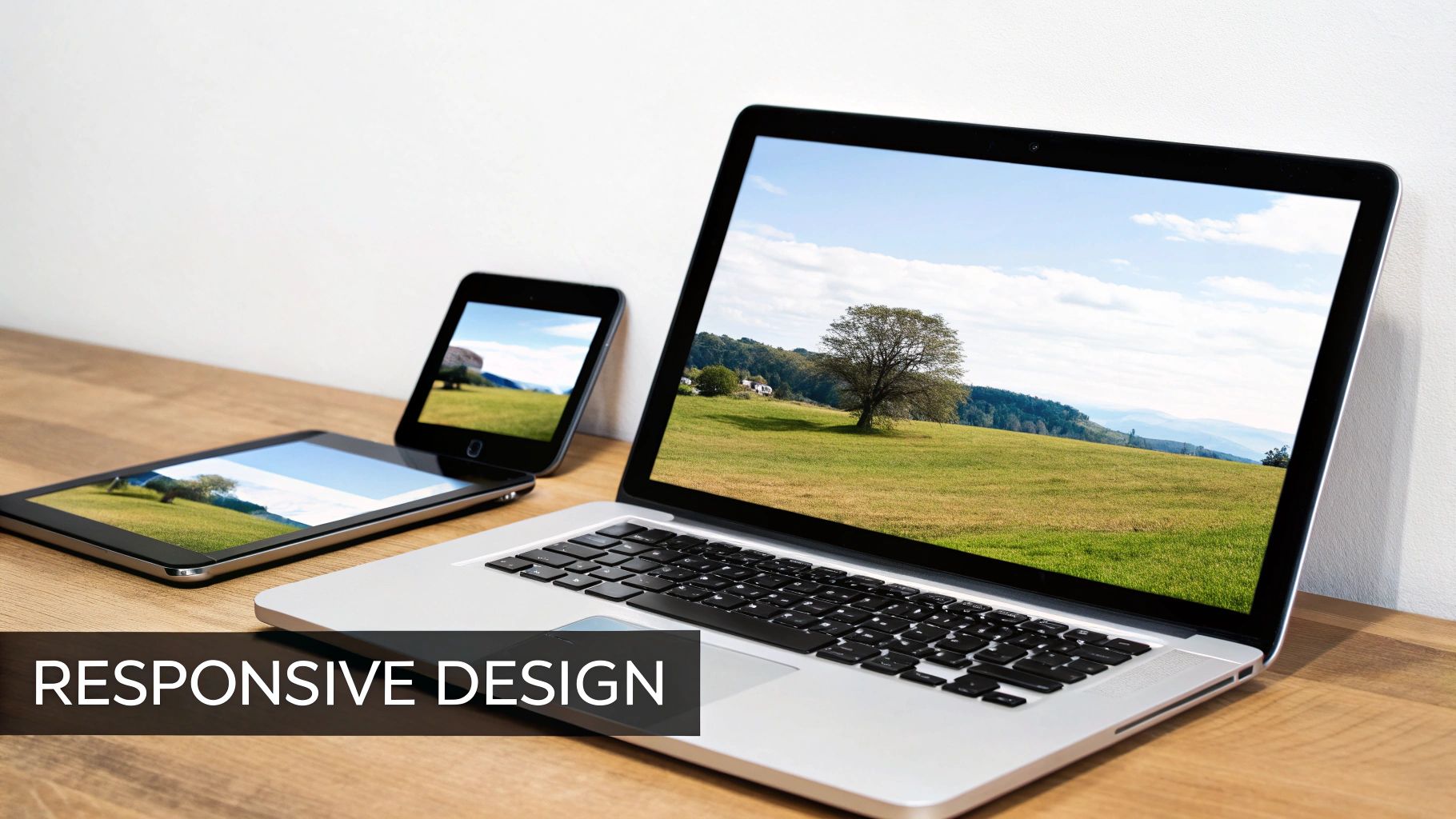
Back in the day, designing a website was simple: you built one version for a desktop computer. That approach is now a total relic. Your visitors show up from everywhere—laptops, massive monitors, tablets, and tiny phone screens. A responsive layout is the magic that lets your website gracefully adapt to any of them.
Think of it as a fluid container, stretching and shrinking to fit perfectly. On a desktop, your user gets the full-width, multi-column experience. When they switch to their phone, that same layout intelligently snaps into a single, scrollable column. Menus tuck themselves away, and text resizes for easy reading.
This isn't just a nerdy "nice-to-have" feature; it's non-negotiable for modern business. A non-responsive site on a mobile is a complete disaster. We’re talking tiny text, impossible-to-tap buttons, and endless pinching and zooming. That kind of frustrating experience sends potential customers running to your competitors in a heartbeat.
The Mobile-First Mindset
Designing for mobile first is a game-changing shift in thinking. Instead of creating a complicated desktop design and then trying to squash it onto a small screen, you start with the most restricted view: the mobile phone. This forces you to get ruthless about what truly matters—your core message, key calls-to-action, and the most vital content.
Adopting a mobile-first approach has some serious perks:
Crystal-Clear Focus: It cuts through the clutter, making sure your most important info is front and centre.
Better User Experience: It guarantees a smooth, intuitive journey for the majority of users who are browsing on their phones anyway.
Faster Loading Times: Mobile-first designs are naturally lighter, which helps your pages load quicker—a massive factor in keeping people from bouncing.
A mobile-first website design isn’t about sacrificing features. It’s about building a stronger, more focused foundation that works brilliantly everywhere, for everyone.
Google’s Stamp of Approval
Beyond just keeping users happy, a responsive layout has a direct impact on whether people can even find you. Google now uses the mobile version of a site for its indexing and ranking, a policy called mobile-first indexing. In plain English, if your site is a mess on mobile, your search rankings will suffer across the board—even for people searching on desktops.
Commentary on UK web design shows that responsive, content-focused layouts are now a basic expectation, directly shaping how British consumers interact with brands. With online sales making up nearly a third of all UK retail spending, a layout that fails on small screens means you’re waving goodbye to a huge chunk of potential customers. Many UK small businesses use website builders but then bring in specialist agencies to nail the layout, ensuring pages don't just look good but actually rank and convert. You can dive deeper into how UK web design trends are shaping the market and why responsiveness is king.
In short, a responsive website design layout isn't an upgrade anymore. It's the price of entry if you want to stay relevant, competitive, and visible in a world run by mobile phones.
Ready to make sure your website delivers a flawless experience on every device? Let Baslon Digital craft a fully responsive, mobile-first design that captivates your audience and drives growth.
Optimising Your Layout for Conversions and Accessibility
A gorgeous website layout is a fantastic start, but let's be honest, its real job is to perform. Does it actually get visitors to do something? And is it welcoming to everyone, regardless of ability? This is where Conversion Rate Optimisation (CRO) and accessibility come together, turning your design from just a pretty face into a hardworking business tool.
CRO is the art of tweaking your layout to gently nudge users towards a specific goal, whether that’s filling out a contact form or hitting that "Buy Now" button. It’s all about making the action you want them to take the easiest, most obvious next step. A layout that converts is one that removes friction and lays out a clear, compelling path for the user to follow.
In the same breath, accessibility makes sure that path is wide open for every single visitor, including those with disabilities. An accessible layout isn't just an ethical checkbox to tick; it’s just smart business. When you accommodate everyone, you grow your potential audience and show the world you're an inclusive brand.
Driving Action with Strategic Design
Your layout’s number one job is to make conversions feel completely effortless. This means putting your calls-to-action (CTAs) right where users’ eyes naturally land—usually above the fold or right after a really convincing chunk of content. Even a button’s colour, size, and wording can massively impact how many people click it.
Think about weaving these CRO-focused tactics into your layout:
Visual Cues: Use clever directional elements like arrows or even photos of people looking towards your CTA to draw the eye. It's a subtle but powerful trick.
Simplified Forms: Keep your forms short and sweet. Seriously, only ask for what you absolutely need. Every extra field is another reason for someone to give up and leave.
Clear Value Proposition: Make sure your headline and opening sentence scream what you do and why it's brilliant. Don't make people guess.
On top of that, mastering onboarding UX design can be a game-changer for keeping users around. A layout that smoothly guides new visitors helps them see your value faster, which is a massive win for long-term engagement and, you guessed it, conversions.
An optimised layout doesn’t just show users what to do; it makes them want to do it. It blends psychology with clean design to erase hesitation and encourage that final click.
Building an Inclusive Digital Space
Accessibility (often sneakily shortened to A11y) is all about making a website that anyone can use, no matter their physical or cognitive abilities. And here's a pro-tip: building accessibility into your layout from the very beginning is way easier than trying to bolt it on as an afterthought.
Here are a few key things to keep in mind:
Colour Contrast: Make sure there’s enough contrast between your text and its background. This is a must-have for people with visual impairments to read your content comfortably.
Legible Typography: Choose fonts that are clean and easy to read. Use a font size that doesn’t force people to squint at their screens.
Keyboard Navigation: Every clickable element—from links to buttons to form fields—must be fully usable with just a keyboard. No exceptions.
The thoughtful use of empty space, or white space, is another secret weapon that helps both conversions and accessibility. You can learn more about how to boost clarity and conversions with white space in web design in our detailed guide. It cleans up the clutter, improves readability, and makes your most important elements pop, creating a much friendlier experience for everyone.
Ready to build a layout that not only looks professional but actually brings in business and welcomes every visitor? Contact Baslon Digital today to design a website that delivers real, measurable results.
Got Questions About Website Layouts? We've Got Answers.
Diving into website design can feel like opening a can of worms, especially when you're just trying to run your business. Let's tackle some of the most common questions we hear, with answers that are actually straightforward.
How Often Should I Update My Website Layout?
There's no magic number here, but a good rule of thumb is to think about a major layout refresh every two to three years. Design trends and tech move at lightning speed; what looked slick and modern in 2022 can feel clunky and dated by 2025.
But this doesn't mean you need to tear everything down and start from scratch that often.
Think of it more like gardening than demolition. You should always be pruning and tweaking things based on what your visitors are doing and what the data tells you. A full-blown redesign is for when your business goals have shifted, your brand has a new personality, or your current layout just isn't getting people to click that "buy now" button anymore.
Does My Website Layout Actually Affect My SEO?
Absolutely. It's a huge deal. While the layout itself isn't a direct ranking factor like a keyword is, it has a massive knock-on effect on your SEO. A layout that's confusing, slow to load, or a nightmare on mobile creates a terrible user experience.
And what happens when users have a terrible experience? They leave. Fast. This shoots your bounce rate through the roof, which is a major red flag for Google. A high bounce rate basically tells search engines, "Hey, this site isn't very helpful," and your rankings can tank. A clean, intuitive, and mobile-friendly layout keeps people engaged, sending all the right signals to boost your visibility.
What Are the Biggest Layout Mistakes I Should Avoid?
Oh, we see the same classic blunders all the time. It's easy to fall into these traps, but avoiding them is the difference between a website that helps your business and one that actively hurts it.
Here are the top three to steer clear of:
Forgetting About Mobile Users: Seriously, don't do this. Over half of all web traffic now comes from phones. If your site is a pinch-and-zoom disaster on a mobile screen, you're slamming the door on a huge chunk of potential customers.
Creating Clutter: We call this "visual chaos." Trying to cram too much text, too many images, and a dozen different calls-to-action onto one page is a recipe for disaster. It overwhelms visitors, they can't find what they're looking for, and they'll leave feeling frustrated.
Hiding Your Calls-to-Action: The whole point of your website is to get people to do something. If your "Contact Us" or "Add to Cart" buttons are tiny, buried at the bottom of the page, or blend in with the background, you're shooting yourself in the foot. Your main CTAs need to be big, bold, and impossible to miss.
A successful website layout is all about removing friction. It guides the user's journey so effortlessly that they don't even have to think about where to click next—they just know.
Feeling a bit lost with your current layout or planning a new website from the ground up? Schedule a free, no-obligation consultation with Baslon Digital, and let our experts help you figure it out.
Turning Your Grand Vision into a Website That Actually Works
Knowing the theory behind website layouts is one thing. But the real game-changer is turning that knowledge into a sleek, high-performing website that actually helps your business grow. Platforms like Wix give you an amazing toolbox, but it takes a pro to build a masterpiece with it.
That’s where we come in. At Baslon Digital, we bridge that awkward gap between a cookie-cutter template and a custom-built site that’s laser-focused on results. We’ll help you pick the perfect layout for your goals, mould it to fit your brand’s personality, and tweak every last pixel for conversions and Google-friendliness.
From Layout Theory to Ka-Ching!
Investing in a professional website isn't just another bill to pay; it's a strategic play that should give you a clear return. The web design scene in the UK is all about delivering real, measurable results. Agencies are now expected to back up their layout choices with cold, hard data, proving that a well-structured, user-friendly site is far more profitable than a hastily thrown-together one. For a deeper dive, you can check out some detailed findings on the economics of the UK web design industry.
A successful website is more than just a pretty face. It's a strategic asset that works around the clock to attract, engage, and convert your dream customers, delivering a real return on your investment.
When you hire an expert agency, you’re plugging into a system that knows how to make layouts make money. We're all about turning your vision into a website that not only looks fantastic but performs even better, bringing in the leads and sales that let you do what you do best.
Ready to transform your online presence with a website design layout that drives results? The team at Baslon Digital is here to bring your vision to life. Contact us today for a chat and let’s create a website that works as hard as you do.
Comments