7 Top Web Design Examples to Inspire Your 2025 Site
- Baslon Digital

- Nov 11, 2025
- 15 min read
Updated: Dec 5, 2025
Crafting a website that captivates visitors and converts them into customers can feel like a monumental task. When you're staring at a blank canvas, finding the right starting point is often the biggest hurdle. This is where exploring high-quality web design examples becomes an invaluable part of your creative process. It's not about copying, but about understanding what works and why.
This curated list moves beyond surface-level inspiration. We've gathered some of the best platforms and resources to help you analyse what makes a design truly effective. For each entry, we'll break down the strategic thinking behind the layout, user experience (UX), and calls-to-action. You'll find specific, replicable tactics that you can apply directly to your own project, whether you're a freelancer, a small business owner, or an e-commerce entrepreneur.
We provide direct links and screenshots to make your research efficient, helping you gather practical ideas quickly. You’ll see how different sites tackle common challenges, from portfolio showcases to product sales. For more inspiration on clean and functional design, consider exploring the shortgenius Homepage. By the end of this article, you will have a clear, actionable framework for building a website that not only looks professional but also achieves your business goals.
1. Baslon Digital
Baslon Digital earns its top spot as a featured choice due to its masterclass in conversion-first design. This London-based Wix Studio agency’s own website serves as one of the best web design examples for small businesses and freelancers. It perfectly demonstrates how to blend a clean, professional aesthetic with a relentless focus on guiding visitors toward a specific action, whether that's booking a call or understanding the services offered. The site is a living portfolio of its strategic principles.
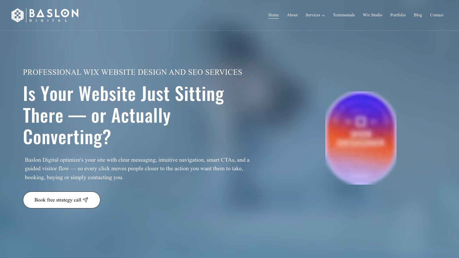
What truly sets Baslon Digital apart is its clear, user-centric information architecture. From the moment you land on the homepage, the value proposition is unmistakable: "We build websites that win you business". This powerful headline is immediately followed by compelling social proof (Wix Legend Agency status, 5-star reviews) and a clear, primary call-to-action (CTA): "Book a Free Strategy Call". The visitor journey is intuitive and logical, leading users from services and case studies to trust-building testimonials and informative blog posts. This organised flow minimises friction and maximises clarity, ensuring potential clients find exactly what they need without confusion.
Strategic Breakdown and Actionable Takeaways
Baslon Digital’s site excels by combining specialised expertise with tangible business outcomes. The copy focuses not just on building websites, but on delivering results like leads, sales, and bookings.
Conversion-Focused Navigation: The primary navigation is streamlined into essential sections like "Services", "Portfolio", and "About". The most important CTA, "Book a Free Call", is given prominence in the header, making it accessible from any page.
Layered Social Proof: The agency strategically places different forms of social proof throughout the site. The Wix Legend Agency badge provides industry authority, while detailed client testimonials offer relatable, outcome-focused stories that resonate with small business owners.
Educational Content as a Funnel: Instead of a hard sell, Baslon Digital provides valuable resources like cost guides and articles. This positions them as experts and builds trust. For instance, their guide on how to start a website from scratch in the UK helps attract organic traffic while demonstrating their knowledge.
Why It Stands Out
Feature | Analysis & Advantage |
|---|---|
Niche Specialisation | By focusing exclusively on Wix Studio, Baslon Digital projects deep expertise. This assures clients they are getting a specialist, not a generalist, for platform-specific challenges. |
End-to-End Service | The agency offers a complete package: design, custom development, SEO, and ongoing maintenance. This is a huge benefit for small businesses seeking a single, reliable partner. |
Consultative Approach | The absence of fixed pricing packages encourages a personalised consultation. This ensures projects are scoped accurately and clients get a tailored solution, not a one-size-fits-all product. |
Pros:
Laser-focused on converting visitors into customers.
End-to-end service from a recognised Wix specialist.
Strong emphasis on social proof builds immediate trust.
Personal, UK-based service ideal for SMEs and freelancers.
Cons:
Exclusively a Wix agency, not suitable for other platforms.
Requires a consultation for a precise quote.
Explore Baslon Digital’s website to see how a clear strategy and a deep understanding of a target audience can create a powerful, results-driven online presence.
2. Awwwards
For those seeking to push the boundaries of creativity, Awwwards is the definitive global standard for cutting-edge digital design and development. It operates as a highly respected awards body, with a jury of leading designers, creative directors, and innovators who evaluate submissions from around the world. The result is a curated gallery of the most innovative and technically impressive web design examples you can find anywhere online.
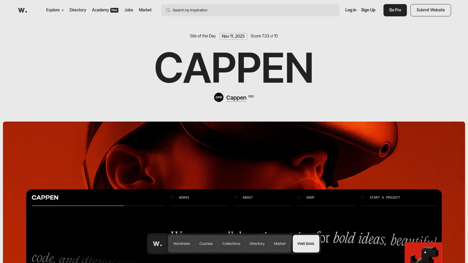
Unlike simple galleries, Awwwards provides deep context for each featured site, including scores for design, usability, creativity, and content. This breakdown helps you understand precisely why a particular design is successful, offering a masterclass in digital excellence. The platform is not just about passive inspiration; it’s an active learning ecosystem.
Strategic Analysis and Key Features
Awwwards excels by combining its inspirational gallery with tangible professional development resources. This dual focus makes it invaluable for freelancers and agencies aiming to stay ahead of industry trends.
Curated Excellence: Every site has won an award, ensuring you are only viewing top-tier, professionally vetted work. You can filter by categories, tags, technologies, colours, and countries to find highly relevant examples.
Awwwards Academy: For those who want to learn the techniques behind the award-winning designs, the Academy offers over 100 courses from industry experts on topics like WebGL, creative coding, and advanced UI/UX.
Professional Recognition: A Pro membership allows designers to be listed in a professional directory, submit their own work for consideration, and gain visibility within the global design community. Explore a detailed website showcase of Awwwards to see how this recognition elevates a portfolio.
Actionable Takeaways
Pros | Cons |
|---|---|
Extremely high-quality, trend-setting examples. | Many designs require large budgets and specialised teams. |
Combines inspiration with structured learning via the Academy. | Key content, like courses and submissions, is behind a paywall. |
Excellent for networking and professional visibility. | Can be intimidating for beginners or small-scale projects. |
Practical Tip: Don't try to replicate these high-budget sites exactly. Instead, deconstruct one or two key elements you admire, such as a unique hover effect, an innovative navigation menu, or a compelling scrolling animation. Focus on adapting a single, manageable idea for your own project.
Explore the latest "Site of the Day" on Awwwards to analyse what is currently defining excellence in digital design and see what small-scale ideas you can borrow.
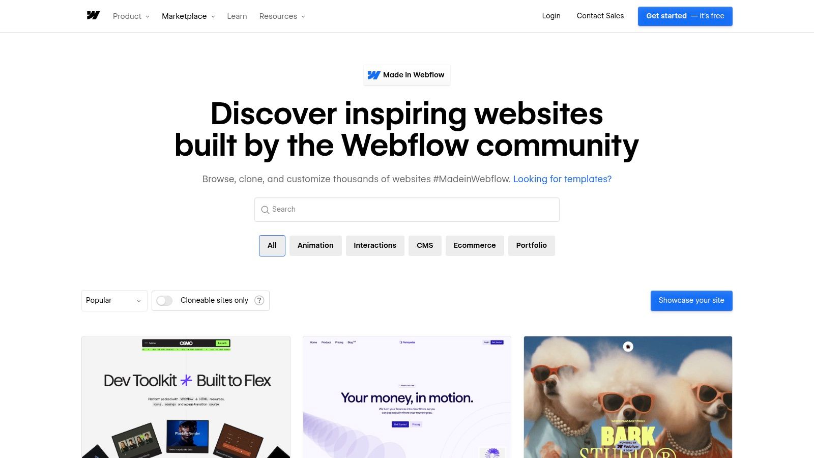
3. Made in Webflow (Webflow Showcase / Cloneables)
For designers who learn by doing, Made in Webflow offers a fundamentally different approach to inspiration. It’s not just a gallery of polished end-products; it's a living library of web design examples that you can take apart and rebuild. This official showcase features projects built by the Webflow community, many of which are "cloneable," meaning you can copy the entire project into your own Webflow account with a single click.
This hands-on model transforms passive browsing into active learning. Instead of just admiring a complex interaction or a clever layout, you can instantly access its underlying structure, styling, and animation settings. It’s the ultimate way to reverse-engineer professional work and understand how advanced concepts are executed in a real-world development environment.
Strategic Analysis and Key Features
Made in Webflow bridges the gap between seeing a great design and knowing how to build it. Its value lies in providing the actual building blocks, not just a picture of the final result. This is particularly powerful for freelancers and small businesses who need to produce high-quality sites efficiently.
Cloneable Projects: The standout feature is the ability to clone entire websites or specific components directly into your workspace. This allows you to dissect layouts, deconstruct complex animations, and adapt professional techniques for your own use.
Community-Curated Gallery: The showcase is populated by real projects from designers and agencies. You can filter by tags like "animation," "portfolio," or "landing page" to find relevant, practical examples that solve common design problems.
Seamless Workflow Integration: As it's built into the Webflow ecosystem, moving from inspiration to production is incredibly smooth. You can explore a variety of website design software options to see how this integration compares. For more resources, the official Webflow tools page is also a useful reference.
Actionable Takeaways
Pros | Cons |
|---|---|
Immediate, hands-on learning by dissecting working sites. | Cloning and customisation require a Webflow account. |
Many high-quality examples are free to clone and use. | Not all showcased sites are cloneable; it depends on the creator. |
Excellent path from example to production using one platform. | Some advanced features will require a paid Webflow plan. |
Practical Tip: Use the "Cloneable" filter to find a project with one specific feature you want to master, like a unique CMS-driven slider or a sticky navigation effect. Clone the project and focus solely on understanding how that one element was built before trying to implement it in your own design.
Explore the "Popular" section on Made in Webflow to see which cloneable projects the community finds most useful and start deconstructing them today.
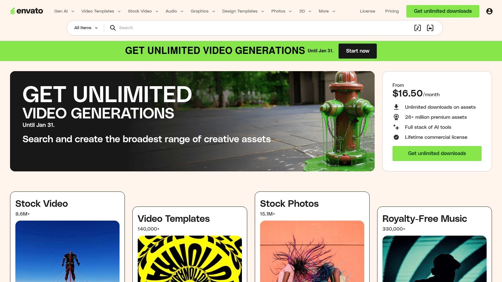
4. Envato Elements
For designers and developers who need a vast library of ready-made assets to jump-start projects, Envato Elements is an indispensable resource. It operates on a subscription model, offering unlimited downloads of millions of creative assets. This includes a massive collection of website templates, UI kits, fonts, and mockups that serve as excellent web design examples for study or direct implementation.
Unlike curated galleries that showcase finished products, Envato Elements provides the building blocks. It allows you to deconstruct professionally designed templates to understand their structure, layout, and component design. This hands-on approach is perfect for learning practical skills and speeding up your workflow by adapting high-quality, pre-built frameworks.
Strategic Analysis and Key Features
Envato Elements excels by offering a predictable, high-value subscription for a nearly endless supply of creative tools. This makes it an efficient and cost-effective solution for agencies, freelancers, and businesses that produce digital content at scale.
Vast Asset Library: Gain access to thousands of website templates, WordPress themes, UI kits, and presentation decks. This allows you to explore different design styles and functionalities for various industries.
Unlimited Downloads & Simple Licensing: A single subscription provides a broad commercial licence for all items, simplifying legal considerations. You can download as many assets as you need while your subscription is active.
Team-Friendly Plans: Specialised plans for teams offer centralised billing, member management, and the ability to share and track asset downloads, making it a great tool for collaborative design projects.
Actionable Takeaways
Pros | Cons |
|---|---|
Extensive library of templates and assets for diverse needs. | Content quality can vary, so items need careful vetting. |
Predictable subscription pricing ideal for heavy usage. | Subscription pricing is shown in USD and local VAT applies at checkout. |
Excellent for teams with centralised management features. | Requires an active subscription to use downloaded assets in new projects. |
Practical Tip: Use the website template kits not just for building, but for learning. Download a template for a platform you know well (like WordPress or Figma) and analyse its structure. Pay close attention to how the designer organised layers, named components, and structured the user flow. This is a practical way to learn industry-best practices.
Browse Envato Elements to find a template that aligns with your next project and see how you can adapt its professional structure to fit your unique brand.
5. ThemeForest (Envato Market)
For those looking for functional, deployable, and diverse web design examples, ThemeForest is the world’s largest marketplace for website themes and templates. Rather than offering high-concept inspiration, it provides a massive library of ready-to-use designs for platforms like WordPress, Shopify, and static HTML. This makes it an incredibly practical resource for freelancers and small businesses who need to study real-world structure, user flows, and commercial layouts.
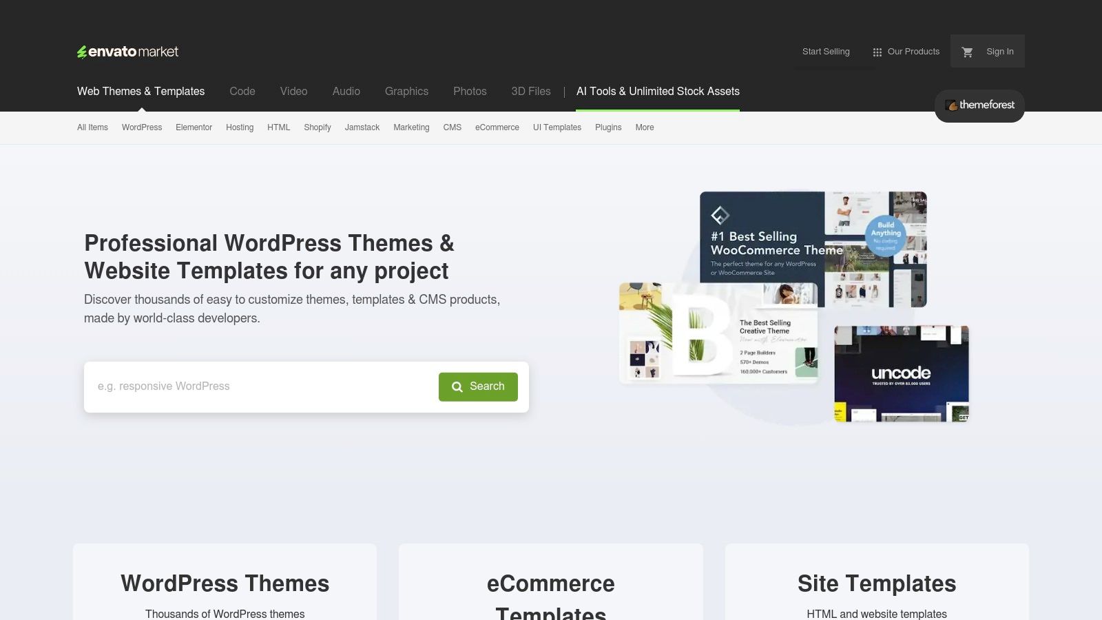
Unlike curated galleries, ThemeForest operates on a commercial model where you can purchase and download a fully functional theme. This allows you to go beyond visual analysis and deconstruct the underlying code, structure, and plugin integrations. It’s a hands-on approach to learning what makes a design work from both the front-end and back-end perspectives.
Strategic Analysis and Key Features
ThemeForest’s primary strength is its sheer volume and practicality. It bridges the gap between abstract inspiration and tangible application, offering a cost-effective way to acquire professional-grade design foundations.
Massive Catalogue: With thousands of themes for nearly every CMS and industry, you can find specific examples for e-commerce, portfolios, corporate sites, and niche blogs. This variety allows for highly relevant research.
Transparent Purchasing Model: Each theme is priced individually, with clear licensing terms for single or extended use. For UK buyers, VAT is applied at checkout, with clear guidance provided for VAT-registered businesses.
Mature Review System: User ratings, comments, and sales data help you gauge a theme's quality, support level, and real-world performance. This community feedback is crucial for vetting potential purchases.
Actionable Takeaways
Pros | Cons |
|---|---|
Sheer breadth of ready-to-run examples across all technologies. | Quality and code standards can vary widely between authors. |
Cost-effective way to study or deploy production-ready themes. | Buyer fees and VAT can significantly add to the final price. |
Clear pricing, licensing, and VAT guidance for UK purchasers. | The sheer number of options can feel overwhelming without clear goals. |
Practical Tip: Use the "Live Preview" feature extensively before making a purchase. Test every page, interaction, and responsive breakpoint. Pay close attention to the theme’s documentation and the author’s comment section to assess the quality of support you can expect.
Explore the "Bestsellers" in your specific category on ThemeForest to understand current commercial design trends and identify proven layouts that you can adapt for your own project.
6. One Page Love
For projects where concise storytelling and a direct call-to-action are paramount, One Page Love is an essential resource. This platform is a tightly curated gallery dedicated exclusively to the art of single-page design. It cuts through the noise of complex, multi-page sites to provide focused inspiration for landing pages, portfolios, event sites, and product launches, offering some of the cleanest web design examples available.
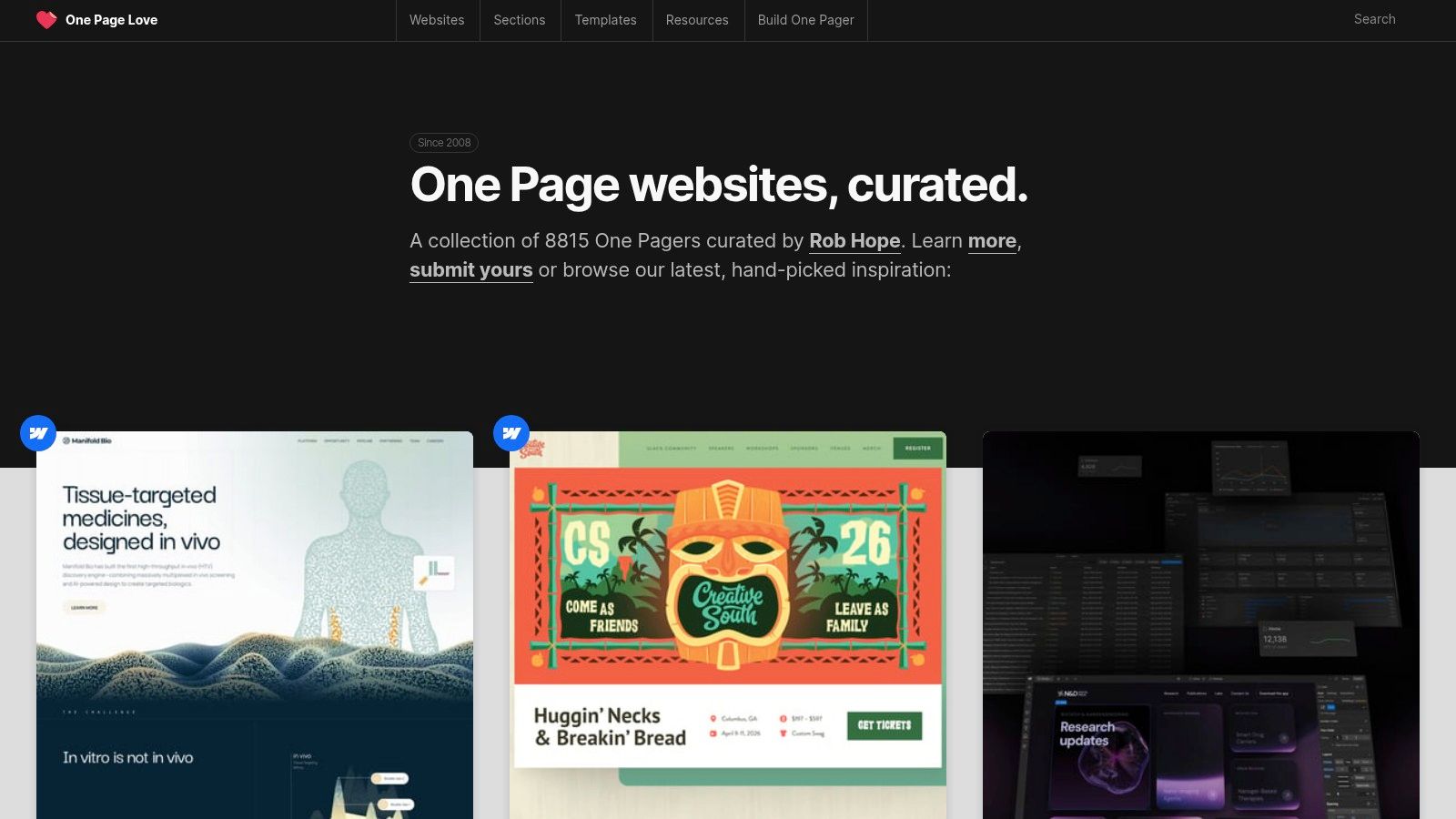
Unlike broader galleries, One Page Love champions the "less is more" philosophy. Each featured design demonstrates how to create a complete and compelling user journey within a single scroll. The platform’s value lies in its specificity, providing clear case studies in efficient information architecture and conversion-focused user experience.
Strategic Analysis and Key Features
One Page Love serves a dual purpose by blending a high-quality inspiration gallery with a practical marketplace for templates. This approach makes it uniquely useful for freelancers and businesses needing to launch projects quickly without compromising on design quality.
Niche Curation: The gallery is strictly limited to one-page websites, ensuring every example is relevant for studying linear narratives, clear navigation, and effective content hierarchy. You can filter by categories like "Portfolio," "Landing Page," and "App."
Multi-Platform Template Marketplace: Beyond inspiration, the site offers a catalogue of templates for various platforms, including HTML, Webflow, Carrd, and WordPress. Each listing clearly states the platform and any associated costs.
Transparent Submission Process: The long-running editorial and submission process allows designers to get their work featured, providing a valuable channel for professional visibility within a specialised design community.
Actionable Takeaways
Pros | Cons |
|---|---|
Highly focused on landing pages and single-page UX patterns. | The niche focus means it's unsuitable for complex project research. |
Offers templates across multiple platforms, both free and paid. | Some templates require paid plans on third-party platforms to work. |
Excellent resource for learning concise, conversion-driven design. | Inspiration is limited to one specific, though popular, format. |
Practical Tip: Analyse how the featured sites handle navigation. Since there are no other pages, look at how they use anchor links, sticky headers, and clear section dividers to guide users smoothly down the page without causing disorientation. This is a critical skill for creating effective landing pages.
Browse the "Landing Page" category on One Page Love to see how top designers capture user attention and drive action within a single, focused view.
7. Amazon.co.uk (Web design books)
While digital galleries offer visual inspiration, sometimes the most effective way to learn is through structured, expertly curated content. For this, Amazon.co.uk serves as an essential UK-based marketplace for web design books, providing access to in-depth case studies, foundational theory, and practical, example-rich guides that can transform your understanding of what makes a great design. These books offer a different kind of web design examples- ones that are deconstructed and explained by industry veterans.
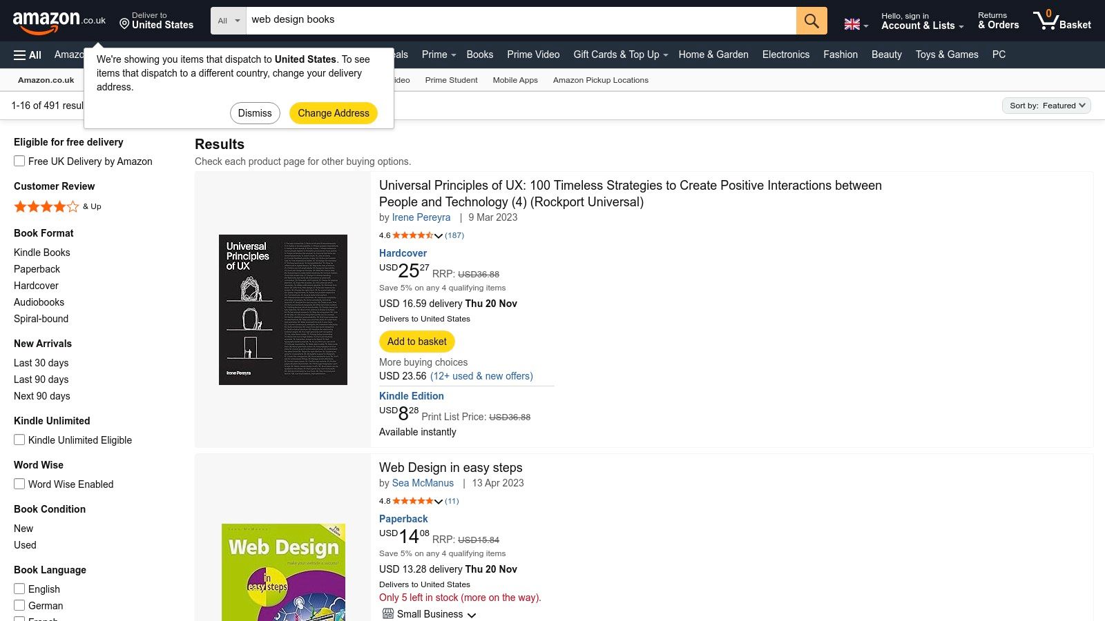
Unlike endlessly scrolling through websites, books provide a focused, finite learning path. Whether you need a comprehensive handbook on UX principles or a visual compendium of minimalist layouts, Amazon's vast library allows you to build a physical or digital collection of knowledge. For UK-based professionals, the platform offers the convenience of fast Prime shipping and a localised marketplace with new and used options.
Strategic Analysis and Key Features
Amazon's strength lies in its ability to organise and deliver deep knowledge on demand. It complements online inspiration by providing the foundational principles and strategic thinking behind effective design, making it a powerful tool for serious skill development.
Curated Bestseller Lists: Quickly identify the most influential and highly-regarded books in the design community by exploring the "Best Sellers" in web design categories. This helps filter out outdated or low-quality content.
Multiple Formats: Choose the learning style that suits you best, from physical paperbacks and hardcovers for your desk library to Kindle editions for on-the-go reading and searching.
Structured Learning: Books offer a cohesive, A-to-Z learning experience on specific topics like typography, colour theory, or user research, which is often difficult to piece together from disparate online articles.
Actionable Takeaways
Pros | Cons |
|---|---|
Structured learning with case studies and detailed examples. | Content is static and cannot be updated like a live website. |
Fast, UK-friendly fulfilment for Prime-eligible items. | Quality varies by author; checking reviews and publication dates is crucial. |
Easy comparison of formats, prices, and new/used options. | Can be a slower method for finding quick visual inspiration. |
Practical Tip: Use the "Look Inside" feature to preview a book's table of contents and introduction before purchasing. This helps you assess whether the content and writing style align with your learning goals and ensures the examples provided are relevant to your projects.
Browse the web design bestsellers on Amazon.co.uk to find a structured guide that can deepen your understanding of the principles behind the inspirational designs you see online.
7-Source Web Design Comparison
Service | Implementation complexity 🔄 | Resource requirements ⚡ | Expected outcomes ⭐📊 | Ideal use cases 💡 | Key advantages ⭐ |
|---|---|---|---|---|---|
Baslon Digital | 🔄 Medium — custom Wix Studio design + development | ⚡ Medium — agency fees, ongoing maintenance | ⭐📊 High — conversion‑focused sites that increase leads/sales | 💡 Small businesses, freelancers needing Wix + hands‑on support | ⭐ Wix‑specialist end‑to‑end service, fast delivery, strong social proof |
Awwwards | 🔄 Variable — browsing is easy; replicating trends can be complex | ⚡ High — top designs often require skilled teams and budget | ⭐📊 High — cutting‑edge inspiration and trend insight | 💡 Designers seeking high‑end inspiration, learning and recognition | ⭐ Curated award examples, Awwwards Academy and professional perks |
Made in Webflow | 🔄 Low — many sites are cloneable; customization raises complexity | ⚡ Low–Medium — Webflow account; paid plans for production features | ⭐📊 Practical — rapid prototypes and hands‑on learning | 💡 Rapid Webflow builds and learning by reverse‑engineering | ⭐ Cloneable live sites and smooth path from example to production |
Envato Elements | 🔄 Low — download and adapt templates/assets quickly | ⚡ Medium — subscription cost; items need vetting | ⭐📊 Broad — accelerates design with plentiful assets | 💡 Teams or individuals needing many ready assets and templates | ⭐ Huge library + unlimited downloads under a single commercial license |
ThemeForest (Envato Market) | 🔄 Low–Medium — ready themes, customization may require coding | ⚡ Low–Medium — one‑time purchases; varying technical effort | ⭐📊 Wide — deployable themes across multiple platforms | 💡 Quickly launch sites on WordPress, Shopify, HTML, etc. | ⭐ Massive catalog, clear pricing/licensing and platform variety |
One Page Love | 🔄 Low — focused on single‑page templates and examples | ⚡ Low–Medium — free/paid templates; some platform subscriptions needed | ⭐📊 Focused — strong patterns for landing pages and conversions | 💡 Landing pages, MVPs and single‑page UX studies | ⭐ Curated one‑page designs with clear platform notes and templates |
Amazon.co.uk (Web design books) | 🔄 Low — read and apply structured concepts | ⚡ Low — purchase cost; physical or Kindle formats | ⭐📊 Steady — structured learning, case studies and reference | 💡 Long‑form learning, theory, and reference material | ⭐ Wide selection, UK shipping/fulfillment and edition comparisons |
Turn Your Inspiration Into a Reality
We’ve explored a diverse collection of resources, moving from the polished portfolios on Awwwards to the practical, ready-to-use assets on Envato Elements. The journey through these web design examples has revealed a central theme: a successful website is a masterful blend of strategic thinking, user-centric design, and clear, compelling communication. It’s not just about looking good; it's about functioning brilliantly.
The examples showcased demonstrate that modern web design prioritises clarity and intuition. From the single-page narratives on One Page Love to the robust e-commerce structures found in ThemeForest templates, the common thread is a relentless focus on the user experience. An effective design guides visitors effortlessly towards a specific goal, whether it’s making a purchase, filling out a form, or simply understanding a brand’s message.
Core Principles to Guide Your Design
As you move from inspiration to implementation, remember the foundational principles we've seen in action. These are the strategic pillars that transform a collection of visual ideas into a high-performing digital asset.
Clarity Over Complexity: The most impactful designs are often the simplest. Prioritise a clean layout, intuitive navigation, and legible typography. A visitor should understand your site’s purpose within seconds.
Purpose-Driven CTAs: Every call-to-action should be intentional. Use contrasting colours, compelling copy, and strategic placement to draw the eye and encourage clicks, just as we observed in many high-converting templates.
Mobile-First Mentality: A significant portion of your audience will view your site on a mobile device. Always design and test for smaller screens first to ensure a seamless experience for every user, a non-negotiable standard in today's digital landscape.
Visual Hierarchy: Guide your visitor’s attention. Use size, colour, and spacing to create a clear path through your content, highlighting the most important information and leading them naturally to your call-to-action.
Your Actionable Next Steps
Feeling inspired is the first step; taking action is what builds a business. Begin by synthesising the ideas you’ve gathered. Don’t just copy a design you like, deconstruct it. Ask yourself why it works. Is it the bold colour scheme, the minimalist layout, or the clever use of micro-interactions?
Create a simple mood board or a document where you collate screenshots, colour palettes, and font pairings that resonate with your brand's identity. Then, map out your user journey. What is the single most important action you want a visitor to take? Design every element on your key pages to support that one goal. This focused approach will ensure your final product is not only beautiful but also effective.
By studying these web design examples, you've equipped yourself with a powerful toolkit of ideas and strategies. The next move is yours. Start small, focus on your core message, and build a website that not only represents your brand but actively works to achieve your business objectives.
Feeling inspired but need an expert hand to bring your vision to life? The team at Baslon Digital specialises in translating creative concepts into stunning, high-performance websites. Explore our portfolio at Baslon Digital and discover how we can help you build a digital presence that gets results.
Comments