How to Plan Website Structure for SEO & UX
- Baslon Digital

- Oct 8, 2025
- 13 min read
Before you even think about colours or fonts, we need to talk about your website's bones. Planning your website structure for SEO & UX is like drawing up the architectural blueprint for a house before you start pouring the foundation. It’s all about mapping out your content and organising it into a hierarchy that makes sense.
A solid structure is the secret sauce for a great user experience and, frankly, it’s non-negotiable for SEO success.
Building Your Website’s Architectural Blueprint
Think of it this way: a well-planned structure ensures your visitors can glide through your site effortlessly, finding exactly what they need without getting lost or frustrated. Get it wrong, and you're looking at a one-way ticket to high bounce rates, zero engagement, and being invisible on Google. Ouch.
This isn’t just about making a list of pages. It’s about understanding how every piece of content connects and presenting that journey in a way that feels completely natural to your audience. This blueprint is the absolute bedrock of your entire online presence.
Why a Solid Structure Matters
A meticulously planned website structure directly hits two of the most critical areas for online success: user experience (UX) and search engine optimisation (SEO).
For Your Visitors: A logical layout helps people find information fast. It cuts down on the frustration that makes them click away and encourages them to stick around longer. When users can easily guess where to find what they're looking for, they're far more likely to do what you want them to do, like buy something or get in touch.
For Search Engines: Google’s little crawler bots follow the links on your site to figure out what it’s all about and index your content. A clear hierarchy helps them understand the relationship between your pages, pinpoints your most important content, and ultimately, helps you rank higher. If you want to dive deeper into this, you can master website optimisation for search engines with our detailed guide.
A well-structured website isn’t just a random collection of pages. It's a carefully crafted journey that guides users to their destination while screaming "quality and authority" to search engines.
To put it all together, let's look at the core components that make a website structure effective for both people and search engines.
Core Pillars of Effective Website Structure for SEO & UX
Pillar | Primary Goal | Key Action |
|---|---|---|
Hierarchy | Create a logical flow | Organise pages from broad categories to specific topics. Think parent pages and child pages. |
Navigation | Make it easy to get around | Design clear menus (header, footer) that are intuitive and consistent across the site. |
URL Structure | Signal relevance | Use clean, descriptive URLs that reflect the page's content and its place in the site hierarchy. |
Internal Linking | Connect related content | Link between relevant pages to guide users and spread link equity for SEO. |
Ultimately, the goal here is to build a scalable foundation that supports your business from day one and can grow with you.
For a comprehensive look at the entire creation process, from initial strategy to launch day, you might want to explore this excellent step-by-step guide on how to create a professional website.
Mapping Your Audience and Business Goals
Before you even think about a sitemap or a fancy homepage design, let's get one thing straight: you need to know who you're building this thing for and what you want them to do. A great website structure isn’t just a bunch of pages linked together; it’s the sweet spot where what your customers need meets what your business wants.
Without that clarity? You're just throwing spaghetti at the wall and hoping something sticks.
First, you’ve got to dig deep into your audience. I’m not talking about basic stuff like age and location. What really keeps them up at night? What problem are they desperately trying to solve when they land on your site?
Understanding their pain points is everything. For example, a freelance photographer’s audience isn't just searching for "photography services." They're typing in "affordable wedding photography packages" or "natural family portraits." Each phrase screams a different user intent, and your site structure needs to answer that call directly.
Aligning User Intent with Business Objectives
Once you’ve got a handle on your user, it’s time to sync up their needs with your own goals. Let’s be real, your website isn’t just a pretty online brochure. It's a tool, and it needs to deliver specific results.
Are you trying to get more leads? Sell products directly from your site? Or maybe you just want to become the go-to expert in your field by sharing awesome information? Nailing this down is non-negotiable because it shapes the entire journey a visitor takes.
For a deeper dive into this all-important research phase, check out our guide on how to determine who your online audience is. It’s packed with practical steps for finding the people who actually matter to your business.
The best websites feel like they're reading your mind. That’s because the user’s goals and the business’s goals are perfectly in sync. The site’s structure makes the user’s next logical step the one you wanted them to take all along.
Let's make this real. Imagine you run a small bakery in London.
Your Business Goal: Increase online orders for custom celebration cakes.
Your Audience’s Need: To quickly find cake designs, see prices, and easily place a custom order without any fuss.
Your website structure has to mirror this perfectly. A big, obvious "Celebration Cakes" button in your main menu is a must. From there, it should branch out into logical sub-pages like "Wedding Cakes," "Birthday Cakes," and a crystal-clear "Get a Quote" page. Every click guides them closer to placing that order.
Turning Insights into Structural Decisions
This whole process is about turning abstract ideas into a concrete plan. The insights you gather become the main categories and pages of your website.
Think about the main things a user wants to do on your site:
Find product info: This means you need clear product categories and detailed pages that answer all their questions.
Learn about you: An "About Us" section with team photos and a story isn't fluff; it builds trust.
Get help: A solid "FAQ" or "Help Centre" can save everyone a lot of time and frustration.
Each of these user needs becomes a pillar of your site's architecture. Getting this foundation right ensures every page has a purpose, creating a logical, intuitive experience that encourages visitors to stick around and take action.
Designing a Scalable Information Architecture
Alright, you've done the homework on your audience and nailed down your business goals. Now, it's time to turn those ideas into a proper blueprint for your website. This is where we stop dreaming and start planning, using what’s known as Information Architecture (IA)—which is just a fancy way of saying we need to organise everything so people can actually find what they're looking for without getting frustrated.
Think of it like this: you wouldn't just toss all your products onto random shelves in a shop, right? You'd group them logically. Your website needs the exact same treatment. A solid IA is the backbone of a good user experience, and it's crucial for everything from keeping visitors happy to optimizing your sales funnel by showing people a clear path from A to B.
This infographic breaks down the basic process pretty well.
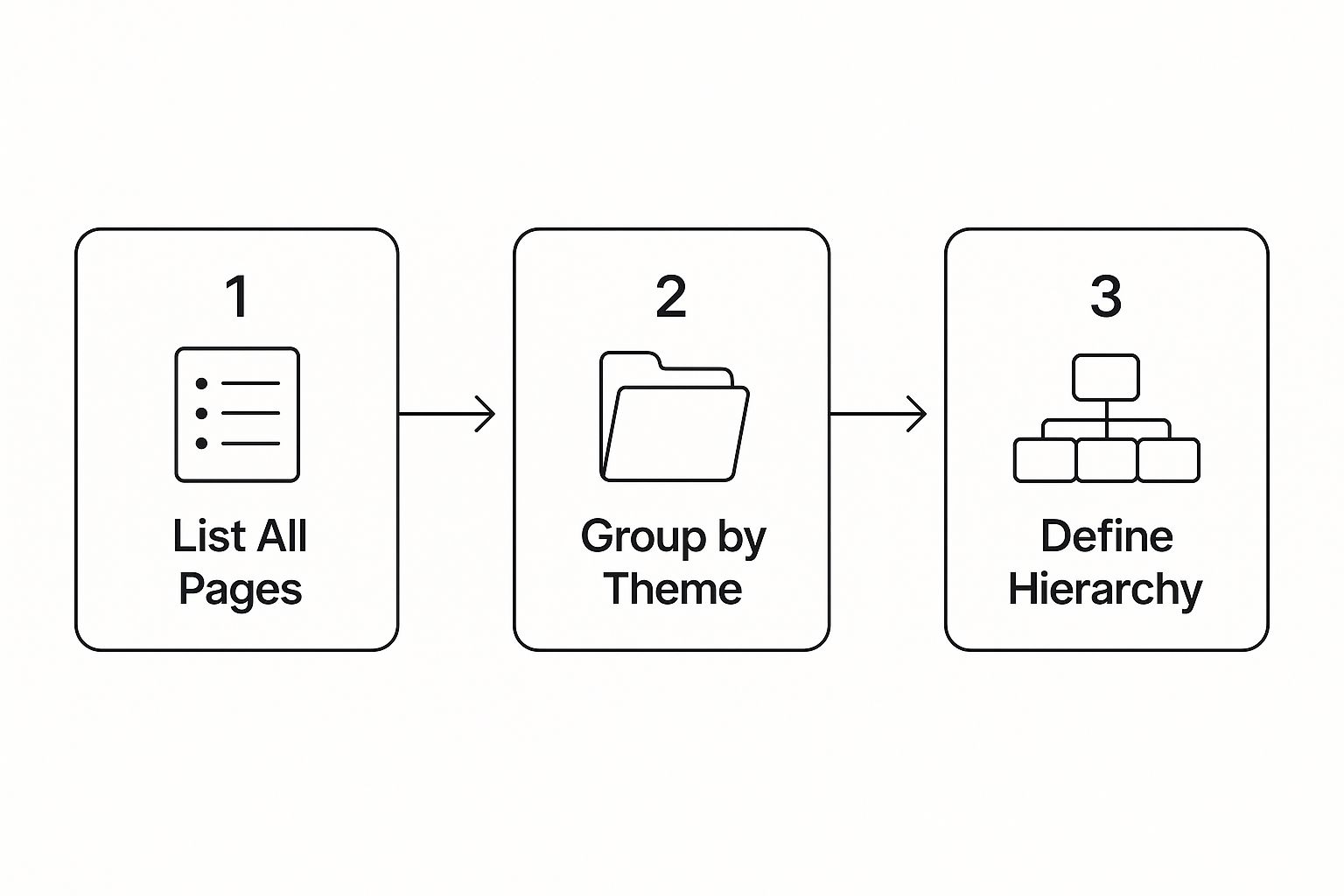
Essentially, you’re taking stock of everything you have, sorting it into sensible piles, and then building a clear structure from there.
From Content Lists to a Visual Sitemap
First things first, let's do a content inventory. This sounds technical, but it just means making a big list of every single page you think your website needs. Don’t get hung up on the order yet. Just dump it all out—homepage, service pages, every blog post idea, about us, contact page, the lot.
Got your master list? Good. Now the real fun starts. Begin grouping related pages together. If you’re running an e-commerce site, this might mean creating categories like "Men's," "Women's," and "Sale." A service-based business might group pages under "Our Services," "Case Studies," and "About Us."
These groups will eventually become the main sections of your website's navigation.
The point of information architecture isn't just about organising stuff; it's about creating clarity. Someone should land on your homepage and instantly get what you do and where they need to go, just by glancing at your navigation.
This is where a visual sitemap becomes your best mate. A sitemap is basically a flowchart for your website. It maps out how all your pages connect to each other, giving you a bird's-eye view of how a user will travel through your site.
Choosing the Right Structural Model
While there are a few ways to structure a site, the hierarchical model is the most common for a reason—it just makes sense. It looks like a family tree: the homepage sits at the very top, followed by your main categories, which then branch out into more specific subpages. It’s clean and intuitive.
When you start building this hierarchy, keep a few things in mind:
Keep it shallow. No one wants to click five times to find what they're looking for. Aim to get users to any page within three to four clicks from the homepage. Any deeper, and you risk them giving up.
Use obvious labels. This is not the time to be clever with jargon. Use simple, straightforward terms your audience understands. Call it "Services," not "Our Innovative Solutions."
Plan for growth. Your business isn't static, so your website shouldn't be either. Think about what you might add down the line—new products, more services, a bigger blog—and make sure your structure can accommodate that without a total overhaul.
Getting this structure right from the start builds a solid foundation that works for your users and your long-term goals.
Crafting Intuitive Navigation and User Journeys
Even the most brilliantly organised website is a total failure if your visitors can't find their way around. Your site’s navigation is the bridge connecting people to what they need; if that bridge is wobbly or confusing, they’ll just turn back and leave. Simple as that.
This is where we move from the architectural blueprint to the actual signposts. The aim is to design a navigation system that feels so natural, so completely effortless, that users glide from one point to the next without ever having to think about it.
It’s a massive piece of the puzzle. An overwhelming 94% of people say easy navigation is the most crucial feature a website can have. This isn’t just some fleeting trend; it’s a fundamental expectation that directly impacts whether someone trusts you or gets frustrated and clicks away.
To put that number in perspective, clear product info came in second at 91%, while a company team page was only important to 63% of people. You can find out more about these website design statistics and what users really want.
Designing a User-Centric Main Menu
Your main menu, usually sitting proudly in the header, is the primary tool visitors will use to explore your site. It needs to be clean, consistent, and predictable. Forget trying to be clever with jargon or overly creative labels—clarity is your best friend here.
Think back to the top-level categories you mapped out earlier. Those should form the core of your main menu.
Keep It Simple: Try to stick to seven main navigation items at most. Any more than that and you risk causing "decision fatigue," making it harder for people to focus on what matters.
Use Obvious Language: Use words your audience actually uses. "Services" is always better than "Our Innovative Solutions," and "Contact" beats "Let's Connect."
Logical Order: Arrange your menu items by importance, usually from left to right. Your most critical pages, like "Services" or "Products," should come first.
A great navigation menu shouldn’t make users think. It should feel like an extension of their own thoughts, effortlessly guiding them to their destination in the fewest clicks possible.
For example, a local plumber’s website might have a menu like this: . It’s simple, direct, and leaves absolutely no room for confusion.
Beyond the Header: The Role of Footer and Contextual Links
While the main menu is the star of the show, other navigational aids play a vital supporting role in creating a smooth journey for your users.
Footer NavigationYour website's footer is the perfect spot for all those important but secondary links that don’t need prime real estate in the header. This usually includes things like:
Utility pages (Privacy Policy, Terms & Conditions)
Contact details and your address
Social media links
Secondary links to your "About Us" or "Careers" page
Contextual Links and Breadcrumbs
Contextual links are the internal links you place within your page content that point to other relevant pages on your site. They are fantastic for both SEO and the user experience, helping people discover related content organically as they read.
Breadcrumbs are a secondary navigation trail that shows users their current location within the site's structure (e.g., ). They're especially useful for larger sites, as they reduce the number of clicks needed to go back and prevent people from feeling lost.
By combining a crystal-clear main menu with smart footer design and internal linking, you create a complete navigational ecosystem. This helps users solve their problems quickly and ensures search engine crawlers can effectively understand and index your entire website.
Building a Responsive and Future-Proof Structure

A neat, logical website structure is a brilliant start, but let's be honest, it's only half the story. In today's world, your website has to work flawlessly whether it’s viewed on a giant desktop monitor or a tiny smartphone screen. This is where planning for a responsive, future-proof design stops being a "nice-to-have" and becomes completely non-negotiable.
It’s not just a good idea; it’s what your users demand. As of December 2023, a staggering two-thirds (66.02%) of all UK web traffic came from mobile devices. That trend isn’t slowing down. You can dig deeper into UK website traffic statistics to see how people are really browsing.
The data sends a crystal-clear message: if your website is a mess on mobile, you’re slamming the door on the vast majority of your potential audience.
Adopting a Mobile-First Mindset
The mobile-first approach flips traditional web design on its head. Instead of designing a sprawling desktop site and then desperately trying to cram it onto a smaller screen, you start with the smallest canvas and work your way up. This simple shift forces you to be ruthless with your priorities.
When you’re designing for a small screen, you naturally zero in on what’s truly essential:
Core Content: What information is absolutely vital for someone to see the second they land on a page?
Simple Navigation: How can you create a menu that’s a breeze to tap and navigate on a phone? No fat-finger frustrations allowed.
Performance: How do you make sure the site loads lightning-fast, even on a dodgy mobile connection?
This isn’t just about making mobile users happy. The clarity and focus that come from a great mobile experience almost always result in a cleaner, more efficient, and less cluttered desktop site, too. If you want to dive deeper into this, we've got a detailed article explaining what responsive web design is.
A future-proof structure isn’t about gazing into a crystal ball. It’s about building a flexible foundation that can easily adapt to new content, new tech, and new user habits without needing a complete, soul-destroying rebuild.
Designing for Scalability and Growth
Beyond just looking good on different devices, your site's architecture needs to be able to grow with your business. A rigid structure that works perfectly for five services will completely fall apart when you try to add twenty. Thinking ahead is the name of the game.
As you’re mapping out your information architecture, always be asking, "What if?"
What if we decide to launch a whole new product line next year?
What if we want to add a massive resource hub with hundreds of articles?
What if we expand into a new country or market?
By using a modular approach to your content and building a flexible hierarchy, you ensure that adding new sections doesn't throw the entire user journey into chaos. This kind of foresight saves an incredible amount of time, money, and headaches down the line, allowing your website to evolve right alongside your ambitions.
Testing Your Structure and Launching With Confidence
A brilliant plan on paper is one thing, but a structure that real people can navigate without getting lost is another kettle of fish entirely. Your website blueprint isn’t really finished until it’s been put to the test.
This final stage is all about checking your assumptions, making sure the technical launch goes smoothly, and keeping an eye on performance to ensure all your hard work actually pays off.
Validating Your Information Architecture Before Launch
Before you even think about writing a single line of code, you need to test your structure with actual users. Trust me, this step can save you from eye-wateringly expensive redesigns down the line by catching navigational blunders early on. One of the simplest, yet most powerful, ways to do this is tree testing.
In a tree test, you give users a simple task (e.g., "Find the price for a custom wedding cake") and show them a stripped-back, text-only version of your site structure. Their job is to click through the categories to find what they're looking for. It's a pure test of your information architecture, with no flashy visuals to distract them.
If a bunch of users get hopelessly lost trying to complete a simple task, it’s a massive red flag. It means your category labels are confusing or your hierarchy isn't as intuitive as you thought. This is your golden opportunity to fix it before it becomes a real-world headache for your customers.
Technical Launch Essentials for SEO
Once you’re confident in your structure, it's time to prep for a successful launch from a technical SEO perspective. A crucial part of introducing your new, beautifully organised website to search engines is creating and submitting an XML sitemap.
Think of this file as a detailed roadmap for search engine crawlers, listing every important URL on your site. Submitting it through Google Search Console helps Google discover and index your pages much faster—which is especially important for a brand new or freshly restructured website.
The current economic climate in the UK has certainly squeezed business budgets, which has a knock-on effect on web design investment. In fact, the sector's income has been contracting by a compound annual rate of 0.8% and is expected to hit £640.6 million by 2025 due to post-pandemic pressures. Even with tighter budgets, a well-planned website structure is more critical than ever; businesses need to maximise every visitor's experience to stay ahead. You can read more about the current economics of the UK web design industry and how it’s shaping digital strategies.
Post-Launch Monitoring and Iteration
Your job isn’t done the second the site goes live. Nope, the launch is just the beginning. Now you get to use real-world data to see how your carefully planned structure actually performs in the wild.
Here’s what you should be focusing on:
Analyse User Behaviour: Tools like Google Analytics are your best friend here. Dive into the "Behaviour Flow" report to spot where users are dropping off or taking weird, unexpected journeys through your site.
Track Key Metrics: Keep a close eye on your bounce rate, time on page, and conversion rates. A crazy-high bounce rate on a category page, for instance, probably means there’s a mismatch between what users expected and what they found.
Gather Feedback: Use heatmap tools or simple on-site surveys to get direct feedback. Watching session recordings can be incredibly insightful, revealing the exact moments where users hesitate, struggle, or get confused.
By constantly keeping tabs on these areas, you can spot and fix usability problems, ensuring your website structure continues to serve both your users and your business goals.
Ready to build a stunning, effective website that truly works for your business? The team at Baslon Digital specialises in creating custom websites with intuitive navigation and optimised structures that drive results. Get in touch with us today to turn your vision into reality!
Comments