A Proven Process to Design a Website with Wix for UK Businesses
- Baslon Digital

- Jan 17
- 17 min read
Updated: Jan 19
A website design process that actually works is simple: figure out your goals, get to know your audience, plan the structure, design it, and then build it. This isn't just about making things look pretty; it's a strategic plan to make sure your finished site is a powerhouse for your business, driving results you can actually measure.
Laying the Strategic Foundation for Your Website
Before you even think about colours or fonts, the real work begins. Diving straight into design without a solid plan is like trying to build a house without a blueprint. It might look interesting for a minute, but it's not going to be functional or last very long. This first phase is all about defining what a "win" actually looks like for your website.
A truly great website is a purpose-built tool. Are you trying to boost online bookings by 20%? Maybe your main goal is to pull in 50 qualified leads every month. Setting clear, measurable goals right from the start gives you a north star for every single decision you make down the line.
Defining Your Core Strategy
Let's say you run a local bakery in London. To stand a chance against the big chains, your website can't just be a pretty gallery of cakes. The strategy needs to be laser-focused on what will actually grow your business.
That could mean a few things:
Online Ordering: Setting up a dead-simple system for local delivery and collection to grab the convenience-loving crowd.
Community Focus: Highlighting your involvement in local events or sharing customer stories to build a fiercely loyal neighbourhood following.
Lead Capture: Using a newsletter sign-up to offer discounts and build a direct marketing list for a new loyalty programme.
This initial thinking creates a clear path, starting with your goals and moving right into understanding your audience and checking out the competition.
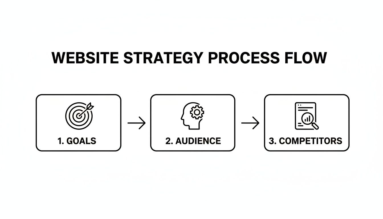
This just goes to show that any successful project has to start with clear goals before you can even begin to figure out who you're talking to and what everyone else is doing.
Documenting Your Vision
To make this strategy stick, you've got to write it all down in one place. This document, which is usually called a website brief, makes sure everyone—whether it's just you, a designer you've hired, or a full agency—is on the same page. To get a clear vision from the get-go, it's a great idea to use an essential website design brief template. It's the perfect tool for translating your business goals into things a designer can actually work with.
Think of your strategy as a filter. For every choice you make during the design process, ask yourself: does this support my core goals? If it doesn't, it gets cut. This disciplined approach is what separates an effective website from all the digital noise out there.
This focus on getting a return on your investment has become more critical than ever. The UK web design industry is tightening its belt, with some projections showing a market decline of 0.8% on a compound yearly basis, potentially reaching £640.6 million in 2025. For small businesses, that means every single pound spent on a website has to be justified with clear, tangible results.
Ready to nail down your website's goals but not quite sure where to begin? Have a look at our guide on how to write a website brief. It’ll help you create a rock-solid foundation for your project.
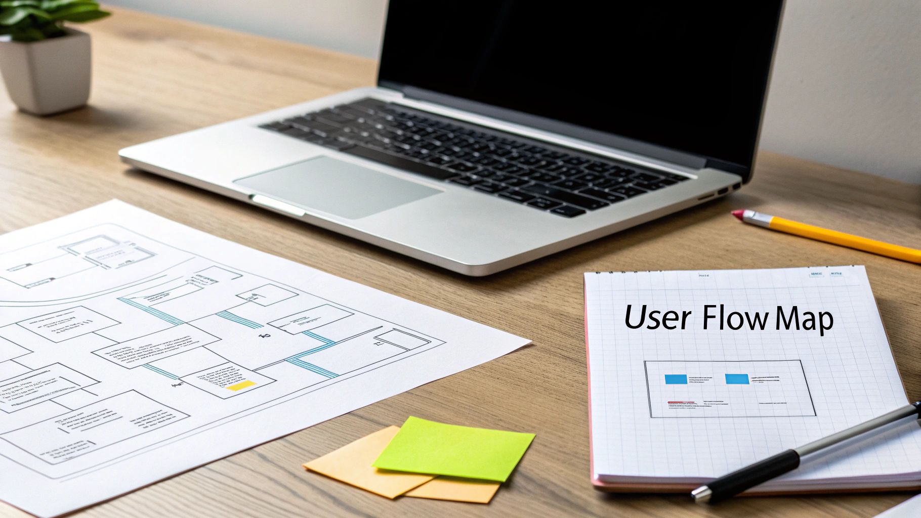
Mapping Your Website's Blueprint and User Flow
Once you’ve nailed down your goals, it’s time to stop dreaming and start building. This is where we sketch out the actual structure of your site and figure out exactly how people will navigate through it. A smooth user journey isn’t magic; it’s the result of good, solid planning.
Think about it from a customer’s perspective. A potential client lands on a freelance consultant's homepage, finds the 'Services' page in a heartbeat, gets hooked by a case study, and then—bam—the 'Contact' form is right where they expect it to be. That seamless path is what turns a casual visitor into a paying client. The first step to achieving that is creating a sitemap.
Creating Your Website Sitemap
A sitemap is basically a family tree for your website's pages. It shows what pages you'll have and how they're all connected. Think of it as the table of contents for your site. It forces you to organise your thoughts and content logically before you even get tempted by pretty colours and fonts, making sure every page has a reason to exist.
For most small UK businesses, the structure is fairly straightforward. You don't need to reinvent the wheel, just make sure you cover the essentials.
Here’s a simple table to use as a starting point. It outlines the absolute must-have pages for any small business looking to make an impact online.
Essential Pages for a Small Business Website
Use this table as a starting point for your sitemap, outlining the core pages most UK small businesses need to succeed online.
Page Type | Primary Purpose | Key Elements to Include |
|---|---|---|
Homepage | To grab a visitor's attention instantly and point them towards the important stuff. | A killer headline, a quick intro to what you do, and clear calls-to-action. |
About Us | To build trust by sharing your story, your mission, and the faces behind the business. | Your brand's purpose, team bios, and what makes you different from the competition. |
Services/Products | To lay out what you’re selling and why the customer should care. | Clear descriptions of your offerings, pricing (if it makes sense), and the benefits for them. |
Contact Us | To make it ridiculously easy for people to get in touch. | A contact form, business email, phone number, and a physical address if you have one. |
Blog/Resources | To show you know your stuff, establish authority, and give Google a reason to like you. | Genuinely helpful articles, case studies, or guides that your ideal customer would search for. |
Mapping these out first stops you from building a confusing, digital maze that frustrates visitors and kills any chance of a sale.
Sketching Wireframes to Test User Flow
With your sitemap in hand, the next move is to create wireframes. A wireframe is a super simple, stripped-back sketch of a webpage. It's all about layout and function—no colours, no fancy fonts, just boxes and lines. It’s the skeleton of your page, showing where things like menus, buttons, and contact forms will live.
You don’t need to be an artist or have expensive software. A pen and paper or a free online tool will do the job perfectly. The whole point is to test how a user will move through the site early on. By sketching it out, you can spot clunky navigation or confusing layouts before you’ve invested a single minute in the actual design. Honestly, this step saves a ton of headaches and expensive do-overs later.
A great wireframe answers one simple question: "What should the user do on this page?" If the answer isn't immediately obvious from the layout, the wireframe needs more work. This focus on action-oriented design is what makes a website effective.
As you plan your site's structure, it’s a good idea to familiarise yourself with the key elements of modern website design that really get people to click.
The great thing about using Wix is that it gives you a massive head start. It's packed with professionally designed templates that already have a strong user flow built in.
As you can see, you can filter templates by your industry. This means the layout you start with is already geared towards what customers in your field—whether it's an online shop or a service business—are looking for.
By starting with a clear sitemap and testing your ideas with basic wireframes, you're building a rock-solid foundation for a website that not only looks great but is also a dream for your customers to use.
Ready to start planning a website that guides users effortlessly from visitor to customer? Get in touch with Baslon Digital today, and let's build your blueprint for success together.
Bringing Your Brand to Life with Visuals and Content
Okay, you've got the blueprint of your website sorted. Now for the fun part. This is where we stop looking at stark outlines and start breathing some real personality into your site. It’s time to transform those wireframes into a compelling visual and written experience that actually connects with people on an emotional level.
This isn’t just about slapping your favourite colours on a page. It's about building a cohesive visual identity that tells your brand’s story the second someone lands on your site. People form an opinion about a company almost instantly based on its design, so getting this right is non-negotiable for building trust.
Defining Your Visual Language
Your website's visuals—the colours, fonts, and images you choose—all work together to create a specific vibe. A law firm is going to look and feel very different from a children's toy shop, and for good reason. The goal is to align every design choice with what your target customer expects and likes.
A brilliant way to get started is by creating a mood board. Think of it as a collage of images, textures, fonts, and colours that capture the essence of your brand. This becomes your visual North Star, making sure every design decision you make later on is consistent and on-brand.
Here’s a quick breakdown of what to think about:
Colour Palette: Colours trigger emotions. Blues often feel trustworthy and professional (hello, financial services), while vibrant oranges and yellows scream energy and fun, perfect for a creative agency. Stick to two or three primary colours and a couple of accent shades to keep things looking clean and organised.
Typography: The fonts you pick say a lot. Serif fonts (like Times New Roman) can feel traditional and dependable, whereas sans-serif fonts (like Arial or Helvetica) come across as more modern and sleek. A good rule of thumb is to pair a distinct font for headings with a super readable, simple font for the main text.
Imagery: Use high-quality photos and graphics that reflect your brand’s values and resonate with your audience. If you're a local plumber, professional shots of your friendly team on the job build immediate trust. An online craft shop, on the other hand, would do better with artistic, detailed photos of their products being used.
Crafting Content That Converts
Stunning visuals will draw people in, but it’s your words that will convince them to stick around and actually do something. Great website copy is clear, persuasive, and sneakily optimised for search engines without sounding like a robot wrote it. It needs to speak directly to your ideal customer, hitting on their pain points and positioning you as the perfect solution.
"Site hierarchy and the information you provide your visitors with is more than just how your site looks. It directly impacts how many visitors ultimately buy your products. Be clear about your offerings through your content, visuals and buttons right from the get go."
This means every single headline, service description, and button has a job to do. Your content should act as a guide, leading visitors naturally through your site towards that main goal, whether it’s filling out a contact form or hitting "buy now."
Writing for Your Audience and for Google
Your website copy has to pull double duty: it needs to charm human readers while also satisfying Google's algorithms. The trick is to always, always write for people first. Focus on creating genuinely helpful, informative content that answers the questions your potential customers are already typing into the search bar.
Think about your tone of voice. A financial consultant needs to sound professional and authoritative to build confidence. A personal trainer, however, might adopt an energetic and encouraging tone to motivate visitors. This tailored approach makes your brand far more relatable.
Once you’ve got compelling copy, you can start weaving in relevant keywords naturally. This helps Google figure out what your page is all about, boosting your chances of ranking. For instance, instead of just saying "our services," an electrician in London might write "expert electrical services for London homeowners." It’s more descriptive for the reader and a whole lot better for SEO.
When you thoughtfully combine a strong visual identity with purposeful, customer-focused content, you create an experience that doesn’t just look professional—it works hard to turn casual visitors into loyal customers.
Ready to craft a visual identity and content strategy that truly represents your brand? Contact Baslon Digital today, and let’s bring your vision to life with a website that gets results.
Building Your Wix Website: From Concept to Reality
Okay, you’ve done the hard thinking. You've got your strategy, your wireframes are mapped out, and your visual concepts are ready to go. Now for the fun part: rolling up your sleeves and actually bringing your website to life. This is where your ideas stop being just concepts on a page and become a real, functioning digital home for your business. And honestly, using a platform like Wix makes this leap from paper to pixel surprisingly painless.
Your first big decision is how to begin. Wix throws open the doors to a massive library of professionally designed templates, which, let's be real, is a brilliant shortcut for most small businesses. But if you have a very specific vision that a template just won’t do justice to, you can always start with a blank canvas for total creative freedom.

The beauty of Wix is that it’s built for everyone, no matter your skill level or how ambitious your project is. It gets the tech out of your way from the very start.
Getting Hands-On with the Drag-and-Drop Editor
Once you've picked your starting point, you'll land in the Wix Editor. This is your new command centre. Thanks to its super intuitive drag-and-drop interface, you can customise pretty much everything. Need to move a text box, resize a picture, or tweak a colour? It’s just a few clicks. This is where you translate your mood board and wireframes into a live, interactive design.
But a website needs to do things, right? This is also where you add the essential functions that make your site work for you.
Want to generate leads? Pop in a custom contact form.
Need to show off your portfolio? Integrate a slick photo gallery.
For service-based businesses, adding a booking system can be a total game-changer, letting clients schedule appointments right there on your site.
For those who want to push the boundaries a bit further, you might want to check out our deep dive on getting started with Wix Studio for some next-level customisation options.
Think Mobile First, Or Don't Bother
I can't stress this enough: you absolutely must prioritise the mobile version of your site. It’s not just a trend; it's the reality of how people use the web now. Mobile browsing accounts for a whopping 63% of all web traffic globally. For many people, their phone is their primary—and sometimes only—way of getting online.
For UK agencies like Baslon Digital, these numbers just confirm what we already know: a mobile-first approach isn’t a choice anymore. It's a flat-out necessity. To dig deeper into these trends, check out the 2025 web design and development industry report.
Wix gets this, which is why it gives you a separate mobile editor. You can easily switch to the mobile view to adjust layouts, make text bigger or smaller, and even hide certain elements that might clutter up a small screen. It’s all about creating a clean, fast, and frustration-free experience for your mobile visitors.
Remember, Google primarily uses the mobile version of your site for indexing and ranking. A poor mobile experience won't just frustrate users; it will actively sabotage your chances of showing up in search results.
Baking in the SEO Basics from Day One
A stunning website is completely useless if nobody can find it. While you’re building your pages in Wix, you can start laying the groundwork for your on-page SEO to give your site a fighting chance in the search rankings. This isn’t as scary or technical as it sounds, and Wix has built-in tools to hold your hand through it.
For every single page you build, focus on these three core tasks:
Page Titles: This is the big headline that shows up in Google search results and in the browser tab. Make it descriptive and pop your main keyword in there (e.g., "Bespoke Wedding Cakes in London | Your Bakery Name").
Meta Descriptions: This is that little snippet of text under your title in the search results. Think of it as a mini-advert for your page. Write something compelling (around 155 characters) that makes people want to click.
Alt Text for Images: Don't skip this! Add descriptive text to all your images. It helps visually impaired users understand your content, and it gives search engines another clue about what your page is all about.
By weaving these simple SEO practices into the build from the very beginning, you’re not just designing a website; you’re building a powerful marketing tool designed to attract the right people.
Testing, Launching, and Planning for Future Success
Your website is built, the content is in place, and you’re practically at the finish line. But hold on. This final part of the process is arguably the most important. Hitting "publish" without rigorous testing is like opening a shop without checking if the doors unlock or the till works. It’s this last phase that makes sure all your hard work pays off with a flawless experience for your visitors.
Before your site sees the light of day, it needs a thorough, top-to-bottom inspection. Think of it as your pre-flight check; every single component has to be perfect to ensure a smooth journey for your users.

Your Essential Pre-Launch Checklist
This isn't the time for a quick glance. You need to systematically test every single element. Better yet, ask a friend or colleague to go through it too—a fresh pair of eyes can spot issues you've become completely blind to.
Here’s a checklist to get you started:
Functionality Check: Click every single link, button, and menu item. Fill out every contact form and test any booking systems to make sure submissions are actually going through.
Cross-Browser and Device Testing: Your site must look and work perfectly on Chrome, Safari, and Firefox. More importantly, check it on different devices—a desktop, a tablet, and multiple smartphones. What looks great on an iPhone might be a hot mess on an Android.
Proofread Everything: Scour your site for typos and grammatical errors. Nothing undermines professionalism faster than sloppy copy. Read every headline, paragraph, and button label out loud. Seriously.
Load Speed Test: Slow websites lose visitors. Fact. Use a tool like Google's PageSpeed Insights to check how quickly your pages load. If it's crawling, compress your images and review any huge files that might be bogging it down.
Once you’ve ticked every box and are confident the site is perfect, it’s go-time. In Wix, this is as simple as connecting your domain and hitting that big, beautiful publish button.
Monitoring Performance After Launch
Launching your website isn't the end of the road. It's the beginning of a whole new chapter focused on data-driven improvement. Understanding how visitors interact with your site is pure gold for making smart decisions down the line.
This is where analytics tools come in. Wix has its own built-in analytics, which is a great starting point. For deeper insights, you’ll also want to connect Google Analytics. Both will help you track key metrics.
Don’t just look at the numbers; look for the stories they tell. A high bounce rate on your services page might mean your pricing is unclear or your call-to-action is weak. Use this data not as a report card, but as a roadmap for what to improve next.
This data-led approach is crucial, especially in a growing market. The UK e-commerce sector is projected to surge from £285.60 billion by the end of 2025 to an incredible £906.25 billion by 2030. For small business owners, this highlights that a well-designed and constantly optimised website is vital for capturing a piece of this expanding pie. You can explore more insights into these explosive e-commerce growth projections.
The Importance of Ongoing Maintenance
A website is a living asset, not a static brochure you print once and forget about. It requires regular care to keep it secure, functional, and performing at its best. A simple maintenance plan protects your investment for the long term.
Here are a few regular tasks you should add to your calendar:
Checking for Broken Links: As you update content, links can break, creating a rubbish user experience.
Reviewing SEO Performance: Keep an eye on your rankings and look for new opportunities. We have a great guide covering effective strategies for Wix SEO success that can help.
Updating Content: Keep your blog fresh, and update service pages to reflect any changes in your business.
This ongoing attention ensures your website continues to be a powerful tool that drives growth for your business.
Ready to not only launch your website but also ensure its long-term success with a solid maintenance and analytics plan? Contact Baslon Digital today, and let's build a website that delivers results from day one and beyond.
Let Baslon Digital Guide Your Website Journey
Trying to follow the entire process to design a website can feel like you’re trying to assemble flat-pack furniture without the instructions. It’s a huge task, and honestly, you don’t have to go it alone. Building a site that actually gets results isn't just about picking colours; it's a strategic mission, and having an expert co-pilot makes all the difference.
Why Partner with an Expert?
At Baslon Digital, we guide small businesses across London and the UK through every single stage of their digital journey. We live and breathe this stuff, from the initial brainstorming sessions right through to popping the champagne at launch and keeping things running smoothly afterwards.
Our professional Wix design, SEO, and maintenance services are here to save you precious time and help you sidestep the expensive mistakes that often come with a DIY approach. We’re not just building websites; we’re building a powerful online presence that drives real, measurable growth for your business.
Having a professional guide you through the website design process ensures every decision is intentional and laser-focused on your business goals. It turns a potential headache into a strategic asset that works for you 24/7.
If you're ready to create a website that not only looks fantastic but also works tirelessly for your business, it’s time for the next step.
Let’s bring your digital vision to life. Contact Baslon Digital today for a no-obligation consultation and let's have a chat about how we can help your business thrive online.
Your Website Design Questions, Answered
Even with the best plan, you're bound to have a few questions bubbling up. It’s completely normal. Let's tackle some of the most common queries we hear from UK business owners, so you can move forward feeling clear and confident.
How Long Does it Take to Design a Website with Wix?
The honest answer? It depends entirely on what you need the site to do.
For a straightforward, brochure-style website with just a handful of pages, we can usually get you from our first chat to a live launch in about 2-4 weeks. That gives us enough time to nail the strategy, handle the design, and build it out properly without rushing.
But if we're talking about a more complex project—say, an e-commerce shop with a big product catalogue or a site with a sophisticated booking system—it's going to need more time in the oven. For those bigger builds, a timeline of 6-12 weeks is much more realistic. We’ll map out a detailed timeline right at the start, so you’ll always know exactly what’s happening and when.
What's the Average Cost for a Professional Website in the UK?
This is a bit like asking "how long is a piece of string?" because website costs can vary wildly. A simple site using a pre-made template might only be a few hundred pounds, whereas a fully custom-built site with all the bells and whistles can run into the thousands.
It all boils down to a few key things:
The number of pages: More pages mean more design time and more content to create. Simple as that.
Custom features: Need to take online bookings, set up a members-only area, or sell products online? These integrations add complexity and will influence the cost.
Content and SEO: If you need us to write compelling copy for your pages or lay a solid SEO foundation, that's factored into the budget too.
The best way to think about it is not as a cost, but as an investment. A great website is a hard-working asset that generates leads and sales for your business 24/7.
Can I Update My Wix Website Myself After It's Built?
Absolutely, yes! This is honestly one of the biggest perks of building on the Wix platform. Its editor is incredibly intuitive and user-friendly.
Once we’ve designed and launched your site, we'll give you a bit of training so you can confidently handle the day-to-day stuff yourself. You'll be able to easily change text, swap out images, or publish a new blog post without ever needing to call a developer.
Of course, if you ever want to make bigger structural changes or need a hand with technical bits, we’re always here with ongoing support and maintenance packages.
Why is a Mobile-First Design Approach So Important?
Okay, let's be blunt: a mobile-first approach isn't just important anymore, it's non-negotiable.
Why? Because the vast majority of your potential customers will first find you and browse your website on their phone. If that experience is clunky, slow, or just plain broken, they're gone. And they probably won't be back.
But it gets even more critical. Google now primarily uses the mobile version of your site to decide how to rank you in search results. A website that isn't optimised for mobile doesn't just annoy visitors—it actively damages your visibility on Google, which directly suffocates your ability to bring in new leads and sales.
Ready to start your website journey with a clear plan and an expert in your corner? Baslon Digital specialises in creating stunning, effective Wix websites for UK businesses that actually get results. Let's have a chat about bringing your vision to life.
Comments