Choosing Easy to Read Fonts for Your Website
- Baslon Digital

- Dec 5, 2025
- 15 min read
Updated: Dec 8, 2025
When you’re picking a font, the best choices are always a mix of simple and clear. Think of fonts like Georgia, Lato, and Open Sans – they're popular for a reason. They have clean letter shapes and plenty of breathing room, which makes them a doddle for people to read on a screen.
Why Easy to Read Fonts for Websites Are Critical for Success

Imagine your website's text is a conversation you’re having with a visitor. If your words are hard to make out, it’s like someone mumbling through their side of the chat. It’s frustrating, confusing, and gets you nowhere. Picking an easy-to-read font isn't just a design choice; it’s one of the most fundamental parts of a good user experience.
Good, clear typography is the invisible hand guiding your visitors through your content. When the text is effortless to read, it lowers their cognitive load – basically, the brainpower they need to understand what you’re saying. A reader who isn’t struggling with your font is a reader who will stick around, actually absorb your message, and feel like they can trust your brand.
The Impact on Engagement and Trust
A bad font choice creates friction, plain and simple. It's an instant reason for someone to click away. On the flip side, great typography makes your content feel more professional and authoritative, building credibility without you even realising it.
When users can read your content without squinting, they’re far more likely to see your brand as trustworthy and reliable. Readability isn't just for designers—it's a business asset that creates a positive experience.
It all circles back to your bottom line. Good typography boosts engagement and makes your site more accessible to everyone, including people with visual impairments. The benefits are pretty clear:
Increased Dwell Time: People will actually stay and read your content if it doesn't give them a headache.
Lower Bounce Rates: A good reading experience means fewer people will land on your site and leave immediately.
Improved Conversion Rates: When your calls to action are crystal clear, more people will follow them.
Enhanced Accessibility: Simple, clean fonts are a must for meeting web accessibility standards and serving all users.
Ready to see how the right typography can completely change your website's effectiveness? Let's dive into the principles of readability and figure out how to choose fonts that work for you, not against you.
Understanding Readability and Legibility
So, what actually makes a font ‘easy to read’? It’s not just about what looks nice; there’s a real science to how our brains process text on a screen. To pick the best fonts for your website, you first need to get your head around two key ideas that people often mix up: readability and legibility.
Let’s use an analogy. Imagine you're listening to someone give a speech.
Legibility is about how clearly you can make out each individual word. Is the speaker mumbling, or is every syllable sharp and distinct? In the world of fonts, legibility is all about how easily you can tell one letter from another. Can you instantly spot the difference between a lowercase 'l' and a capital 'I', or an 'e' and a 'c'? That’s legibility.
Readability, however, is about the overall experience of listening to the whole speech. Is the speaker's rhythm and pace easy to follow, or is it a jarring, exhausting slog? For fonts, readability is how comfortable it is to scan and understand long chunks of text, like blog posts or paragraphs. It’s the secret sauce that makes reading feel completely effortless.
The Building Blocks of a Readable Font
While legibility is about the individual letters, readability is a team effort. Several characteristics of a font have to work together to create a smooth ride for the reader's eye, stopping them from getting tired or frustrated. A font with great readability lets people focus on your message, not on trying to figure out what the words say.
Three of the most important factors that make a font easy to read are:
Generous X-Height: The x-height is just the height of a font’s lowercase letters (like 'x', 'a', 'c') compared to its uppercase letters. Fonts with a taller x-height are almost always easier to read on screens because the main part of each letter is bigger and clearer.
Balanced Letter Spacing (Kerning & Tracking): Spacing is everything. If letters are squashed together, they turn into a jumbled mess. If they’re too far apart, our eyes struggle to group them into words. A good font has well-thought-out spacing that gives each character breathing room while keeping the words flowing.
Appropriate Line Height (Leading): This is the vertical space between lines of text. Not enough space, and your paragraph becomes a dense, intimidating wall of text. Too much space, and the reader’s eye has to jump too far, which completely breaks their reading rhythm.
Good typography is invisible. The best fonts don’t shout for attention; they put the spotlight on the content. The goal is to create an experience so seamless that the font itself just disappears, letting the reader get completely lost in the message.
Why This Matters for Your Website
Once you grasp these principles, choosing a font stops being guesswork and becomes a smart, strategic decision. Now, when you look at a font, you can see beyond its style and start analysing its structure. You can ask yourself: Are the letters open and distinct? Is the x-height generous enough for reading on a phone? Does the spacing feel balanced?
This knowledge empowers you to build a much better user experience. A thoughtful approach to typography is a massive part of a strong user interface. For a deeper dive into creating a site that people love to use, check out our guide on how to improve your web user interface for better engagement.
Ultimately, picking an easy-to-read font is an act of respect for your audience. It shows you value their time and attention, which makes them far more likely to stick around, read what you have to say, and connect with your brand.
Now that you can spot the key ingredients of a readable font, let’s move on to picking the perfect typefaces that match your brand’s unique personality.
Selecting the Right Fonts for Your Brand
Choosing a font for your brand is so much more than just picking something that looks nice; it’s a strategic move that broadcasts your entire identity to the world. Think of your font as your brand’s voice. Is it strong and traditional? Or is it modern and a little bit quirky? The right typography makes this difference instantly obvious.
This visual voice has a huge impact on how potential customers see your business. A financial services firm, for example, would probably lean towards a classic serif font like Georgia. Those little finishing strokes—the serifs—give off a vibe of history, trustworthiness, and reliability. You know, all the qualities you’d want in someone looking after your money.
On the other hand, a tech startup might go for a clean sans-serif font like Montserrat or Lato. The lack of serifs makes these fonts feel modern, straightforward, and efficient, which is a perfect match for a brand built on innovation and fresh ideas. Your chosen font starts telling your brand’s story before a single word is even read.
Aligning Typography with Your Brand Personality
Before you can even think about picking a font, you need to get crystal clear on your brand’s personality. Is your brand playful or serious? Luxurious or affordable? Minimalist or elaborate? Answering these questions will massively narrow down your options.
Think about the emotions and ideas that different font styles bring to mind. Rounded, soft fonts often feel friendly and approachable, making them a great fit for a children's brand or a community blog. In contrast, fonts with sharp, geometric angles can feel strong, precise, and tech-focused.
Documenting these choices is absolutely vital for consistency. Once you’ve pinned down your brand's voice, locking in your font selections in a brand style guide makes sure everyone on your team uses them correctly. For a deeper dive, you can learn more about what a style guide is and why your brand needs one in our comprehensive article.
Your Practical Font Selection Checklist
Beyond just personality, your font has to be technically sound and versatile enough for everything you need it for. A beautiful font is completely useless if it doesn’t work well across your entire website. Before you commit, run through this practical checklist to make sure your font is up to the job.
Does it have enough weights? A solid font family should come with multiple weights (like light, regular, bold, and black). This variety is essential for creating a clear visual hierarchy, letting you separate headlines from body text and draw the eye to important bits of information.
Does it have all the characters you need? Check if the font supports all the languages you might need, especially if you have an international audience. Also, make sure it includes special characters and symbols, like the copyright symbol (©) or currency signs (£, $, €), so you don’t hit frustrating roadblocks later on.
Is it web-optimised? Not all fonts are created equal, and some look much cleaner on screens than others. Stick to fonts designed specifically for web use to guarantee they look crisp and clear across all browsers and devices, from giant desktop monitors to tiny mobile screens.
This infographic helps visualise the difference between readability for paragraphs and legibility for individual letters.
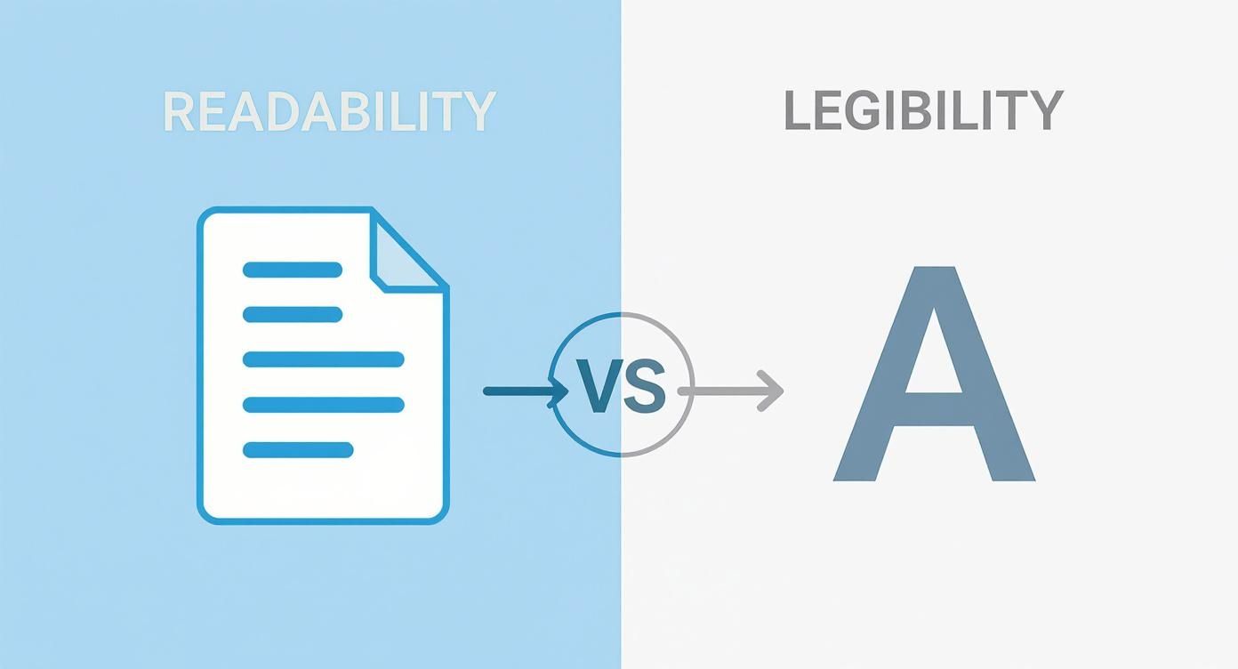
This distinction is key. While a font's individual letters might be clear up close (legibility), its overall design is what makes it comfortable to read in long blocks of text (readability).
The Real-World Impact of Clear Fonts
The importance of choosing easy to read fonts isn't just some abstract design theory; it has real, measurable benefits. The Plain English Campaign, founded way back in 1979, has been banging this drum for decades. Over the years, UK government departments discovered that documents using simple, easy to read fonts like Arial at size 12 or larger saw up to a 50% reduction in complaints from readers about misunderstandings.
Your font choice directly influences how users perceive you and whether they trust you. A well-chosen typeface reinforces your brand identity, improves the user experience, and makes your message more accessible and persuasive.
Ultimately, picking the right fonts is about finding that sweet spot between your brand's personality and the practical need for readability. It’s a foundational decision that strengthens your brand while making sure your audience can actually enjoy what you have to say.
Our Top Picks for Easy to Read Web Fonts
Alright, you've got the theory down. Now for the fun part: picking the actual fonts. Staring at the thousands of options out there can feel a bit like trying to pick a single grain of sand off a beach. It's overwhelming.
To save you the headache, we've put together a go-to shortlist of reliable, easy to read fonts that look fantastic on screens. These are the tried-and-tested workhorses of the web.
We've split the list into two camps: the old-school, dependable web-safe fonts and the sleek, versatile Google Fonts. Every single one has been chosen for its crystal-clear readability, so your message comes through loud and clear, no matter the device.
Timeless Web-Safe Classics
Think of web-safe fonts as the original crew of the internet. They’re pre-installed on just about every computer, which guarantees your text will look exactly how you want it to for virtually every visitor. They’re fast, dependable, and have a rock-solid track record for readability.
Here are two of the absolute best:
Georgia: A serif font that was literally designed for screens. Georgia has a large x-height, which keeps its letters from blurring together at small sizes. It has a traditional but friendly vibe, making it perfect for blogs or sites that want to feel authoritative yet warm.
Verdana: This one's a classic sans-serif known for its wide letters and generous spacing. These features were designed on purpose to make it incredibly legible, even on ancient, low-resolution screens. That quality still makes it a top choice for body text today. Its open, friendly feel is ideal for clear, no-nonsense communication.
Versatile and Modern Google Fonts
Google Fonts is a massive, free library of high-quality fonts built specifically for the web. They’re a breeze to add to any site and offer incredible variety. These are a few favourites that designers absolutely love for their clean looks and killer performance.
LatoLato is a sans-serif that walks the perfect line between professional and friendly. Its semi-rounded letters give it a warm, approachable feel, but its strong structure means it holds up beautifully in long paragraphs. It’s a true chameleon, fitting in on almost any type of website.
Open SansCommissioned by Google itself, Open Sans was engineered for one thing: excellent legibility. It has a tall x-height and open letterforms that create a neutral yet friendly look. This is the kind of "invisible" font that lets your content do all the talking, making it a default choice for body text.
RobotoYou might recognise this one—it’s the default font for Android. Roboto has a geometric structure but with friendly, open curves, giving it a unique "mechanical but human" feel. It was designed to create a natural reading rhythm, which makes it super comfortable for users scrolling through long articles.
The best web fonts are the ones your visitors don't even notice. When a typeface is truly easy to read, the user focuses entirely on the message, not on the letters themselves. This seamless experience is the hallmark of great typography.
To help you decide, we've put our top picks into a simple comparison table.
Recommended Easy to Read Fonts Comparison
This table compares our top recommended fonts, highlighting their style, best use case, and key readability features to help you choose the right one for your website.
Font Name | Type (Serif/Sans-Serif) | Best For | Key Readability Feature |
|---|---|---|---|
Georgia | Serif | Blogs, articles, authoritative content | Large x-height, designed for screens |
Verdana | Sans-Serif | Body text, straightforward communication | Wide characters, generous spacing |
Lato | Sans-Serif | Versatile use, corporate and friendly sites | Semi-rounded letters with strong structure |
Open Sans | Sans-Serif | Body text, user interfaces, minimalist design | Tall x-height, neutral and open forms |
Roboto | Sans-Serif | Body text, mobile apps, tech-focused sites | Geometric skeleton with open curves |
Hopefully, that makes the choice a little less daunting! For more examples and a deeper dive, check out this great list of the 15 Best Fonts For Websites.
Picking any of these fonts will instantly give your website's readability a boost. They create a solid foundation for a clear, engaging user experience. For more expert advice on pulling your site's look together, feel free to explore our other typography tips.
By starting with a proven, easy-to-read font, you're setting your website up for success and making sure your message is accessible and enjoyable for everyone.
Mastering the Art of Font Pairing
Picking one great font is a solid start, but throwing a few together without a plan? That’s how you get visual chaos. Think of font pairing like putting together an outfit; you need pieces that actually complement each other to create a look that feels intentional and polished. Get it right, and you create a clear visual hierarchy that tells your reader exactly where to look.
The golden rule here is to keep it simple. Seriously. Stick to no more than two or three fonts for your entire website. Any more than that, and your design will feel cluttered and unprofessional, overwhelming visitors before they’ve even read a single word. The goal is a seamless experience, not a typographic jumble sale.
Strategies for Successful Font Pairing
You don’t need a design degree to create a brilliant font combination. It usually boils down to one of two dead-simple strategies: go for contrast or stick to consistency. Both can give you stunning, super-readable results.
A classic, highly effective method is to create contrast by pairing a serif headline with a sans-serif body font. The decorative flair of a serif font like Georgia or Merriweather makes it pop perfectly for a title. Meanwhile, the clean, simple lines of a sans-serif like Open Sans or Lato keep the main content ridiculously easy to read. This contrast creates an obvious distinction between different types of text.
On the flip side, you can create a subtle, elegant look by staying within a single font family. For example, use a bold or black weight of Montserrat for your headlines and its regular weight for your body text. This trick, known as pairing by weight, guarantees harmony while still giving you enough difference to guide the reader’s eye.
Font pairing is about creating a visual conversation between different elements on your page. The headline should grab attention, while the body text should feel like a comfortable, easy-to-follow discussion.
Building a Clear Visual Hierarchy
Visual hierarchy is the secret sauce for directing your audience's attention. By playing with size, weight, and colour, you can tell visitors what to read first, what’s most important, and how different bits of information relate to each other.
Here are some quick do's and don'ts to nail it:
Do:
Establish a clear size difference: Your main headline (H1) should be way bigger than your subheadings (H2, H3), which in turn should be bigger than your paragraph text. It’s not rocket science.
Use bold weights for emphasis: Make your headlines bolder than your body text so they jump off the page.
Use colour sparingly for accents: A different colour for links or key call-to-action buttons can draw the eye without creating a mess.
Don't:
Pair two very similar fonts: If the fonts are too alike, it just looks like a mistake. Go for obvious contrast or clear consistency.
Use decorative or script fonts for body text: These are almost always a nightmare to read in long paragraphs. Save them for short, punchy headings if you absolutely must.
Forget about mobile: Always, always check how your font pairings look on a smaller screen. What looks amazing on a desktop can feel cramped and unreadable on a phone.
By pairing your fonts thoughtfully, you turn plain text into a well-organised, professional design that makes your site easier to read and strengthens your brand’s message.
Ready to put these principles into practice on your own Wix site? The expert designers at Baslon Digital can help you choose and implement the perfect font pairings to elevate your brand and improve your user experience. Get in touch with us today to see how we can transform your website's typography.
How to Get Your Fonts Live on Your Website
You’ve picked your fonts, paired them like a pro, and now it’s time for the fun part: bringing them to life on your actual website. This might sound a bit techy, but honestly, with modern website builders, it's simpler than you think. The trick is to start with your global settings to get a consistent, professional look across every single page.
Think of it like this: you set your main headline and body fonts once, and those changes ripple out everywhere automatically. This saves you a massive amount of time and stops your site from looking like a chaotic scrapbook pieced together page by page. Consistency is everything for a smooth user experience.
Most website builders, including Wix, keep these controls in one central spot, usually called "Theme" or "Site Styles." This is your command centre. From here, you can dictate the style of your headings, paragraphs, and links all in one go, making sure your brand identity stays strong and cohesive.
Changing Global Fonts in Wix
To get your chosen easy to read fonts rolled out across your entire Wix site, you’ll need to edit your site's theme. The process is dead simple and gives you total control over your typography, ensuring every last bit of text—from the biggest title to the smallest footnote—is perfectly on-brand.
Here’s how to do it, step-by-step:
Find the Site Design Panel: In the Wix Editor, look for the "Site Design" icon on the left-hand menu. It usually looks like a little paintbrush.
Customise Your Theme: Click on "Site Theme," then hit "Customise." This opens up all the main text and colour settings for your website.
Go to Text Styles: You'll see a "Text" tab. Click it. Inside, you'll find all your heading levels (H1, H2, etc.) and paragraph styles laid out.
Apply Your Fonts: Click on the text element you want to change (let's say "Paragraph 1"). You can then choose your font, tweak its size, and set the weight. Just repeat this for all your heading and body text styles, and you've built a complete, consistent typographic system. Bam.
Here's what the Wix Editor's text theme panel looks like. This is where you'll define the styles for all your headings and paragraphs.
As you can see, you get really granular control. You can set the font, size, and styling for each text type, which is the secret to site-wide consistency.
Adding Custom and Google Fonts
Wix comes with a fantastic selection of fonts, but maybe you have a custom font that’s part of your core branding, or you’ve found the perfect one in the giant Google Fonts library. Good news—you can add them. This gives you way more creative freedom and helps your site stand out from the crowd.
The ability to upload custom fonts is a game-changer for brand consistency. It ensures that the unique typographic voice you've crafted offline can be perfectly replicated online, creating a truly unified brand experience for your audience.
To upload your own font files or pull in more from Google, just head to the "My Fonts" section inside the text editor. It’s a straightforward process that lets you use licensed fonts you've bought or other free ones that aren't included by default. Once they're uploaded, they’ll pop up in the dropdown menu with all the standard options, ready for you to apply globally.
Feeling ready to put your new font strategy into action but want an expert eye to make sure it's perfect? The team at Baslon Digital specialises in creating stunning, readable Wix websites. Contact us today for a design consultation and let's make your website's typography really work for you.
So, What Now? Time to Fix Your Website’s Readability
You’ve made it. You now have all the insider knowledge needed to transform your website’s user experience with typography that actually works. The main takeaways are pretty simple: great readability is the secret sauce for keeping people on your site, it’s all about making smart design choices (not just picking what looks cool), and the right font pairing gives you that polished, professional vibe you’re after.
Honestly, the single most impactful thing you can do right now is to choose one of the many easy to read fonts for your main body text. Don't get stuck in a loop of indecision. A simple switch can make a world of difference in how people see and interact with your content.
Here’s your challenge: go to your website this very second. Look at your current fonts through the lens of this guide and try swapping in one of our recommended options. Check it on your phone and your computer. You’ll see the difference for yourself.
To get the most bang for your buck, make sure your new, super-readable fonts are part of a bigger plan to optimise landing pages for better conversions. After all, a clear font on a well-designed page is a killer combo for success.
Ready to hand this over to someone who does this in their sleep? The experts at Baslon Digital live and breathe this stuff, creating stunning, highly readable Wix websites that get real results. Contact us today and let’s give your site the design and user experience it deserves.
Comments