Sales Funnel Optimization: Unlock Your Business Growth

You've got a website. It looks good. The logo is in the right place, the colours feel on-brand, and a few people are definitely visiting.
But the enquiries are patchy, the cart gets abandoned, or the “Contact Us” page feels like a digital waiting room no one wants to enter.
That's where sales funnel optimization stops being a marketing buzzword and starts becoming a practical fix. A funnel is the route a visitor takes from “I've just found you” to “I'm ready to buy, book, or enquire”. When that route is unclear, slow, or full of tiny annoyances, people leave. Not because your business is bad, but because your website made the next step harder than it needed to be.
The upside is worth paying attention to. Businesses in the UK market that maintain a documented and optimized sales funnel generate 2.3 times more ROI than those without one (marketingltb.com sales funnel statistics). That's the difference between a website acting like a brochure and a website acting like a salesperson who follows up.
If you're also trying to improve how people discover your site in the first place, broader digital promotion can help. For businesses exploring paid exposure in software and tech-focused spaces, Saaspa.ge advertising is one example of a niche visibility channel worth reviewing alongside your own funnel work.
Table of Contents
Mapping Your Funnel and Setting Clear KPIs - The four stages that matter on a small business website - A simple KPI table you can actually use
Diagnosing Leaks Where Customers Disappear - What to look for in your data - Behaviour tools that explain the why
High-Impact Conversion Rate Optimisation Tactics - Write buttons and headlines like they have a job to do - Reduce friction on forms and checkout - Use trust signals where decisions happen
Implementing A Simple A/B Testing Plan - Test one variable at a time - Keep a simple testing log
Automating and Extending Your Funnel - Automate the handoff after conversion - Build for repeat business, not just first-time sales
From Website Traffic to Actual Sales
A lot of small business owners focus on traffic first. That makes sense. More visitors feels like progress.
But traffic on its own doesn't pay invoices. If the homepage is vague, the service page rambles, or the contact form asks for a life story before offering any value, visitors drift off. The funnel breaks long before the sale.
A better question is this: what should a visitor do next, and is that next step obvious?
For a service business, the route might be homepage to service page to enquiry form. For an online shop, it might be product page to cart to checkout. Different business models, same principle. Every page should move people forward, not leave them poking around like they've entered a shop with no signs and no staff.
Practical rule: If a visitor lands on any key page and can't tell what to do within a few seconds, the funnel needs work.
Sales funnel optimization starts by treating your website like a guided journey. Not a collection of pages. Not a design portfolio. A journey. That shift changes how you write headlines, place buttons, build forms, and structure navigation.
Here's the part many businesses miss. Funnel work isn't only about fixing the final checkout or enquiry page. It's about making each step lead naturally to the next one. If your awareness page attracts the wrong audience, your decision page has to work twice as hard. If your decision page feels trustworthy but your form is clunky, the sale still disappears.
That's why the strongest websites feel easy to use. They don't rely on visitors being patient. They reduce hesitation before it shows up.
Mapping Your Funnel and Setting Clear KPIs
Before you start tweaking buttons and rewriting copy, map the route customers take. Not the route you hope they take, but the existing one.
On most small business websites, a practical funnel can be simplified into four working stages: Awareness, Interest, Decision, and Action. That framework is easier to manage than a massive flowchart and still detailed enough to uncover problems.
For B2B websites, patience matters. In the UK, B2B sales funnels typically convert between 1% and 5%, significantly lower than the general 3–10% average, due to longer buying cycles and multi-stakeholder decision-making processes (VWO on good funnel conversion rates). So if you run a consultancy, agency, training business, or specialist service, don't judge your funnel like an impulse-buy snack display at the till.
The four stages that matter on a small business website
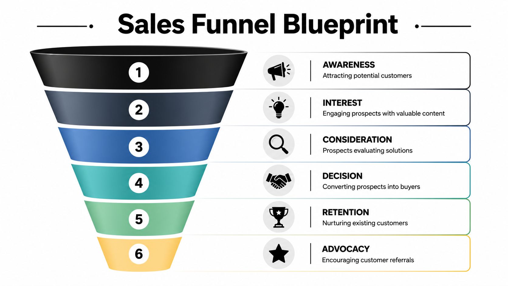
Awareness is how people first discover you. That might be through Google search, social media, a directory listing, a referral, or an ad. On Wix, this stage is influenced by your SEO settings, blog content, page titles, and landing pages.
Interest begins when someone stays long enough to look around. They read your service page, click into pricing, scroll a case study, or browse products. This stage depends heavily on page clarity, mobile layout, and whether the copy answers real questions.
Decision is where people compare, hesitate, and check whether they trust you. At this stage, testimonials, FAQs, delivery details, returns information, portfolio samples, and location signals do real work. A pretty layout helps, but clear evidence helps more.
Action is the conversion step itself. Booking, buying, enquiring, subscribing. At this stage, button labels, form fields, checkout flow, and page speed can make or break the outcome.
If you need a plain-English refresher on what to track inside your site data, this guide on website analytics explained simply is a useful companion before you start measuring each stage.
A simple KPI table you can actually use
You don't need a giant analytics dashboard worthy of a Formula 1 pit wall. You need a few useful indicators tied to each stage.
Funnel Stage | Primary KPI | Example Wix Tool/Feature |
|---|---|---|
Awareness | Landing page visits from search, social, or campaigns | Wix Analytics, SEO Setup Checklist, blog pages, campaign URLs |
Interest | Time on key pages, scroll depth, clicks to service or product pages | Wix Analytics, site search, menu structure, repeaters and sections |
Decision | Clicks on testimonial areas, pricing views, FAQ engagement, add-to-cart or form-start rate | Wix Pro Gallery, testimonials sections, FAQ app, product page layouts |
Action | Completed purchases, completed forms, booked calls, checkout completion | Wix Stores, Wix Forms, Wix Bookings, thank-you pages, automations |
A few rules make this far more useful:
Track one primary action per page: A homepage can introduce several things, but it should still push one main action.
Separate browse pages from conversion pages: Your blog and your checkout page should never be judged by the same standard.
Review mobile first: On many Wix sites, the mobile layout tells the truth faster than desktop does.
A funnel map is only helpful when each stage has one measurable sign of progress.
For example, a photographer might define Awareness as visits to the wedding photography page, Interest as clicks into package details, Decision as viewing testimonials and FAQs, and Action as submitting the booking form. An online gift shop would map the same logic differently. Same funnel. Different path.
The biggest mistake here is setting vague goals like “improve engagement”. Better to ask, “Are people clicking from the homepage into the service page?” and “Are they finishing the form once they start it?” That's actionable. “Engagement” usually isn't.
Diagnosing Leaks Where Customers Disappear
Once the funnel is mapped, the next job is detective work.
Most underperforming websites don't have a traffic problem first. They have a bottleneck problem. Data-driven funnel analysis reveals that funnel bottlenecks are the primary cause of dropped prospects, with regular auditing of each funnel stage allowing UK businesses to identify specific leaks rather than attributing issues to traffic volume (Apollo on sales funnel optimization).
That distinction matters. If lots of visitors reach your service page but very few click the CTA, buying more traffic won't fix the page. It will just send more people into the same hole.

What to look for in your data
Start with a short audit of pages that should move people forward.
Check these first:
Homepage to next click: Are visitors moving into the page you most want them to see?
Service or product pages: Are they clicking enquiry, add to cart, or pricing links?
Cart and checkout flow: Are people dropping off between cart and payment?
Contact forms: Are people starting the form but not finishing it?
A simple way to read this is to compare one step against the next. If people add to cart but don't begin checkout, the problem may be delivery information, pricing clarity, or trust. If they begin checkout but don't finish, the culprit may be account creation, payment friction, or mobile usability.
For shops, allowing people to move quickly matters. This article on checkout as guest is worth a look if your checkout flow feels heavier than it should.
Behaviour tools that explain the why
Analytics tells you what happened. Heatmaps and session recordings help explain why.
Tools like Hotjar and Microsoft Clarity can show whether people are rage-clicking a non-clickable element, abandoning a form on a specific field, or failing to notice a button that looked obvious in the editor but vanished into the design on mobile. Wix users often discover that a layout which feels balanced on desktop becomes awkward once stacked vertically.
Look for patterns, not isolated odd sessions. One confused visitor is normal. A repeated struggle on the same step is a signal.
Common leak patterns include:
Buried CTAs: The button exists, but it's too far down or blends into the page.
Too much choice: Three offers compete when one should lead.
Form fatigue: The user wants to enquire, but your form feels like a tax return.
Trust gaps: Pricing, delivery, credentials, or testimonials are too far from the decision point.
If users keep hesitating in the same place, the page isn't “fine”. It's asking them to do extra work.
That's the heart of diagnosis. Don't guess. Watch what people do, then fix the page they're struggling with.
High-Impact Conversion Rate Optimisation Tactics
Small changes often do the heavy lifting in sales funnel optimization. Not glamorous changes. Usually not the kind that win design awards either.
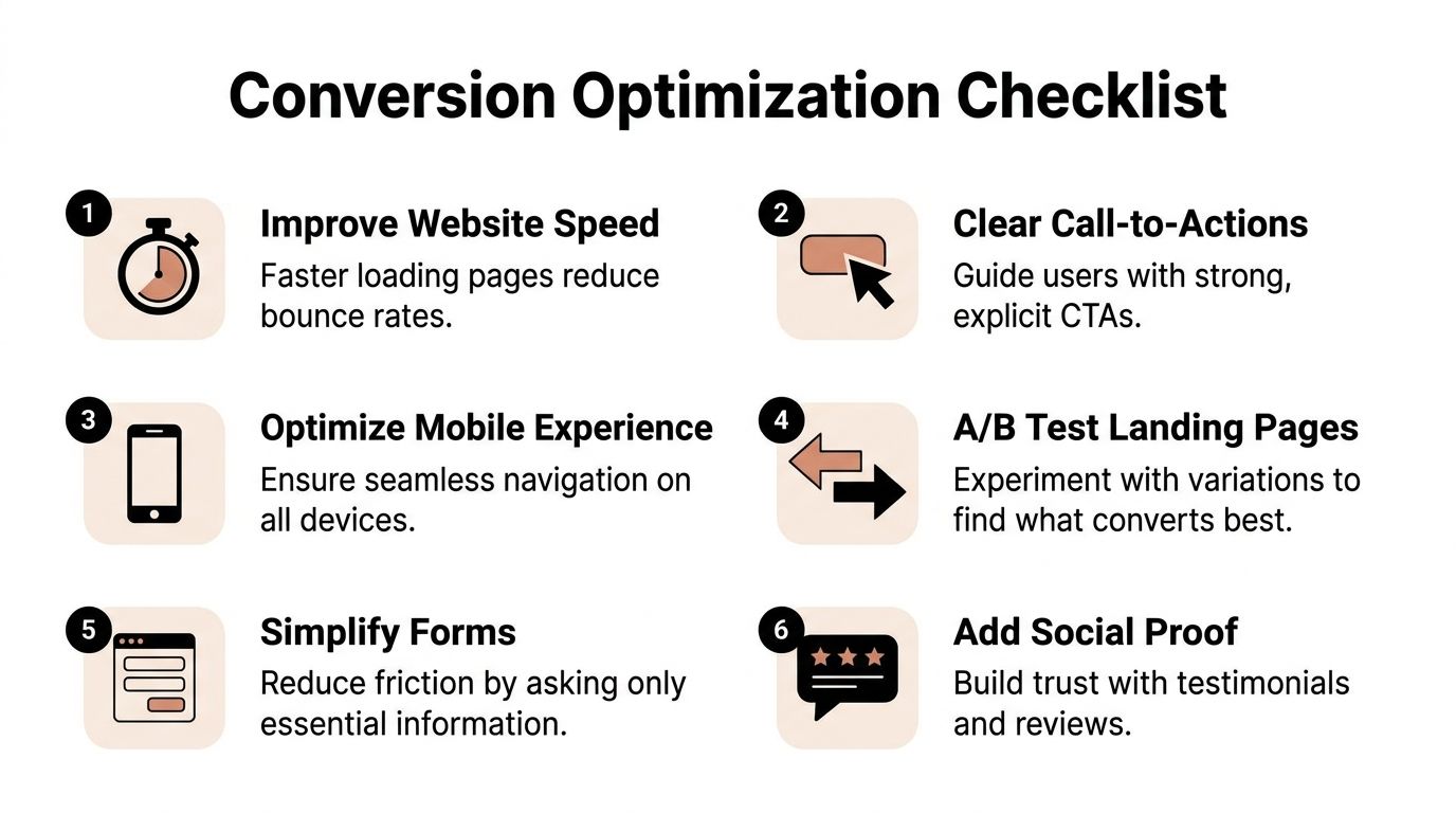
The tweaks that improve conversion are often the ones that remove confusion, lower effort, and answer a question a second earlier than the visitor expected.
Write buttons and headlines like they have a job to do
Buttons shouldn't sound like they were written by a committee that feared commitment.
“Submit” is technically a button label. It's also the digital equivalent of a shrug. On a Wix site, change vague labels into action-led copy that tells people exactly what happens next.
Better examples:
For service businesses: “Get My Quote”, “Book a Discovery Call”, “Check Availability”
For ecommerce: “Add to Basket”, “Buy Now”, “See Delivery Options”
For lead magnets: “Download the Guide”, “Send Me the Checklist”
Headlines matter in the same way. A generic headline such as “Welcome to Our Website” burns valuable space. A clearer one like “Wix Website Design for London Small Businesses” or “Handmade Gift Boxes Delivered Across the UK” gives the visitor a reason to stay.
If you want examples of how focused pages should be built around a single action, this piece on landing pages that actually convert is worth bookmarking.
A strong landing page usually does three things quickly:
States the offer clearly
Shows proof near the offer
Makes the next click easy
Here's a useful walkthrough on the subject:
Reduce friction on forms and checkout
Wix gives you plenty of flexibility with forms, but flexibility can tempt people into overbuilding. More fields do not equal better leads. Sometimes they just equal fewer leads.
This is especially important in trust-heavy sectors. 78% of UK SMBs in professional services report that 3-field forms still cause drop-offs when visitors cannot see verified local case studies or testimonials placed near CTAs (Design Stack on sales funnel optimization). That's the key point. Even a short form can underperform if the surrounding page hasn't earned trust.
Practical fixes on Wix:
Use conditional logic: Ask follow-up questions only after the user gives a relevant answer.
Remove non-essential fields: If you don't need a company name or budget range at first contact, don't ask for it.
Add microcopy: A line like “We'll reply within business hours” can reduce hesitation.
Show progress where needed: Multi-step forms work better when the path feels short and obvious.
For ecommerce, the same principle applies at checkout. Remove distractions, keep payment options visible, and surface delivery and returns information before the final step. A checkout page should feel like a straight path, not an obstacle course assembled by someone who hates weekends.
Use trust signals where decisions happen
This is the tactic people often understand in theory and mishandle in practice.
Trust signals don't work best in a lonely testimonial page hidden in the menu. They work near the point of action. That means beside the enquiry button, under the package summary, near the add-to-cart area, or close to the payment section.
Good trust elements include:
Local testimonials: Especially useful for service businesses working in a specific city or region
Recognisable payment icons: Helpful on product and checkout pages
Portfolio samples or before-and-after visuals: Strong for designers, trades, consultants, and clinics
Plain-language FAQs: Because many objections are ordinary, not dramatic
Put reassurance where doubt appears, not where your designer found spare space.
On Wix, that usually means editing page sections directly around forms and buttons, not stuffing all proof into the footer and hoping people scroll that far. A testimonial slider, a short review strip, or a two-line credibility note can do more beside a CTA than a whole wall of praise tucked away elsewhere.
Implementing A Simple A/B Testing Plan
A/B testing sounds technical, but the working idea is simple. Show version A to one group, version B to another, and compare which performs better.
The mistake is testing too much at once. If you change the headline, image, button colour, layout, and offer all in one go, you won't know what caused the result. That's not a test. That's a makeover.
Test one variable at a time
Keep your first tests painfully simple. That's a compliment.
Good first tests for a Wix site include:
Headline versus headline: One clear promise against another
Button copy versus button copy: “Book a Call” against “Get My Free Quote”
Form length: Short form against slightly longer form
Testimonial placement: Above the CTA versus below it
Hero section image: Product shot versus person-led image
Pick one page with one action. Then choose one thing to test on that page.
A practical example for a service business: Version A says “Contact Us”. Version B says “Get a Free Quote”.
That's a clean test because the page goal stays the same. Only the prompt changes.
Change one thing. Measure one outcome. Keep the test boring enough that the result means something.
Wix users can run this in different ways. Some use dedicated testing tools from the Wix App Market. Others duplicate a landing page and split traffic manually from ads or email campaigns. Either route works if the setup is tidy and the success metric is clear.
Keep a simple testing log
You don't need a massive experimentation framework. A basic spreadsheet is enough.
Track:
What page you tested
What single element changed
What action counted as success
When the test ran
Which version won
What you'll test next
Memory is unreliable. After a few rounds, many businesses forget what they changed and start repeating old experiments under a new name.
A/B testing also works best as a habit, not a one-off event. The best-performing sites keep refining obvious pages over time. Homepage. Service page. Product page. Checkout. Thank-you page. One sensible test at a time.
Automating and Extending Your Funnel
The funnel doesn't end when someone buys or submits a form. That's just the handoff.
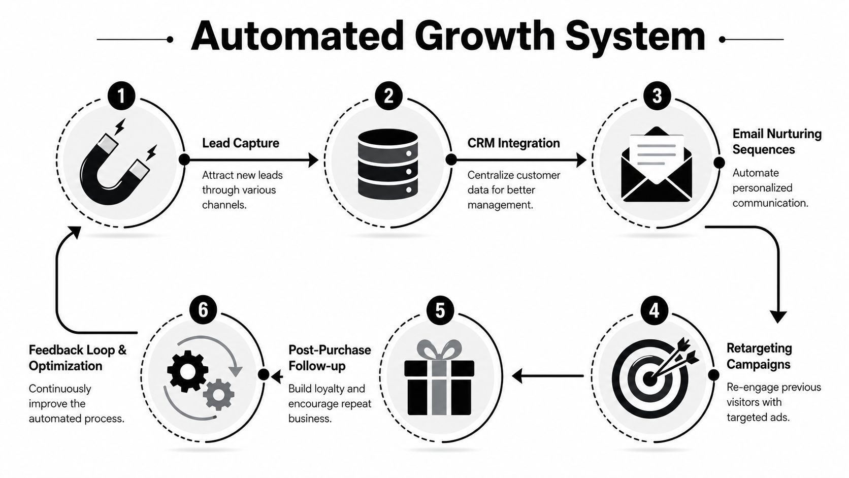
A good funnel keeps working after the conversion by following up, reinforcing trust, and bringing people back when it makes sense. That's where automation earns its keep. Not as a gimmick. As a system that stops leads and customers from going cold the moment they've taken action.
Automate the handoff after conversion
If someone fills in a form and hears nothing, the website has done its bit and the business has dropped the baton.
Wix Automations can help tidy this up. You can set up an instant confirmation email after a form submission, trigger a welcome sequence for new subscribers, or send abandoned cart reminders through Wix Stores. Those automations don't replace human service, but they do remove silent gaps.
Useful automations include:
Enquiry confirmations: Reassure the person that their message arrived
Booking reminders: Reduce no-shows and confusion
Abandoned cart emails: Bring people back to unfinished purchases
Post-purchase emails: Share next steps, care info, or related recommendations
The important part is tone. Automated messages should sound useful and calm. Not like a robot wearing a sales tie.
Build for repeat business, not just first-time sales
Many small businesses often leave money on the table. They work hard to win the first conversion, then go oddly quiet.
That's risky. 71% of UK SMBs lose 40%+ of repeat revenue due to poor post-conversion follow-up, yet post-purchase trust signals placed near action points can increase repeat conversion by 34% (Matomo on conversion funnel optimisation).
The practical lesson is straightforward. Reassurance shouldn't vanish after the sale. Keep trust visible around the next action too.
Examples:
A shop can place review prompts and support information near reorder links.
A consultant can send a short follow-up sequence with FAQs, process details, and a clear path to the next booking.
A therapist, tutor, or coach can guide clients towards the next appointment with clear scheduling instructions and relevant resources.
The strongest funnels feel joined-up. The customer doesn't have to guess what happens after payment, after enquiry, or after delivery. The site and the follow-up make it obvious.
That's how a funnel becomes more than a one-time conversion path. It becomes part of customer experience.
Your Next Step to a Higher-Converting Funnel
A stronger funnel rarely comes from one dramatic redesign. It comes from steady improvements made in the right order.
Map the journey. Diagnose the leaks. Optimise the pages that matter most. Test changes one at a time. Automate the follow-up so momentum doesn't die the moment someone clicks.
That sequence works because it deals with reality. Not assumptions. Not “I think this looks better”. Actual behaviour, actual friction, actual next steps.
If you're doing this in-house, keep it simple. Start with one core path through your website and improve that first. A homepage that leads nowhere, a service page with no proof, or a checkout that asks too much too soon can drag down the whole site.
For broader practical reading around selling and customer retention, curated seller resources can be useful alongside your own funnel reviews.
Sales funnel optimization isn't about tricking people into converting. It's about making it easier for the right people to take the next step with confidence.
If you want expert help turning your website into a clearer, higher-converting sales funnel, Baslon Digital can help with strategy, Wix design improvements, and practical funnel fixes that turn more visitors into enquiries and sales.
Comments