How to Create Landing Pages That Actually Convert
- Baslon Digital

- Oct 23, 2025
- 14 min read
Updated: Oct 27, 2025
Before you even think about picking a colour scheme or writing a single word of copy, we need to talk strategy. A killer landing page isn't just thrown together; it's meticulously planned. Without a solid game plan, you're just building a pretty page that does absolutely nothing.
Let's get the foundations right first. This is where you make the purposeful decisions that will guide every other choice you make.
Setting the Stage for Conversion Success
First things first: what is the one thing you want people to do when they land on this page? I’m serious, just one. Are you trying to get email sign-ups for your newsletter? Pushing registrations for an upcoming webinar? Driving sales for that shiny new product?
Trying to do it all is a recipe for disaster. It confuses visitors, dilutes your message, and kills your conversion rate. Pick one primary goal and stick to it like glue. Everything else is just noise.
Know Your Audience and Your Rivals
Once your goal is crystal clear, it’s time to get inside the heads of the people you’re trying to reach. We need to go deeper than basic demographics. What’s the real problem your UK audience is trying to solve right now? What are their biggest frustrations and what makes them hesitate before clicking "buy"? When you truly understand their perspective, you can frame your offer as the perfect, no-brainer solution they’ve been searching for.
Next up, a little friendly snooping on your competitors. Take a good look at their landing pages. What are they doing well? And, more importantly, where are the gaps you can exploit? Maybe their messaging is vague, their offer is a bit meh, or their design looks like it’s from 2010. This isn’t about copying them; it’s about finding a weakness and making it your strength.
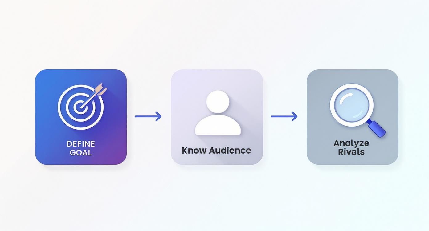
This whole process is about starting with what you want to achieve, then looking outward to what your audience needs and where you fit in the market.
Benchmarking Your Future Success
So, what does success actually look like? Knowing the lay of the land helps set realistic expectations. Here in the UK, the average landing page conversion rate hovers somewhere between 4.3% and 6.6%. Some industries, like finance, knock it out of the park, reaching as high as 15.6%.
And if you’re in the B2B space, you’re in luck—lead generation pages in the UK do exceptionally well, with an average conversion rate of a whopping 13.28%. It's worth diving into the latest landing page statistics to see how your sector stacks up.
The most successful landing pages are born from a clear strategy. Every element—from the headline to the button colour—should be a deliberate choice aimed at achieving a single, well-defined goal.
By nailing these fundamentals, you ensure every decision you make from here on out is intentional and laser-focused on your objective. You're setting yourself up for a win before you've even opened the Wix editor.
Ready to turn this strategy into a high-performing page? Let's get into the design.
Designing a Page That Guides and Persuades
Great design is more than just making things look pretty; it's your silent salesperson, guiding your visitor from "hmm, what's this?" to "shut up and take my money." When you're figuring out how to create a landing page, your number one design goal is clarity. Every single element needs to work together to make the path to conversion feel effortless.
Forget about clutter. Seriously. Your focus should be on creating a powerful visual hierarchy. Think of it as arranging things on the page so your visitor's eye naturally lands on the most important bits first: your killer headline, the juicy benefits, and finally, your call-to-action (CTA). It’s a visual breadcrumb trail leading them exactly where you want them to go.
Master the Art of Simplicity
One of the biggest blunders I see is people trying to cram way too much onto one page. Strategic use of white space—all that glorious empty area around your text and images—is your absolute best friend. It gives your content room to breathe, making it far easier to scan for visitors who are, let's face it, probably in a hurry.
This isn’t just a stylistic choice; it genuinely hits your bottom line. Research from the UK shows that shorter pages with clear, punchy content actually outperform longer, more complicated ones by a whopping 13.5% in conversions. Businesses in tough sectors, like the UK restaurant scene, have boosted their conversion rates to as high as 9.8% just by simplifying their pages. You can dig into the numbers in this landing page statistics report.
Your landing page has one job. Any element that doesn't support that single objective—whether it's a confusing navigation menu, a distracting sidebar, or a random image—is actively working against you.
To get started, let's break down the core components every high-converting design relies on. These are the non-negotiables.
Core Components of High-Converting Design
Here’s a look at the essential design elements and the role they play in getting that all-important click.
Element | Purpose | Best Practice Example |
|---|---|---|
Hero Section | Grab attention instantly and slam-dunk your value proposition. | A punchy headline, a supportive sub-headline, and a top-notch image or video that actually reflects the offer. |
Social Proof | Build trust and show you're the real deal. | Featuring testimonials from happy UK clients, logos of companies you've worked with, or star ratings. |
Benefits-Focused Copy | Explain how your offer solves their specific problem. | Using bullet points to list tangible outcomes and results, rather than just a dry list of product features. |
Clear CTA | Tell visitors exactly what to do next, leaving no room for doubt. | A brightly coloured button with action-oriented text like "Get Your Free Quote" or "Download the Guide Now". |
Getting these pieces right creates a logical flow that makes it easy for visitors to understand what you're offering and why they should care.
Choosing Colours and Images That Build Trust
Before a visitor even reads a single word, your visuals are already talking. The colours you pick should vibe with your brand and stir up the right emotions. For instance, blues often feel trustworthy and secure (hello, finance brands!), while greens are linked with growth and health.
The images you choose have to feel authentic and relevant. Ditch the cheesy, generic stock photos whenever you can. Instead, use high-quality photos of real people—your team or your customers—to build a genuine human connection. This helps visitors see themselves benefiting from what you're offering and makes your brand feel way more trustworthy.
A strong design foundation is crucial, but it's your copy that will ultimately seal the deal. Let's dive into how to write words that truly connect and sell.
Writing Copy That Connects and Sells
Okay, you've got a design that looks the part. Now it's time for your words to do the heavy lifting. The copy on your landing page has one job, and one job only: to convince visitors that you have the exact solution to their problem. It’s all about making a connection, proving your value, and gently nudging them toward that "yes."
This whole dance starts with your headline. It's the first—and let's be honest, sometimes the only—thing people read. It needs to grab them by the collar. A vague or clever-for-the-sake-of-clever headline just won't cut it. It has to scream the number one benefit of your offer.
Think about it. "The Future of Accounting" is forgettable. But "Spend 5 Minutes on Invoicing, Not 5 Hours"? That hits a nerve. It speaks directly to a massive pain point and promises a tangible, oh-so-desirable outcome.
Crafting Headlines That Stop the Scroll
To get your headlines working harder, you can lean on a few tried-and-true formulas. Think of these less as rigid rules and more as starting points to get the creative juices flowing.
The "How To" Formula: "How to Create Landing Pages That Convert Without Writing a Single Line of Code." This instantly promises a new skill while taking away a common fear.
The "Benefit + Timeframe" Formula: "Double Your Email Subscribers in the Next 30 Days." It sets a clear, juicy goal with a specific timeline. Who wouldn't want that?
The "Question" Formula: "Are You Making These Common SEO Mistakes?" This piques curiosity like nothing else. People have to know if they're guilty.
From Features to Benefits
Once your headline has them hooked, the rest of your copy needs to reel them in. A classic rookie mistake is just listing a bunch of product features. Nobody really cares that your software has "AI-driven analytics." What they care about is that it helps them find new customers twice as fast. See the difference?
Always, always frame your copy through the customer's eyes. Ask yourself, "What's in it for them?" The answer is your benefit, and that's what actually sells.
This shift in perspective is everything. To really nail this, our in-depth guide on how to write website content that converts dives much deeper into turning boring features into benefits your audience can't ignore.
The Power of Social Proof
Here’s a secret: people trust other people more than they trust you. Weaving social proof into your copy is one of the most powerful ways to dissolve scepticism and build instant credibility. Don't just hide your testimonials in a dusty corner of the page—integrate them where they'll have the most impact.
Imagine placing a glowing quote from a happy UK client right next to your call-to-action button. And get specific! "This service helped my London-based bakery increase online orders by 40%" is infinitely more persuasive than a bland "Great service!"
Creating a Call to Action That Works
Finally, we arrive at the call-to-action (CTA). This needs to be crystal clear, compelling, and create a sense of urgency. Weak, passive phrases like "Submit" or "Click Here" are conversion killers. You need action-packed language that reinforces the value they're about to get.
Instead of "Download," try "Get Your Free Marketing Guide Now."
Instead of "Sign Up," go with "Start My 14-Day Free Trial."
Your CTA is the final, crucial step in this carefully crafted journey. Make it completely irresistible.
Ready to take your killer copy and actually build the page? Next, we'll walk through bringing your landing page to life with Wix, step-by-step.
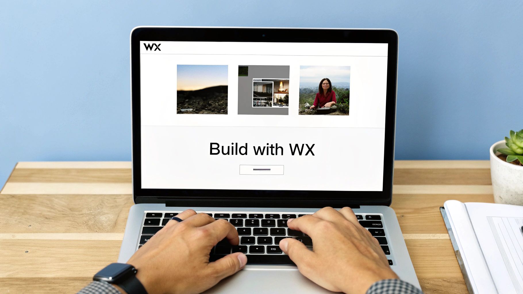
Bringing Your Landing Page to Life with Wix
Right, you’ve got your strategy nailed down, the design is looking sharp, and your copy is ready to persuade. Now for the fun part: making it real. Building your page doesn't have to feel like wrestling with code. A platform like Wix completely removes that technical headache, letting you focus on what really matters—bringing your vision to life with simple drag-and-drop tools.
Your first move is picking a template. Wix has a massive library, but don't just grab the first one that looks pretty. You need to find a template whose layout already supports your one and only conversion goal. If you're chasing leads, for instance, look for a template with a big, bold form right in the hero section. It just makes sense.
Once you’ve found your starting point, the real work begins: customisation. This is your chance to inject your brand's personality into every pixel. Ditch the placeholder text and drop in your killer headlines and benefits-focused copy. Switch up the colour scheme to match your brand palette and upload your own authentic images. For a deeper dive into what the platform can really do, check out our guide on [getting started with Wix Studio](https://www.baslondigital.com/post/getting-started-with-wix-studio).
Optimising for Every Visitor
Now let’s get into the technical bits that make a huge difference. Your landing page absolutely must look and work perfectly on any device, especially mobile. In the UK market, mobile traffic is king, accounting for over 70% of visits to retail and e-commerce pages. The problem? Mobile conversion rates often lag way behind desktop, which points to one glaring issue: loads of pages just aren't properly optimised.
A clunky or slow-loading mobile page can send nearly half your audience running for the hills, making responsiveness a total non-negotiable. You can find more details in this UK conversion optimisation report.
Inside the Wix editor, constantly use the mobile view toggle to check and tweak your layout. Elements that look fantastic on a desktop can quickly become a crowded mess on a smaller screen.
A seamless mobile experience isn't just a nice feature; it's a fundamental requirement for conversion. Test your page on an actual smartphone to make sure buttons are easy to tap and forms are a breeze to fill out.
Finally, get your lead capture form set up. Keep it simple—seriously. Only ask for the information you absolutely need right now. The more fields you add, the more you can watch your conversion rate plummet. Connect the form to your email marketing service so new leads are automatically funnelled into your workflow.
Before you hit that big "Publish" button, run through this final checklist.
Fast Load Times: Compress your images before you upload them. Huge image files are the number one culprit behind slow-loading pages.
Basic On-Page SEO: Pop into the Wix settings for your page and add a clear title tag and meta description. This is how you tell search engines what your page is all about.
Proofread Everything: Typos and grammar mistakes scream unprofessional. Read every single word out loud—it's the best way to catch those sneaky errors.
With these practical steps ticked off, you're all set to launch a professional, high-performing landing page that’s actually built to do its job.
Are you ready to build a stunning Wix website that not only looks incredible but also drives real results for your business? [Contact Baslon Digital today for a free consultation!](https://www.baslondigital.com)
Testing and Refining for Continuous Improvement
Hitting "publish" on your new landing page isn't the finish line; it’s the starting block. Let's be honest, the best landing pages are never truly "finished." They’re living, breathing things that evolve based on real user data, turning good results into great ones through a constant cycle of testing and tweaking.
Adopting this mindset of continuous improvement is what separates pages that just sit there from those that consistently smash their targets. You’d be amazed how small, data-driven changes can lead to huge uplifts in conversions over time. This is where you stop guessing what works and start knowing what works.
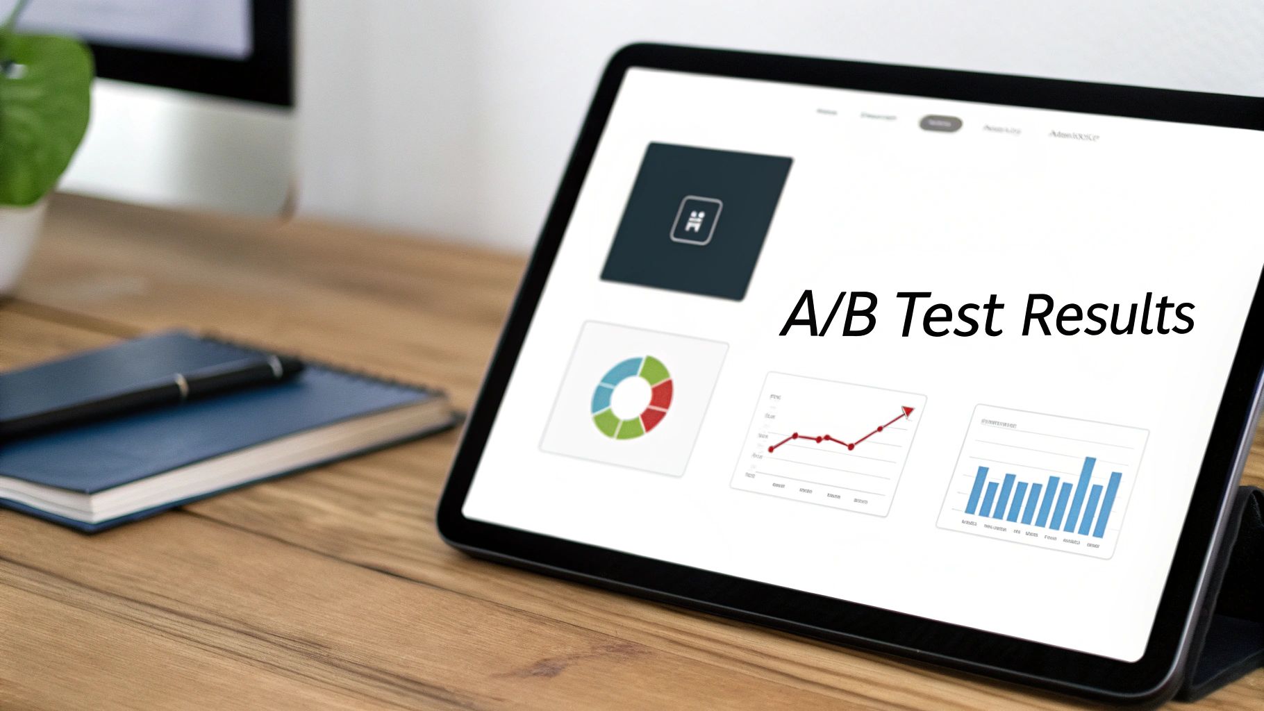
The cornerstone of this whole process is A/B testing, sometimes called split testing. It sounds a bit technical, but the concept is beautifully simple. You just create two versions of your page (an 'A' and a 'B'), change just one single element on Version B, and see which one performs better.
Mastering the Art of the A/B Test
The golden rule of A/B testing is to only test one variable at a time. Seriously. If you change both the headline and the button colour, you'll never know which change actually made the difference. Was it the brilliant new copy or the flashy orange button? You'll have no idea. Patience is everything here.
Start with the elements that are most likely to have a big impact on conversions. These are your "big rocks":
Your Main Headline: Does a benefit-focused headline ("Triple Your Leads in 30 Days") outperform a question ("Struggling to Find New Leads?")?
The Call-to-Action (CTA) Text: Test something simple like "Get Your Free Quote" against a more urgent "Request My Consultation Now." The phrasing matters more than you think.
The Hero Image: Does a picture of a smiling person using your product work better than a clean shot of the product itself?
Button Colour: It sounds trivial, but sometimes a simple switch from your standard brand blue to a high-contrast orange can make a surprising difference.
Once you have a clear winner, that version becomes your new baseline (your new 'A'), and you can move on to testing another element. For a deeper dive into this, you should explore these [powerful conversion rate optimisation tips for 2025](https://www.baslondigital.com/post/8-powerful-conversion-rate-optimization-tips-for-2025).
Optimisation isn't a one-off task; it's an ongoing strategy. Every test, whether it wins or loses, gives you a valuable insight into how your audience thinks and what makes them tick.
Tracking the Metrics That Actually Matter
To figure out which version of your page is winning, you need to be looking at the right data. It's easy to get lost in vanity metrics, so focus on the numbers that directly tell you if your page is doing its job.
Conversion Rate: This is your North Star. It’s the percentage of visitors who actually did the thing you wanted them to do (like filling out your form). A higher conversion rate is the ultimate sign of a successful test.
Bounce Rate: This number shows you the percentage of people who land on your page and leave without doing anything at all. A high bounce rate could be a red flag that your headline or opening message just isn't grabbing them.
Time on Page: How long are people sticking around? If visitors are leaving in a few seconds, your copy probably isn't engaging enough to hold their attention.
By consistently testing, analysing these key metrics, and refining your approach, you create a powerful feedback loop. This cycle of improvement is fundamental to building landing pages that don't just look good, but actually lead the pack.
Ready to take the next step in building your online presence? [Let Baslon Digital design a stunning, high-converting Wix website for your business.](https://www.baslondigital.com/contact)
Your Landing Page Questions Answered
Even with the best plan in the world, once you start getting your hands dirty building a landing page, questions always seem to pop up. Let's tackle some of the most common ones that crop up when you're trying to figure out how to create pages that actually convert.
Think of this as your go-to cheat sheet for navigating those nagging doubts. Getting these details right is what separates a pretty page from a profitable one.
Can a Blog Be Used as a Landing Page?
This one comes up a lot, and it's a classic point of confusion. Technically, sure, you can send ad traffic to your main blog feed. But should you? Absolutely not.
Your blog page is built for browsing. It's packed with delicious distractions—sidebars, navigation menus, links to a dozen other articles. It's an all-you-can-eat buffet.
A proper landing page is a single-course meal with one purpose. It ruthlessly strips away all those distractions to laser-focus the visitor on one specific action, like downloading your new guide. For any real business goal, a dedicated landing page will beat a blog post every single time.
How Many Landing Pages Do I Need?
Ah, the million-dollar question. The honest answer? It depends entirely on your campaigns. There’s no magic number.
Best practice is to create a unique, tailored landing page for every single offer, every audience segment, and every traffic source. Running different Google Ads for separate services? Each one needs its own landing page. It's non-negotiable.
This lets you perfectly match your page's message to what the user was searching for. A HubSpot study found that businesses rocking 31 to 40 landing pages pulled in 7 times more leads than those with just a handful. More pages equal more chances to connect.
What Makes a Landing Page Fail?
Even the most beautiful landing page can fall completely flat. Knowing the common culprits is the first step to making sure yours doesn't join the graveyard of failed pages.
The number one killer of conversions is a mismatch between your ad and your landing page. If someone clicks an ad promising "50% Off Summer Dresses" and they land on your generic homepage, they're gone. Instantly. The scent must be consistent from click to conversion.
Other frequent offenders include:
Glacially slow page speed: Every second is an eternity online. People will not wait around.
A muddy offer or weak headline: If they can't figure out what you're offering in three seconds, you've already lost.
Too many CTAs: Asking visitors to do five different things at once leads to them doing nothing at all. Stick to one goal.
A design that breaks on mobile: A massive chunk of your traffic is on their phone. If your page looks like a mess, you're throwing money away.
Nailing these fundamentals will put you leagues ahead of the competition, creating pages that don't just look good, but consistently deliver the goods.
Still have questions? No problem. We've put together a quick-reference table to answer a few more common queries that pop up during the landing page creation process.
| Frequently Asked Questions || :--- | :--- || Question | Answer || How long should a landing page be? | As long as it needs to be to convey the value proposition and persuade the user. For a simple email sign-up, short is fine. For a high-ticket service, you'll need more detail, social proof, and FAQs. || Should I have a navigation menu? | Generally, no. Removing the main navigation menu eliminates exit points and keeps the visitor focused on the single conversion goal of the page. || What's the ideal conversion rate? | It varies wildly by industry, offer, and traffic source. Average conversion rates often fall between 2-5%, but highly optimised pages can achieve 10% or more. Focus on continuous improvement rather than a single number. || Can I use a video on my landing page? | Absolutely! A well-produced video can significantly boost engagement and conversion rates. Just make sure it's short, to the point, and supports the primary message of the page. |
Hopefully, this gives you a clearer picture of what it takes to build a landing page that works hard for your business.
Ready to build a stunning, high-converting Wix website that captures leads and grows your business? The team at Baslon Digital specialises in creating custom websites that drive real results.

Comments