How to Improve Conversion Rate on Website A Practical Guide
- Baslon Digital

- Dec 12, 2025
- 15 min read
Right, before you even think about tweaking buttons or rewriting headlines to get more conversions, you need to know where you're starting from. It's a bit like trying to get directions without knowing your current location – you can drive around all day, but you'll never know if you're getting any closer.
This is all about ditching the guesswork and getting a solid, data-backed foundation for everything you do next.
Figuring Out Your Conversion Baseline
First things first, what does a 'conversion' actually mean for your business? It's not always a sale, especially for freelancers or service-based businesses.
A conversion is simply any valuable action a visitor takes that inches them closer to becoming a customer.
Let's break it down:
For an e-commerce shop: This one's easy – a completed purchase. Cha-ching.
For a service business (like a freelancer or agency): A submitted contact form or a booked consultation call is gold.
For a blogger or creator: A new email newsletter subscription.
For a software company: Someone signing up for a free trial or requesting a demo.
Whatever your key action is, you need to track it. If you haven't already, get into Google Analytics and set up these actions as 'Goals'. This is how you turn fuzzy visitor behaviour into a hard number you can actually improve.
How to Calculate Your Current Conversion Rate
Doing the maths is straightforward. Here’s the formula:
(Total Number of Conversions / Total Number of Visitors) x 100 = Conversion Rate (%)
So, if your Wix website had 5,000 visitors last month and 100 of them filled out your contact form (your big conversion goal), your conversion rate is 2%. Simple. This little percentage is the most important number in your entire optimisation journey. It tells you, point-blank, how well your website is doing its job.
Don't panic if your number feels low. Seriously. The average website conversion rate usually sits around 2-3%. The aim isn't to magically hit double digits overnight; it's to establish a starting line that you can consistently push forward from.
Is Your Conversion Rate "Good"? Putting It in Context
Knowing your own conversion rate is one thing, but understanding how it stacks up is another. This is where industry benchmarks come in handy. Performance can be wildly different depending on your sector because customer journeys and buying habits vary so much.
A quick look at recent UK data shows just how much things can differ.
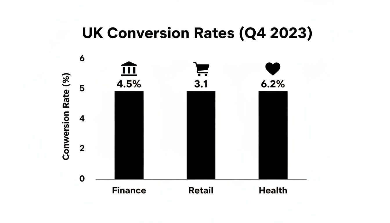
As you can see, some industries naturally have higher conversion rates than others. This helps you set realistic goals and understand the field you're playing on.
To give you an even clearer picture, here’s a breakdown of how different UK industries are performing.
UK Conversion Rate Benchmarks by Industry
A comparative look at average conversion rates across key UK sectors, helping you contextualize your website's performance against the competition.
Industry / Traffic Source | Average UK Conversion Rate | Top 25% Performers |
|---|---|---|
Finance | 4.5% | 9.8% |
Retail & E-commerce | 3.1% | 6.5% |
Health & Wellness | 6.2% | 12.1% |
B2B Services | 2.8% | 5.9% |
Travel & Hospitality | 3.9% | 8.2% |
Seeing these numbers helps you understand what's achievable and where the high-performers in your space are operating. Having this solid baseline is the first, most critical step toward building a website that doesn't just look good, but actually works for your business.
Ready to find out exactly where your website's friction points are? Our free website audit can pinpoint the key areas holding back your conversions.
Optimizing for Speed and Mobile Users
In a world where attention spans are shorter than a TikTok video, a slow website is the quickest way to kill a sale. Every single second your site takes to load is another reason for a potential customer to give up and go elsewhere. This isn't just a minor annoyance; it's a direct hit to your wallet.
The numbers don't lie. Research shows that shaving just one second off your page load time can boost conversions by a whopping 2%. When you think about how slow speeds cost UK businesses an estimated £2.5 billion a year in lost sales, you realise speed isn't just a nice-to-have. It’s absolutely essential.
Your Practical Speed Audit Checklist
Good news: you don't need to be a coding genius to make your site faster. Especially if you're on a platform like Wix, many of the biggest improvements are surprisingly straightforward.
Here’s what you can do right now to get things moving quicker:
Shrink Your Images: Seriously, this is the #1 culprit for slow websites. Massive, unoptimised images will bring your site to a screeching halt. Use free tools like TinyPNG or Squoosh to cut down file sizes without making your photos look terrible. That gorgeous high-res photo is useless if no one sticks around long enough to see it load.
Use Browser Caching: This is a clever trick that tells a visitor's browser to save parts of your site (like your logo and fonts). The next time they visit, those bits load instantly. Most modern platforms, Wix included, handle this for you, but it’s worth double-checking that it’s working.
Ditch Unnecessary Apps: That live chat widget you never use? The third-party social media feed that looks cool but no one clicks on? Each one adds extra code that slows your site down. Be ruthless. If an app isn't directly making you money or improving the user experience, get rid of it.
Pro Tip: Pop your URL into Google's PageSpeed Insights. It's free and will give you a score plus a list of exactly what you need to fix for both desktop and mobile. No guesswork required.
Designing for the Mobile-First Reality
A fast site is only half the battle. If your website looks like a hot mess on a phone, you're still losing customers. More than half of all internet traffic now comes from mobile devices, yet mobile conversion rates are often way behind desktop. Why? Because most mobile sites are a pain to use.
A proper mobile-first approach isn’t about just shrinking your desktop site down. It’s about designing for the thumb.
Key Elements of a High-Converting Mobile Design
Make Buttons Tappable: Your calls-to-action should be big, bold, and have plenty of breathing room. If someone has to pinch and zoom just to click "Add to Cart," you've already lost them.
Simplify Your Navigation: Forget those complicated dropdown menus that are impossible to use on a small screen. A clean "hamburger" menu is your best friend. Prioritise your most important pages and make them easy to find.
Create Frictionless Forms: Nobody enjoys typing on a phone. Keep your forms as short as humanly possible—ask only for what you absolutely need. Use larger fonts and turn on autofill to make checking out a breeze.
Think About the Thumb Zone: Most people browse one-handed, using their thumb to navigate. Place your most important buttons and links where their thumb can easily reach them—usually in the centre and bottom half of the screen.
Keeping your site fast and mobile-friendly is an ongoing job, not a one-and-done task. For Wix users, our guide on Wix website maintenance offers a simple routine to keep everything running smoothly.
Curious to see how your site stacks up? Our free website audit will give you a detailed report, showing you exactly what's slowing you down and how you can fix it.
Building a Foundation of Trust and Credibility
Think about the last time you bought something online from a brand you'd never heard of. What was it that tipped the scales and made you feel confident enough to punch in your card details?
Chances are, it was a bunch of small signals that told your brain, "this is a legitimate, trustworthy business." Without that bedrock of trust, even the most slickly designed website is going to fall flat on conversions.

It's dead simple: people buy from businesses they trust. Nailing your conversion rate isn't just about fast loading times or clever copy; it's about making your visitors feel safe and secure. Every single element on your site either builds that confidence or slowly chips away at it.
Harness the Power of Social Proof
One of the most potent psychological tools in your arsenal is social proof. When we see that other people have already bought from you and had a good experience, our own hesitation just melts away. It’s a shortcut to credibility.
You've got to be strategic and showcase this proof where it counts—on your homepage, product pages, and right next to those "buy now" buttons.
Authentic Customer Reviews: Don't just slap up five-star ratings. A healthy mix of detailed, honest reviews (even a few four-star ones) feels far more genuine. Integrate a reviews platform that shows off real feedback from real people.
Detailed Testimonials: Go beyond a simple quote. A testimonial with a customer’s full name, their photo, and a specific story about how you solved their problem is incredibly persuasive.
Case Studies: If you’re a service-based business, a detailed case study is the ultimate trust signal. It walks a potential client through the problem, your solution, and the brilliant results you delivered.
Building credibility isn't a one-off task; it's an ongoing process of showing, not just telling, that your business is reliable. Authentic social proof can increase conversion rates by as much as 270% because it answers the visitor's unspoken question: "Can I trust you?"
Display Your Trust Signals
Beyond what your customers are saying about you, your website needs its own set of credentials. These are the visual cues that reassure visitors their connection is secure and their data is safe. Think of them as the non-negotiables for any site that handles personal info or payments.
This is something you see major brands do all the time—they plaster the logos of their own happy customers all over their site to build instant credibility.
Displaying logos from well-known clients acts as a powerful, immediate endorsement. It tells new visitors you're a trusted partner in your industry without you having to say a word.
Commit to Radical Transparency
Finally, trust is built on honesty. Being upfront and clear about your processes and policies gets rid of uncertainty and prevents any nasty surprises that send customers running for the hills.
Here’s what every visitor needs to see:
SSL Certificate: That little padlock in the address bar is non-negotiable. It signals a secure connection, and browsers will actively warn users away from sites that don't have one.
Secure Payment Logos: Displaying familiar logos like Visa, Mastercard, and PayPal right at the checkout is a powerful visual reassurance.
Clear Policies: Your shipping and returns policies should be ridiculously easy to find and understand. Don't bury them in the footer.
Accessible Contact Info: A business with a physical address and a clear phone number just feels more real and accountable. You can learn more about how we do this by checking out the story of Baslon Digital.
By weaving these elements of social proof, security, and transparency into your website's DNA, you create an environment where visitors feel confident enough to click that button.
Crafting High-Converting Copy and CTAs
Your website's design, speed, and fancy trust badges might get people to show up, but it's your words that actually make them stay and buy. Think of your website copy as your best salesperson—one who works 24/7 without needing a coffee break. If that salesperson is boring, you're leaving cash on the table.
It all boils down to a simple shift in mindset. Stop talking about what your product or service is. Start screaming from the rooftops about what it does for your customer. Nobody buys a drill because they want a drill; they buy a drill because they want a hole in the wall. That tiny pivot from features to benefits is where persuasive copy is born.
Speak Your Customer’s Language
Want to know the fastest way to improve your conversion rate? Write copy that sounds like it was stolen directly from your ideal customer's brain. You need to use their words, nod along with their frustrations, and frame your offer as the only logical next step.
To pull this off, you have to become a bit of a detective. Where are they stuck? What drives them nuts? What are they secretly wishing for?
Here’s how you find out:
Read Customer Reviews: Stalk your own reviews and, more importantly, your competitors'. What exact phrases do people use when they're thrilled? Or furious? That's pure gold.
Scour Forums and Social Media: Find out where your people hang out online. Is it a subreddit? A niche Facebook group? Listen to how they describe their problems when they think no one is selling to them.
Just Talk to Them: Seriously. If you have customers, get them on a quick call. The insights you'll get into the language that actually connects with them are priceless.
Once you have this intel, inject it straight into your headlines and body copy. Instead of a bland, corporate statement like "Our software is efficient," hit them with something that reflects their pain: "Stop wasting hours on manual admin." See the difference? One is a feature; the other is a solution.
Write Headlines That Stop the Scroll
Your headline has one job: to get the first sentence read. That’s it. Most people scan websites like they're looking for a lost cat—quickly and with purpose. A weak headline means all that brilliant copy you wrote below it might as well be invisible. A headline has to scream value and make an immediate promise.
Let's say you're a freelance web designer. You could have a headline that says, "Professional Web Design Services." Yawn. Or you could have one that says:
"Get a Wix Website That Actually Brings You Clients"
This headline just works. It's specific, it’s laser-focused on the benefit, and it speaks to the real reason someone wants a website—to get more clients, not just to have a pretty online brochure. It promises a tangible result, which is what grabs attention and makes people care.
Deconstructing the Perfect Call-to-Action
Your Call-to-Action (CTA) is the grand finale. It's the moment of truth where the conversion actually happens. Vague, lazy CTAs like "Submit" or "Click Here" are conversion killers. They create hesitation and uncertainty. A brilliant CTA, on the other hand, is clear, urgent, and makes the user feel smart for clicking.
The secret? Use action-packed words that complete the phrase, "I want to..."
Let's break it down:
Instead of: Submit
Try: Get Your Free Quote Now
Instead of: Sign Up
Try: Claim My 10% Discount
Instead of: Learn More
Try: See Plans and Pricing
Notice how the better versions are specific and dangle a little carrot? They tell the user exactly what they're getting. Colour makes a difference, too. There's no single "magic" colour, but your CTA button needs to have high contrast with its background. It has to pop. Orange and green are popular for a reason—they stand out against most site designs.
Placement is also key. Don't just slap a CTA anywhere. Put it right where the user is most likely to think, "Okay, I'm convinced." Usually, that’s right after you’ve laid out all the juicy benefits of your offer.
Getting your copy and CTAs right is a game of listening, tweaking, and testing. If you want a second pair of expert eyes on your website to spot where the words might be letting you down, you can book a free 30-minute meeting with us. We’d love to chat about your site’s potential.
Designing a Checkout So Smooth They Can't Help But Buy
You’ve done all the hard work. You’ve wooed them with brilliant copy, built up trust, and led your visitor right to the finish line. They’re poised at the checkout or ready to fill in your contact form... and then, poof. They vanish.
This is the final, most treacherous hurdle, and it's where an unbelievable number of sales and leads simply disappear into thin air. A clunky, confusing, or just plain annoying process can sabotage everything you’ve achieved in a matter of seconds. The mission here isn't just to make it look nice; it's to make this final step so absurdly easy that your user glides through it without a second thought.
Cut the Clutter: Why Your Forms Are Scaring People Away
Every single box you ask someone to fill in is a tiny moment of friction. A little bit of work. While some are essential, many businesses are guilty of asking for way too much information upfront. It's a proven conversion killer—studies show 27% of users will ditch a form if it’s too long or complicated.
It’s time to be ruthless. Go through every field on your forms and ask yourself one simple question: "Do I really need this information right now?"
Lead Forms: Do you honestly need their company name and inside leg measurement on the first contact? Probably not. A name and an email address are usually all it takes to get the ball rolling.
Checkout Pages: Can you let the billing address automatically copy from the shipping address? Can you use a postcode lookup to fill in the address fields for them? These small wins make a massive difference to the user experience.
Expert Insight: Here's a little story. Expedia famously boosted its profits by a staggering $12 million just by deleting one single field from its booking form. That’s not a typo. It’s proof that making the user's job easier is one of the most powerful levers you can pull for better conversions.
Tackling the Biggest Checkout Killers
For anyone selling online, the checkout page is a minefield. According to the Baymard Institute, the average cart abandonment rate is hovering just under 70%. Think about that. Seven out of every ten shoppers who add something to their cart leave without buying. The good news? Most of the reasons are completely fixable.
The biggest culprits are almost always nasty surprises and unnecessary demands that pop up at the very last second. For fashion e-commerce, helping customers overcome that "will it actually suit me?" hurdle is huge. This is where clever tools like AI Clothing Try On technology come in, giving shoppers the confidence to click "buy" long before they see the payment form.
Here are the top offenders you need to eliminate from your checkout process, like, yesterday:
Surprise Shipping Costs: This is the undisputed champion of cart abandonment. Nobody likes a last-minute fee. Be crystal clear about shipping costs from the get-go. Even better, offer a clear threshold for free shipping (e.g., "Free shipping on all orders over £50!").
Forcing Account Creation: Making someone create an account before they can give you their money is a massive conversion roadblock. Always, always offer a guest checkout option. You can gently nudge them to create an account after the purchase is complete, but never hold their order hostage.
Limited Payment Options: Don't just assume everyone has a Visa card. Integrating digital wallets like PayPal, Apple Pay, and Google Pay can give your conversion rate a serious bump. They’re faster, often feel more secure, and let people pay with just a click or a fingerprint.
Add a Little Reassurance at the Finish Line
Once you've stripped out all the friction, the final step is to add a few touches that actively reassure the user and make them feel good about their decision.
A progress bar is a brilliant little psychological trick. Seeing "Step 2 of 3" instantly calms nerves by showing people exactly where they are and that the end is in sight. It turns a daunting task into a manageable one.
Finally, double down on trust right where it matters most. Display your security seals (like your SSL certificate badge) and the logos of accepted payment methods prominently on the checkout page. A simple reminder of your money-back guarantee or easy returns policy at this final stage can be the last little nudge they need to complete their purchase with confidence.
Wondering if your checkout process is secretly costing you sales? Book a free website audit and we'll dig in to find the exact friction points that are holding you back.
Your CRO Action Plan and Next Steps
Alright, we've covered a lot of ground. But all this knowledge is useless unless you actually do something with it.
Don't feel overwhelmed. Think of conversion rate optimisation as a constant cycle—a process of making small, smart tweaks, seeing what happens, and doing more of what works. You don’t need to tear down your entire website overnight.

The secret is to start small and build up some momentum. If you're looking for even more ideas to get the ball rolling, check out these additional Conversion Rate Optimization tips.
Your High-Impact Quick Wins
Want the fastest way to get started? I mean, right now? Here are a few high-impact, low-effort changes you can make today to see an immediate lift.
Fix Your Main CTA: Is your main button a bit... boring? Change vague text like "Submit" to something specific and benefit-driven. Try "Get Your Free Quote Now" and see what happens.
Add One Killer Testimonial: Go find your best customer review. Now, stick it right next to your main call-to-action or on your checkout page. Social proof is ridiculously powerful.
Kill One Unnecessary Form Field: Seriously. Go to your contact form or checkout page and delete one field that isn't absolutely essential. Expedia famously made an extra $12 million a year just by removing a single, optional field from their form.
Conversion Rate Optimisation isn't a one-and-done project; it's a mindset. The real goal is to build a culture of constant improvement, where every little change is a chance to learn more about your customers and serve them better.
Your journey to a website that actually converts begins with just one step. Pick one thing from this guide—one of these quick wins, one copy tweak, one A/B test—and just do it. Today.
Ready to find out exactly where your biggest growth opportunities are hiding? Book a free, no-obligation website audit with our team. We'll show you the low-hanging fruit you've been missing.
Still Got Questions?
Diving into conversion rate optimisation can feel like opening a can of worms. Let's tackle a couple of the most common questions that pop up when freelancers and small businesses start this journey.
What’s a “Good” Conversion Rate, Anyway?
Honestly, that’s the million-dollar question, and the answer is… it depends. There's no single magic number that fits everyone.
A "good" conversion rate is massively influenced by your industry, what you're selling, and where your traffic is coming from. People often throw around a typical range of 2-4%, but that figure can be wildly misleading. A quirky e-commerce shop selling handmade cat jumpers might hit a much higher rate than a B2B consultant with a six-month sales cycle.
My advice? Forget industry averages for a second. The best thing you can do is figure out your own baseline—what’s your conversion rate right now? Once you know that, your goal is simple: beat it. A steady, month-on-month improvement is way more valuable than chasing some generic number you found on a blog.
Stop obsessing over a universal benchmark and focus on outperforming your past self. A 10% increase on your current conversion rate, whatever that number is, is a huge win and a perfectly realistic target to aim for.
How Long Until I Actually See CRO Results?
Ah, another classic. The timeline for seeing a return on your optimisation efforts really varies. Some tweaks can give you a boost almost overnight, while others are more of a slow burn.
You’ve got two main categories of changes:
The Quick Wins (think days or weeks): Simple A/B tests can deliver results fast. I’m talking about things like changing the text on your main call-to-action button or slapping a killer customer testimonial right on your checkout page. You can often see a measurable impact in just a few days.
The Long Game (think months): Bigger projects, like a complete overhaul of your product pages or a major effort to speed up your entire site, naturally take longer. You need more time to not only implement the changes but also to collect enough data to know for sure if they worked.
Patience is your best friend here. The most important thing is to get into a rhythm of testing, measuring, and learning from every single change you make.
Ready to stop guessing and start getting real results? The team at Baslon Digital lives and breathes this stuff, creating high-performing Wix websites that turn casual visitors into loyal customers. Let us show you what's possible with a free, no-strings-attached website audit.
Comments