Contact Us Page Design: Convert More with a Proven Layout
- Baslon Digital

- Nov 7, 2025
- 13 min read
Updated: Nov 10, 2025
Let’s be honest, most ‘Contact Us’ pages are an afterthought. They’re often treated like a dusty digital filing cabinet—a place to dump an email address and a generic form. This is a massive missed opportunity. Your contact page isn't just a utility; it's one of the most powerful conversion tools on your entire website.
Why Your Contact Us Page Is a Conversion Powerhouse
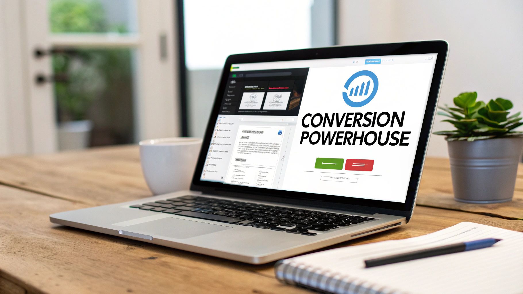
Think about it. When someone lands on your contact page, they're actively trying to connect. They have a question, a problem, or a project in mind. This is a high-intent, make-or-break moment.
A clunky, confusing page can stop that connection dead in its tracks. In fact, a staggering 44% of website visitors will simply leave if they can't find contact information easily. You’re literally turning away warm leads.
More Than Just a Form
A well-thought-out contact page does so much more than just collect messages. It's a strategic touchpoint that directly contributes to your bottom line.
Here’s what a great page actually accomplishes:
Builds Instant Trust: Showing multiple, clear contact options—like a phone number, a physical address, and dedicated emails—proves you're a real, accessible business.
Qualifies Leads for You: The structure of your form can intelligently sort enquiries. Sales questions go straight to the sales team, and support issues head to the support desk. Simple.
Stops User Frustration: An intuitive layout and clear instructions turn a potential point of friction into a smooth, seamless experience.
Closes the Deal: For many businesses, especially in services, this page is the final step before a prospect becomes a paying client. Its effectiveness is directly tied to your growth.
Your contact page is often the final hurdle a potential customer must jump over before they decide to do business with you. Making it easy, reassuring, and efficient isn’t just good design—it’s smart business.
Ultimately, the effort you put into your contact us page design shows customers how much you value their time. The principles are similar to when you create landing pages that actually convert; the goal is always to guide the user toward a specific action with absolute clarity.
Ready to stop treating your contact page like a forgotten corner of your website? Let's dive into how you can build an experience that encourages connection and drives real results.
Building a Contact Experience People Actually Want to Use
Before you even think about fonts and colours, let's get one thing straight: a killer contact us page design starts with understanding who's using it and what they desperately need to do. Everything else is just decoration.
Think about it. A potential client ready to talk business has a totally different goal than a current customer who needs tech support right now. A journalist chasing a deadline needs a direct line to your press team, not a generic info@ email address that gets checked once a week. The first, most crucial step is mapping out these different user journeys. Get this right, and the rest will follow.
Get to Know Your Visitors (No, Really)
First up, you need to figure out who's actually landing on your contact page. For most businesses, it boils down to a few key groups.
Prospective Clients: These folks are kicking the tyres. They have questions about pricing, your process, or what you can do for them. Their mission is to decide if you're the right fit.
Current Customers: They've already paid you, and now they need help. Their top priority is getting fast, helpful support. Don't make them jump through hoops.
Media or Press: Journalists, bloggers, and influencers are on a tight schedule. They need quick access to press kits, contact details for interviews, or official statements.
Potential Partners: Other businesses might see a chance to collaborate. Make it easy for them to pitch their ideas.
When you know who these people are, you can anticipate what they need and remove any friction stopping them from getting it. A good page guides each person exactly where they need to go, without them even having to think about it. You can dive deeper into smoothing out these pathways in our practical guide on how to improve website user experience.
Choose Your Weapons: The Right Contact Methods
Once you know who you’re talking to, you can offer them the best ways to get in touch. A single, generic contact form is almost always the wrong answer. Instead, think about a strategic mix of options that works for your audience and, just as importantly, your own team's ability to respond.
For instance, a big, bold phone number screams "we're here to help" and is perfect for urgent sales enquiries or support issues. Live chat is brilliant for zapping those quick questions that might otherwise stop someone from making a purchase. In fact, research shows that 44% of online consumers say having their questions answered by a live person during a purchase is one of the most important features a site can offer.
A great contact page doesn't just offer one door; it offers the right door for each visitor. The goal is to make the process of reaching out feel intuitive and reassuring, not like a chore.
Don't just stop at a form. Offering options like live chat and direct messaging, powered by efficient remote team communication tools, can make a world of difference to the user experience. This shows you respect your visitor's time and that you're actually accessible. It turns a boring utility page into a purposeful, user-centric tool that helps everyone—your audience and your business.
Ready to put these ideas into action? Let's break down the essential bits and pieces of a high-performing contact page.
The Anatomy of a High-Performing Contact Page
Alright, let's move past the high-level strategy and get our hands dirty. What actually makes a great contact us page design work? Think of it less like a simple form and more like a well-oiled machine. Every single piece—from the words you pick to the trust signals you show off—has a job to do.
The mission is simple: get rid of any hesitation or friction. When someone lands on this page, they should feel completely confident that they're in the right spot and that their message isn't just going to disappear into the ether. This is where good copy, smart forms, and clear calls-to-action really shine.
Crafting Compelling and Actionable Copy
The language you use here instantly sets the vibe. Stuffy, corporate jargon puts up a wall, but warm, inviting copy makes people feel welcome. Ditch the boring "Contact Us" headline. Please. Go for something that sounds like a real human wrote it and matches your brand’s personality.
How about trying one of these on for size?
Action-Oriented: "Let's Build Something Great Together"
Supportive: "How Can We Help?"
Direct and Simple: "Get in Touch"
This idea applies to the small text, too—the microcopy. Instead of a bland "Submit" button, use words that actually reflect what the user is trying to do. "Send Your Message," "Get a Free Quote," or "Schedule a Consultation" are all way more effective. It's a tiny change, but it makes it crystal clear what happens next and reinforces why they’re taking this step in the first place.
Designing Forms That People Actually Complete
The contact form is the heart of the page, but it's also where things go wrong most often. A long, confusing form is the fastest way I know to kill a conversion. Study after study confirms it: shorter forms just work better. One piece of research even found that chopping form fields from four down to three can boost conversions by a whopping 50%.
Your mantra here should be: only ask for what you absolutely need for the very first follow-up.
Name: A must-have for personalising your reply.
Email: Essential. How else will you get back to them?
Message: The whole reason they're here.
Only add fields like 'Phone Number' or 'Company Name' if you genuinely cannot start the conversation without them. Every extra box you add is another reason for someone to give up and leave.
A great contact form respects the user's time. It asks for the bare minimum, functions flawlessly on any device, and makes the process of reaching out feel effortless, not like a chore.
Building Trust at the Point of Contact
Before anyone is going to hand over their personal details, they need to trust you. Your contact page is the perfect spot to shore up your credibility with some powerful trust signals. These little elements provide social proof and show you're a real, legitimate business.
Think about it from your visitor's perspective. What would make them feel more secure? Often, it's the little things that make the biggest difference in a contact us page design.
This infographic breaks down how to point users in the right direction based on why they're visiting.
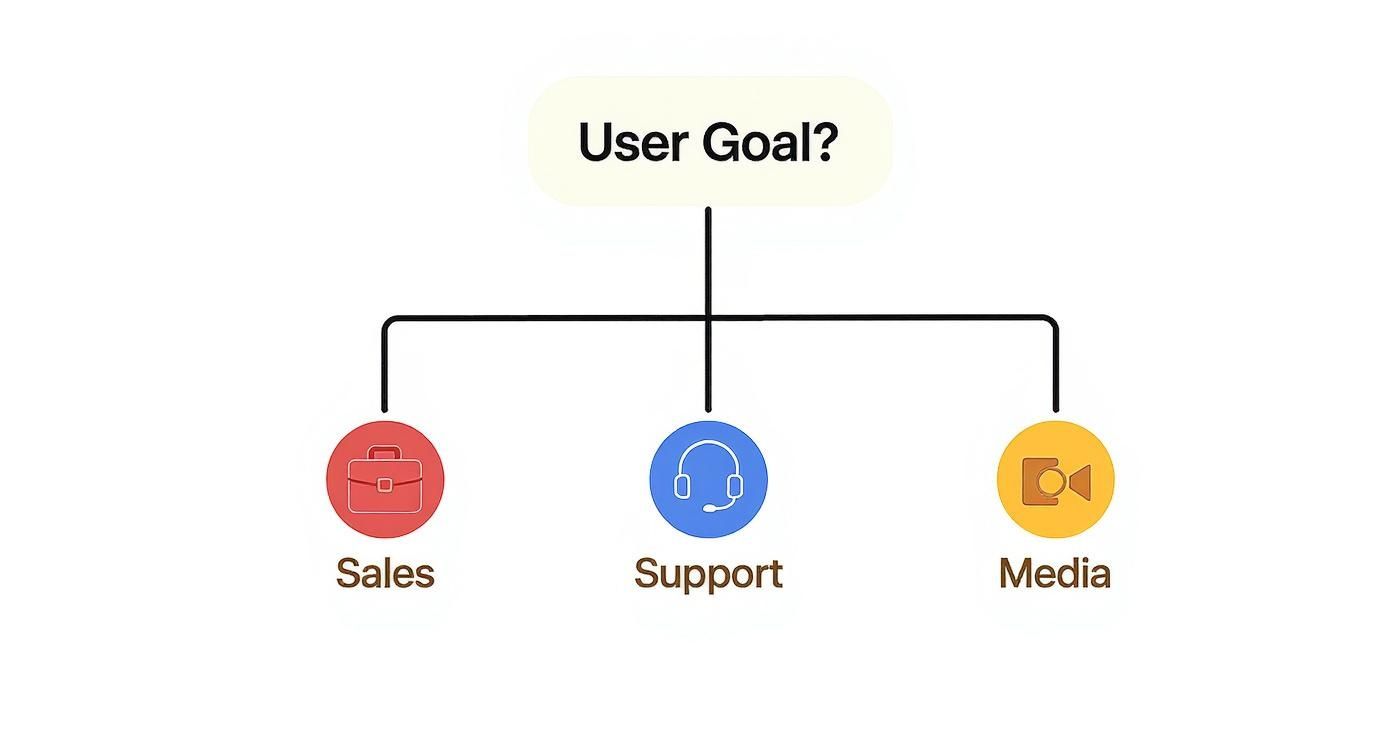
As you can see, routing different types of visitors to the right channel from the get-go is key. It cuts down on frustration for them and speeds up response times for you. A true win-win.
For a lot of businesses, especially local ones, adding a physical address with an embedded map is another fantastic trust signal. It makes your operation feel real and tangible. In the same way, including photos of your team or your office helps humanise your brand. Suddenly, they're not filling out a form on an anonymous website; they're reaching out to actual people.
Here's a quick checklist to make sure you've covered all the essential components for your page.
Contact Page Component Checklist
This table is a handy reference to ensure you've included the key elements that turn a good contact page into a great one.
Component | Purpose | Best Practice Tip |
|---|---|---|
Engaging Headline | Sets a welcoming, human tone from the start. | Avoid "Contact Us." Try something like "Let's Talk" or "How Can We Help?" |
Concise Introduction | Briefly explains why and when users should get in touch. | Set expectations. Let them know typical response times (e.g., "We'll reply within 24 hours"). |
Streamlined Form | Captures essential lead information with minimal friction. | Ask for the absolute minimum. Name, email, and message is often enough. |
Actionable CTA | Motivates users to complete the form submission. | Use specific text on the button, like "Send My Request" or "Get a Quote." |
Trust Signals | Builds credibility and reassures users their data is safe. | Include testimonials, client logos, security badges, or a privacy policy link. |
Alternative Contact | Provides other ways to connect for different user needs. | List your email, phone number, and physical address if applicable. |
Team/Office Photos | Humanises the brand and makes it feel more personal. | A friendly team photo can make your business feel more approachable. |
By weaving these components together—clear copy, a simple form, and solid trust signals—you create an experience that doesn't just work, but actively encourages people to make that connection.
Ready to see how speed and accessibility can make or break your design? Let's dive into the technical essentials next.
Optimising for Speed and Accessibility
Having a gorgeous contact us page design is only half the story. If that stunning page takes forever to load or is a nightmare for some visitors to use, then all that creative effort is basically pointless.
Think about it. A potential client is ready to get in touch about a big project, but your contact form just won’t load on their phone. They’re not going to sit around and wait. They'll just hit the back button and find a competitor whose website actually works. This is where the techy stuff—performance and inclusivity—becomes a non-negotiable part of your design strategy.
Make It Fast: The Need for Speed
Page speed isn't just a number for developers to obsess over; it directly impacts how people feel about your site and, ultimately, your bottom line. Slow pages are frustrating. They drive people away and can seriously hurt your rankings on Google.
In fact, Google's Core Web Vitals are now a massive factor in how your site gets ranked, making speed a must-have. For UK brands, getting that contact page to load in under two seconds is critical. Plus, accessibility isn't just a nice-to-have; it's required under the UK Web Accessibility Regulations 2018. This means your contact page must be usable by everyone, including people with disabilities. You can discover more insights about UK web design trends on avy.me.
Ready to speed things up? Start here:
Image Optimisation: This is a big one. That massive, uncompressed photo of your team could be the main culprit slowing your page down. Compress your images without turning them into pixelated mush.
Minimise Code: Tidy up any clunky CSS or JavaScript that's slowing down your page's rendering time. Less code often means more speed.
Leverage Caching: Using browser caching lets you store parts of your page so it loads way faster for anyone who comes back for a second visit.
For a deeper dive, check out our guide on how to improve website loading speed fast.
Design for Everyone: Accessibility Essentials
So, what is accessibility? It’s about making sure people with disabilities can use your page without any friction. This includes folks who might use screen readers, navigate with a keyboard, or have visual impairments. Honestly, it’s not just about ticking a legal box in the UK; it’s just the right thing to do.
An accessible contact page is a welcoming one. It sends a clear message that you value every potential customer, regardless of their ability, and you've made the effort to include them.
Getting the basics right is easier than you might think. A great starting point is making sure every single field on your form has a clear, descriptive label that a screen reader can announce properly. Forget those floating "Email" placeholders that disappear—use a proper tag.
Putting Accessibility into Practice
Next up, check your colours. Is your text blending into the background? That’s a no-go for anyone with low vision. Use an online contrast checker to make sure your colour combos meet accessibility standards.
And here's a simple test: try to navigate and fill out your entire form using only the tab key. No mouse allowed! If you can do it smoothly, you’re on the right track. This is absolutely vital for users with motor impairments.
By optimising for both speed and accessibility, you’re not just building a contact page. You’re creating an experience that’s efficient, inclusive, and builds trust from the very first click. It’s the solid foundation every high-converting page needs.
Common Design Mistakes That Kill Conversions
You can have the best intentions in the world, but a contact us page design riddled with a few classic mistakes will fall completely flat. I've seen it happen time and time again. These seemingly tiny errors pile up, creating just enough friction to send a potential customer packing.
Honestly, spotting these pitfalls is the first step to creating a page that actually works.
One of the biggest offenders? The ridiculously long contact form. Asking for someone’s life story—their job title, company size, annual budget, and probably their favourite biscuit—before you’ve even said hello is a massive turn-off. It just screams "you're about to enter a long, painful sales funnel."
Hiding Essential Information
Another clanger is burying your contact details. Forcing people to go on a treasure hunt for a phone number or email address feels shady, as if you don't really want them to get in touch. It instantly makes your brand feel less credible.
Your key contact info should be front and centre, not tucked away in the footer like an afterthought. Hiding it creates a terrible user experience and is a surefire way to lose visitors. It’s such an easy fix, and it shows you’re open for business.
Poor design is the single biggest reason for negative website feedback. A confusing layout or a form that doesn't work properly on mobile isn't just an annoyance—it's a direct barrier between you and your next customer.
In fact, the numbers don't lie. A staggering 94% of negative website feedback is directly linked to poor design, often involving clunky contact pages. What’s more, 77% of UK web design companies say that bad website design is their clients' biggest weakness, and you can bet the contact section is a prime culprit. You can read the full research on web design statistics to see just how big the impact is.
Vague Messaging and Unhelpful Errors
Finally, unclear communication can completely derail the whole process. That generic "Submit" button? It tells the user absolutely nothing. Is their message going to sales? Support? A digital black hole? Who knows.
The same goes for error messages. "Error: Invalid Input" is about as helpful as a chocolate teapot. Good design guides the user, highlighting exactly which field is wrong and explaining how to fix it. Without that clarity, most people will just give up rather than play detective.
Steer clear of these common blunders, and you can turn your contact page from a dead end into a smooth, effective conversion machine.
Your Burning Contact Page Questions, Answered
Alright, so you’ve got the big picture down, but the devil’s in the details, right? When you’re actually building the thing, a million little questions pop up. Getting these small things right is what turns a decent contact page into one that actually gets you leads. Let’s tackle some of the common head-scratchers.
Think of this as the finishing touches that make all the difference.
How Many Fields Should My Contact Form Have?
Honestly? As few as humanly possible. Every single field you add is another reason for someone to give up and leave. Think about it – are you more likely to fill out a form with three boxes or ten?
For most businesses, all you really need to get the ball rolling are three things: name, email, and a message box. That’s it. Only add more fields, like a phone number or company name, if you absolutely cannot have that first conversation without them. If it can wait, leave it out.
Should I Bother with a Physical Address and Map?
This one’s a definite "it depends." If you have a brick-and-mortar shop, a showroom, or an office that customers actually visit, then yes, one hundred percent. Putting your address and a map on the page is a massive trust signal. It shows you’re a real, established business and makes it dead simple for local folks to find you.
But if you're a fully digital business working from a home office or a co-working space? Skip it. It’s not relevant and might just confuse people. Stick to other ways of building trust instead.
The best call-to-action is specific and value-driven. Instead of a generic 'Submit', use text that clearly communicates what happens next, such as 'Get Your Free Quote' or 'Schedule a Consultation'. This simple change sets clear expectations and boosts clicks.
What’s the Best Thing to Write on the Contact Button?
Whatever you do, please don’t just leave it as “Submit.” It’s so boring and uninspired! Your call-to-action (CTA) button needs to feel like the final, satisfying step of a process. Use energetic, action-focused words that tell the user exactly what’s about to happen. You’d be shocked at how much this tiny detail can affect your conversion rate.
Try to get inside your visitor’s head. What are they trying to achieve? Match the button text to their goal. Here are a few much better options:
Get Your Free Quote
Schedule a Consultation
Send Your Message
Request a Callback
See how much clearer that is? It tells the user what to expect, reassures them, and makes them feel much more confident about clicking.
Ready to Build a Contact Page That Actually Converts?
Right, you've got the roadmap. You know what it takes to turn your contact page from a forgotten corner of your website into a machine for building connections. The secret isn't magic; it's about understanding what your visitors want, earning their trust, and making it ridiculously easy for them to get in touch.
Go on, pull up your current contact page and run it through the checklist we've covered. Find just one or two things you can tweak today. Honestly, a well-thought-out contact us page design is one of the fastest wins you can get for generating more leads and starting better conversations with your customers.
The team at Baslon Digital lives and breathes this stuff. We specialise in creating stunning, user-friendly Wix websites that don't just look good—they get the job done.
Fancy a chat? Get in touch today and let's see what we can build together.
Comments