How to Improve Website User Experience: A Practical Guide
- Baslon Digital

- Oct 16, 2025
- 15 min read
Updated: Oct 21, 2025
Think of your website as your digital front door. When someone arrives, do they feel welcome and know exactly where to go, or are they left confused and frustrated? That initial feeling is the heart of user experience (UX), and it's much more than a trendy design buzzword—it's a make-or-break business metric.
A positive user experience is what builds the kind of brand loyalty and customer trust that actually drives sales. It's about making a visitor's journey so ridiculously smooth they can find what they need and take action without even thinking about it.
Why User Experience Is Your Most Valuable Asset

Let's get practical. Imagine someone lands on your site looking for a specific service. If your navigation is a mess and the information they need is buried three clicks deep, they’re gone. Vanished.
Now, picture a competitor's site where that same service is highlighted on the homepage with a big, obvious "Learn More" button. That effortless journey is what separates a bounce from a conversion. It's as simple as that.
The Power of First Impressions
You don't get minutes to win someone over online. You get seconds. Milliseconds, even. That first snap judgment is almost entirely visual, based on your site's layout, colour scheme, and overall vibe. A cluttered, outdated design doesn't just look bad; it screams "untrustworthy" and sends potential customers running for the digital hills.
This isn't just a hunch; the data backs it up. A wild 75% of consumers admit to judging a business's credibility based purely on its website design.
Even worse? A staggering 88% of users are unlikely to return to a site after just one bad experience. That’s right—one clumsy interaction can lose you a customer for good. User trust in the UK is heavily influenced by a company's digital presence, and a polished website is non-negotiable. If you're curious, you can discover more insights about website statistics and trends to see the full picture.
Your website is often the very first handshake a customer has with your brand. A poor user experience is like a limp, awkward handshake—it kills credibility before you even get a chance to say hello.
To help you get a clearer picture of what goes into a great UX, we've broken down the core components. Think of these as the pillars holding up a website that people actually enjoy using.
Key Pillars of Effective User Experience
Pillar | What It Means for the User | Business Impact |
|---|---|---|
Intuitive Navigation | "I can find what I'm looking for instantly." Menus and links are clear and logical. | Reduces bounce rates and keeps users on-site longer, increasing the chance of conversion. |
Visual Design | "This site looks professional and trustworthy." The layout, colours, and fonts are clean and appealing. | Builds brand credibility and makes a powerful first impression, fostering user trust. |
Performance & Speed | "Pages load almost instantly." The site is fast and responsive on any device. | Improves user satisfaction and has a direct, positive impact on SEO rankings. |
Accessibility | "I can use this site easily, regardless of my abilities." It works well with screen readers and is navigable via keyboard. | Broadens your audience and demonstrates corporate social responsibility, enhancing brand image. |
Clear CTAs | "I know exactly what to do next." Buttons and links guide the user toward a specific action. | Directly drives conversions, whether it's making a purchase, filling a form, or signing up. |
Each pillar is essential. A fast site with confusing navigation is still frustrating, and a beautiful site that's inaccessible misses out on a huge audience. They all have to work together.
UX as a Revenue-Generating Investment
It's time to shift your thinking. Improving your website's user experience isn't a cost—it's one of the smartest investments you can make in your business's growth. A well-designed user journey doesn't just prevent frustration; it actively steers visitors toward your most important goals.
Every tiny improvement you make is a step toward higher engagement, a stronger brand, and a healthier bottom line.
Ready to turn your website from a simple online brochure into a high-performing conversion machine? The first step is figuring out where you stand right now.
Contact Baslon Digital today for a professional UX audit and discover how we can help you create a website your customers will absolutely love.
Mastering Speed and Mobile Performance
In the online world, patience is a virtue few of us possess. A slow-loading website isn't just a minor hiccup; it’s a massive turn-off, basically telling your visitors you don’t value their time. Let's be honest, performance is a huge part of a good user experience, and it often decides whether someone sticks around or slams the back button in frustration.
This is especially true on mobile. The shift to mobile isn't just a trend anymore; it's the norm. With mobile now driving most e-commerce traffic, a clunky or slow mobile site is like having a shop door that's too heavy to open – you're actively turning away more than half of your potential customers.
Shaving Off Precious Seconds
Every single second counts. Data from the UK shows the average time spent on a page is a fleeting 54 seconds. That’s not a lot of time to make an impression.
And when 53% of users expect a page to load in under three seconds, the pressure is really on. A delay of just one second can jack up your bounce rate by a staggering 123%. Ouch. That potential lead just became another missed opportunity. Want more proof? Check out this report on UK social media statistics.
So, how do you fight back? You start by tackling the biggest culprits of slow load times.
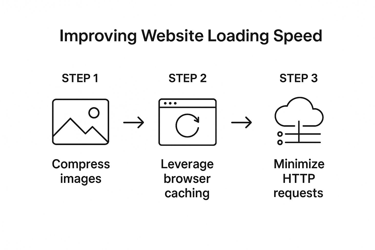
The game plan is simple:
Squash those huge image files.
Get clever with how your site’s assets are stored and delivered.
Cut down the number of requests your site has to make.
Your goal is to make your website feel instantaneous. Think of it like a conversation; long pauses kill the momentum. A fast website keeps the dialogue flowing smoothly with your user.
Start by compressing your images. Tools like TinyPNG or Squoosh are lifesavers here, drastically shrinking file sizes with almost zero noticeable drop in quality. Next, look into browser caching. This lets a visitor's browser 'remember' parts of your site, so it doesn't have to reload everything from scratch every time they visit.
For a much deeper dive, check out our guide on how to improve website loading speed fast.
Beyond Responsiveness: A Mobile-First Mindset
Look, just having a "mobile-friendly" website isn’t enough anymore. That's table stakes. A truly great mobile experience isn’t just a shrunken-down version of your desktop site. It’s designed for the mobile user, right from the very beginning. This is what we mean by a mobile-first design approach.
Think about the context of someone on their phone. They're often on the go, staring at a small screen, and using their thumbs to get around. This calls for a totally different design philosophy:
Keep it simple: Screen space is precious. Only show what's absolutely critical. Cut the fluff.
Design for thumbs: Make sure your buttons and links are big enough and have enough space around them to be tapped easily. Nothing is more annoying than fat-fingering the wrong link.
Rethink navigation: Use things like collapsible "hamburger" menus and make sure your search bar is easy to find and use.
Think vertically: People scroll on their phones. A lot. Structure your content for a smooth, natural scrolling experience.
Adopting this mindset means your mobile experience isn't an afterthought. It's a core, intuitive journey built for the majority of your audience.
Is your site's performance holding you back? Get in touch with Baslon Digital for a free performance audit and learn how we can make your website lightning-fast on every device.
Designing Intuitive Navigation and Clear Layouts
Think of your website as a digital shop. If that’s the case, your navigation is the aisle signage. Get it wrong, and customers will wander around confused before giving up and storming out. An intuitive site structure isn’t just a nice-to-have; it's the absolute foundation of a great user experience.
The whole point is to make finding information feel completely effortless. Visitors shouldn't have to think about where to click next; the path should be obvious. This predictability builds trust and keeps them engaged with your content, rather than battling a confusing menu.
Building a Logical User Journey
You’ve probably heard of the 'three-click rule'—the idea that a user should find anything they need within three clicks. While it’s not a rigid law, it’s a brilliant principle that forces you to simplify. Your main tool for this is a clear and logical navigation menu.
Put yourself in a first-time visitor's shoes. Are your menu labels straightforward? You have to avoid jargon or overly clever names. A "Contact Us" page should be called exactly that, not "Let's Connect." When it comes to navigation, clarity always wins against creativity.
Getting this right means having a solid plan from the very beginning. For more on this crucial first step, you can learn how to plan your website structure for SEO and UX in our detailed article.
An intuitive layout doesn't just happen. It's the result of carefully considering your user's goals and designing a path of least resistance to help them achieve it.
This planning stage directly impacts how you organise your content into logical categories and subcategories, which is what makes the entire website feel cohesive and easy to get around.
Using Visual Hierarchy to Guide the Eye
Once your structure is solid, you need to guide the user's attention on each page. This is where visual hierarchy comes into play. It’s the art of arranging elements to show their order of importance.
You can pull this off with a few simple techniques:
Size: Bigger things naturally grab more attention. Your most important headlines and call-to-action buttons should be prominent.
Colour and Contrast: A brightly coloured button on a neutral background will pop. Use your brand’s accent colours to highlight key actions you want people to take.
Placement: Things placed at the top of the page or in the centre are seen as more important. Stick to common reading patterns, like the "F-pattern," where users scan across the top and then down the left side.
A perfect example is an e-commerce product page. The product image and the "Add to Cart" button are almost always the largest and most visually distinct elements. Why? Because that's the main action the business wants the user to take.
The Power of White Space and Consistency
A cluttered page is a confusing page. Period. White space, or negative space, is the empty area around elements on your page. Using it well gives your content room to breathe, which massively improves readability and reduces the mental effort for the user. It helps separate different sections and creates a clean, professional look.
Consistency is just as critical. Your navigation menu, button styles, and colour schemes should stay the same across your entire website. This predictability creates a sense of familiarity and helps users feel more confident as they move from page to page. It reinforces your brand and makes their journey feel seamless.
Is your website’s navigation causing more confusion than conversions? Book a consultation with Baslon Digital, and let's design a clear, user-friendly layout that turns visitors into happy customers.
Making Sure People Actually Read Your Stuff
So, you’ve built a website that works. Great. But if visiting your site feels like trying to read a textbook after a long day, you’ve already lost. A site that’s a giant wall of text is a one-way ticket to a high bounce rate. The way you present your words and pictures is just as crucial as what they’re saying. It's about making your pages easy on the eyes and genuinely interesting to look at.
It All Starts With Your Text
First things first, let’s talk typography. Picking a font is a balancing act between showing off your brand’s personality and, you know, actually being legible. That cool, edgy script font might look amazing on a logo, but if your visitors have to zoom in just to read a sentence, you've failed. Stick to clean, simple fonts like Open Sans or Lato for your main text. They look sharp on any screen, from a giant monitor to a tiny phone.
But the font itself is only half the story. Size and contrast are the real heroes of readability. The rule of thumb these days is to keep your body text at least 16px. Anything smaller feels like a punishment. Just as vital is the contrast between your text and its background—there's a reason black text on a white background has stuck around. It just works. If you're playing with colours, use a tool like the WebAIM Contrast Checker to make sure you're not making things impossible for people with visual impairments.
Give Their Eyes a Break
Let's be honest, nobody wants to read an endless sea of words. You need to break things up with visuals. Think of high-quality images, icons that make a point, or even short videos as punctuation for your page. They’re not just decoration; they’re essential tools for keeping people hooked.
Visuals do a few key things really well:
They add context. An image can often explain a concept faster and more effectively than a whole paragraph.
They create breathing room. A picture or a graphic gives the reader a quick pause, making long articles feel much less daunting.
They boost engagement. A short, snappy video can grab someone's attention and explain your product in a way that plain text just can't.
Think of your page like a conversation. You wouldn't just drone on and on without a break, would you? Visuals are your way of showing, not just telling. They re-engage your visitor and make the whole experience more of a two-way street.
Don't Underestimate Your Colour Palette
Finally, let's get into your colour scheme. Colours are more than just window dressing; they set a mood and can even nudge people towards taking action. Your brand’s colours should reflect the vibe you’re going for. There’s a reason so many banks and tech companies use blue—it screams trust and stability.
A solid colour palette usually has three main components:
A primary colour: This is your big brand colour, the one you're known for.
A secondary colour: This one supports your primary colour and is used for less critical elements.
An accent colour: This should be a bold, contrasting colour that you save for the important stuff, like your "Buy Now" or "Get in Touch" buttons. It needs to pop.
When you thoughtfully combine easy-to-read text, eye-catching visuals, and a smart colour scheme, your website transforms. It goes from being just a page of information to a genuinely compelling experience.
Ready to make your website not just functional, but visually captivating? [Contact Baslon Digital today](https://www.baslondigital.com/contact) to discuss how our design expertise can elevate your brand's online presence.
Crafting High-Converting CTAs and Forms

A brilliant user experience is more than just a pretty design that makes people feel good; it’s about gently nudging them towards a specific, valuable action. This is where your Calls to Action (CTAs) and forms stop being just page elements and become your hardest-working conversion tools.
Think of them as the signposts on your website. Without clear directions, even your most interested visitor can get lost, frustrated, and click away. A powerful CTA cuts through all that noise and gives them one clear, compelling reason to act, turning a passive browser into an active lead or a paying customer.
The Anatomy of a Powerful CTA
Getting people to actually want to click your CTA is part art, part science. It’s definitely not about just slapping a button on a page and hoping for the best. The CTAs that truly work all share a few key traits that make a huge difference in how people respond to your offers.
Here’s the secret sauce for an effective CTA:
Action-Oriented Language: Ditch passive words like "Submit." Instead, use strong, benefit-driven verbs. "Get Your Free Quote" is infinitely more persuasive than a boring "Send."
Clear Value Proposition: The user needs to know exactly what they're getting. "Download My Free eBook" leaves no room for doubt, unlike a vague "Click Here."
Contrasting Colour: Your CTA button needs to pop. It has to stand out from the rest of the page so it’s instantly recognisable as something you can click on.
Strategic Placement: Put your CTAs where people’s eyes naturally land—right after a compelling paragraph or at the very end of a service description makes perfect sense.
Think of your CTA as the final, friendly nudge in a conversation. You've explained the value; now you're making it incredibly easy for the user to say "yes" to your offer.
For a deeper dive, check out the 8 powerful conversion rate optimization tips for 2025 we’ve put together, as they tie directly into crafting more effective CTAs.
Making Forms Less of a Chore
So, your CTA worked and they clicked. Great! But if it leads to a form, your job is only half done. Nothing kills a conversion faster than a long, complicated form. The goal here is to make this process as quick and painless as humanly possible.
Seriously, every extra field you ask for increases the odds they’ll just give up.
Scrutinise every single field on your forms. Is a phone number absolutely essential for a simple newsletter sign-up? Probably not. Stick to the bare minimum information you need to get started. Also, make sure you use clear, simple labels above each field and have helpful, real-time error messages pop up if someone makes a mistake.
For e-commerce sites, the checkout form is the final boss battle. Streamlining this is non-negotiable. If you're using WooCommerce, for example, choosing the right payment gateway is critical. You can explore the best payment gateways for WooCommerce to boost conversions to see how a smooth payment process creates a much better user experience and, ultimately, more sales.
Building a System for Continuous UX Improvement
Getting your website's user experience right isn't a "set it and forget it" kind of job. Far from it. It's a never-ending cycle of watching, listening, and tweaking based on how real people actually use your site. Assumptions are the enemy here; cold, hard data is your best friend.
If you genuinely want to understand your users, you have to go beyond the usual analytics reports and get direct feedback. This is how you build a continuous feedback loop—the secret sauce to making smart, user-focused decisions that make your site better over time.
Tapping Into What Your Users Are Really Thinking
The best way to figure out what’s working (and what’s making people leave) is to watch them and ask them directly. A few tools can give you a window right into your user's mind, showing you exactly where they get stuck, what they click on, and where they just give up.
Heatmaps: These are brilliant. They create a visual map showing where users click, move their mouse, and how far down the page they bother to scroll. You can instantly see which parts of your page are hot property and which bits are being completely ignored.
Session Replays: Fancy watching a recording of someone's visit to your site? That's exactly what this is. Session replays show you their entire journey from start to finish, letting you spot frustrating bugs or confusing layouts you'd never find otherwise.
On-Page Surveys: Sometimes, the simplest solution is the best. A tiny pop-up survey asking a direct question like, "Was anything stopping you from signing up today?" can deliver incredibly powerful feedback straight from the source.
Building a great user experience means you're never actually finished. It's a commitment to constantly observing, identifying friction, and being brave enough to make changes based on what you find.
For businesses that are serious about this, connecting with UX researchers can offer much deeper, more structured insights than automated tools alone ever could. That kind of qualitative feedback adds the crucial "why" behind the "what."
When you combine these methods, you stop guessing what your users want. You start building a website that actually evolves with their needs, which means a better experience for them and better results for your business.
Ready to build a user-centric website that gets better every single day? Book a free consultation with Baslon Digital, and let's create an experience your customers will love.
Still Got Questions About Website UX?
Let's clear up a few common questions that pop up when people start digging into user experience.
How Often Should I Be Fiddling with My Website’s UX?
Think of your website's UX like a garden—it needs regular tending, not just a one-off planting session. You can’t just set it and forget it.
A solid plan is to give it a proper review every quarter, or any time you make a big change like adding a new feature. But don't wait for a formal review; using tools like heatmaps can give you a constant pulse on what's working and what's making visitors rage-quit. This way, you can fix issues before they become major headaches.
Okay, What’s the Real Difference Between UX and UI? I Hear Them Thrown Around All the Time.
Great question. It’s easy to get these two mixed up.
Think of it this way: User Interface (UI) is the "look"—the pretty colours, the cool fonts, the slick buttons. It's the paint job and fancy rims on a car. User Experience (UX) is the "feel"—how easy it is to navigate, how quickly it loads, and whether visitors can actually do what they came to do. It's how the car actually drives.
You can have the most beautiful website in the world (great UI), but if nobody can figure out how to buy something, the UX is a disaster. A stunning UI is totally useless without a solid UX to back it up.
Can I Actually Improve My UX if I’m on a Shoestring Budget?
Absolutely. You don’t need a massive budget to make a huge impact. Some of the most effective changes cost nothing but a bit of your time.
Start with the simple stuff: clean up your navigation menu so it's not a cluttered mess. Make your text easier to read. Go compress those giant images that are slowing your site down to a crawl. You can even gather priceless feedback with free on-page surveys.
At the end of the day, the most crucial part of good UX is empathy. Just put yourself in your visitor's shoes for a minute. If a page or a checkout process feels clunky and confusing to you, you can bet it feels that way to your customers too.
Ready to turn your website from a digital brochure into a powerhouse that actually grows your business? At Baslon Digital, we specialise in creating stunning, user-friendly websites that get real results. Don't just settle for a good-looking site—invest in an experience that converts visitors into loyal customers.
[Book a free consultation with us today!](https://www.baslondigital.com) and let's build a website your users will love.
Comments