Website Design for Lead Generation: A Step-by-Step Guide

A lot of small businesses know the feeling. The new Wix site looks clean, the photos are sharp, the typography feels polished, and then the enquiries just do not show up. That gap between “looks good” and “brings in leads” is where website design for lead generation either works or fails.
The fix is not to make the site busier. It is to make every page behave like part of an enquiry system, where the copy, layout, forms and calls to action all push a visitor towards one clear next step. UK benchmark data makes that difference hard to ignore, because the median landing page conversion rate for lead-generation use cases sits at 6.6% across 41,000 pages, while broader UK ecommerce benchmarks sit around 1.5% IRVale's 2026 UK conversion benchmarks. That gap says a lot. Structure and intent matter more than visual polish.
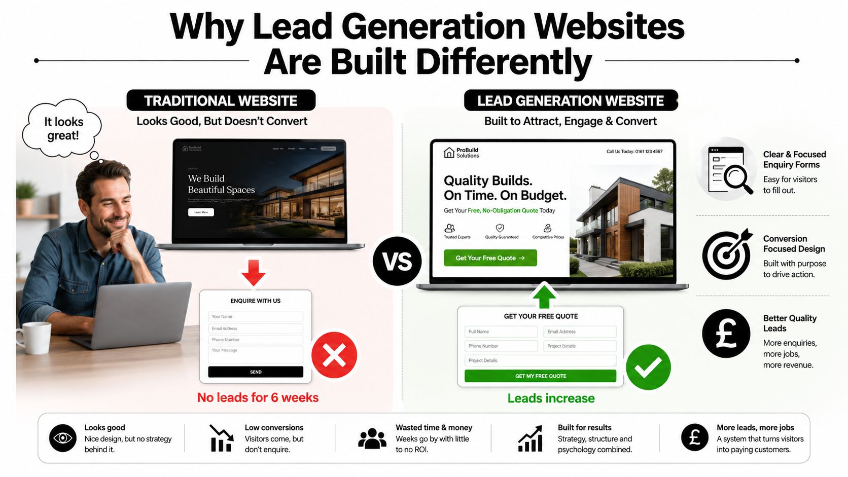
A brochure site tries to impress. A lead-generation site tries to qualify, reassure and capture. The same Wix template can do either job, depending on what sits above the fold, how much friction the form creates, and whether the CTA tells the visitor exactly what happens next. If you want inspiration across different sectors, browse lead generation industries and you will see how much the offer and the action shape the final layout.
Table of Contents
Why Lead Generation Websites Are Built Differently - Brochure thinking versus lead thinking
Defining Your Offer, Audience and Primary Conversion Event - Choose one primary conversion event
Writing Messaging, Trust Signals and Calls to Action That Convert - Rank trust signals by weight
Designing Forms, Lead Magnets and Funnels That Lower Friction - Reduce effort before and after the form
Designing for Mobile Visitors Without Copying the Desktop Layout - Rebuild the mobile path, don't compress the desktop one
Testing, Tracking and Iterating After Launch - A/B testing that does not waste time
Why Lead Generation Websites Are Built Differently
A trades firm in Manchester can spend £3,000 on a Wix redesign, admire the finished pages, and still receive no enquiries for six weeks. The problem is usually structural. A lead-generation website must guide a suitable visitor towards a measurable action, then give them enough confidence to complete it.
UK benchmark data shows why the distinction matters. The median landing page conversion rate for lead-generation use cases is 6.6%, compared with roughly 1.5% for broader UK ecommerce benchmarks IRVale's 2026 UK conversion benchmarks. The figures do not make design irrelevant. They show why clarity of offer, page structure and CTA placement deserve more attention than visual polish alone.
Brochure thinking versus lead thinking
A brochure-led page tries to explain the whole business. A lead-focused page gives the right visitor enough information to take the next step. The headline should name the outcome, supporting copy should address doubt, and the form should appear before a visitor has to search through the footer.
Practical rule: if a page tries to educate, impress and convert all at once, it usually does none of them well.
Wix templates make this mistake easy because the layouts look finished before the conversion logic has been tested. A polished hero can still produce weak results if the CTA is vague, navigation competes for attention, or the form requests information the sales team does not need. On mobile, crowded sections and long journeys create even more opportunities for abandonment, so the layout must be judged by completed enquiries, not screenshots.
For sector-specific patterns, browse lead generation industries and compare how the offer changes the page hierarchy. The practical framework is straightforward: offer, structure, message, form, mobile, technical setup, tracking and iteration. Each decision should support the same measurable enquiry system.
Defining Your Offer, Audience and Primary Conversion Event
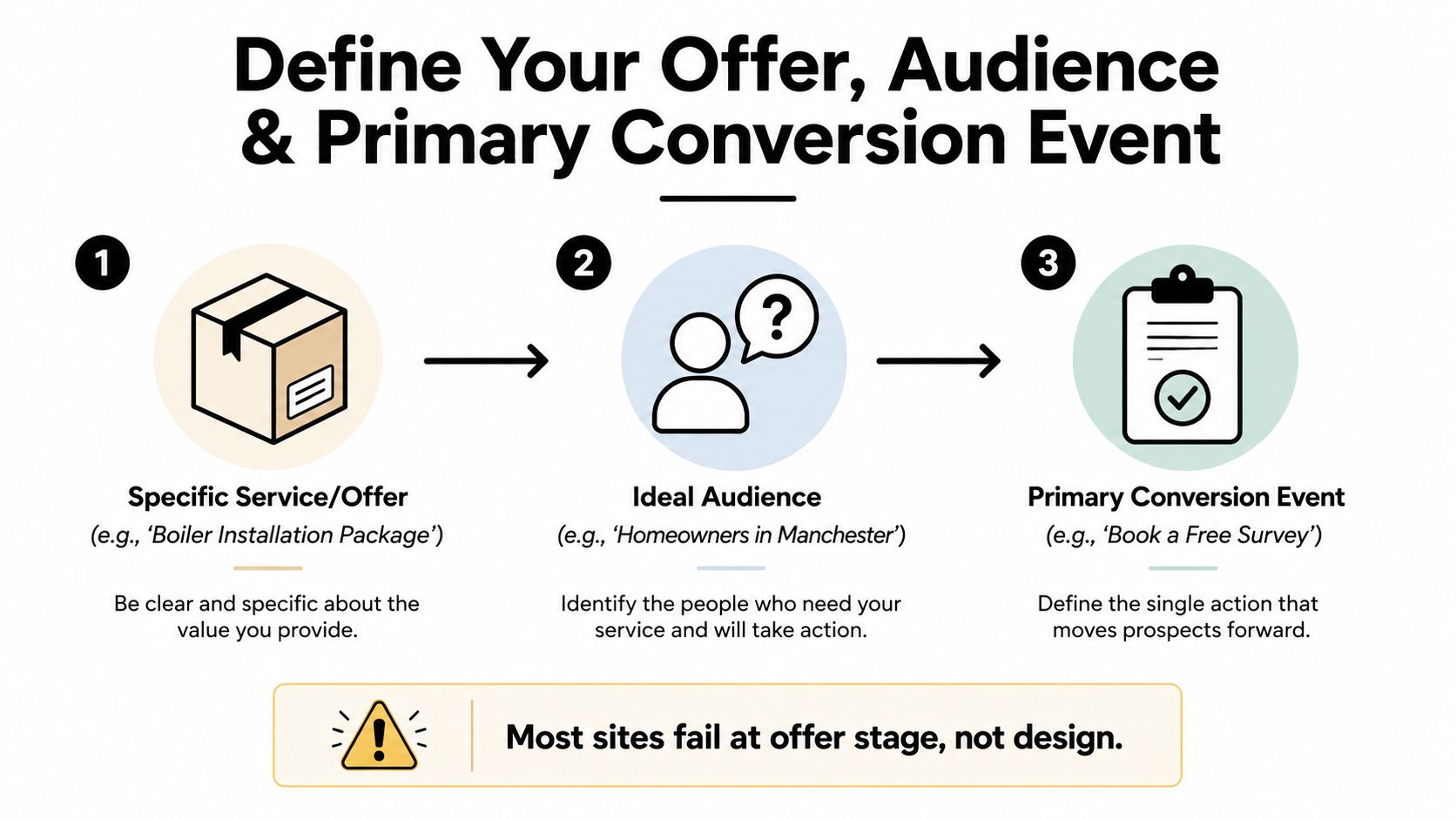
Most weak lead-gen sites fail before design even starts. The offer is too broad, the audience is too vague, and the website ends up speaking to everyone, which means it persuades no one. A strong offer is specific enough that a stranger can picture what they are enquiring about. “We help businesses grow” is not an offer. A scoped service, package or outcome is.
The audience needs the same discipline. Pick one primary persona, then define their role, location, problem, trigger event and budget range in plain English. If you build for homeowners in one city, you do not need the same page logic as a consultant targeting directors across the UK. Source-to-intent mapping matters here too. Search traffic, referrals, LinkedIn visitors and direct visitors all arrive with different levels of readiness, so they should not be forced through identical journeys.
Choose one primary conversion event
The entire site should be engineered around one primary action. Usually that is a form submission or a booked call. Secondary actions, like email signups or chatbot opens, can exist, but they should sit below the main goal. The clearer that hierarchy is, the easier it becomes to design the homepage, service pages and landing pages without internal competition.
If you want a structured way to define the audience before you open Wix, the target audience framework at Baslon Digital's audience definition guide is a useful reference point.
A quick 30-minute exercise helps here. Write the offer in one sentence. Name the persona. List three traffic sources. Then choose the one conversion event that matters most this quarter. That small exercise saves hours of guesswork later, because every layout choice becomes easier once the objective is fixed.
Structuring Homepages and Dedicated Landing Pages
Homepages and landing pages should not be treated as the same thing with different URLs. A homepage is a guided tour. It gives branded visitors, referrals and curious searchers enough orientation to move deeper. A dedicated landing page is a focused pitch. It should do one job and get out of the way.
The homepage needs a clear above-the-fold stack. Start with a benefit-led H1 that names the outcome, then a subhead that qualifies who it is for, then one primary CTA. A trust signal belongs nearby, such as reviews, client names or years in business. The navigation should be trimmed, not bloated. Visitors who already know the brand do not need six competing paths before they can enquire.
For dedicated landing pages, the order is more rigid. Hero, problem-agitation, benefits, social proof, FAQ, form or booking widget. Everything should point to one action. Paid traffic, bottom-of-funnel organic searches and email clicks usually need less orientation and more persuasion, so secondary links can dilute the page.
Section / Element | Homepage | Dedicated Landing Page |
|---|---|---|
Purpose | Orientation and routing | One conversion goal |
Navigation | Limited but present | Minimal or none |
Above the fold | Outcome, audience, CTA, trust signal | Offer, CTA, immediate relevance |
Supporting content | Services, about, blog, case studies | Problem, benefits, proof, FAQ |
Form placement | Contact access, often later on page | Strong presence, usually near the end or repeated |
Best traffic | Branded search, referrals, general visitors | Paid traffic, targeted search, email clicks |
The same Wix template can support both if you change the layout logic. The issue is not the template itself. It is whether the page is built for exploration or conversion. If you want a practical layout reference, Baslon Digital's landing page design guide is worth reviewing alongside your own wireframe.
A page that tries to sell, educate and capture at the same time usually creates friction at every step.
The rule of thumb is simple. One conversion goal per page. If the page tries to be a homepage, service page and landing page at once, it usually captures nothing.
Writing Messaging, Trust Signals and Calls to Action That Convert
The fastest way to lose an enquiry is to make the visitor work for basic answers. Good messaging answers three questions in seconds, what do I get, who is it for, and what happens next. That hierarchy belongs in the headline, the subhead and the supporting copy, not hidden in the third paragraph.
Rank trust signals by weight
Not every trust cue belongs in the same place. Certifications and review counts should sit near the top because they reduce doubt early. Named case studies, project examples and measurable results can appear lower on the page once the reader has enough context. Full testimonials and methodology details belong deeper still, where the visitor is actively checking whether you are credible.
A CTA should never feel like a generic form submission. Use strong verbs and benefit-led wording, such as “Get Your Quote” or “Download” rather than “Submit” Superhub's UK lead-generation CTA guidance. A contrasting button colour helps the action stand out visually, and repeated exposure across the page matters, especially on blog posts and high-traffic sections Alacrity Foundation CTA examples for lead capture.
Useful standard: one primary CTA per section, with the same promise repeated in slightly different language.
If the button sits inside a paragraph of weak copy, it gets ignored. If the button says exactly what the visitor gets, it feels like the next logical step. “Book a free 20-minute audit” is clearer than “Learn more” because it names the action and the value.
A quick pre-publish checklist keeps the page honest. Does the headline state the outcome? Does the subhead say who it is for? Does the CTA use a verb? Are the strongest trust signals visible before the visitor has to scroll? If any answer is vague, the page still has work to do.
For examples of how persuasive page formats are handled in commercial content, find advertorial conversion benchmarks and compare how tightly the offer is tied to the action.
Designing Forms, Lead Magnets and Funnels That Lower Friction
A form is not just a field stack. It is the last bit of resistance between interest and enquiry, so every unnecessary field can cost you attention. The best forms ask for the minimum needed to qualify the lead, then let the conversation continue after submission.
Reduce effort before and after the form
Multi-step forms can feel easier than one long block of fields because the user sees progress, not effort. Smart defaults and inline validation also help because they prevent small mistakes from becoming abandonment points after the visitor has already committed. On mobile, the job gets harder, so click-to-call, WhatsApp, SMS-first paths and live chat often make more sense than forcing someone to type a long message.
Lead magnets should match the stage of intent. A template, calculator, audit or short report works when the visitor wants useful help but is not ready to book. The thank-you page should keep the conversation moving, not dead-end with a blank “thanks” screen.
Here is a simple funnel that works for service businesses. First, offer a useful lead magnet. Then send a focused nurture email. Then invite the lead to a sales call once interest is warm enough.
Accountants: a tax-saving checklist or expense organiser can lead into a discovery call.
Trades: a quote guide or project planner can move a homeowner towards a site visit.
Consultants: a short audit or benchmark report can open the door to a booked strategy call.
If you need a reference for contact form structure, Baslon Digital's website contact form guide is a practical place to compare field choices and layout decisions.
Before any form goes live, ask a few friction questions. Does every field earn its place? Can the visitor finish on a phone without zooming? Does the thank-you page tell them what happens next? If the answer is no, the form still needs trimming.
Designing for Mobile Visitors Without Copying the Desktop Layout
Most traffic problems blamed on design are really mobile problems. A desktop page shrunk into a phone screen becomes cramped, slow and hard to act on. Headline lines break awkwardly, CTAs drop below the fold, and forms feel like chores. On a lead-generation site, that is where the enquiry leak usually starts.
Recent UK benchmark reporting shows a clear device gap, with desktop conversion around 3.7% and mobile around 1.8% Lightly Salted's UK SME CRO guide. That difference does not mean mobile is broken. It means mobile often needs a different path. Fewer fields, clearer trust signals, faster load, and message-first actions can be more effective than copying desktop persuasion line for line.
Rebuild the mobile path, don't compress the desktop one
A mobile-first page should use a single-column flow. The primary CTA belongs where the thumb can reach it easily, and a sticky bottom bar often works better than a button buried in the hero. Tap targets need room to breathe, and navigation should stay limited so the visitor can move without mis-taps.
A practical mobile checklist helps the whole page stay honest:
Hero: the offer, audience and CTA must still be visible without scrolling too far.
Proof: trust signals should be easy to scan, not squeezed into tiny text.
Offer: the value proposition should stay direct and short.
Form: shorten it or replace it with click-to-call or message-first options.
Footer: keep contact routes obvious, but do not rely on the footer to save the page.
The technical side matters just as much as the layout. Connect a custom domain, turn on HTTPS, fill in Wix SEO fields, including title tag, meta description, alt text, structured data and sitemap, then submit the URL to Google Search Console and Wix analytics. Speed improvements also matter, so compress images, lazy-load below the fold, remove unused Wix apps and enable browser caching before launch.
For teams refining referral portals and other fast-moving interfaces, styling your Refport referral portal is a useful reminder that clean interfaces come from disciplined component choices, not from crowding the screen.
On mobile, the site should feel like a fast path to action, not a reduced version of desktop.
Install GA4 and Google Tag Manager, then fire one primary conversion event on form submit, click-to-call and calendar bookings. Pass UTMs from ads so enquiries can be attributed to the right source. After that, check the page in Lighthouse on a real phone, because simulated desktop testing misses the friction that users feel.
Element | Desktop Treatment | Mobile Treatment |
|---|---|---|
Navigation | Limited top nav | Simplified, usually fewer items |
CTA placement | Hero and mid-page | Sticky bottom bar plus hero |
Forms | Can support more context | Shorter, faster, often split |
Images | Larger, more visual detail | Compressed, lighter, faster load |
Proof | Beside or below hero | Stacked and scannable |
Contact actions | Form, call, book | Call, message, tap-to-book |
Testing, Tracking and Iterating After Launch
A lead-gen site is a system, not a launch event. Once the pages are live, the job is to read the numbers in a disciplined way and improve one part at a time. That starts with a short list of metrics that tell you whether enquiries are happening.
Track the conversion rate on the main landing page, the form completion rate, the cost per lead from paid channels and the speed scores you see in Search Console. Those numbers are more useful than raw traffic because they tell you where the funnel is leaking. The UK conversion benchmarks earlier in the article are a useful reference point, but the site should still be judged on its own traffic mix and intent level Greenlight Digital Media's UK conversion-rate workflow.
A/B testing that does not waste time
A basic Wix test should change one variable only. Test headline versus headline, CTA copy versus CTA copy, or a shorter form versus the existing version. Do not mix everything together, because then you will not know what moved the result.
Run the test until each variant has at least 200 unique visitors or for two clear business weeks, whichever gives you a fair read first. Then look for a meaningful difference, not a gut feeling. If the results are mixed, leave the page alone and test something else. Inconclusive tests are still useful because they stop you from making random edits based on mood.
A monthly review rhythm keeps the site from drifting:
Search Console: watch for query shifts and page-level changes.
GA4: check top exit pages and where people stop moving.
Low performers: refresh pages that convert under 2% with better messaging or stronger proof, where the data supports that conclusion.
Documentation: record every change so the next test starts from a known baseline.
Use a launch checklist before you call the site finished. Offer and audience defined, one conversion event named per page, CTA verbs written clearly, trust signals near the form, mobile path tested on real devices, SEO fields complete, GA4 and conversion events verified, sitemap submitted and a redirect map ready if the old site is being replaced. That keeps the redesign tied to outcomes instead of opinions.
A sensible maintenance rhythm is 30, 60 and 90 days. Check speed, review content, inspect enquiry paths, then retest anything that looks soft. That cadence keeps the site improving without turning every small tweak into a new project.
If you want a second set of eyes on the enquiry funnel, Baslon Digital offers Wix website design, maintenance and SEO, with booking flows and conversion-focused page structure built around clear calls to action. For a practical review of the current site and what is leaking enquiries, visit Baslon Digital and book a conversation that is focused on the pages, forms and mobile paths that matter most.
Comments