Best Font for Website: A Practical Guide to Choosing the best font for website
- Baslon Digital

- Dec 23, 2025
- 17 min read
Picking the best font for a website? It's got to be readable, match your brand's vibe, and load without a fuss. If you’re looking for a safe bet, you can't go wrong with screen-friendly classics like Open Sans, Roboto, or Lato. They're popular for a reason—they just work. The real trick is finding that sweet spot between a font that looks great and one that your visitors can actually read without squinting.
Why Your Website Font Is a Powerful Business Tool

Think of your website’s font as its voice. Long before someone reads a single word, your typography is already making a first impression. It’s whispering things about your brand—are you trustworthy and serious, or creative and fun? It's basically the digital version of a firm handshake, setting the tone from the get-go.
This means choosing the best font for a website is way more than just a tiny design choice; it's a strategic business move. Get it right, and you make your content a joy to read. Get it wrong, and you’ll have visitors clicking the back button before you can say "bounce rate."
The Business Impact of Typography
Good typography isn't just about looking pretty. It has a real, measurable impact on how people see your brand and use your site. It’s all about communicating clearly and building a connection.
Here’s how fonts can make or break your business:
Brand Perception: A font has a personality. A classic serif font can feel established and authoritative, while a clean sans-serif often comes across as modern and approachable.
User Experience (UX): Fonts that are easy on the eyes encourage people to stick around and actually read what you have to say. A better experience often leads to more conversions. It’s that simple.
Accessibility: An accessible font means more people can read your content, including those with visual impairments. It’s a simple way to be more inclusive and reach a wider audience.
Your font choice is an unsung hero of your website's success. It guides the user, reinforces your brand message, and can ultimately be the difference between a visitor who converts and one who bounces.
When you get down to it, your font is a workhorse. It helps you structure information, create a visual hierarchy, and guide the reader's eye exactly where you want it to go. A solid typography system is a cornerstone of your brand’s identity, which is why it’s crucial to document it in a style guide. If you're ready to get your brand's look and feel organised, it's worth learning what a style guide is and why your brand needs one.
Ready to find the perfect typeface that speaks for your brand and connects with your customers? Let's dive into the core principles of web typography.
Understanding the Core Principles of Web Typography
Before you dive in and pick a font for your website, it’s worth getting a handle on the principles that separate a good choice from a disastrous one. This isn't just about making things look pretty; it's about how visitors feel about your brand and whether they stick around. Get this right, and you're already halfway to a professional, effective website.
You'll often hear two terms thrown around: legibility and readability. They might sound the same, but they’re not. Think of it like this: legibility is about being able to tell one letter from another. Can you instantly spot the difference between an 'e' and a 'c'? That’s good legibility.
Readability, on the other hand, is about how comfortable it is to read whole chunks of text. It's that easy-breezy feeling you get when your eyes just glide across a paragraph without any effort. A font might be perfectly legible letter by letter, but if the spacing is a mess, it becomes an unreadable wall of text. The sweet spot is a font that nails both.
The Main Font Classifications
Fonts generally fall into a few big families, and each one has its own personality that sends a specific message to your reader. Knowing the difference helps you match your typography to your brand’s voice.
Here are the three main types you’ll be working with:
Serif Fonts: These are the fonts with little decorative feet, or 'serifs', at the ends of the letters. Think Times New Roman. Serif fonts tend to feel traditional, authoritative, and trustworthy. They're a solid choice for brands that want to look established and reliable.
Sans-serif Fonts: Just as the name implies, "sans-serif" means "without serif." These fonts are clean, modern, and stripped-back. Arial and Helvetica are the classic examples. They communicate simplicity and a forward-thinking vibe, which explains why they’re everywhere in web design today.
Display Fonts: This is a catch-all category for anything super stylised, like script or decorative fonts. They're designed to be head-turners and work best in small doses—for logos, headlines, or short, punchy phrases. They're big on style but often sacrifice readability, so keep them away from your main body text.
Your first big decision is choosing which family to go with. A law firm might lean towards a trustworthy Serif, while a tech startup will almost always go for a clean Sans-serif to look fresh and approachable.
Prioritising Web Accessibility
Beyond pure style, accessibility is a non-negotiable principle of modern web typography. An accessible website is one that everyone can use, including people with visual impairments or reading disabilities. Your font choice is a massive part of this. The Web Content Accessibility Guidelines (WCAG) lay out the standards for making text readable for all.
A font that's hard to read is a font that excludes your audience. Choosing a font designed for screen clarity isn't just good practice—it's good business.
Unfortunately, a lot of websites get this wrong. Recent UK web design stats paint a pretty stark picture: a whopping 26.9% of websites have poor typography that kills readability and sends users packing. This problem is closely tied to the shocking 94% WCAG 2.1 failure rates, which show just how common accessibility issues are. Opting for a clear, geometric sans-serif like Montserrat can be a simple but powerful fix. You can find a deeper dive into this data in the comprehensive analysis from SQ Magazine.
At the end of the day, a beautiful font is useless if it alienates your visitors. To really get why font choices are so critical to user satisfaction, you need to understand the fundamentals of UX/UI design. By mastering legibility, font psychology, and accessibility, you’re not just picking a font—you’re creating a better experience for everyone.
Ready to see which fonts actually make the cut? Let’s check out some of the best options out there.
The Best Fonts for Modern Websites
Right, now that we’ve got the theory down, let’s get to the good stuff. When you start hunting for the best font for a website, you’ll almost certainly land on Google Fonts, a massive library of free, top-notch typefaces made for the web.
Here’s my curated list of fonts that just plain work on screen. These are popular for a reason—they nail that tricky balance between personality and pure, simple readability, making sure your message doesn't get lost. We'll look at what makes each one tick and where they really shine.
This little diagram sums up the three pillars of good web typography we've been talking about.
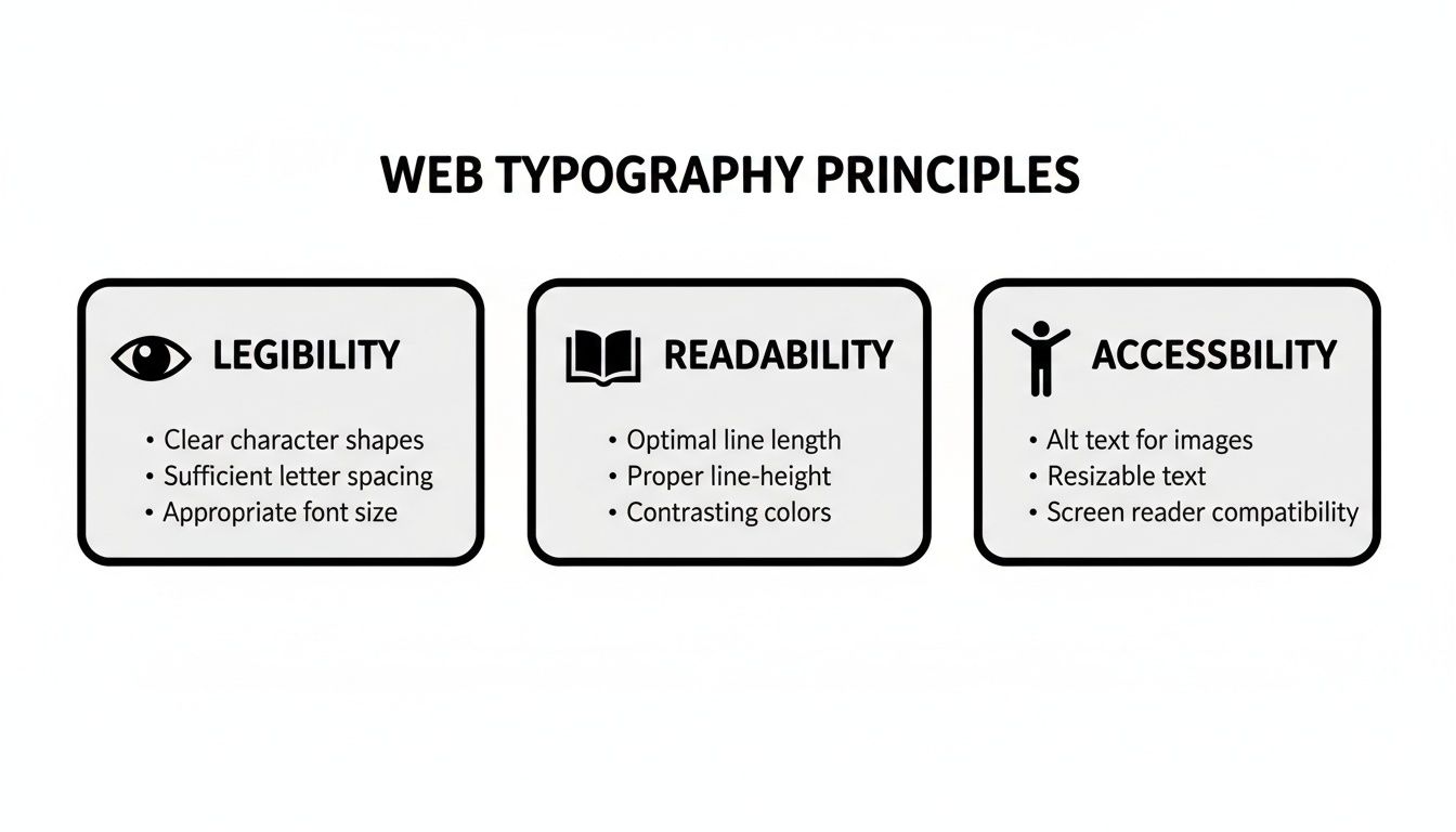
It's a simple reminder: your font has to be legible (can I see it?), readable (can I understand it?), and accessible (can everyone use it?) to give your visitors a good experience.
To help you narrow down the choices, here’s a quick-reference table of some of my favourite, reliable fonts.
Top Recommended Website Fonts and Their Best Use Cases
This table gives you a snapshot of excellent fonts and where they fit best.
Font Name | Type | Best For | Key Characteristic |
|---|---|---|---|
Montserrat | Sans-Serif | Headlines, modern branding | Confident and geometric |
Lato | Sans-Serif | Body text, corporate sites | Warm and friendly |
Open Sans | Sans-Serif | All-purpose, UI design | Neutral and highly legible |
Roboto | Sans-Serif | Tech, mobile-first sites | Mechanical yet approachable |
Playfair Display | Serif | Titles, luxury branding | Elegant and high-contrast |
Merriweather | Serif | Long-form content, blogs | Sturdy and easy on the eyes |
Choosing any of these is a solid start. They are tried, tested, and loved by designers for good reason.
Top Sans-Serif Fonts for Clarity and Style
Sans-serif fonts are the undisputed champs of web design. Their clean lines look sharp on digital screens, giving off a modern, approachable vibe. You really can't go wrong.
Montserrat: A true modern classic. Its geometric, urban feel makes it a killer choice for headlines, navigation menus, and short bits of text. It feels confident and stylish—perfect for creative agencies, portfolios, and fashion brands.
Lato: The name means "summer" in Polish, and that's exactly how it feels: warm and friendly. Its semi-rounded letters give it a welcoming vibe without sacrificing an ounce of professionalism. It’s a workhorse for both body text and headlines, making it a go-to for corporate sites and blogs.
Open Sans: Google actually commissioned this one specifically for web and mobile use, and it shows. It has a neutral but friendly appearance, making it one of the most readable fonts out there. With a huge range of weights, it’s flexible enough for anything from e-commerce sites to tech startups.
Roboto: Another Google creation, designed as the default for Android. It has a geometric core but with friendly, open curves. The designers call it a "dual nature"—part machine, part human. This makes it a fantastic all-rounder for just about any website.
A font's personality should match your brand's voice. Montserrat feels like a confident art director, while Lato feels like a helpful colleague. Choose the voice that best represents you.
Recommended Serif Fonts for a Touch of Class
While sans-serifs rule the web, sometimes you need a little something extra. Serif fonts can add a touch of elegance, tradition, and authority. They're brilliant for creating contrast and a more sophisticated look.
Playfair Display: With its high-contrast letters and delicate strokes, Playfair Display is pure elegance. It’s made for headlines and titles, giving off a classic, editorial vibe. Think luxury brands, high-end blogs, or any site that wants to feel a bit fancy.
Merriweather: This one was built from the ground up for on-screen reading. Merriweather is a super-legible serif with a sturdy structure and generous spacing, which makes it comfortable to read for long stretches. It's a fantastic choice for news sites, online magazines, and blogs with lots of content.
The Rise of Variable Fonts
Now, here’s something really clever: the variable font. Think of it not as a single font, but as an entire font family squeezed into one tiny, efficient file. This one file can generate every possible weight, width, and style—from paper-thin to extra bold and everything in between.
This is a game-changer for two big reasons. First, it gives designers massive creative freedom without bogging down the website. Second, and more importantly, it makes your site load faster by cutting down the number of font files a browser has to download.
That performance boost is huge, especially in our mobile-first world. Here in the UK, mobile internet usage has soared to account for 60% of total internet traffic as of 2024. This makes fast-loading, readable fonts non-negotiable. It also helps explain why sans-serifs like Montserrat are so dominant; UK consumers are 71% more likely to engage with digital content that's visually appealing and easy to read. If you want to dive deeper, you can discover more insights about these UK typography trends on 123internet.agency.
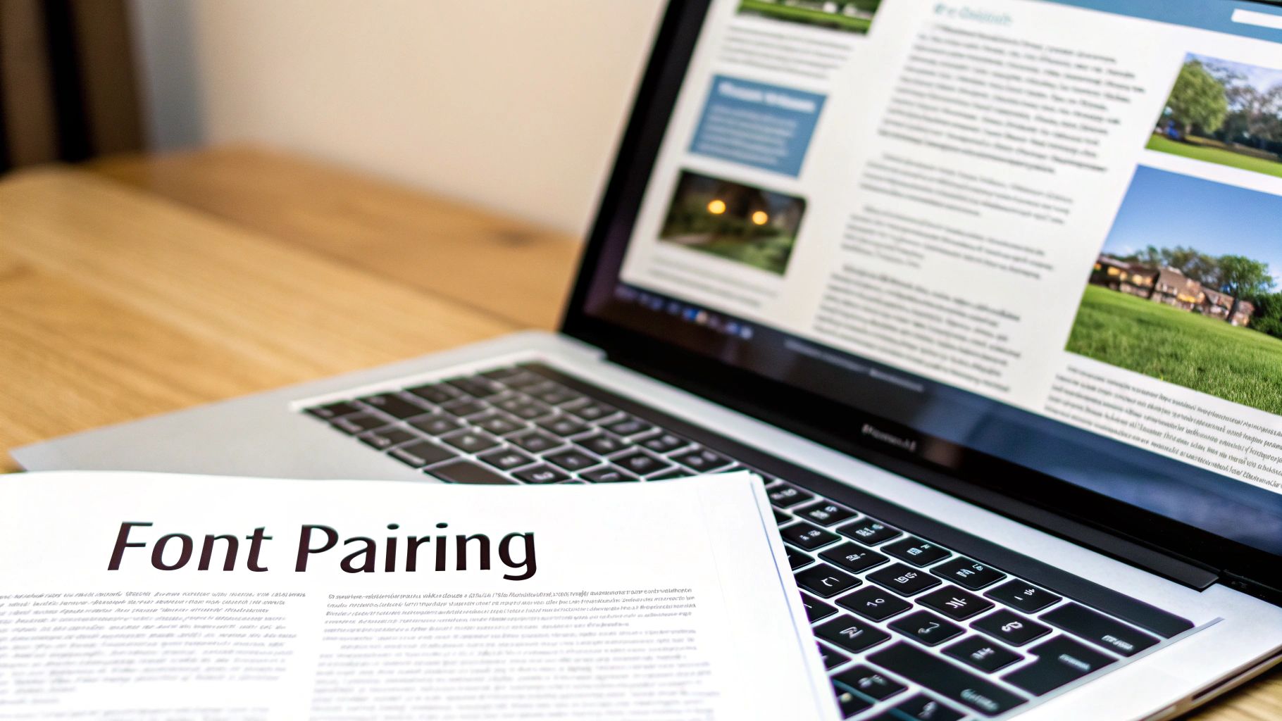
Picking a great font from this list will get you started on the right foot. But the real magic happens when you pair it correctly with another. Ready to create a professional look? Let's get into the art of font pairing.
Mastering Font Pairing and Visual Hierarchy
Choosing a single font is a solid start, but the real magic happens when you pair them up to create a professional and organised visual hierarchy. This is what separates a site that looks a bit thrown together from one that feels polished and intentional. It’s all about guiding your visitor’s eye, making your content a breeze to scan, and dialling up your brand’s personality.
The golden rule of font pairing is beautifully simple: seek contrast, not conflict. Think of it like a conversation. If two people are too similar, it gets boring. If they're wildly different, it's just chaotic noise. You're looking for two fonts that are different enough to create some visual spark but still feel like they belong together.
This contrast is what builds your visual hierarchy. Let's be real—not all text on a page is equally important. Headlines need to grab attention, subheadings have to organise the flow, and the body text is there to do the heavy lifting. A great font pairing makes these roles obvious at a glance.
Simple and Effective Font Pairing Strategies
You don’t need to be a seasoned designer to pull off beautiful font combinations. There are a few tried-and-tested strategies that just work, giving you a reliable starting point for picking the best fonts for your website's different bits and pieces.
Here are three powerful techniques to get you started:
Pair a Serif with a Sans-Serif: This is the classic, can't-go-wrong combo. The decorative flair of a serif headline (like Playfair Display) creates a beautiful contrast with the clean, straightforward readability of a sans-serif body (like Lato). It instantly creates a clear distinction between your main titles and your paragraphs.
Use Different Weights from the Same Family: If you're going for a more minimalist and cohesive vibe, just stick to one versatile font family. Use a bold or extra-bold weight for your headlines (e.g., Montserrat Bold) and the regular weight for your body text (e.g., Montserrat Regular). This approach guarantees harmony while still creating a strong sense of order.
Combine Two Distinct Sans-Serifs: This one is a bit trickier but can create a seriously modern feel. The key is to find two sans-serifs with different personalities. For example, you could pair a geometric font like Poppins for headlines with a more humanist font like Open Sans for the body. The subtle differences in the letter shapes provide just enough contrast to work.
And it’s not just a hunch—the power of bold, high-contrast typography is backed by data. Monotype's recent research in the UK found that nearly 70% of over 12,000 social media users believe font choice is vital for creating engaging posts. This feeling is even stronger with younger audiences, with 79% of Gen Z and 78% of Millennials agreeing. These insights translate directly to websites, where strong typography keeps people hooked.
Building a Clear Visual Hierarchy
Once you’ve got your font pairing sorted, it’s time to assign roles. Visual hierarchy is the invisible hand that tells your reader what to look at first, second, and third, guiding them smoothly through your content.
A strong visual hierarchy isn't just about making things look good; it's a fundamental part of creating a great user experience. It reduces cognitive load and allows visitors to find the information they need effortlessly.
To build this structure, think in terms of size, weight, and colour. Your main heading (H1) should be the biggest, boldest thing on the page. Subheadings (H2, H3, etc.) should get progressively smaller and less bold, creating a clear ladder of importance. Your body text should be the smallest, but optimised for pure, easy reading. This structure is non-negotiable for improving your site's user experience. To dig deeper into this, check out our practical guide on how to improve website user experience.
For another perspective on how font choice shapes a design's message, even in print, this guide on mastering font pairing and typography for covers is a great read. The principles of setting a mood and guiding the eye are universal. By getting these pairing and hierarchy techniques right, you can make sure your website not only looks professional but also communicates your message with clarity and impact.
Ready to put these fonts into practice? Let's move on to the technical setup and best practices for sizing and spacing.
Technical Setup and Typography Best Practices
Right, you’ve picked a stellar font pairing. Now for the nuts and bolts. This is where we turn your design choices into a website that actually works and is a dream to read. Getting the sizes, weights, and spacing right is non-negotiable for giving your visitors the best experience, no matter what screen they’re using.
Think of it like tuning a guitar. You can have the best instrument in the world, but if it's out of tune, it's just going to sound awful. In the same way, even the best font for a website needs to be dialled in perfectly to shine.
Getting Font Sizing Just Right
One of the biggest questions I get is: how big should my text be? While there’s no single magic number, there are some solid guidelines that work for pretty much everyone. It's a balancing act between making text easy to read and not taking up the whole screen.
For your main body text—all those lovely paragraphs you’ve written—aim for a font size between 16px and 18px. This is the sweet spot for reading on a screen. Anything smaller, and you’re asking for eye strain. Anything bigger can feel a bit clumsy and means a whole lot more scrolling.
Optimal font size isn't just a design choice; it's an accessibility must-have. A comfortable base size makes sure your content is easy to read for the widest possible audience, including people with visual impairments.
For headings, you need to go bigger to create that clear visual pecking order we talked about. A good rule of thumb is to make your main headline (your H1) about 1.8 to 2.2 times bigger than your body text. From there, you can scale down for your subheadings (H2, H3, etc.) to keep things organised.
Mastering Weight and Line Height
Besides size, two other things make or break your text's readability: font weight and line height.
Font weight is just a fancy term for how thick the letters are. Most font families give you a few options, but you'll mainly stick to two:
Regular (400): This is your workhorse for all body text. It’s designed to be super readable over long stretches.
Bold (700): Save this for headings, subheadings, and for making a point on key words or phrases. Use it sparingly, and it'll have way more impact.
Line height (or leading, if you want to sound old-school) is the vertical space between lines of text. Honestly, this might be the most important factor of all. If lines are squashed together, your text becomes a dense, scary block that nobody wants to read. Too far apart, and the eye gets lost.
The gold standard for body text is a line height of around 1.5 to 1.7 times your font size. This gives each line of text room to breathe, making it effortless for the reader's eye to move from one to the next.
To make things a bit easier, here’s a quick checklist you can refer to when setting up your site’s typography.
Recommended Font Sizing and Spacing Checklist
This table is your quick reference guide for getting those core typography settings spot on. Use these as a starting point to ensure your website is as readable as possible.
Element | Recommended Font Size | Recommended Font Weight | Recommended Line Height |
|---|---|---|---|
H1 Heading | 32px – 40px (or 1.8-2.2x body) | Bold (700) or Extra Bold (800) | 1.2 – 1.4 |
H2 Subheading | 26px – 32px (or 1.4-1.6x body) | Bold (700) | 1.3 – 1.5 |
H3 Subheading | 22px – 26px (or 1.2-1.4x body) | Bold (700) or Semi-Bold (600) | 1.4 – 1.6 |
Body Text | 16px – 18px | Regular (400) | 1.5 – 1.7 |
Buttons & Links | 16px – 18px | Semi-Bold (600) or Bold (700) | 1.0 (single line) |
Captions | 12px – 14px | Regular (400) or Italic | 1.3 – 1.5 |
Remember, these are guidelines, not unbreakable rules. The perfect settings will always depend on the specific font you've chosen, so don't be afraid to tweak them until they feel just right.
Creating a Fail-Safe with Font Fallbacks
What happens if a visitor’s browser has a bad day and fails to load your beautiful custom font? This is where a font-stack, or font fallback system, saves the day. It's basically a prioritised list in your CSS that tells the browser, "Try this font first. If that doesn't work, try the next one, and so on."
It’s your insurance policy to make sure your site stays readable and professional, no matter what. A classic CSS font-stack looks something like this:
This code tells the browser to first try loading Montserrat. If that’s not available, it’ll try Helvetica, then Arial, and as a last resort, whatever generic sans-serif font is on the user's computer. Simple, but so effective.
Demystifying Font Licensing
Finally, a quick word on licensing. Not all fonts are free for you to just grab and use. While places like Google Fonts are a goldmine of high-quality, open-source fonts that are free for commercial use, many premium fonts require a paid licence. Always, always check the licence agreement before slapping a font on your website. The legal headaches are just not worth it.
If you're building your site with a platform like Wix, you're in luck—they give you access to a huge library of pre-licensed fonts, which takes all the guesswork out of it.
Nailing these technical best practices ensures your typography isn't just pretty, but also robust, accessible, and fast. Of course, fonts are just one piece of the performance pie. For the full picture, check out our guide on how to improve website loading speed fast to get your whole site running smoothly.
Ready to see how your choices hold up in the real world? Let’s talk about testing your fonts for maximum impact.
Testing Your Fonts for Maximum Impact
Right, you’ve picked your fonts, nailed the pairings, and fiddled with all the technical settings. Now for the final—and arguably most important—step: making sure your beautiful typography actually works in the wild. Testing is where the theory gets a reality check, ensuring your website is just as sharp and readable for your visitors as it is on your screen.
Think of it like a test drive. You wouldn't buy a car without taking it for a spin, and the same logic applies here. You need to see how your fonts handle different road conditions—in this case, the jungle of devices and browsers your audience is using.
Cross-Device and Browser Checks
Your website is going to be seen on a dizzying number of screen sizes and across browsers like Chrome, Safari, and Firefox. The kicker? Each one can render fonts just a little differently, which can sometimes lead to some truly weird glitches.
A quick check across the main platforms can save you a world of pain later. Just load up your site on:
A desktop computer
A tablet (like an iPad)
A mobile phone (try both an iPhone and an Android if you can)
Keep an eye out for any strange rendering issues, make sure your font weights are showing up correctly, and confirm that your text is easy to read everywhere. Even the best font in the world will let you down if it doesn’t perform consistently.
The Blur Test and User Feedback
Once you’ve sorted the technical side of things, it’s time to check how your fonts work in practice. One of the fastest and most revealing tricks in the book is the blur test.
The blur test is brilliantly simple: take a few steps back from your screen and squint your eyes until the text goes fuzzy. Can you still make out the structure? Do the headlines and buttons pop? This little trick instantly tells you if your visual hierarchy is strong enough to guide someone’s eye.
If your key elements all mush together into one big, blurry block, you might need to dial up the contrast in your hierarchy.
But at the end of the day, the most golden insights come from real people. Grab a friend or colleague and ask them to look at your website for the first time. Watch where their eyes go naturally and ask them what stands out. Their fresh perspective is priceless for spotting things you’ve gone completely blind to.
By properly testing your fonts, you make sure every choice you’ve made adds up to a smooth, engaging, and seriously effective user experience.
A Few Final Questions About Website Fonts
Alright, let's tackle some of the common questions that pop up when you're deep in the trenches of web typography. Think of this as a quick-fire round to clear up any lingering doubts.
What Is the Absolute Best Font for My Website?
If I had a pound for every time I was asked this... While there’s no single "best" font that works for every single website on the planet, some are brilliant all-rounders. If you twisted my arm and made me pick one, I'd say you can't go far wrong with Open Sans or Lato.
Both were designed specifically for screens, which is a massive plus. They are what's known as humanist sans-serifs, meaning they're clean and modern but still have a friendly, human touch. Their letters are nice and open, with plenty of space, which stops your readers' eyes from getting tired. Honestly, they’re so versatile you could use them for a corporate law firm or a personal baking blog, and they’d still look the part.
How Many Fonts Are Too Many?
This is a classic rookie mistake. It’s tempting to use all the shiny new fonts you find, but please don't. A solid rule of thumb is to stick to two, or at the absolute most, three font families. Any more than that and your website starts to look cluttered, chaotic, and frankly, a bit amateur. It confuses the user and weakens your brand.
The standard professional setup is one font for your headlines and another for your main body text. That’s usually enough to create a clear hierarchy and some nice visual contrast. If you absolutely need a third, save it for something special, like a call-to-action button that you really want to pop.
"A limited font palette is a sign of a disciplined and intentional design. It forces you to build hierarchy through weight, size, and colour, resulting in a stronger, more cohesive user experience."
Can Fonts Really Slow Down My Website?
Oh, absolutely. It's a bigger deal than most people realise. Every time you add a custom font—say, from Google Fonts—a visitor’s browser has to download that font file before it can display your text. The more fonts and font weights (bold, regular, light, etc.) you add, a lot more files need to be downloaded. This can seriously slow down your page load times, and a slow site is a one-way ticket to annoying your visitors and getting on Google’s bad side.
This is where clever modern tech like variable fonts comes in. Instead of downloading a separate file for every single weight and style, you download one single, compact file that contains the entire font family. It’s a total game-changer, giving you all the design flexibility you could want without bogging down your site's performance. It's the smart way to choose the best font while keeping your website lightning-fast.
Feeling ready to create a website with typography that truly connects with your audience? Baslon Digital specialises in crafting beautiful, high-performing Wix websites for small businesses. Contact Baslon Digital today, and let's create a site that truly represents your brand.


Comments