What Is Heat Mapping: A 2026 Guide

Heat mapping is a colour-coded way to visualise where users click, scroll, and linger on a webpage. It turns a page full of raw behaviour into a picture you can read quickly, and in the UK the same term can also mean GIS-based mapping of heating and cooling demand, so it pays to separate the two from the start.
If you've opened a dashboard and felt unsure whether the red patches mean success, confusion, or a broken page, you're in the right place. The term sounds simple, but people use it in different contexts, and that confusion can send small businesses down the wrong path when they're trying to improve a website or plan a local energy project.
Table of Contents
The Four Main Types of Website Heatmaps - Click maps - Scroll maps - Move maps - Attention maps
How to Read a Heatmap Without Misleading Yourself - Read the colour before you read the story - Turn the colour into a testable question - Three questions to ask every time
Setting Up Heatmaps on Your Website Step by Step - Step 1 Define the question - Step 2 Choose the tool - Step 3 Install it in Wix - Step 4 Run the test long enough - Step 5 Act, then measure again
Best Practices, Privacy, and Your Next Steps - Good habits that keep the data useful
Understanding What Heat Mapping Really Means
A heat map is a data-visualisation method that uses colour intensity to show the amount or frequency of values across a matrix, map, or time period. The legend uses colour gradients or discrete colours to explain what the values mean. In plain English, warmer colours usually signal more activity and cooler colours signal less, which makes patterns easier to spot at a glance. That is why teams use heatmaps to replace raw tables with visual signals they can read faster than rows of numbers alone, especially in website analytics where clicks, scroll depth, and time spent on page are easier to interpret as colour-coded behaviour than as spreadsheet cells. For a simple explanation of how website measurement fits together, see Baslon Digital's guide to website analytics. The CDC's overview of heat maps also notes a historical milestone, Toussaint Loua's 1873 colour chart, often described as the first known heat-map-like visualisation, which shows the idea has been around for more than 150 years. CDC heat map overview
For website owners, the key point is simple. A heatmap is not a mystery graphic, it is a shortcut for seeing where attention gathers and where it fades. If a page has one bright cluster near a button and a lot of cold space below it, that tells you something useful about how people are moving through the page.
In the UK, though, heat mapping can mean something very different. Planning and energy teams often use it as a GIS-based spatial analysis that turns local heating and cooling demand into a colour-scaled surface, often shown in MWh per square metre per year, which helps with district heating feasibility, retrofit targeting, and decarbonisation planning. The same word is doing two jobs, so a business owner searching for website analytics can easily end up reading about urban energy demand instead. Interreg NWE guide to heatmapping
Practical rule: if you're looking at clicks, scrolls, movement, or attention on a page, you're in website heatmap territory. If you're looking at geography, districts, or energy demand, you're in GIS territory.
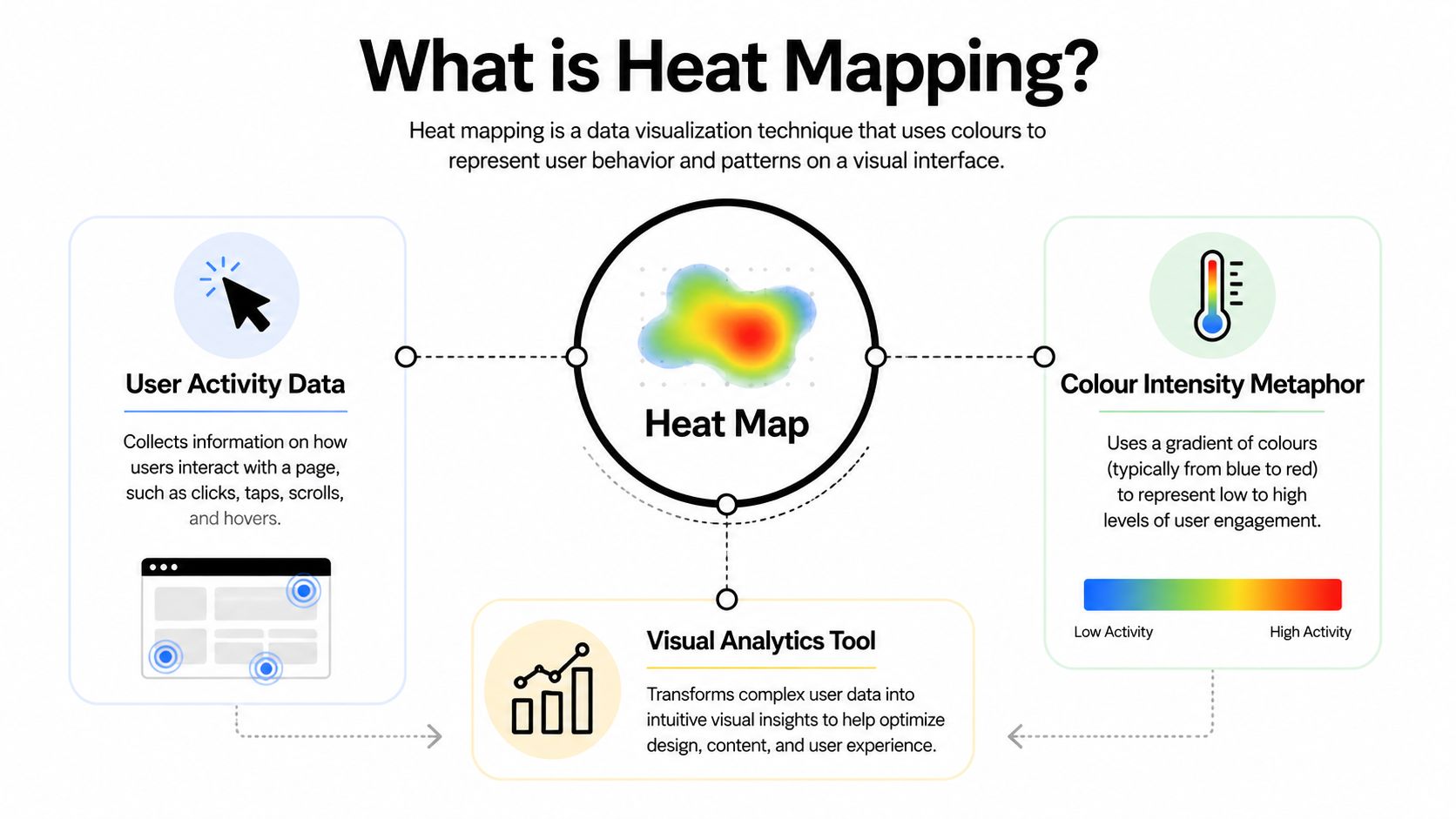
“Heat” means intensity, not temperature. NASA's Earth science lesson makes that distinction clear, heat maps show the amount or concentration of something, and the legend uses colour gradients or discrete colours to explain the values. That matters because a website heatmap is really saying, “People did this here, more often than elsewhere.” It is not saying the page is hot. NASA Earth science lesson on reading a heat map
The Four Main Types of Website Heatmaps
Website heatmaps aren't one single chart. They answer different questions, so the right type depends on what you're trying to learn about the page. Adobe describes heatmaps as visualisations of aggregated user interactions, and in practice that means you can look at clicks, scrolling, cursor movement, and predicted attention rather than guessing from bounce rates alone. Adobe heat map basics
Click maps
Click maps show where people tap or click. If a decorative image has a bright cluster of clicks, people may think it's interactive when it isn't. If a call-to-action is ignored, the page may be burying it, styling it weakly, or placing it where people don't expect to act.
Scroll maps
Scroll maps show how far down the page visitors travel. They're useful when a page is long and the most important message sits too low. If readers never reach the booking form, pricing table, or product proof, the issue may not be the offer, it may be page length or layout.
Move maps
Move maps track cursor travel. They're not a perfect mirror of the eye, but they can still show where people hesitate, skim, or linger. If a cursor stalls over a form field or feature list, that often signals friction, uncertainty, or extra mental effort.
Attention maps
Attention maps overlay predicted focus areas. They help you see which parts of a layout are likely drawing the eye first, so you can judge whether the visual hierarchy makes sense. They're especially useful when a page has competing headings, images, and buttons.
A quick comparison helps when you're choosing what to use first.
Heatmap type | What it measures | Best for |
|---|---|---|
Click map | Taps and clicks on page elements | Finding ignored or misleading elements |
Scroll map | How far visitors move down the page | Checking whether key content sits too low |
Move map | Cursor movement and hover patterns | Spotting hesitation and friction |
Attention map | Predicted focus areas | Reviewing visual hierarchy and layout |
For most UK small-business sites, click maps and scroll maps are the best starting point. They answer the simplest questions first, and simple questions usually lead to the quickest design fixes.
How to Read a Heatmap Without Misleading Yourself
A heatmap only helps if you read it like a chart, not like a screenshot of one visitor's mood. The colour legend matters first, because the strongest colour is only meaningful relative to the rest of the page. Atlassian's guide is useful here, because it explains that a heat map is a two-axis grid where each cell encodes values for binned ranges, which means you're looking at aggregated cells, not raw individual points. Atlassian heatmap guide
Read the colour before you read the story
A red area doesn't automatically mean success. It might mean people found the element useful, but it can also mean they're stuck, confused, or repeatedly trying to click something that doesn't behave like a link. If you only glance at the brightest zone, you can miss the fact that the page is creating friction instead of momentum.
Practical rule: a hot spot is a hypothesis, not a conclusion.
That's why the next question should always be, “What happened before and after this area?” A sticky navigation bar with lots of accidental clicks can look like a valuable hotspot, but the core issue may be that the bar is too visually dominant. A decorative banner can attract clicks for the wrong reason, which is a design problem, not a sign of engagement.
Turn the colour into a testable question
The best reading habit is to translate the heatmap into a design question. For example, if a button is bright red but conversion is still weak, ask whether the copy is unclear, the button looks inactive, or the surrounding content is distracting. Then check session recordings or run an A/B test so you're not guessing from colour alone. Baslon Digital's plain-English guide to A/B testing
NASA's guidance is a good reminder that heatmaps show the amount or concentration of a measure, not the thing itself. So the heatmap is never the final answer. It's the starting point for a better question.
Three questions to ask every time
What is the page trying to make people do? If the answer isn't obvious, the design may be unclear before the heatmap even enters the picture.
What does the hot area represent? A lot of clicks on a non-interactive image point to confusion, not success.
What would I change first, then retest? A good heatmap points to one concrete edit, not a complete redesign.
A hot area can be popular and unprofitable at the same time. That distinction is where careful UX thinking beats gut feeling.
Setting Up Heatmaps on Your Website Step by Step
The cleanest way to use heatmaps is to start with one question, not five. If you don't know what you're trying to prove, the chart will give you noise instead of direction. For a service site, the question might be simple, such as whether visitors are seeing the booking button at all.
Step 1 Define the question
Write one page-level question before you install anything. For example, ask whether visitors notice the booking form, whether they scroll far enough to reach pricing, or whether they try to click an image that isn't a link. That one sentence keeps the analysis focused.
Step 2 Choose the tool
Common options include Hotjar, Microsoft Clarity, and Lucky Orange. The right choice depends on your budget, reporting needs, and how smoothly it fits your Wix workflow. If you're comparing tools, a useful starting point is the MD TECH TEAM conversion insights on heat mapping tools, which gives a practical overview for site owners weighing their options.
Step 3 Install it in Wix
Wix makes this manageable without a developer. You can usually paste a tracking snippet into the custom code area in the Wix dashboard, or use a Wix App Market integration if the tool offers one. The exact path depends on the platform and the app you choose, but the aim is always the same, get the script onto the pages you want to track.
Step 4 Run the test long enough
Let the tool collect enough sessions to show a stable pattern rather than a lucky one-off. If you check too early, you'll act on noise. If you check too often, you'll be tempted to tweak the page before you understand what the data is saying.
Don't change the page every time you see a small cluster. Wait for a pattern, then decide.
Step 5 Act, then measure again
Make one design change, such as moving a call-to-action higher, clarifying a button label, or reducing friction in a form. Then run the heatmap again to see whether the pattern changes. If the page is on Wix, this loop is especially useful because edits are usually quick, so you can test and refine without a long development cycle.
A Real-World Example of Heat Mapping in Action
A London physiotherapy clinic had steady website traffic, but bookings weren't moving in the same direction. The owner suspected the service pages were doing their job, yet people still weren't reaching the booking form.
The first heatmap gave a clear clue. The scroll map showed that many visitors never made it far enough down the page to see the form, and a click map revealed a bright cluster on a decorative hero image that looked clickable but wasn't. That told the team the page was creating distraction before it created action.
The fix was straightforward. They moved the call-to-action higher on the page and gave the button stronger visual contrast so it looked like a button, not a decorative label. The lesson wasn't that the offer had changed, it was that the path to the offer had been made easier to follow.
When a team wants the mechanics behind this sort of page reading in motion, a short screen recording helps connect the dots between the heatmap and the actual user journey.
After the redesign, the clinic had a clearer booking path and a page that matched visitor expectations more closely. The heatmap didn't replace design judgement, it exposed the point where the original layout was losing people.
A similar pattern shows up in Wix-based e-commerce too. A shop owner can use a move map to see hesitation around a sizing chart link, then decide whether the chart needs better placement, stronger labelling, or a more obvious connection to the product page. The data doesn't write the fix for you, but it makes the friction visible enough to act on.

Best Practices, Privacy, and Your Next Steps
Heatmaps are useful, but they need guardrails. In the UK, that starts with consent, transparency, and a sensible approach to data minimisation. If your heatmap tool records behavioural data, your cookie policy and consent setup should explain what's collected, why it's collected, and how visitors can opt in or out where required.
The safest practice is to avoid recording form inputs, anonymise session data where possible, and keep the focus on patterns rather than identities. That keeps the tool useful without drifting into unnecessary personal data capture. It also helps your team stay disciplined, because the goal is to improve the page, not to monitor people more than you need to.
Good habits that keep the data useful
Test one change at a time. If you move the button, rewrite the headline, and shorten the page all at once, you won't know which change mattered.
Review heatmaps on a schedule. Monthly review is usually more useful than daily checking, because it keeps you focused on patterns rather than noise.
Pair heatmaps with other evidence. Session recordings, conversion data, and an A/B test help you check whether the hot area is valuable.
Keep the page context in mind. A hot zone near the top of a page isn't automatically better than one lower down if it doesn't support the next step.
The broader optimisation principle is simple. If a design choice is confusing, the heatmap will often show you where the confusion lives, but not why it exists. That's why conversion optimisation tips are most effective when they're paired with behaviour data rather than used on their own.
Treat heatmapping as part of a decision process, not a trophy chart. When you use it that way, it becomes a practical guide for cleaner pages, clearer actions, and better visitor experience.
If you want a review of your Wix site, Baslon Digital can look at your current layout, interpret the heatmap signals, and help prioritise the fixes that matter most. Visit Baslon Digital to book a free discovery call and turn your heatmap data into clear next steps.
Comments