Website Design for Personal Trainers That Converts

A prospective client lands on your site from Instagram between sets. They want to know whether you train people like them, what it costs, and whether they can book today. If the first screen shows a dramatic stock image, a vague promise, and no obvious way to choose a time, they won't wait for a reply to a buried contact form. They'll return to Google and book with the trainer whose site makes the next step obvious.
That moment is the true test of website design for personal trainers. The site must look credible, but it also has to move a mobile visitor from interest to a confirmed appointment with as little hesitation as possible. In the UK, the market is crowded, with 24,856 personal trainer businesses in 2025 according to IBISWorld and another industry source reporting 25,934 businesses in 2025 (UK conversion benchmarks). A polished website helps, but a clear booking funnel is what turns attention into revenue.
Table of Contents
Why Most Trainer Websites Lose Bookings - Start with the offer, not the template
Branding, Photography, and Proof That Builds Trust - Show the coach, not a generic fitness mood
Mobile UX, CTAs, and Speed That Convert - Remove avoidable mobile friction
Launch Checklist and Ongoing Maintenance Plan - Maintain the funnel, not just the pages
Why Most Trainer Websites Lose Bookings
A trainer with 500 monthly visitors and zero bookings can see the problem clearly in Wix Analytics: high mobile exits on the homepage and no booking starts. The issue is often the route between interest and action. Visitors may understand that the trainer offers fitness coaching, yet still lack enough information or direction to choose a session.
A stock-photo hero communicates “fitness” without identifying the trainer, location, specialism, or likely result. “Transform Your Body Today” sounds energetic but leaves practical questions unanswered. Is the offer one-to-one training, online coaching, rehabilitation-adjacent support, or group classes? Is the trainer nearby? What happens after the visitor clicks?
Start with the offer, not the template
Before selecting a Wix template, separate the business into clear offers. One-to-one sessions, online programming, small-group training, and hybrid packages may need different pages, prices, proof, and booking rules. Combining them on one generic Services page makes visitors interpret the business instead of choosing the route that fits them.
Run a short discovery exercise:
Audit commercial priorities: Identify which offer attracts the right clients and creates the strongest long-term value. Do not give every service equal prominence by default.
Choose a specific buyer: A promise such as post-natal strength within a defined local area gives visitors more direction than “fitness for everyone”. Hypertrophy coaching for engineers who travel is another focused example.
Interview existing clients: Ask what they searched, which page they read, and what persuaded them to book. Use their wording in headlines and FAQs.
Inventory proof: Gather qualifications, real training photographs, permitted transformation images, named reviews, logos, and relevant Google reviews.
Write a positioning brief: State the buyer, desired outcome, offer, price anchor, and proof pillars on one page. Test each design choice against that brief.
This process prevents a common Wix mistake: building an attractive site before deciding what it sells. The visual system should support one primary decision. It cannot compensate for an unclear business model.
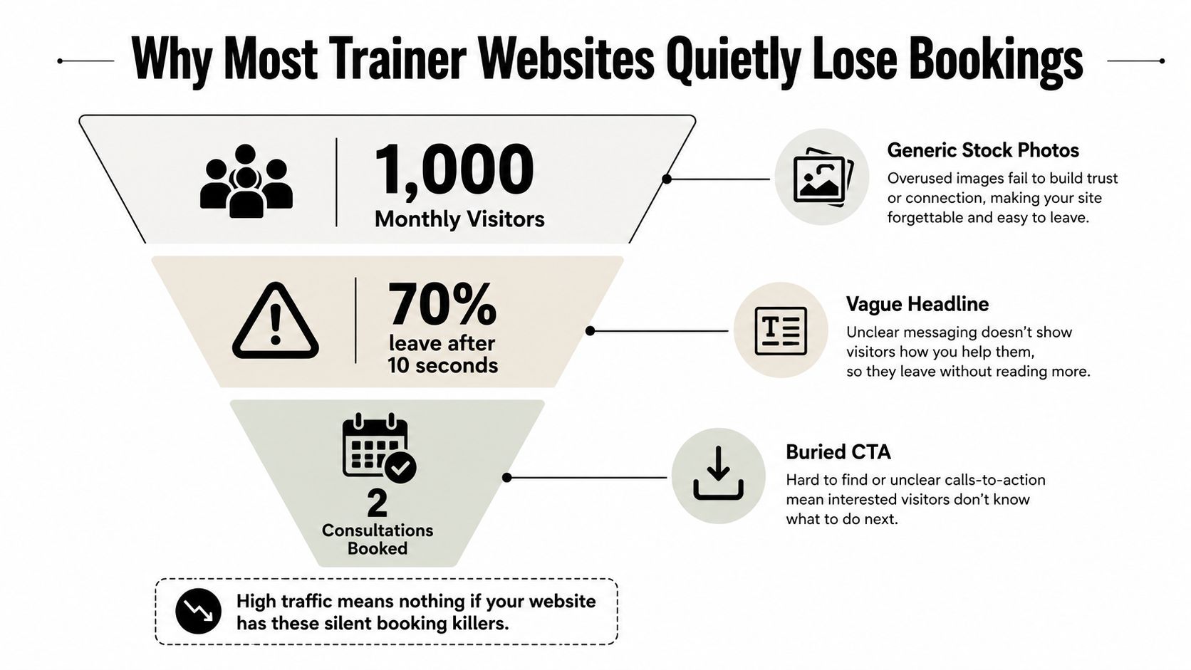
Use analytics to locate the leak. High mobile exits on the homepage point to a weak first screen or slow media. Service-page visits without booking starts suggest a message mismatch, missing prices, or an unclear CTA. Booking starts without completions often indicate too many fields, unavailable times, unexpected payment steps, or policies shown too late.
Practical rule: Treat every page as a route to a decision. If visitors cannot tell what to do next, the design has created work instead of removing it.
Little Green Agency's guide to best practices for website design reinforces practical priorities around clarity, consistency, and user-centred page structure. For a trainer, that means one audience per service page, one primary action, and proof placed beside the point where hesitation appears.
The commercial context makes these details worth fixing. UK benchmark data reports average ecommerce conversion around 1.93% in May 2026, while another UK benchmark places average website conversion around 2.9% and top landing pages at roughly 5.31%. These figures are not personal-training guarantees, but they show why clearer messaging and easier mobile booking can matter when the baseline is low.
Map the Site Structure That Guides Visitors
A trainer's site should feel like a guided conversation. The homepage identifies the right person and offers the next step. The Services page helps them choose a format. Results and About pages remove doubt. Booking completes the decision.
A practical Wix structure looks like this:
Homepage: Lead with a niche-specific headline, a clarifying subheading, one primary booking CTA, and three proof points. Give each visitor one service summary, then link to the relevant detail page.
Services: Separate one-to-one training, online coaching, and group sessions into distinct cards or pages. Include the outcome, delivery format, duration, price or price range, location, and a direct booking action.
About: Tell a concise story connected to qualifications, coaching philosophy, and the client's problem. Use a photograph of the trainer coaching, not only a posed portrait.
Results: Organise transformations, written testimonials, video reviews, and relevant media or professional logos. Add context so visitors understand who achieved the result and what service they used.
Booking: Embed the Wix Bookings flow with availability, payment expectations, cancellation rules, and location details visible before confirmation.
Contact: Include the map, phone, email, service area, and any useful note about gym access or unusual opening arrangements.
The footer should repeat the essential routes, including Services, Results, Booking, Contact, privacy information, and terms. A simple sitemap supports both human navigation and search discovery. Information architecture matters because visitors need to understand where they are, what they can find there, and how to return to the main path. Baslon Digital's guide to what information architecture means provides useful context for making that structure deliberate rather than accidental.
The primary path should remain visible even when someone enters through a service page or Google result. A persistent Book Now action, descriptive page titles, and consistent navigation help the visitor continue without returning to the homepage.
Branding, Photography, and Proof That Builds Trust
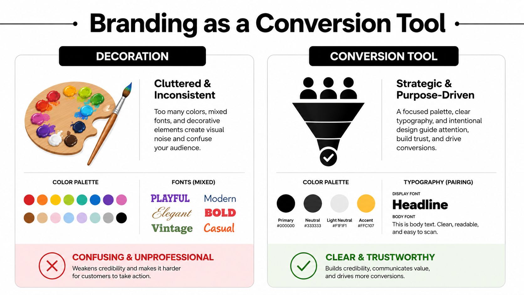
A trainer's visual identity should answer a practical question within seconds: “Am I in the right place, and can I trust this person?” Decoration alone can't do that. A restrained palette, readable type, and recognisable photography make the business easier to understand on a small screen.
Use two main colours as a starting point. An energetic accent can highlight booking actions, while a trustworthy neutral can carry backgrounds, text, and longer sections. Pair one display font with one body font, then check both at mobile sizes. If the display type looks impressive in a desktop mock-up but becomes difficult to scan on a phone, it isn't serving the funnel.
Show the coach, not a generic fitness mood
Stock photography creates distance. Visitors want to see the person they'll meet, the training environment, and the type of client experience they can expect. Use candid images of the trainer coaching, correcting movement, or speaking with a client. The face should remain recognisable when the image is reduced to a thumbnail.
Each important page needs a clear visual anchor:
The homepage can show the trainer delivering the core service.
A niche service page can show an appropriate client context, with consent.
The About page should connect the trainer's story to a real coaching moment.
The Results page should prioritise client evidence over abstract gym imagery.
Proof needs the same discipline. Replace “I help people get fit” with specific, verifiable evidence. Start with measurable outcomes only where the trainer can substantiate them, then add named results, client context, and short testimonials. Don't publish transformation images or personal details without clear permission.
A testimonial becomes stronger when it explains the starting problem, the coaching approach, and the change experienced. Full names can add credibility when clients consent, but initials or first names with context may be more appropriate where privacy matters. Video reviews can work particularly well because visitors hear the client's voice and see a real person rather than a polished graphic.
Audit proof page by page before launch. A page that makes a strong promise but offers no supporting evidence will feel promotional. A page that places proof beside the relevant booking action gives the visitor a reason to continue.
MeasuringU found an average NPS of just 7% across tested fitness and nutrition websites (fitness website usability findings). That result is a useful warning, even for visually polished sites. A stylish interface doesn't automatically create confidence. The words, images, evidence, and next action must work together.
Wire Up Booking, Payments, and Class Systems
The booking funnel should operate as one connected journey:
Discover the offer, choose a slot, pay or place a hold, receive confirmation, and arrive prepared.
Wix Bookings can provide the central flow, but configuration determines whether it feels effortless. Create a separate service for each meaningful offer. Give it a clear duration, delivery method, address or Zoom detail, price, cancellation policy, and availability rule. A visitor shouldn't have to email the trainer to discover whether an online consultation is available.
Place the booking widget or pricing-plan button near the top of each service page. Repeat the action after the offer explanation and proof, but keep the wording consistent. “Book an initial consultation” is more useful than “Submit”, especially when the service isn't a generic enquiry.
For payments, connect an appropriate processor such as Wix Payments or Stripe so the financial step happens during checkout where suitable. Don't rely on a follow-up email for information the visitor needs to complete the appointment. For group classes, set capacity limits and enable a waitlist so the system can handle full sessions without manual message chains.
Automations should support the promise made on the page:
Confirmation: Send the appointment details, address or meeting link, and preparation guidance.
Reminder: Use a timed reminder that reinforces the appointment and relevant cancellation policy.
No-show handling: Make the policy visible before payment and repeat it in confirmation messages.
Follow-up: Trigger a review request after an appropriate session or milestone.
The broader operational logic is covered well in this resource on how clubs simplify payments and comms. The lesson for an independent trainer is simple: the website, calendar, payment system, and messages should share the same information.
Before publishing, complete the entire journey on a phone. Choose a service, select a real test slot, enter payment details in a controlled test, and check the confirmation. If any step causes uncertainty, fix the system rather than adding another explanatory paragraph. Baslon Digital's overview of the Wix booking system is also useful when planning the connection between services, availability, and appointments.
SEO and Local Visibility for Trainers
Search visibility works best when it reflects the services and locations a trainer can serve. Build pages around clear intent, such as “personal trainer near me”, a neighbourhood plus “personal trainer”, or a specialist service paired with a city. Don't force every keyword onto one homepage. A visitor searching for online coaching needs different information from someone looking for sessions at a local gym.
Create a dedicated page for each substantial offer. Include the service and location naturally in the title, main heading, meta description, image alt text, and supporting copy. Explain the format, who it's for, where it takes place, how booking works, and what the first appointment involves. Search optimisation should improve the visitor's decision, not produce repetitive text.
Your Google Business Profile deserves the same attention as the website. Complete the category, service list, service areas, photographs, Q&A, and updates. Seed the Q&A with genuine questions clients ask, then answer them plainly. Keep the business name, address, and phone details consistent across Yelp, Apple Maps, Mindbody, and relevant local directories.
The contact page should include a Wix map when a public location is appropriate, while service-area trainers should explain where they travel and where online sessions are delivered. Add LocalBusiness schema through Wix SEO settings, then check that the details match the visible page content.
A manageable content rhythm is more useful than a large blog. Publish a short case-study post tied to a local search theme, using consented client details and a clear link to the relevant service. Track impressions and queries in Google Search Console, then improve pages that already show signs of relevance instead of publishing disconnected topics.
For a practical explanation of neighbourhood-focused optimisation, see this guide to what local SEO means. The principle is straightforward: make it easy for nearby prospects, search engines, and map platforms to understand the service, location, and next step.
Mobile UX, CTAs, and Speed That Convert
For trainers, the phone is often the first design environment. Prospects may arrive from Instagram, TikTok, Google, or a message link while travelling or between appointments. The first screen should contain one trainer identity, one clear offer, one relevant image, and one primary CTA.
A sticky mobile bar can keep Book Now, WhatsApp, and Call available without forcing a visitor to scroll back to the header. Use only the contact options the trainer can respond to reliably. A WhatsApp button that receives no timely reply creates a different kind of friction.
CTA copy should describe the action and its benefit. “Book an initial assessment” tells the visitor more than “Get Started”. The button needs strong contrast, sufficient spacing, and a tap area that remains comfortable on a small screen. One UK CTA guide recommends a mobile tap target of at least 48px tall (UK CTA best practices).
Remove avoidable mobile friction
Keep forms short. Ask only for information needed to qualify or schedule the enquiry, and validate phone and email fields before submission. Don't put a long questionnaire before a visitor can see availability unless the service requires it.
Speed matters because a heavy hero video, multiple tracking scripts, and uncompressed images delay the decision. Compress the main image, defer non-essential scripts, and inspect every service page in Lighthouse. Accessibility belongs in the same quality pass:
Images: Add useful alt text that describes the training context.
Video: Provide captions for testimonial and explanatory videos.
Colour: Check contrast against WCAG AA requirements.
Navigation: Make focus states and keyboard paths visible.
Forms: Label fields clearly and explain errors in plain language.
Test comprehension before launch. GOV.UK recommends clear success criteria, potential users, and qualitative usability testing with 5–6 participants (GOV.UK usability testing guidance). For a lean trainer-site check, ask a few people who don't know the business to identify the offer, price, location, and next action quickly. Measure whether they complete the booking task, how long it takes, and where they abandon it.
Repeat the CTA after the hero, after proof, and near the page footer. A UK landing-page guide recommends this repeated placement, with social proof directly under the hero, beside the form, and before the final action (UK landing-page design guidance). Repetition is useful when the page is long, but competing calls to action aren't.
Launch Checklist and Ongoing Maintenance Plan
A website isn't ready because every page looks finished in the Wix editor. It's ready when a real person can complete the important tasks without assistance.
Run a focused launch check:
Test the booking journey: Use a phone, select each service, complete a controlled payment test, and verify the confirmation message.
Check availability rules: Confirm that the calendar blocks travel time, existing appointments, holidays, and unavailable locations.
Review policies: Make cancellation, late-arrival, payment, and class-capacity rules visible before the visitor commits.
Inspect mobile layouts: Check headings, sticky bars, forms, image crops, tap targets, and embedded widgets on current phones.
Validate structured data: Use Google's Rich Results testing process and correct any errors that don't match the visible page.
Test communication: Confirm that booking notifications reach the trainer and that clients receive the correct address, link, and preparation details.
Connect Google Analytics 4, Google Search Console, and Wix Analytics. Create events for completed bookings, phone clicks, contact submissions, and key booking starts. These signals help separate a page that attracts attention from one that produces appointments.
Review the Google Business Profile after launch. Match the visible business name, address, and phone, add current gym photographs, and publish useful updates connected to real availability or seasonal offers. Avoid posting for the sake of activity. Each update should answer a question or give a relevant reason to enquire.
Maintain the funnel, not just the pages
Set a monthly review routine:
Booking behaviour: Examine where visitors leave and whether a service page creates more hesitation than others.
Proof freshness: Replace outdated testimonials, check permissions, and add new evidence where appropriate.
Schedules: Update classes, opening information, prices, and trainer availability.
Performance: Recheck page speed after adding Wix apps, videos, pop-ups, or tracking tools.
Search visibility: Review trainer-specific queries and improve pages that are gaining impressions.
Run one controlled change at a time. Test a hero message or CTA wording against completed bookings rather than clicks alone. Keep a record of changes in a shared Notion page, including the date, reason, result, and any integration affected. That simple documentation prevents a future edit from breaking the calendar or payment flow.
Independent fitness landing-page research reports an average conversion rate of 8.3% for health and fitness landing pages, while well-optimised gym pages are reported to convert 10–20% of visitors into leads. The same benchmark reports that the average gym converts 28% of leads into booked appointments, showing why lead follow-up and appointment completion deserve as much attention as the landing page itself (fitness landing-page benchmarks). Treat those figures as directional benchmarks, not promises. Your own completed booking data is the standard that matters.
A strong trainer website doesn't need more decoration. It needs a clear offer, credible proof, fast mobile paths, visible prices where appropriate, and a booking system that works from first tap to confirmation.
Baslon Digital creates custom Wix websites for personal trainers, including clear service pages, mobile booking journeys, lead forms, and conversion-focused layouts. If your current site looks polished but makes visitors work to book, visit Baslon Digital to discuss a practical redesign built around your offers and client journey.
Comments