
How we rebuilt the Baslon Digital website (and what changed)
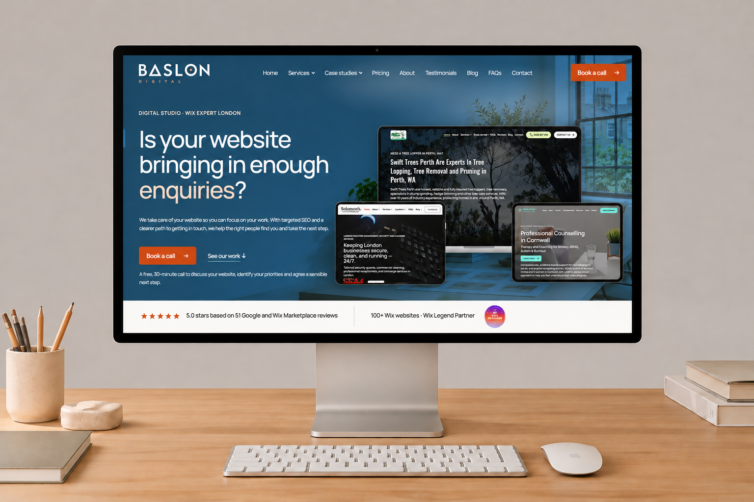
We recently rebuilt the Baslon Digital website from the ground up. Here is a high-level look at the improvements we made and why we made them. If your own site is due a refresh, the same principles apply.
On this page
- 1. A clearer message in the first few seconds
- 2. Services that each have their own page
- 3. Real work, in the clients' own words
- 4. Built to be fast
- 5. Designed for phones as much as desktops
- 6. Accessible by default
- 7. Search foundations done properly
- 8. A blog that is easier to use
- 9. An easier way to start a conversation
- 10. Built so it can keep improving
- What to take from this
A website is never finished. It is a working tool, and it should be judged the way you would judge any other tool in your business: does it help the right people understand what you do and get in touch?
We recently rebuilt the Baslon Digital website from the ground up. Here is a high-level look at the improvements we made and why we made them. If your own site is due a refresh, the same principles apply.
1. A clearer message in the first few seconds
Visitors decide very quickly whether a site is for them. The new homepage opens with a dark studio-style hero, a single clear promise and one obvious next step, Book a call. Social proof sits directly beneath it, so credentials and client reviews are visible without scrolling.
The rest of the homepage now follows the order a visitor's questions tend to arrive in:
- What problem might I have?
- What do you do about it?
- Who have you done it for?
- How does working with you actually go?
- What happens next?
2. Services that each have their own page
Previously, a lot of what we do was described in one place. Now each service has its own dedicated page, covering Wix SEO, website design, custom development and website maintenance and support, along with pages for people searching for a Wix designer or developer in London. Each page speaks to one need, which is easier to read and easier for search engines to understand.
3. Real work, in the clients' own words
We expanded the case studies and reviews. Visitors can filter our work, read what the challenge was and what changed, and see the client's own testimonial, with their wording and attribution kept exactly as given. We would rather show real results from real clients than make claims we cannot back up.
4. Built to be fast
Speed affects both how a site feels and how it performs in search. For the rebuild we:
- Moved to a lightweight, static-first build with very little unnecessary code.
- Self-hosted our fonts and loaded them without blocking the page.
- Served images in modern formats at sizes suited to each screen.
- Removed scripts that forced the browser to do extra layout work.
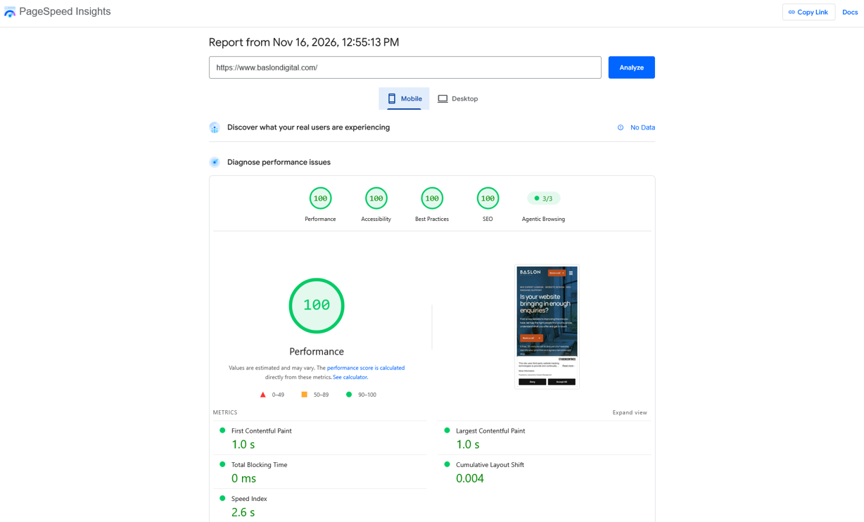
The result: when we ran the homepage through Google PageSpeed Insights on 16 November 2026, it scored 100 for Performance, Accessibility, Best Practices and SEO on both mobile and desktop. On mobile, the page painted its first content in 1.0 seconds, its largest content in 1.0 seconds, had 0 ms of blocking time and a Speed Index of 2.6 seconds. On desktop those figures were 0.3 seconds, 0.5 seconds, 0 ms and 0.8 seconds. Layout shift was 0.004 on both, so nothing jumps around while the page loads.
These are lab results from a single test run, and scores can vary from run to run and over time. They are a snapshot, not a guarantee, but they show the foundations are sound.
5. Designed for phones as much as desktops
Many visitors will see the site on a phone first. We checked every page across desktop, tablet and mobile, then adjusted the details: a mobile header with a solid background, long case studies that collapse into shorter summaries, larger tap targets for links, and a hero arranged so the key proof still fits on the first screen. Content is capped at a comfortable maximum width, so it also reads well on very large monitors.
6. Accessible by default
Good design includes everyone. We use at least 16px for body text and 14px for supporting labels, darkened our accent and muted text colours to meet contrast guidelines, added a skip link for keyboard users, and tidied the markup so screen readers can follow it.
7. Search foundations done properly
As a Wix SEO specialist, we hold our own site to the standard we recommend to clients. That meant:
- Clear, descriptive page titles and meta descriptions.
- Structured data so search engines understand our business, services and FAQs.
- Clean URLs with no trailing clutter, plus a sitemap covering pages and blog content.
- Social sharing images, so links look right when they are shared.
- A new favicon so the brand is recognisable in browser tabs and bookmarks.
8. A blog that is easier to use
We have published a large number of articles over the years, so the blog needed to work harder. Posts now have a table of contents that links to the matching headings, properly formatted tables that scroll sideways on small screens, searchable titles, category and tag pages, and a "From the blog" section on the homepage that always shows the latest articles. Our long-standing readers' view counts were carried across, too.
9. An easier way to start a conversation
Everything points to one primary action: Book a call. It opens a booking page with our calendar embedded, so you can choose a time straight away. For people not yet ready for a call, there are two lower-commitment options: a free site review and a contact page with a short form, company details and a privacy policy checkbox, so you know how your information will be used.
10. Built so it can keep improving
Finally, the site now lives in a version-controlled codebase, with shared header and footer components and a consistent design system. That makes it quicker to improve, safer to change and easier to keep consistent as we add pages, case studies and articles. We still use Wix for the things it does well, such as the blog, forms and bookings.
What to take from this
You do not need to rebuild everything to get the benefits. If you are reviewing your own website, start with these questions:
- Can a new visitor tell what you do and what to do next within a few seconds?
- Does each service have a page of its own?
- Is your proof real, specific and easy to find?
- Does it load quickly and work well on a phone?
- Is it readable and accessible for everyone?
- Are the SEO basics in place and measurable?
- Is it easy to get in touch?
If the honest answer to a few of these is "not quite", we would be happy to take a look. You can book a free call or ask for a free site review, and we will tell you where the biggest gains are likely to be. Visit https://www.baslondigital.com/contact
27 views