How to Increase Website Conversion Rates: UK Expert Tips
- Baslon Digital

- Oct 10, 2025
- 15 min read
If you want to get more conversions from your website, you have to stop guessing and start making decisions based on actual data. That means digging in and auditing your site to figure out why visitors aren't taking action. Tools like heatmaps and sales funnel analysis are brilliant for this, helping you find the exact points of friction. Only then can you make targeted changes that actually move the needle.
Kicking Off Your Conversion Audit for Real Insights
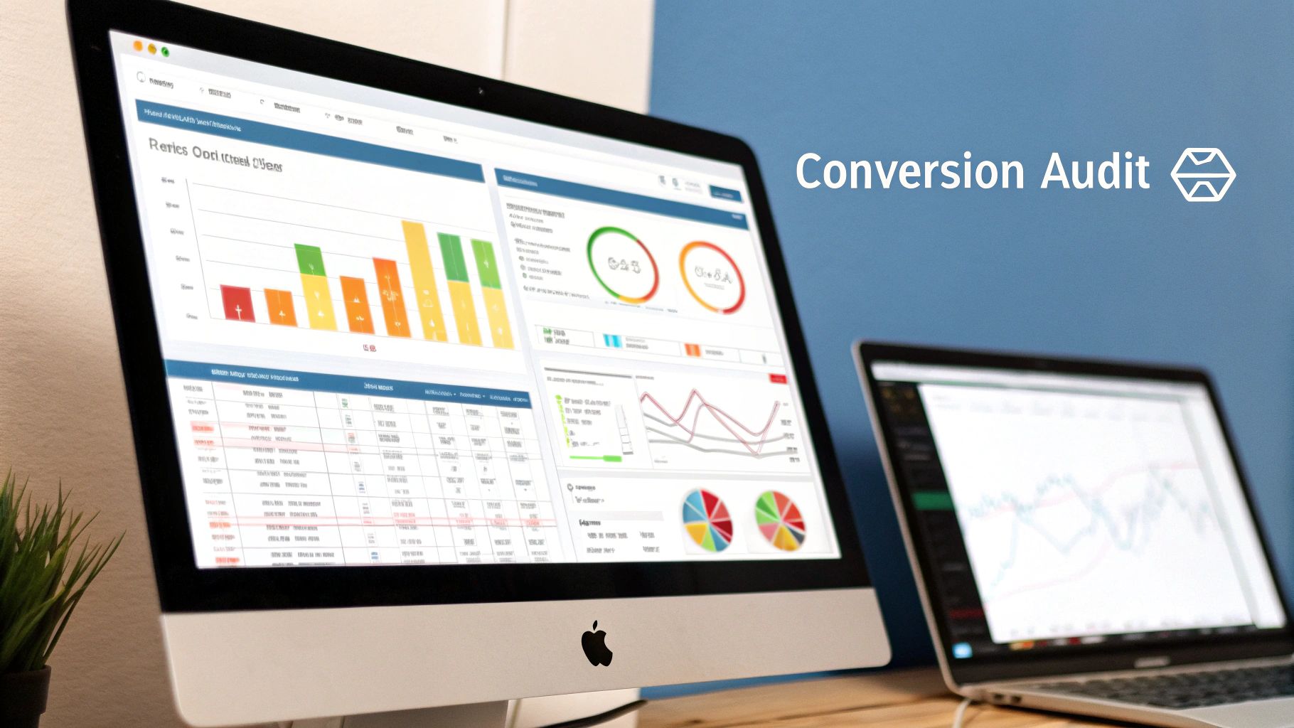
Before you even think about changing a button colour or tweaking a headline, you need a crystal-clear picture of what’s really happening on your site. A proper conversion audit is your first move. It takes you beyond surface-level stats to understand genuine user behaviour. This isn't just about collecting data; it's about building an evidence-based strategy to make sure every change you make has a direct impact on your bottom line.
Think of this initial analysis as an opportunity hunt. Every frustrating navigation step, every abandoned cart, and every confusing form field is a golden chance to make things better.
See Your Site Through Your Visitor's Eyes
The best insights always come from seeing your website from the user's perspective. Analytics tell you what happened, but behavioural tools show you why. They're the key to uncovering those moments of hesitation or confusion that make people click away.
Heatmaps are fantastic. They show you exactly where users click, where they move their mouse, and how far down the page they scroll. You might discover that loads of people are clicking on an image that isn't actually a link—a clear sign of a design flaw.
Session recordings are even better. These are literal videos of real people using your site. Watching someone struggle to find the checkout button or get stuck in a loop trying to fill out a form can be a massive eye-opener.
These tools turn abstract numbers into human stories, giving you the context you need to make improvements that matter. Once you've got a baseline, you can start gathering both quantitative data from analytics and invaluable qualitative insights. Knowing how to utilize customer feedback for continuous improvement is a game-changer, revealing pain points you never would have guessed.
Picking Apart Your Conversion Funnel
Your conversion funnel is simply the journey a visitor takes from their first click to completing a goal, like making a purchase. The whole point of an audit is to find the biggest "leaks"—the stages where you're losing the most potential customers.
For instance, you might find that 90% of users add an item to their cart, but only 40% actually make it to the payment page. That’s a massive red flag. It points to a serious problem in your checkout process, maybe caused by surprise shipping costs or a clunky account creation form.
By focusing on the biggest drop-off points first, you can put your resources where they’ll have the most significant impact on your revenue. It's all about prioritising fixes for maximum gain.
The UK e-commerce sector has shown impressive resilience, with top sites often blowing past the standard 1–4% conversion rate. Sectors like electronics and home appliances are averaging 3.6%, which proves that UK retailers are getting pretty good at optimising the user journey. We also know from experience that even small tweaks found through A/B testing can lift conversion rates by 10–20%.
Ready to get started? To really pinpoint what's holding your site back, you need a structured approach. This checklist covers the essentials for your initial audit.
Key Areas for Your Conversion Audit
Audit Area | What to Look For | Tools to Use |
|---|---|---|
User Experience (UX) | Confusing navigation, broken links, non-responsive design on mobile. | Google Analytics, User Session Recordings (e.g., Hotjar), User Surveys |
Calls-to-Action (CTAs) | Vague or unclear CTA text, poor placement, buttons that don't stand out. | Heatmaps (e.g., Hotjar), A/B Testing Tools (e.g., Google Optimize) |
Page Load Speed | Slow loading times on key pages (homepage, product pages, checkout). | |
Analytics & Tracking | Missing tracking codes, incorrect goal setup, data discrepancies. | Google Analytics, Google Tag Manager, Manual Site Crawl |
Checkout Process | Unexpected costs, forced account creation, too many form fields. | Funnel Analysis in Google Analytics, Session Recordings, Competitor Analysis |
Working through this table will give you a solid, data-backed list of priorities to tackle. It transforms your audit from a vague exercise into a clear action plan.
Ready to uncover the hidden opportunities on your own website? Our team at Baslon Digital can help you conduct a thorough conversion audit to kickstart your optimisation journey.
Winning Conversions with Speed and Mobile Design
In the world of online business, speed isn't just a nice-to-have feature; it's everything. A slow website is the silent killer of conversions. It doesn't announce its presence, it just quietly frustrates visitors until they give up and head straight to your competitors. Every single second your site takes to load is literally chipping away at your revenue.
This is a massive deal for UK shoppers, who are some of the most mobile-savvy people in Europe. Research has shown that pages loading in 2.4 seconds convert at around 1.9%. Let that stretch to 3.3 seconds, and the rate drops to 1.5%. At 4.2 seconds? It plummets to less than 1%. The data is clear: UK retailers who've invested in things like content delivery networks (CDNs) and image optimisation have seen their conversion rates jump by 2–3 percentage points. You can read the full research on e-commerce speed to see just how stark the numbers are.
Diagnosing and Fixing Speed Issues
Before you can speed things up, you need to figure out what’s holding your site back. A free tool like Google's PageSpeed Insights is the perfect place to start. It’ll give you a performance score and, more importantly, a list of specific, actionable things to fix.
You’ll often find the same old culprits are to blame for a sluggish site:
Bloated Images: Huge, high-resolution photos that haven't been compressed for the web are incredibly heavy. They are one of the biggest and most common reasons for slow load times.
Inefficient Code: Messy JavaScript and CSS files force a visitor's browser to work way harder than it needs to before the page is actually usable.
Slow Hosting: Don't underestimate the impact of your hosting provider. A cheap, shared server might seem like a good deal, but it can buckle under pressure, especially when you get a spike in traffic.
Taking the time to optimise these elements is a direct investment in your conversion rate. A faster site delivers a better user experience, which in turn builds trust and encourages visitors to complete their goals.
There are loads of practical steps you can take, and we cover them in our detailed guide on how to improve website loading speed fast.
Mastering the Mobile-First Journey
These days, just having a website that shrinks to fit a smaller screen isn't going to cut it. A truly effective mobile experience is designed for mobile users from the ground up. You have to prioritise what’s essential for someone who’s on the go.
Think about their situation. They’re probably using their thumbs to get around, might be on a patchy internet connection, and are surrounded by distractions. Your design needs to account for this. That means thumb-friendly buttons, simple forms that don’t feel like a chore, and a checkout process with as little friction as possible. Every tap should feel natural and move them one step closer to converting.
Getting this right is absolutely vital if you want to understand how to increase website conversion rates in a world where mobile traffic is king.
Are your website's speed and mobile design holding back your conversions? Baslon Digital specialises in creating fast, mobile-first websites that turn visitors into loyal customers. Contact us today for a free website analysis.
Writing Copy and CTAs That Actually Convert
Sure, a slick design and lightning-fast load times get people to stick around, but it’s your words that actually convince them to do something. Think of your website copy and calls-to-action (CTAs) as the engine of your conversion machine. They’re what guide visitors, build their trust, and make clicking that button feel like the most natural next step.
Your copy is your expert salesperson, chatting with a potential customer. It needs to be clear, genuinely helpful, and all about them, not just you. Your CTAs are the same—they’re not just buttons; they're the final, firm instruction at the end of that conversation.
Crafting High-Impact Calls-to-Action
Let's be clear: a CTA is an instruction, not a suggestion. Vague phrases like "Click Here" or "Submit" are total wastes of digital space. They’re boring, they don’t tell the user what’s about to happen, and that tiny bit of uncertainty is often enough to make them bounce.
The best CTAs are crystal clear, create a little bit of urgency, and scream value. The whole point is to make the user feel confident and in charge. It's no surprise that a well-thought-out user interface can boost conversions by a massive 200%, and your CTA buttons are a huge part of that equation.
Use Action-Packed Language: Kick things off with a strong verb. Instead of a sleepy "Learn More," go for something punchy like "Get Your Free Quote" or "Start My Trial." Tell them exactly what to do.
Show Them the Goodies: What’s in it for them? "Download the Guide" is fine, but "Download Your Free E-book" is way better because it reminds them they're getting something valuable for free.
Make It Pop: Your CTA button absolutely has to stand out. Use a contrasting colour that grabs the eye and make sure it’s big enough to be tapped easily, especially on a phone.
Writing Copy That Connects and Persuades
Every single word on your site matters—from the big, bold headlines to the product descriptions and even the tiny bits of text on your contact forms (that’s called microcopy, by the way). Each one is an opportunity to build trust and dial down your visitor's anxiety.
For instance, don't just list a product's features. Translate them into real-world benefits. A travel bag doesn't just have "water-resistant fabric"; it "keeps your gear dry on rainy city breaks." See the difference?
The secret to great copy is to stop talking about yourself. Focus entirely on the customer’s problem and how you solve it. Answer their unspoken questions, knock down their objections, and make them feel like you get them. That empathy is what turns a casual browser into a loyal customer.
Getting the words right is a skill that has a direct line to your ability to increase website conversion rates. If you want to go deeper, our guide on how to write website content that converts is packed with more advanced tips.
Ready to give your website’s messaging a serious upgrade? Let the experts at Baslon Digital help you craft copy and CTAs that actually connect with your audience and get you the results you’re looking for.
Building Trust with Authentic Social Proof
Before anyone is going to give you their email address, let alone their credit card details, they need to trust you. Completely. Trust is the invisible currency of the internet, and if you don't have it, your conversion rates are going nowhere fast.
This is where social proof comes in. It’s not some complicated marketing hack; it’s just basic human psychology. We see other people doing something, and we feel more comfortable doing it too. When a potential customer sees that others have bought from you and had a great experience, their own anxiety about making a purchase starts to fade.
Considering research shows that 94% of first impressions are related to design, weaving these trust signals right into your website isn't just a nice-to-have. It’s essential.
Let Your Customers Do the Selling
Honestly, the best way to build credibility is to step back and let your happy customers do the talking. Generic, anonymous praise like "Great service!" just doesn't cut it anymore. Today's buyers are savvy, and they want to see real feedback from real people. This is a massive factor in how you increase website conversion rates.
Here's how to put that glowing feedback to work:
Make Star Ratings Obvious: Slap those star ratings and review counts right under your product titles and on category pages. It’s an instant visual stamp of quality.
Feature Proper Testimonials: Go beyond a simple quote. A photo of the customer, their full name, and maybe their company or town turns a faceless comment into a story someone can actually relate to.
Use In-Depth Case Studies: For service businesses, a detailed case study is pure gold. It walks a potential client through the problem, your solution, and the brilliant results you delivered. It's undeniable proof that you know what you're doing.
These things work because they feel genuine. They show you’re not afraid to put your reputation out there because you consistently deliver for your clients.
Use Trust Signals to Calm Jittery Nerves
Beyond customer reviews, other little visual cues—often called trust signals—work wonders to reassure visitors at make-or-break moments. These small but mighty elements can make a huge difference, especially on your checkout and contact pages.
A well-placed trust badge or a clear privacy policy isn't just a design element; it's a promise to your customer. It tells them, "Your data is safe with us, and this is a secure place to do business." This small act of reassurance can be the final nudge someone needs to convert.
Think about adding these trust-builders to your site:
Payment & Security Badges: Show the logos of payment providers people already know and trust, like Visa, Mastercard, and PayPal. Adding security seals from services like Norton or McAfee doesn't hurt, either.
Don't Hide Your Policies: Make your privacy policy, returns policy, and terms of service ridiculously easy to find. Hiding this stuff just looks suspicious and creates unnecessary friction.
Humanise Your 'About Us' Page: Tell your story! Introduce your team with photos and short bios. Showing the real people behind the brand makes your business feel much more approachable and trustworthy.
Is your website doing enough to build that crucial customer trust? Baslon Digital designs websites that put credibility front and centre, helping you turn hesitant visitors into confident buyers. Get in touch to learn how we can help.
Driving Continuous Growth with A/B Testing
Right, so you’ve audited your site and polished your copy. Now the real fun begins. The best websites aren't just built and left alone; they evolve through relentless, data-backed tweaking. This is where A/B testing, or split testing, becomes your secret weapon for non-stop improvement.
So what is it? A/B testing is basically a head-to-head competition between two versions of a webpage to see which one brings in more business. You show 'Version A' to one slice of your audience and 'Version B' to another. Then, you sit back and let the numbers tell you which one converts better. It’s a beautifully simple way to stop guessing what your customers want and just… ask them.
From Educated Guess to Strong Hypothesis
Every decent A/B test kicks off with a solid hypothesis, not just a random thought like, "I wonder if a green button would be better?" That's not a plan; that's a daydream. Your website audit should have handed you a lovely list of potential weak spots. Use that.
A strong hypothesis is a clear, testable statement that connects a specific change to a measurable outcome.
Instead of that vague button idea, try this: "Changing our 'Add to Basket' button from grey to bright orange will make it stand out against the product page background, leading to a 10% increase in clicks." See the difference? Now you have a purpose and a clear finish line for your test.
This infographic breaks down the basic A/B testing cycle—from cooking up your hypothesis to rolling out the winner.
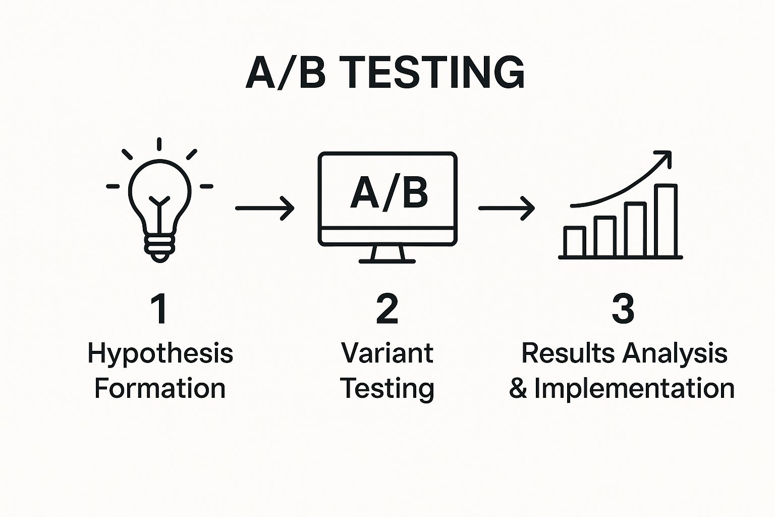
As you can see, it's a loop. You learn something new with every test, and that insight fuels the next one. It’s a cycle of constant refinement, not a one-and-done fix.
Prioritising Your Tests for Maximum Impact
You’ll probably end up with a notebook full of A/B test ideas, but you can't run them all at once. The trick is to prioritise the tests that are most likely to actually move the needle. Zero in on your high-traffic pages—the homepage, key service pages, or the checkout process. Changes there will give you data much faster.
Not sure where to start? Consider testing these high-impact elements:
Headlines: Does a headline screaming benefits beat one that just lists features?
Calls-to-Action (CTAs): Play with the wording, colour, size, and even the placement of your main buttons.
Page Layout: What if you moved your glowing customer testimonials further up the page? Would that build trust earlier?
Form Fields: Does chopping your contact form down from six fields to three actually get you more submissions? (Spoiler: it usually does).
The whole point is to build a culture of continuous optimisation. Every single test, whether it wins, loses, or ties, teaches you something valuable about your audience. That knowledge is what helps you steadily improve your user experience and lift that all-important conversion rate.
A Framework for Choosing Your Battles
With so many ideas, it's easy to get overwhelmed. A simple prioritisation framework can help you decide what to tackle first. It’s a quick and dirty way to score your ideas based on their likely impact, how confident you are they'll work, and how easy they are to implement.
Here's a table you can adapt:
| A/B Testing Idea Prioritisation Framework || :--- | :---: | :---: | :---: | :---: || Test Idea (e.g., Change CTA button colour) | Potential Impact (1-10) | Confidence (1-10) | Ease (1-10) | Priority Score || Change CTA button from grey to orange | 8 | 9 | 10 | 27 || Rewrite homepage headline | 9 | 7 | 8 | 24 || Remove 2 fields from the contact form | 7 | 8 | 9 | 24 || Redesign entire product page layout | 10 | 6 | 3 | 19 |
Just add up the scores for Impact, Confidence, and Ease. The test with the highest total score is where you should start. It’s a simple system, but it forces you to think critically about where your effort is best spent.
There are some fantastic platforms out there to help you run these experiments. If you're looking for the right software, you can check out some of the top conversion rate optimisation tools for UK businesses in 2025.
One of the biggest rookie mistakes is calling a test too early. You have to let it run long enough to reach statistical significance. That’s a fancy way of saying you need to be sure the result isn't just a fluke. This disciplined approach is the bedrock of understanding how to increase website conversion rates for the long haul.
Tailoring the Experience for Different Traffic Sources
Let's be real: not all website visitors are created equal. Someone clicking through from your email newsletter already knows and (hopefully) likes you. But the person who just landed on your site from a random social media ad? They have zero context.
Understanding this difference is everything when it comes to turning visitors into customers.
It's all about creating a coherent journey that makes sense from the very first click. If a visitor arrives from a glowing review on a partner's blog, they expect to see that same energy on your site, not get dumped on a generic homepage. It’s about meeting them where they are.
Aligning Landing Pages with Visitor Intent
The single most effective way to do this is with dedicated landing pages. Stop funnelling all your pay-per-click (PPC) traffic to your homepage. It’s lazy and it doesn’t work. Instead, send them to a page built specifically to match the ad copy they just clicked.
This immediately tells them they’re in the right place, reducing that split-second confusion that makes people hit the back button.
For instance, if you're running a Google Ad for "custom Wix website design in London," the landing page needs to scream that exact phrase in the headline. The images, the text, and the call-to-action should all be laser-focused on that one service. No distractions, no blog links, no other service offerings. Just a clear path from their problem to your solution.
Capitalising on High-Converting Channels
The data doesn't lie. Where your traffic comes from has a massive impact on whether they'll convert. For UK e-commerce sites, traffic from referrals and email marketing are the clear winners, converting at 5.4% and 5.2% respectively. Compare that to organic search (2.1%) or paid ads (1.4%), and you see the difference.
Even better, historical tests from UK agencies show that optimising landing pages for these high-intent sources can boost conversions by another 15–30%. You can dig into these UK conversion rate benchmarks yourself to see the potential.
The lesson here is powerful: visitors from channels built on trust (like email and referrals) show up ready to buy. Your job is to make every other visitor feel that same sense of trust and personal relevance, no matter how they found you.
So, how do you actually do this?
Email Campaigns: Link to landing pages that directly reference the email's offer. A simple, personalised greeting like, "Welcome, valued subscriber!" can work wonders.
Referral Traffic: Acknowledge where they came from! Use a welcome bar or pop-up that says something like, "Great to see you from [Partner's Website]! Here's your exclusive discount."
Returning Visitors: Use cookies to your advantage. Show them products they recently viewed or content that’s tailored to what they looked at last time. It shows you’re paying attention.
This isn't about being creepy; it's about being helpful. A tailored approach proves you understand your visitor's journey and you’re there to make their life easier.
Ready to create targeted experiences that actually convert? The experts at Baslon Digital can help you design custom landing pages and personalisation strategies that get real results.
So, What’s Next?
You’ve made it. You now have the complete playbook for getting your website to work harder for you. The journey to a sky-high conversion rate isn't about finding one silver bullet; it’s about a stubborn, relentless commitment to understanding what your visitors actually want and clearing the path for them to get it.
Start by putting on your detective hat. Do a deep-dive audit to figure out exactly why people are leaving. From there, nail the basics that build a rock-solid foundation: page speed that’s faster than a microwave, a mobile experience that just works, and copy that speaks directly to your customer's biggest problems.
Your Action Plan, Simplified
Audit First, Act Second. Before you change a single thing, get into your analytics. Watch session recordings and pinpoint the exact spots where your sales funnel is springing the most leaks.
Build Trust Like Your Business Depends On It. Use genuine social proof—think detailed testimonials, not just star ratings—and plaster security badges everywhere to kill that last-minute purchase anxiety.
Stop Guessing. Start Testing. Your opinion of what works doesn't matter. Use A/B testing to let your customers tell you what they prefer. These data-backed tweaks are what lead to steady, reliable improvements.
In the end, knowing how to increase website conversion rates boils down to one thing: empathy. It’s about walking a mile in your customer's shoes, seeing your website through their eyes, and making their journey ridiculously simple and reassuring. Every single change should serve them.
If you’re keen to keep learning, checking out other expert resources on how to improve website conversion rates can give you even more strategies. Continuous learning is what will give you the confidence to turn more of your visitors into people who actually buy from you.
Ready to turn these ideas into a website that actually converts? The team at Baslon Digital specialises in building stunning, conversion-focused Wix websites for UK businesses.
Comments