Exit Intent Popups: The Guide for Small Business Owners

You've built a useful website, explained your services clearly, and added a straightforward contact form. Yet visitors still browse, hesitate, and disappear without booking, buying, or subscribing. An exit-intent popup can give those people one relevant final option, but only when it respects why they're leaving and how they're using your site.
For UK small businesses, that means balancing three concerns: recovering otherwise lost interest, avoiding intrusive mobile experiences, and handling cookies and personal data responsibly. The most effective approach isn't to show more popups. It's to show a better message, at a more appropriate moment, to a visitor who has already demonstrated genuine interest.
Table of Contents
Understanding the Value of Exit-Intent Popups - Recovering attention that would otherwise disappear
How Exit-Intent Technology Works - Desktop and mobile signals are different - Timing determines whether the message helps
Setting Up Popups in the Wix Editor - Start with the visitor and the offer - Build the popup in the editor - Choose the trigger and display rules
Designing Effective Popups Without Annoying Visitors - Helpful and harmful choices side by side - Design for trust, especially on mobile
Testing Strategies and UK Compliance Rules - Consent is part of the design
Understanding the Value of Exit-Intent Popups
A visitor reaches a freelance photographer's pricing page, compares packages, reads testimonials, and pauses over the enquiry form. The cursor then moves towards the browser's upper edge, and the visitor leaves without sending a message. The business owner may never learn whether the visitor was comparing suppliers, needed more information, or was not ready to decide.
An exit-intent popup offers one final, relevant way to help. It could provide a short pricing guide, invite a callback request, or ask which information was missing. Used carefully, it resembles a shop assistant politely offering help before a customer walks out, rather than a salesperson blocking the door.

Recovering attention that would otherwise disappear
Exit intent popups support abandonment recovery by focusing on visitors who have already shown genuine interest. UK-focused guidance for SMEs describes them as a last-chance re-engagement tactic that typically converts between 2% and 4% of departing visitors. Its main value is recovering some traffic that would otherwise be lost according to Invoke Media's UK guidance.
A popup cannot repair unclear pricing, slow pages, weak service descriptions, or a confusing checkout. It can help an interested visitor who needs one final prompt or a lower-friction next step. That makes relevance and timing more important than adding a popup tool, particularly for UK small businesses balancing conversion goals with visitor trust and GDPR responsibilities.
Broader benchmarking gives a similarly cautious picture. A Sumo-derived analysis of 1.75 billion popups reported an average conversion rate of 3.09%, while the top 10% reached 9.28% or higher in the benchmark summary cited by Invoke Media. These figures are benchmarks, not a promise for an individual website. Results depend on the offer, the page, the audience, and whether the experience remains usable on mobile.
Practical rule: Treat an exit-intent popup as a helpful final route, not a rescue mechanism for every visitor.
A pricing-page visitor may need a comparison guide. Someone leaving a service page may prefer a callback. A reader finishing a blog post may be willing to download a related checklist. The popup earns its place when that final message addresses the visitor's likely concern without creating another barrier.
How Exit-Intent Technology Works
A visitor reads your service page, pauses at the pricing section, then moves the cursor towards the browser controls. Exit-intent technology recognises that behaviour as a possible departure and presents a message before the page disappears. It does not read thoughts. It monitors behavioural signals and applies the display rules you configure.
On desktop, the common signal is rapid cursor movement towards the browser's upper area. The visitor may be heading for the close button, address bar, or back control. The system detects the cursor leaving the active page area and treats that movement as a possible abandonment signal.
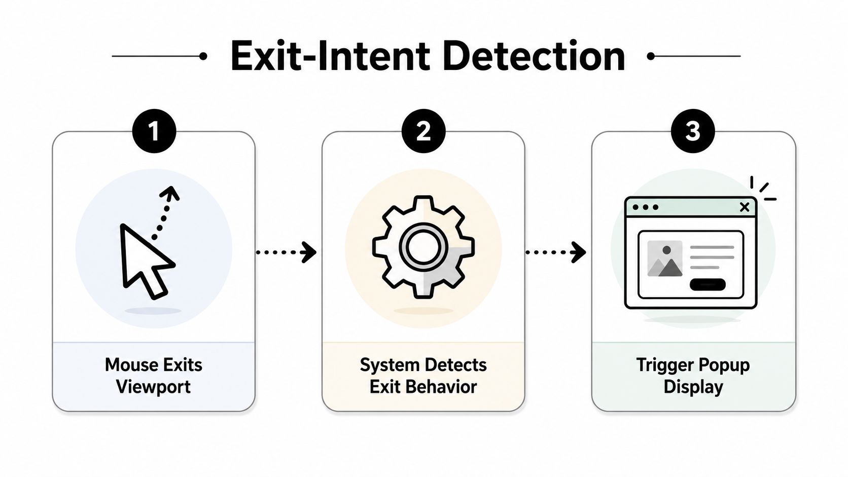
Desktop and mobile signals are different
Mobile devices have no visible cursor, so popup tools rely on other indicators. These may include a back-button action, unusually fast upward scrolling, or a period of inactivity. Each signal is less precise. A visitor could be scrolling back to reread a section, pausing while completing a form, or briefly checking something else.
For UK service and lead-generation websites, the distinction affects visitor trust and GDPR-conscious design. Desktop movement can provide a relatively specific signal, while a mobile trigger may interrupt someone who remains engaged. Configure mobile popups to require meaningful engagement before displaying an overlay, rather than showing one as soon as the page opens.
A practical recommendation for UK service sites combines a time-on-page threshold of 15 to 30 seconds with a dismissal cookie that suppresses the popup for 7 to 14 days as outlined by Aethus. These settings limit repeated interruptions and reduce the risk of inflated impressions disguising a poor visitor experience.
Timing determines whether the message helps
Timing determines relevance. A message shown before a visitor has read anything can feel like a barrier. After someone views a service, reaches pricing, or begins a form, the same message may offer a useful next step. Set display rules around who should see it, where, and under which conditions.
Exit intent works best as a late-stage recovery layer, complementing engagement-based triggers such as viewed-page count and scroll depth. Recent benchmark guidance places exit-triggered conversions at about 1.8%, while engagement-based triggers reached about 2.1% to 2.3%. The same Woohoo benchmark report places exit intent at 2.81%. Treat these figures as comparison points, then test the experience across desktop and mobile.
Setting Up Popups in the Wix Editor
Wix gives small business owners a visual way to create and manage popups without writing JavaScript. The exact labels can vary as Wix updates its interface, but the workflow follows a familiar pattern: create the popup, design its contents, choose the trigger, and set display rules.
Start with the visitor and the offer
Before opening the editor, decide what the popup should achieve. A single goal keeps the design clear. You might collect an enquiry, offer a downloadable guide, let someone request a callback, or help a shopper return to an unfinished purchase.
A service business could use:
A quote request: “Need help choosing the right package?”
A callback option: “Prefer to talk it through? Request a callback.”
A useful resource: “Download the service comparison guide.”
A feedback question: “What information were you missing?”
The offer should relate to the page. A discount on a blog article may feel random, while a guide connected to the article's subject gives the visitor a logical reason to continue.
Build the popup in the editor
Open your Wix dashboard and locate the tools for marketing, forms, or popups. Choose a template close to your intended use, or start with a blank design if you need more control. Edit the headline, supporting text, image, form fields, button label, and close control using the visual editor.
Keep the first version simple. A headline, one short explanation, one or two fields, and a clear button are usually easier to understand than a crowded panel. Check the mobile preview separately, because a layout that looks balanced on a large screen may cover the whole phone display.
Choose the trigger and display rules
In the popup settings, select an exit-related trigger where available. Then restrict the audience and pages. A pricing popup might belong only on pricing or package pages. A content download might suit selected blog posts, not the entire website.
Add rules that prevent unnecessary repetition. Suppress the popup after dismissal, exclude people who have already submitted the form, and avoid showing a first-time offer to an existing customer. You can find a visual walkthrough of the wider Wix popup process in this guide to enabling popups.
Preview the experience on desktop and mobile before publishing. Test the close button, keyboard navigation, form submission, confirmation message, and any consent wording. A popup that works visually but fails at the final interaction will create frustration instead of recovery.
Designing Effective Popups Without Annoying Visitors
Two popups can use the same trigger and produce very different reactions. One offers a clear next step that fits the page. The other blocks the content, uses vague copy, and makes the visitor hunt for the close button.
The difference is usually visible in the first few seconds. Effective designs communicate what the visitor gets, why it matters, and what to do next without making the person feel trapped.
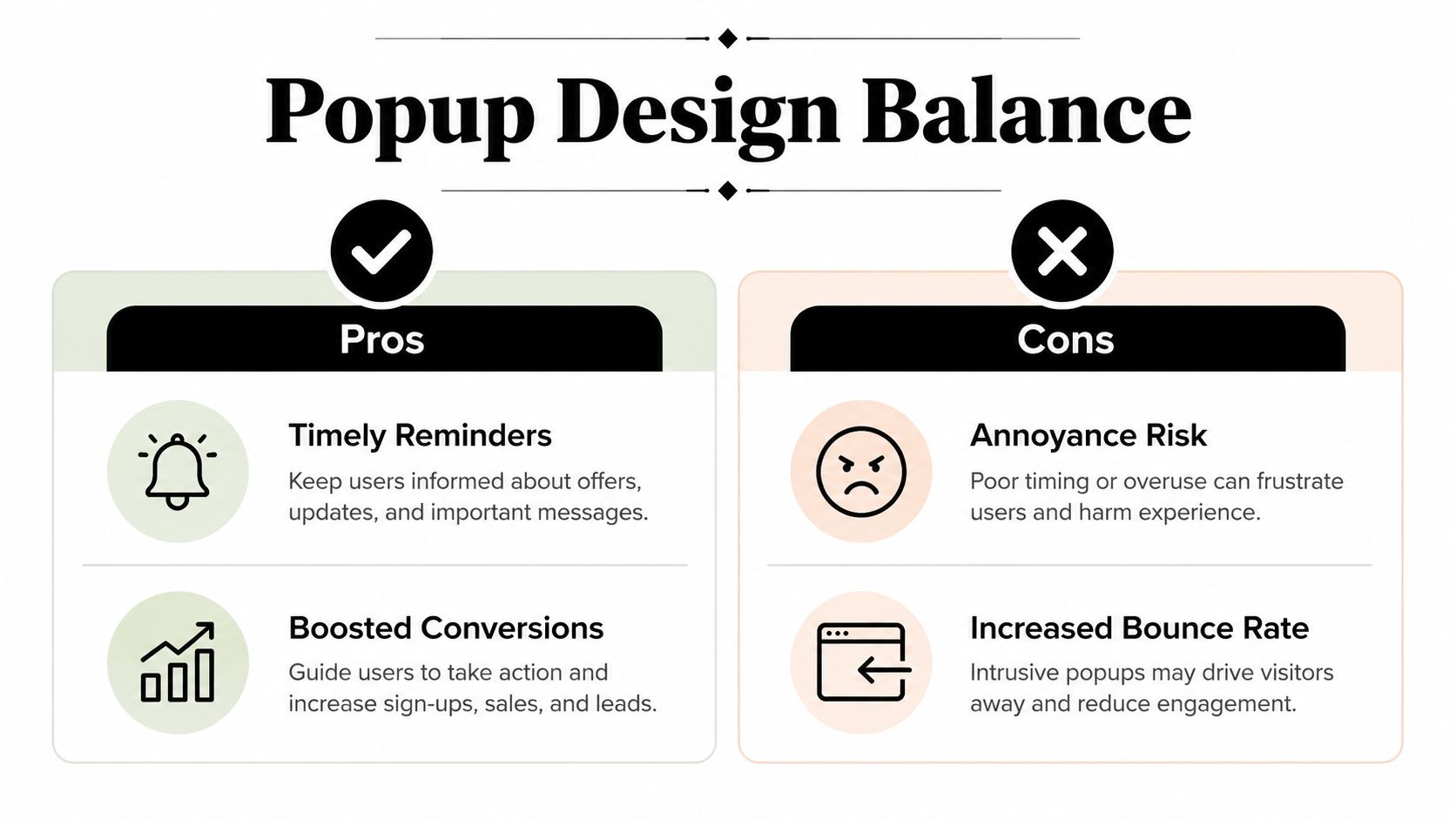
Helpful and harmful choices side by side
Helpful recovery design | Risky interruption |
|---|---|
“Save this pricing guide for later” | “Wait, don't leave!” |
One clear action | Several competing buttons |
A visible, neutral close option | A hidden or guilt-based decline |
Colours and typography that match the website | A design that resembles an unrelated advert |
A message shown after engagement | A popup shown immediately |
A mobile layout that leaves content and controls usable | A full-screen overlay that's hard to dismiss |
A consultant might offer a short checklist after someone reads an advice article. An online shop might remind a customer about items already placed in the basket. A tradesperson could invite a visitor to request a written estimate rather than demanding a phone number immediately.
Copy should stay specific. “Download the renovation planning checklist” tells the reader what happens next. “Don't miss out” creates urgency without explaining the benefit. For more examples of clear, persuasive wording, see this guide to persuasive language.
Design for trust, especially on mobile
UK shopper research found 46% feel overwhelmed by too many options and information on retail sites, while 1 in 5 stop shopping when a popup appears early in the session as reported by Ecommerce News. That makes restraint a commercial decision, not merely an aesthetic preference.
Use one offer, one primary CTA, and a close button that's easy to find. Don't use flashing animation, auto-playing audio, or language that shames someone for declining. If a visitor can leave comfortably, the popup is more likely to feel like an optional service rather than a trap.
Testing Strategies and UK Compliance Rules
A useful test begins with a business question. A visitor may leave a pricing page without enquiring because the next step feels too demanding. Compare a concise comparison guide with a callback invitation, then measure which one produces more completed enquiries. For a cart containing items, test a reminder against information about delivery or returns.
Change one meaningful element at a time where possible. The headline, offer, button wording, image, number of fields, position, and timing can each influence behaviour. Record popup displays, dismissals, submissions, and completed enquiries. Check for negative effects too, such as weaker engagement with the page or a rise in quick exits.
Small samples can make modest conversion differences look more convincing than they are. Recent benchmark guidance recommends testing around 10,000 exit events split evenly when measuring modest lifts in the Woohoo report. A smaller UK small-business site may not reach that volume, so treat the result as directional and avoid changing several variables during the same test. The A/B testing guide explains how controlled comparisons can separate a genuine improvement from normal variation.
Consent is part of the design
In the UK, an exit-intent popup cookie is exempt from consent only when it is strictly necessary to provide a service requested by the user. Cookies used for preferences, behaviour tracking, analytics, or remarketing may require valid opt-in consent, as explained in the ICO guidance on cookies and similar technologies.
Consent must involve a clear affirmative action. Continuing to browse does not count, and pre-ticked boxes are insufficient. Declining non-essential technologies should be as easy as accepting them. Tell visitors why cookies are used, which third parties receive information, and how long the cookies remain active under the cookie rules summary from the Data Protection Network.
An email-capture popup should explain what the business will do with the address. Keep marketing consent separate from the form's required submission, avoid combining unrelated purposes, and provide a clear refusal route. Limited statistical or functionality uses may be treated differently from advertising and cross-site tracking, so the cookie's purpose determines the control required as discussed by Bird & Bird.
The wider policy context supports a restrained approach. The UK government has criticised “endless” and “pointless” cookie notices while recognising that higher-risk sites still need user-facing disclosures as reported by the BBC. For a small business, a credible popup should show one clear purpose, request only necessary information, and close without friction. That protects visitor trust while giving conversion testing a fair chance.
Getting Started with Exit-Intent Popups
A visitor reaches your pricing page, compares options, then moves towards the close button. Before showing a popup, ask what they were trying to achieve and what might have created hesitation. Match the response to that situation. A discount can suit someone showing clear buying intent, a callback can help with a complex service, and a guide may fit someone still researching.
Choose one page where abandonment matters most, such as your highest-abandonment pricing page, and test one relevant offer there for 14 days before expanding to blog posts or other pages. This gives a small UK business a defined starting point and makes the result easier to interpret.
Keep the business goal alongside the visitor's experience. A popup should feel like a helpful alternative, not a barrier placed over the page. Check the wording, close control, and consent choices on a phone as well as a desktop. Explain why any information is requested, separate marketing permission from a required enquiry, and make refusal as clear as acceptance.
Review completed enquiries, offer use, dismissals, and feedback together. If the offer attracts attention but produces poor-quality leads, change the offer before increasing its reach. If visitors find the message intrusive, remove it from that page and reconsider the underlying hesitation rather than adding more prompts.
Baslon Digital creates custom Wix websites, maintains existing sites, and supports SEO for UK small businesses and independent professionals. If you need help designing a compliant exit-intent popup or improving the wider user journey around it, visit Baslon Digital to discuss your website and conversion goals.
Comments