Web Page Header Guide: What It Is and How to Get It Right

You've polished the homepage, chosen a smart colour palette, and perhaps even added a new booking form. Yet visitors still struggle to find your phone number, understand your services, or take the next step. Often, the problem sits in the most repeated part of the site: the web page header.
A good header behaves like a helpful shop assistant. It identifies the business, points people towards the right destination, and makes the next action obvious without competing with the page content. It also needs to work for keyboard users, screen-reader users, mobile visitors, and search engines. In the UK, that combination is shaped by formal accessibility guidance, not just visual preference.
Table of Contents
What a Web Page Header Actually Does - The first frame of reference - Why small details have a large effect
The Anatomy of a Web Page Header - Start with the visual anchor - Give each control a clear job
Four Jobs Every Header Must Do Well - Branding creates recognition - Navigation reduces uncertainty - Conversion shortens the path to action - Trust answers “Can I rely on this business?”
UX, SEO, and Accessibility Best Practices - Build the visible layer first - Treat accessibility as part of the structure
Responsive Behaviour and Wix Implementation Tips - Design for the smallest practical screen - Set up the header in Wix
Header Patterns That Work for Small Sites - Pattern one for service businesses - Pattern two for freelancers and consultants - Pattern three for small e-commerce shops
Pre-Launch Header Checklist and Next Steps - Brand - Navigation - Conversion - Mobile and performance - Accessibility - Final next step
What a Web Page Header Actually Does
A local plumber redesigns his website after noticing that visitors were landing on service pages but leaving without requesting a quote. The old banner contained a large photograph, several competing messages, and a phone number that disappeared on mobile. He replaces it with a compact header, a clear logo, direct service links, and a visible “Get a Quote” button.
The cleaner design makes the business easier to understand. A visitor can identify the company, find the relevant service, and contact the plumber without hunting through the page. That's the practical purpose of a web page header.
The first frame of reference
A web page header is the persistent top region of a website, usually containing the logo, primary navigation, and often a prominent call-to-action. It sits above the main content and may also include a search field, contact details, account controls, a shopping basket, or an announcement bar.
Think of it as the front of a shop. The sign tells people where they are. The window shows what the shop offers. The entrance points them towards the action they're most likely to take. A confusing shopfront makes people hesitate, and a confusing header creates the same problem online.
The header also establishes continuity. When someone moves from your services page to your about page, the same logo and navigation help them understand that they're still in the same place. That repeated orientation matters particularly on larger sites, where visitors might arrive through a search result rather than the homepage.
Practical rule: Every header element should earn its space by helping visitors identify, navigate, trust, or contact the business.
Why small details have a large effect
The header is one of the most frequently seen components on a site. A small wording choice, misplaced link, or unclear icon can therefore create friction across many pages. A phone number hidden in a secondary menu may be technically available but practically invisible to someone ready to enquire.
The opposite is also true. A focused header can make a modest site feel organised and credible. It gives visitors a reliable starting point, supports predictable movement between pages, and keeps the main action within reach.
The rest of this guide looks at the header's component parts, the jobs it must balance, accessibility and SEO requirements, responsive behaviour, Wix implementation, and practical patterns for small businesses.
The Anatomy of a Web Page Header
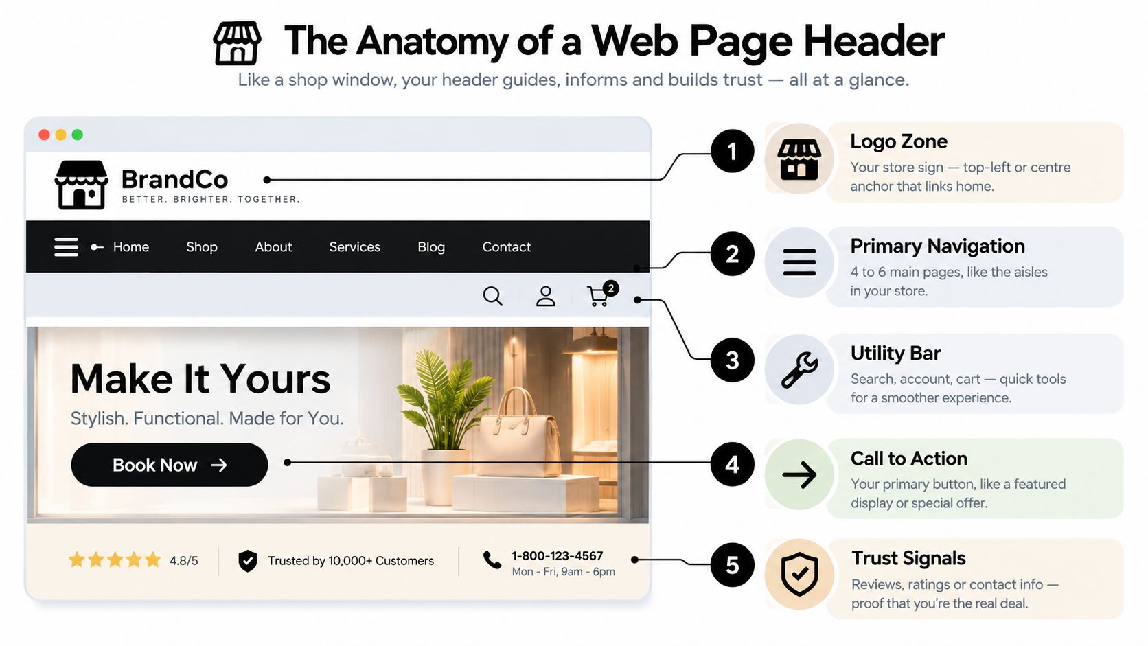
Use a shop window as your mental model. A successful window doesn't display every product, leaflet, and notice at once. It creates a clear hierarchy, with the most useful information placed where people naturally look first.
Start with the visual anchor
The logo zone usually sits on the left on desktop layouts, although centred logos can work for some retail brands. It should link to the homepage and remain visually distinct without taking over the header. Visitors use it as a dependable “start again” control, so don't turn the logo into a decorative image with no link.
Next comes primary navigation. This is the route map for your most important destinations, such as Services, About, Projects, Pricing, or Contact. A service business might need only a few clear links, while a content-heavy organisation may require a more carefully structured menu. Your navigation should reflect the site's information architecture, rather than a list of every page you happen to have created.
Give each control a clear job
A search field earns its place on a catalogue, blog, knowledge base, or large service site. It may be unnecessary on a small brochure website with only a handful of pages. Removing a control that visitors don't need can improve clarity as much as adding a useful one.
A primary call-to-action button anchors the header's main purpose. “Book a Consultation”, “Call Today”, “Order Online”, and “Get a Quote” tell visitors what will happen next. Avoid vague labels such as “Click Here”. Imperial College London recommends short, actionable CTA wording, prominent placement, verbs, and clear information about the next step in its call-to-action guidance.
Utility links carry supporting actions. These might include a phone number, email address, language switcher, Login, Account, or Cart. They're useful, but they shouldn't compete with the main navigation or primary CTA.
For deeper guidance on readable headings and type scale, review this resource on effective typography hierarchy. Your header's visual order should make the logo, navigation, and main action distinguishable at a glance.
Optional features include an announcement bar for a temporary message and a sticky header that remains available while visitors scroll. Both can help, but both consume space. Keep them only when they support a real user need.
Four Jobs Every Header Must Do Well
A header has four connected responsibilities: branding, navigation, conversion, and trust. Small-business owners often make one responsibility dominant. A visually dramatic header may express the brand but hide the contact route. A menu packed with links may expose every page but make the site feel difficult to use.
Branding creates recognition
Your logo, colour, type, and supporting tagline should make the business recognisable from page to page. A solicitor might use restrained typography and a calm navy palette to communicate authority. A creative studio could use a more expressive treatment, provided the navigation remains readable.
Branding isn't decoration added around the useful parts. It helps visitors confirm that they've reached the right business and gives the site a consistent identity.
Navigation reduces uncertainty
Navigation answers a simple question: “Where can I go from here?” Labels should describe destinations in language customers understand. “Services”, “Our Work”, and “Contact” are usually clearer than clever alternatives that require interpretation.
The order also matters. Put the most important routes where visitors can find them quickly, and avoid placing low-priority links beside your main commercial action. On sites with deeper structures, supporting navigation patterns such as breadcrumb navigation can provide additional orientation without forcing every destination into the header.
Conversion shortens the path to action
A takeaway restaurant might place a bold “Order Now” button at the right side of the header. A consultant could use “Book a Call”. A local tradesperson may prioritise a tap-to-call phone number. The best CTA reflects the action customers already want to take, rather than the action the business finds easiest to describe.
The header shouldn't ask visitors to make several decisions before reaching the enquiry route. Make the next step direct, specific, and visually distinct.
Trust answers “Can I rely on this business?”
Contact information, review signals, professional credentials, secure checkout cues, and careful visual polish all contribute to confidence. A freelancer might surface a testimonials link. An online shop may keep account and basket controls easy to locate. A regulated professional may place relevant credentials in a supporting utility area.
Header Role | What It Does | Example Small Business |
|---|---|---|
Branding | Helps visitors recognise the business | A solicitor using consistent navy styling and a clear wordmark |
Navigation | Directs visitors to key destinations | A salon linking Services, Prices, About, and Contact |
Conversion | Makes the preferred action easy | A takeaway displaying “Order Now” |
Trust | Reinforces confidence and legitimacy | A freelancer linking to testimonials and contact details |
A strong header doesn't maximise every feature. It balances the four jobs according to the business model, audience, and most valuable customer action.
UX, SEO, and Accessibility Best Practices
Treat header design as a layered system. User experience, SEO, and accessibility support one another when the HTML structure, labels, hierarchy, and visual design all describe the same page clearly.
Build the visible layer first
Place links in a logical order. Use concise labels that visitors can scan quickly, ideally under four words where the destination allows it. Guide the eye from the logo, through the primary navigation, towards the main CTA rather than giving every control equal visual weight.
Sticky headers need restraint. A fixed header can keep contact and booking options available, but a tall one can cover valuable content on a phone. Keep the sticky area under 80 pixels where possible, and test it with real pages rather than judging it only in the editor.
For SEO, put important destinations in crawlable HTML links. Primary navigation labels can describe key services naturally, but don't turn the header into a block of repeated keywords. The page's H1 belongs in the main content and should describe that page's overall purpose. It shouldn't be hidden inside the header because the header appears first visually.
Treat accessibility as part of the structure
UK public-sector guidance provides a useful standard for any business site. The Home Office manual says a page should use one main H1, logical subheading sequence, and actual heading elements rather than bold text used as a visual substitute. The Home Office page-structure guidance also explains why the document structure must be coded consistently for assistive technologies.
Use semantic landmarks such as , , , and . GOV.UK explains that standard HTML5 elements can create landmarks recognised by screen readers in its guidance on navigation landmarks. Place a skip link immediately after , not inside the header, so keyboard and screen-reader users can bypass repeated navigation.
Every interactive control needs a discernible name. Check keyboard focus order, visible focus styling, meaningful link text, and colour contrast. The UK Digital Accessibility Index for 2026 reports that missing skip-navigation links fail on 61.3% of pages, while vague link text fails on 71.1% of pages. Those figures are reported in the 2026 UK Digital Accessibility Index, and they show why a crowded header and poorly labelled menu can become genuine access barriers.
Run this audit before publishing:
UX check: Can a new visitor find the main service and contact route without exploring?
SEO check: Are important destinations represented by readable HTML links?
Accessibility check: Can someone complete the header journey using only a keyboard?
Structure check: Is there one informative H1 below the header, with headings in sequence?
Mobile check: Does the sticky header leave the content readable?
Responsive Behaviour and Wix Implementation Tips
A responsive header shouldn't shrink the desktop version. It should change its priorities as the available space changes.
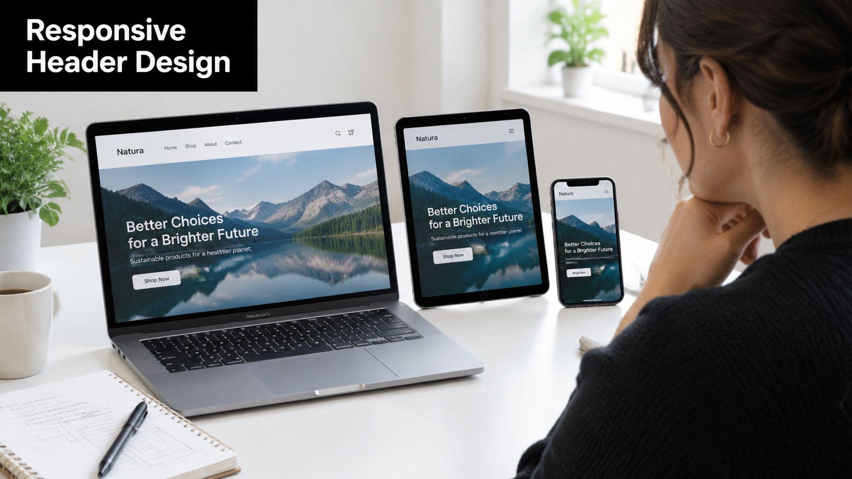
On desktop, a horizontal menu can show the main destinations alongside the logo and CTA. On a tablet, secondary utility links may need to disappear or move into a compact menu. On mobile, the primary navigation commonly becomes a hamburger control that opens a drawer or full-screen panel with generous tap targets.
Design for the smallest practical screen
Keep the mobile header visually light. A phone number, basket, or booking button may deserve priority, while secondary links can sit inside the menu. If you use a sticky header, keep its height under 80 pixels where practical so it doesn't dominate the viewport.
Test both behaviours. A non-sticky header offers more room for content, while a sticky header keeps an important action available during scrolling. The right choice depends on whether visitors need repeated access to that action.
Set up the header in Wix
In the Wix Editor or Wix Studio, open the header area and establish the layout before styling individual links. Use the Wix Header Builder to position the logo, define the navigation area, and create an announcement bar only when it serves a current purpose.
For menus with dropdowns, configure the Velo Site Menu carefully. Check the Wix Studio menu accessibility settings, confirm that keyboard users can reach every item, and inspect the focus ring against the background. A hamburger button needs an accessible name, including an appropriate , so a screen reader can communicate its purpose.
Pin the header on scroll only after testing content coverage. Preview the site in Wix mobile mode, then test it on a real phone if possible. Check that the menu opens, closes, and returns focus sensibly, and that the primary CTA remains understandable at narrow widths.
When creating new pages, clear any Wix default header content you don't need. Duplicate headers can create confusing labels and competing navigation. Before publishing, verify that the hamburger icon has an , that the logo links to the homepage, and that the first keyboard focusable element is the skip-to-content link where your implementation supports one.
Header Patterns That Work for Small Sites
The right header depends on the action your customer needs most. A plumber, a consultant, and an online shop shouldn't use the same arrangement because a template offers it.
Pattern one for service businesses
A local plumber or salon often needs a logo on the left, three or four service links, a visible phone number, and a “Book Now” or “Get a Quote” button. A small utility row can carry a review signal or opening information, provided it doesn't crowd the main action.
This pattern prioritises conversion and trust. Copy the direct CTA and clear service routes, but adapt the labels to your customers. A salon may need Prices and Treatments. A plumber may need Emergency Repairs and Areas Covered.
Derbyshire County Council's style guide takes a particularly strict approach to CTAs. It says CTAs should link to transactional content, appear directly after the introduction paragraph, and be limited to one per page. That guidance is described in its website style guide, and it's a useful reminder that a CTA should lead to a real action, not act as another generic menu link.
Pattern two for freelancers and consultants
A freelancer can often use a quieter arrangement: a distinctive logo, links to About, Work, and Contact, and one “Hire Me” or “Start a Project” button. Whitespace and confident typography do much of the trust-building, so extra badges and menu items may dilute the impression.
The key lesson is focus. Keep the portfolio route easy to reach, give the contact action a clear name, and let the work demonstrate expertise.
Pattern three for small e-commerce shops
A shop needs discovery and checkout access at the same time. A useful arrangement includes the logo, category navigation, a search field, a cart icon with an understandable status, and a Sale or delivery announcement above the main header when relevant.
Copy the persistent access to search and cart, but adapt the category structure to your product range. Too many categories can overwhelm visitors, while too few can make browsing difficult.
Sketch your own header beside these three patterns. Mark which element handles branding, navigation, conversion, and trust. Remove anything that has no clear job before you build it.
Pre-Launch Header Checklist and Next Steps
Use this checklist while viewing the actual site, not only the design canvas. A header can look correct in an editor and still fail when the menu opens, the viewport narrows, or a keyboard user moves through the controls.
Brand
Logo destination: Does the logo link to the homepage?
Visual identity: Do the logo, type, colour, and spacing match the rest of the site?
Image handling: Is the logo compressed appropriately and given useful alternative text where required?
Clarity: Can someone identify the business without reading the whole page?
Navigation
Priority routes: Do the menu links represent the destinations customers need?
Plain labels: Does every link describe where it goes?
Order: Are the most important routes easy to find?
Dropdown behaviour: Can visitors open, use, and close dropdowns with a keyboard?
Mobile menu: Does the hamburger control have an accessible name and a visible focus state?
Conversion
Primary action: Is there one obvious action for the page or business model?
Button wording: Does the CTA use a specific verb, such as Book, Call, Order, or Get?
Destination: Does the CTA lead directly to the relevant form, booking flow, checkout, or contact route?
Mobile visibility: Can visitors find the main CTA without unnecessary scrolling?
Template support: If the CTA is fixed in the template, can editors still keep its wording and destination accurate?
The GOV.UK Publishing Design Guide documents an “Action link” component hardcoded by the developer in homepage templates. That example shows why conversion mechanics sometimes belong in the template layer rather than being left entirely to page editors. Your team should know which header elements are global and which can be changed safely.
Mobile and performance
Viewport test: Does the header remain usable on desktop, tablet, and mobile?
Sticky decision: Does pinning the header help more than it obstructs?
Tap targets: Can visitors activate controls without precision tapping?
Loading: Does the header appear without distracting shifts or oversized assets?
Fallbacks: Does the page remain navigable if an icon or animation fails?
Accessibility
Landmarks: Are header, navigation, main content, and footer coded as meaningful regions?
Skip link: Is the skip-to-content link the first focusable element?
Heading structure: Is there one informative H1, followed by logical heading levels?
Keyboard path: Can someone reach every link, button, search field, and menu item?
Link names: Do links make sense when read out of context?
Contrast: Can text, icons, focus indicators, and buttons be distinguished clearly?
Screen reader output: Does each control announce its purpose and current state?
Public-sector guidance makes these checks more than visual polish. The GOV.UK accessibility requirements state that regulations came into force on 23 September 2018, requiring public-sector websites and mobile apps to meet accessibility standards and publish an accessibility statement. Small businesses aren't public-sector bodies, but the same principles provide a strong benchmark for responsible design and inclusive customer journeys.
Final next step
Once the header passes the checklist, test it with someone who didn't build the site. Ask them to find a service, return home, open the mobile menu, and contact you. Their hesitation will reveal more than another round of visual tweaking.
Baslon Digital designs, maintains, and optimises Wix websites for small businesses, freelancers, and independent professionals, including clear navigation, accessible headers, and purposeful calls to action. Visit Baslon Digital to discuss a header that can be designed, tested, and prepared for launch.
Comments