How to Design a Website from Scratch A UK Guide
- Baslon Digital

- Sep 9, 2025
- 18 min read
Before you even think about picking a colour palette or obsessing over fonts, let’s talk about what really matters. A killer website isn’t just a pretty face; it’s a strategic machine built to get a specific job done. Without a solid plan, you’re just creating digital art—beautiful, maybe, but ultimately useless for your business.
This is the part where you have to ask the hard questions. Who are you actually trying to reach in the UK? What problem are you solving for them that no one else is? Nail these down now, and every other decision becomes infinitely easier.
Defining Your Website's Core Purpose
Every website needs a primary mission. What’s yours? Is it an e-commerce powerhouse designed to sell products directly? Or is it a lead-generation magnet for your service-based business? Perhaps you just want to build a buzzing community around a niche topic.
Figuring this out is non-negotiable. It’s your North Star, guiding every choice you make about layout, content, and features. A site designed to capture leads will plaster contact forms and irresistible calls-to-action everywhere. An e-commerce site, on the other hand, will live and die by its product galleries and a buttery-smooth checkout process.
Your main goal will likely fall into one of these buckets:
Driving Sales: Moving products or services straight from your site into a customer's cart.
Generating Leads: Collecting contact details from people who are interested in what you do.
Building Brand Awareness: Carving out your space and becoming the go-to voice in your industry.
Providing Information: Becoming a trusted resource hub or educational platform for your audience.
Crafting a Clear Project Brief when you plan to design a website from scratch, UK
Before you dive into the actual design of your website from scratch in the UK, think of a project brief as your website’s constitution. It’s the document that pulls all your big ideas into one place, making sure that you (and anyone else involved) are all singing from the same hymn sheet. This is where you’ll detail your brand identity, your core message, and how you’ll measure success (your Key Performance Indicators, or KPIs).
A well-defined project brief is the single most important tool for preventing scope creep and ensuring your final website truly meets your initial goals. It turns abstract ideas into a concrete, actionable plan.
Your brief needs to capture your brand’s personality. Are you buttoned-up and professional, or are you fun, quirky, and approachable? It should also scream your unique value proposition from the rooftops: what makes you different from the sea of competitors out there? If you need a hand finding the right team to bring this vision to life, our guide on how to choose a web design agency has some great pointers.
Conducting Effective Competitor Research
You have to know what the competition is up to. This isn’t about copying their homework; it's about finding the gaps they’ve left wide open for you to exploit. Pick 3-5 of your main UK competitors and put their websites under the microscope. What are they doing brilliantly? And more importantly, where are they dropping the ball? Look for weaknesses in their content, user experience, or messaging that your site can absolutely nail.
This research gives you crucial context, especially in the UK’s crowded digital space. The UK web design industry, with a revenue of around £621.3 million in 2023, is home to over 2.7 million active websites. That’s a lot of noise. To stand out, you need to be unique and compelling. You can dig into more UK web design trends on madebyshape.co.uk.
Before you move on to the more exciting design phases, use this checklist to make sure your foundation is rock-solid.
Essential Website Planning Checklist
This simple table breaks down the critical questions you need to answer before a single pixel is placed. Getting this right is the difference between a website that works and one that just exists.
Planning Component | Key Question to Answer | Example Outcome |
|---|---|---|
Primary Goal | What is the #1 thing this website must achieve? | "Generate qualified leads for our London-based marketing consultancy." |
Target Audience | Who are we building this for, specifically? | "Small business owners in the UK creative industries, aged 30-50." |
Unique Value Proposition | Why should they choose us over anyone else? | "We are the only UK agency offering a fixed-price, 30-day website launch guarantee." |
Key Competitors | Who are our top 3 rivals online? | "Agency A (strong design, weak SEO), Agency B (great SEO, dated design)." |
Core Functionality | What features are absolutely essential for launch? | "A portfolio gallery, a contact form, a blog, and a service pricing page." |
Success Metrics (KPIs) | How will we know if the website is working? | "Achieve 20+ form submissions per month and rank on page one for 'Wix designer UK'." |
Once you’ve ticked off every box in this checklist, you’re not just guessing anymore—you're building with purpose.
By dedicating real time to this foundational work—defining your purpose, writing a clear brief, and snooping on the competition—you ensure every design choice you make later on is deliberate, strategic, and aimed squarely at your goals.
Ready to turn your strategic plan into a stunning reality? Contact Baslon Digital today, and let's start building the website your business deserves.
Structuring Your Vision with Sitemaps and Wireframes
So, you’ve got your big goals sorted. Fantastic. Now, how do you stop that vision from just being a vague idea floating around in your head? You need to give it a skeleton, a structure that will hold everything together before you even think about picking a colour scheme. This is the part where you architect the user’s journey, and honestly, getting this right is half the battle.
Two things are your absolute best friends here: sitemaps and wireframes. Skip this stage, and you’re basically building a house with no blueprint. It’s not going to end well.
Think of a sitemap as the floor plan for your entire website. It’s a simple diagram that shows every single page—from your homepage right down to the thank-you page after someone fills out a form—and how they all link together. It’s not just a list; it’s a map that dictates how people will move through your digital space.
This simple exercise forces you to think like a user. How does someone get from a blog post to your services page? Is it a straight shot or a confusing maze of clicks? A solid sitemap makes sure your website is logical and dead easy for visitors and search engines to navigate.
This image gives you a rough idea of how to get your site's foundation sketched out before you jump into the digital stuff.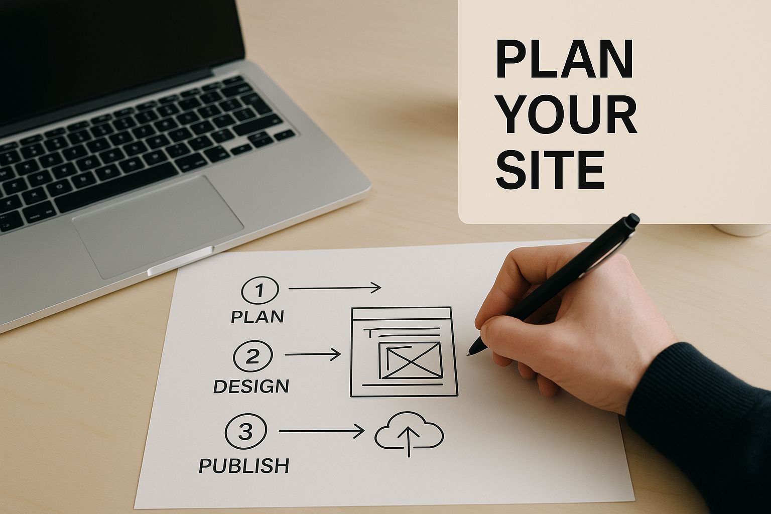
Building Your Website Blueprint with a Sitemap
First thing’s first: list out every page you think your website will need. Don't censor yourself—just get it all down. You can always trim the fat later.
Start with the obvious ones:
Homepage: Your digital front door.
About Us: Where you tell your story.
Services / Products: The bread and butter of what you offer.
Blog: Your space for content, updates, and showing off your expertise.
Contact: The all-important "how to get in touch."
Now, start branching out. Maybe your "Services" page needs to break down into "Web Design," "SEO Services," and "Website Maintenance." This kind of organisation is key. As you build this out, getting familiar with crucial XML sitemap best practices is a smart move. It helps with organisation and makes it easier for Google to find all your brilliant content.
The whole point of a sitemap is to create the shortest, most logical path for a user to find what they're looking for. If a key page is buried three or four clicks deep, nobody's ever going to see it. Keep your structure as flat as you can.
Once you have this map, you can start tracing user journeys. Imagine a potential client from the UK lands on your blog. What do you want them to do next? Your sitemap should guide them, almost effortlessly, towards your contact page or a call-to-action.
From Blueprint to Bones with Wireframing
With the structure mapped out, it’s time to wireframe. A wireframe is basically a super simple, black-and-white sketch of a single webpage. No colours, no fancy fonts, no images. It’s all about structure and functionality. Where do things go?
This is where you make the big decisions. Where does the main menu live? Where are you sticking that big, can’t-miss call-to-action button? How do you lay out your services page so people actually read it?
For instance, a wireframe for a service page might look something like this:
Big hero section up top with a killer headline and a "Get a Quote" button.
Followed by a three-column section showing off key benefits.
Then, a block for client testimonials to build some trust.
And finally, a contact form at the bottom to seal the deal.
It’s pure problem-solving. By stripping away all the visual noise, you can spot usability issues before they become expensive problems. It's no surprise that 76% of bloggers write "how-to" articles—they provide clear, step-by-step value. A wireframe helps you structure that value logically before you commit to the design.
You don't need fancy software, either. You can use pen and paper, or jump into a tool like Balsamiq or Figma. Even Wix itself has drag-and-drop features that let you create a basic layout that can act as a functional wireframe before you start adding your branding. This structural planning is the secret sauce to a website that doesn’t just look pretty, but actually works.
Ready to move from planning to pixels? Our team at Baslon Digital lives for turning structured wireframes into beautiful, high-performing Wix websites. Get in touch with us today for a free consultation.
Bringing Your Brand to Life with Visual Design
Okay, you've got the blueprint. The wireframe has given your website a solid skeleton, but right now, it's just bones. It's time for the fun part: giving it a personality and bringing it to life. This is where we move from a functional map to a high-fidelity visual design that actually looks and feels like your brand.
This stage is all about creating a cohesive visual language. We're talking about picking a colour palette that sets the mood, choosing fonts that have the right tone of voice, and finding images that connect with your UK audience. Get this right, and you build instant trust and make your site feel intentional, not just thrown together.

Defining Your Brand's Colour Palette
Colour isn't just decoration; it's a psychological shortcut. The colours you choose can seriously influence how people feel and what they do on your site. In fact, a whopping 85% of consumers say colour is a primary reason they buy something. No pressure, then!
Think about the emotion you want your visitors to feel. A London-based financial advisor? You'd probably lean towards deep blues and greys to communicate stability and trust. But if you're a quirky startup selling artisanal coffee, you might go for earthy tones like terracotta and forest green to feel more organic and approachable.
Here’s a simple way to build your palette:
Primary Colour: This is your hero colour. Use it for the important stuff, like your logo, headers, and call-to-action buttons.
Secondary Colours: Pick two or three colours that complement your primary one. These are great for subheadings, icons, and less critical buttons.
Neutral Colours: You'll need shades of grey, off-white, or beige for backgrounds and body text. This makes sure everything else pops and your site doesn't feel chaotic.
Choosing Typography That Speaks Volumes
If colours set the mood, then typography is your brand’s voice. The fonts you pick have a massive impact on how readable your site is and the personality it projects. The goal is a perfect marriage of style and function.
A classic mistake is picking a font that looks stunning in a headline but is a nightmare to read in a paragraph. Always, always prioritise clarity for your main body text. For headings, you can afford to be a bit more creative and show some character.
Your typography is a silent brand ambassador. A modern, minimalist sans-serif font like Montserrat says something very different from a classic, elegant serif font like Garamond. Make sure your font's personality matches your brand's message.
For instance, a luxury fashion brand might use a sophisticated serif for headings to scream elegance, then pair it with a clean sans-serif for the text to keep things legible. A tech startup, on the other hand, would probably stick with modern sans-serif fonts to feel innovative and clean. This strategic use of typography has become a massive part of user experience as web design has evolved over the years. You can read more about this journey in our article on the birth and growth of web design from HTML to modern tools.
Sourcing High-Quality Imagery and Graphics
Let's be honest, we can all spot a cheesy stock photo from a mile away. While they have their place, generic images can make your brand feel impersonal and cheap. Your imagery should tell a story and reflect the quality you stand for. High-quality, relevant images don't just look pretty; they increase engagement and build trust.
Think about your options for visuals:
Professional Photography: Nothing beats the real thing. Investing in a photoshoot of your team, your products, or your workspace is the best way to get authentic visuals that make you stand out.
Premium Stock Sites: If a pro shoot isn't in the budget, sites like Adobe Stock or Getty Images offer artistic, high-quality photos that feel miles away from the free, overused alternatives.
Custom Illustrations: Want to look truly unique? Custom illustrations and icons can add a memorable and ownable touch to your design, helping you cut through the noise.
By the end of this stage, you’ll have a complete high-fidelity mockup. This is a pixel-perfect preview of your final website, combining all your chosen colours, fonts, and images. It acts as the definitive guide for the build phase, ensuring the vision in your head gets translated perfectly into a working Wix website.
Building Your Website with User-Friendly Tools
With your visual design locked in, it’s time to turn that static mockup into a living, breathing website. This is the part where many people think they need to hire a developer, but honestly, the game has changed. These days, you can design a website from scratch with powerful, user-friendly tools that don’t require you to write a single line of code.
Platforms like Wix have completely demystified the whole development process, putting professional-grade tools right at your fingertips. This section is all about bringing your design to life using these accessible platforms. We’ll go from setting up an account to launching a fully responsive site that looks incredible on any device.
Getting Started with a Website Builder
First things first, you need to pick the right platform. It’s worth exploring the top content management software (CMS) options to see what’s out there, but for our money, Wix strikes an excellent balance between creative freedom and intuitive functionality. It’s a solid choice for businesses here in the UK.
Setting up an account is a piece of cake. Once you're in, you’ll be prompted to choose a template. Now, it's tempting to pick one that looks perfect straight out of the box, but hold that thought. A template is just a starting point—think of it as a pre-built structure that you can (and should) completely customise to match the high-fidelity mockup you’ve already painstakingly created.
Customising Your Template with a Drag-and-Drop Editor
This is where your vision really starts to take shape. The heart of platforms like Wix is the drag-and-drop editor. It’s a visual interface that lets you add, move, and resize elements on your pages with total precision. You are in full control of the layout, which is a massive advantage for creating something that feels truly unique. If you want a deeper dive, you can learn more about how this works in our post on [why you should use Wix Studio for your website](https://www.baslondigital.com/post/why-use-wix-studio-to-create-your-amazing-website).
I always recommend starting with the global settings:
Colours: Pop in the primary, secondary, and neutral colours from your brand palette. This keeps everything consistent across your entire site.
Fonts: Set your chosen heading and body fonts. Applying these globally will save you a world of pain later—no one wants to change fonts on every single text box.
Page Backgrounds: Sort out the background colours or images for your main site sections.
With those foundations sorted, you can start building out your pages. Add new sections, drag in text boxes, image galleries, and buttons. Your mission is to replicate your wireframe’s structure and your mockup’s visual style, element by element. Don't be afraid to experiment; the "undo" button is your best friend here.
The Critical Importance of Responsive Design
Let’s be real: your website will be viewed on a massive range of devices, from huge desktop monitors to the smallest smartphones. A site that isn't responsive—meaning it doesn't adapt its layout to fit different screen sizes—delivers a pretty terrible user experience. Over half of all web traffic comes from mobile devices, so a non-responsive site is basically telling a huge chunk of your audience you don't care about them.
A great user experience isn’t a luxury anymore; it’s a flat-out necessity. With 96% of households in Great Britain having internet access, businesses have to compete fiercely online. More than half of UK companies now prioritise hiring developers with strong UX/UI skills, which just goes to show how much the focus has shifted to user-centric design.
Thankfully, platforms like Wix automatically create a mobile-friendly version of your site. But—and this is a big but—you absolutely must review and optimise it yourself. Switch to the mobile editor to check how your content reflows. You might need to resize text, hide certain decorative elements that just clutter up a smaller screen, or reorder sections to make sure the most important info appears first. This little bit of attention to detail is what makes a website not just functional but genuinely enjoyable to use, no matter the device.
By using these intuitive tools, you can transform your static design into a dynamic, engaging website ready to meet your audience.
Feeling a bit overwhelmed by the build process? The team at Baslon Digital specialises in bringing ambitious designs to life on the Wix platform. Contact us for a free consultation and let's build your website together.
Optimising Testing and Preparing for Launch
That moment you hit ‘publish’ is a great feeling, but hold on—it’s not quite the finish line when you’re designing a website from scratch. A successful launch is all about what you do right before you go live. This final phase is dedicated to obsessive testing and fine-tuning, making sure every visitor has a perfect experience from their very first click.
Think of it as the final quality check, like a final walk-through before handing over the keys. It’s your chance to hunt down every last broken link, zap any typos, and make sure your site loads faster than a caffeinated cheetah. This level of detail is what separates a professional, trustworthy website from one that just feels… rushed.
The good news is, Wix gives you all the tools you need to build and then rigorously test your site before it ever meets your audience.
Your Comprehensive Pre-Launch Checklist
Before you even think about shouting about your new site from the digital rooftops, you need a pre-launch checklist. Work through it methodically. This isn’t just about making sure things work; it’s about making sure they work perfectly. A single broken link or a page that refuses to load can be enough to lose a potential customer forever.
Here are the absolute non-negotiables to test:
Cross-Browser Compatibility: Your site might look stunning in Chrome, but what about Firefox, Safari, or Edge? You’ve got to test your site on multiple browsers to guarantee a consistent and functional experience for absolutely everyone.
Proofread Everything: Go through every single word on your site with a fine-tooth comb. Check for spelling mistakes, grammatical blunders, and awkward phrasing. Seriously, get a second pair of eyes on it, too—you’ll be surprised what you miss.
Link Integrity Check: Click every. single. link. That means your main navigation, internal links buried in your content, and any external links you’ve added. A 404 error is a dead end for users and a huge red flag for search engines.
Yes, this process can feel a bit tedious, but it is absolutely vital. A polished, error-free website instantly builds credibility and makes your visitors trust you.
Focusing on Performance and Speed
Website performance isn't a "nice-to-have"; it's a core part of the user experience and, you guessed it, SEO. A slow-loading website is a conversion killer. Pages that take more than a few seconds to load see a massive drop-off in visitors. It's a fact.
Your main goal here is to make your site as zippy and lightweight as possible. Two of the biggest wins come from compressing your images and making the most of caching. Huge, unoptimised images are usually the number one culprit for slow load times. Use tools to compress your images before you upload them to Wix, without sacrificing too much quality.
"A one-second delay in page load time can result in a 7% reduction in conversions. For an e-commerce site making £100,000 per day, that one-second delay could potentially cost £2.5 million in lost sales every year."
Caching, which Wix handles automatically for the most part, stores bits of your site so it doesn’t have to be completely reloaded every time someone visits. This dramatically speeds things up for returning visitors, encouraging them to stick around.
Setting Up Basic On-Page SEO
Finally, your beautiful, fast website needs to be discoverable. Before you launch, you need to understand the basics of what makes search engines happy. Learning what is search engine optimization is crucial to making sure your site gets found by the right people.
Wix makes it pretty simple to handle the on-page SEO essentials. For every single page on your site, you need to set:
Title Tags: This is the headline that shows up in Google search results and in the browser tab. It needs to be compelling and include the main keyword for that page.
Meta Descriptions: This is the short snippet of text under your title tag in search results. It doesn't directly affect your ranking, but a well-written one will convince people to click.
Alt Text for Images: Describe what each image shows. This helps search engines understand your visuals and is absolutely essential for accessibility.
Getting this groundwork right is more important than ever. The UK web design market is currently seeing revenues of around £640.6 million despite a slight contraction. To stand out, you don't just need a great design; you need a technically sound website that’s primed for visibility from day one.
Ready to launch a website that’s not just beautiful but also technically perfect? Let the experts at Baslon Digital handle the final checks and ensure your launch is a massive success.
So, What Happens Next?
Right, you’ve done the hard part. You've gone from a blinking cursor on a blank page to a fully-fledged, beautifully designed website. You've got the strategy, the skills, and hopefully, a fair bit of confidence. But the journey isn't over. Not even close.
Think of your website as a new pet. It’s exciting at first, but you can’t just set it up and forget about it. It needs constant attention, tweaks, and a bit of love to keep it healthy.
So, your next mission is to become a bit of a data detective. You need to keep a close eye on your site’s performance. Dive into your analytics and see how visitors, whether from the UK or elsewhere, are actually using your pages. What are they clicking on? Where are they getting bored and leaving? This isn't just numbers on a screen; it's pure gold.
And don't just rely on the data. Actively ask your users for feedback. What do they love? What drives them mad? Don’t be precious about your design; if something isn't working for your audience, change it. The best websites aren't the ones that launch perfectly, but the ones that evolve.
Your website is your brand's digital storefront. Keeping the doors open and customers coming back is all about constantly improving, based on what real users tell you and what the performance data shows.
Feeling fired up and ready to put all this into practice? Your digital adventure is really just beginning. Get started today and build something that truly screams you and connects with the right people.
And if you're feeling a bit like you’re trying to solve a Rubik's Cube in the dark, don't panic. Contact Baslon Digital for a free consultation, and let's get that perfect website built together.
Frequently Asked Questions
Jumping into your first web design project can feel like opening a can of worms—so many questions pop up. We get it. To clear things up, we've put together answers to the most common queries we hear from clients and DIY-ers alike.
How Much Does It Cost to Design a Website?
This is the big one, isn't it? Honestly, it's like asking how much it costs to buy a car—it depends entirely on what you're after.
If you're going the DIY route with a platform like Wix, you could get away with just paying for a domain and a hosting plan. Realistically, you could be looking at under £100 for your first year.
But if you want something custom-built by a professional agency, the price tag can climb from a few thousand to tens of thousands of pounds. It all boils down to complexity. Need e-commerce? Custom graphics? Professional copywriting? Each of those adds to the final figure.
How Long Does It Take to Build a Website?
Much like the cost, the timeline is all over the place. If you're using a Wix template to build a simple, five-page "brochure" site, you could knock it out in a weekend if you've got the coffee and determination.
A more complex project with an agency is a different beast altogether. From the first chat to launch day, a standard professional build usually takes between 6 to 12 weeks. This isn't just about dragging and dropping; it allows for proper planning, design tweaks, content creation, and making sure everything works perfectly before it goes live.
Rushing is the single biggest mistake you can make. A great website isn't built on speed; it's built on careful planning and testing. Giving each stage the time it deserves—from scribbling wireframes to the final checks—will pay you back tenfold with a site that actually works.
Can I Really Design a Website with No Experience?
Absolutely. That’s the entire point of modern website builders like Wix. They exist to give people without a technical bone in their body the power to create something amazing. With intuitive drag-and-drop editors and ready-made templates, all the complicated code is handled for you behind the scenes.
But here’s the catch: while you don't need to learn code, you do need to spend a bit of time getting to grips with basic design principles. A little knowledge about layout, colour theory, and what makes a site easy to use will be the difference between a website that just exists and one that actually helps your business.
What Is the Hardest Part of Building a Website?
You'd think it's the technical stuff, but for most beginners, it's not. Thanks to modern tools, the actual "build" is often the most straightforward part. The real headaches usually come before and after.
The most challenging bits are often:
The Initial Plan: Seriously, trying to pin down your goals, who you're talking to, and what makes you special is tough.
Creating Content: Staring at a blank page and trying to write compelling words is no joke. Same goes for finding high-quality images that don't look like cheesy stock photos.
Getting People to Visit: Once your site is live, the work isn't over. You've got to actually get people to find it.
The tech is the easy part. The real work is in the strategy and the effort you put in long after you hit "publish."
Feeling ready to start but would rather have an expert handle the tough stuff? Baslon Digital lives and breathes Wix, creating stunning, high-performing websites that get real results. Get in touch for a free consultation, and let's bring your vision to life.Now that you have the complete roadmap to designing a website from scratch, the next step is to take action. If you're ready to create a professional, high-performing site but want expert guidance, Baslon Digital is here to help. Get in touch for a free consultation, and let's bring your vision to life.
Article created using [Outrank](https://outrank.so)


Elevate your home with the latest sofa designs from Abhi and Oak. Looking for that perfect blend of luxury and practicality? Explore our stylish collection, featuring the sleek, modern appeal of a leatherette sofa set. Designed for comfort and built to last, these pieces are ideal for any contemporary living space. See all the new arrivals and find your statement furniture piece on our website today.