Ecommerce Website Design: A Small Business Guide for 2026

You're probably in one of two places right now. Either you've got products ready to sell and your website still feels like an empty shop with the lights off, or you already have a store and you're wondering why people visit, browse, then vanish without buying.
That's usually the point where small business owners start thinking about colours, fonts, logos, and whether the homepage banner should be “clean” or “bold”. Those things matter. But in ecommerce website design, they matter for one reason only. They help people trust you, find what they want, and finish the purchase without getting irritated.
A good online shop isn't an art project. It's a sales environment. It needs to answer doubts, remove friction, and make buying feel easy. If it looks lovely but confuses people, it's doing the digital equivalent of putting your till in the stockroom.
Table of Contents
Why Your Ecommerce Design Is a Business Tool Not a Decoration - What design is really doing - Pretty matters. But purpose matters more
The Foundations of a High-Converting Ecommerce Site - Think like a shop owner not a page designer - Design for movement not admiration - Trust is content made visible
Must-Have Features for Your 2026 Online Store - Product pages that answer buying questions - Navigation and search that reduce frustration - Checkout features that match real behaviour
Choosing Your Platform Wix vs Shopify vs WooCommerce - Wix for design flexibility with less technical drag - Shopify for operational simplicity - WooCommerce for control and responsibility
Optimising for Search Engines and Site Performance - Design choices affect visibility - Performance is part of the buying experience
The Big Decision DIY or Hire a Professional Agency - The enthusiastic DIY route - The strategic business owner route - DIY vs Agency Which Path Is Right for You
Why Your Ecommerce Design Is a Business Tool Not a Decoration
A lot of small businesses treat design like icing. Nice to have, worth fussing over, but separate from substance. In ecommerce, that's backwards. Design is the shelf layout, the signage, the sales script, the card machine, and the member of staff who reassures a hesitant buyer that yes, returns are straightforward.
That matters even more in the UK because this isn't a tiny experimental market. The UK's ecommerce market reached £235 billion in 2023, with online spending sitting at around one-quarter of all retail sales, according to this UK ecommerce market summary. In a market at that scale, design decisions affect revenue, not just appearances.
What design is really doing
When ecommerce website design works, it does a few commercial jobs at once:
It guides attention. It shows people where to look first, what matters, and what action to take next.
It removes doubt. It answers the quiet questions buyers ask themselves, such as “Is this trustworthy?” and “What happens if I need to return it?”
It reduces effort. It makes the path from product discovery to payment feel obvious rather than exhausting.
Practical rule: If a design decision doesn't help clarity, trust, or conversion, it's decoration.
Small businesses often lose sales because they focus on brand expression before buying behaviour. They polish the hero section, then bury delivery details. They choose stylish typefaces, then make product descriptions hard to scan. They add movement and effects, then slow the site down. That's like opening a lovely boutique and hiding the price tags.
Pretty matters. But purpose matters more
A good-looking store still matters. People judge quality quickly. But “looks professional” is only useful if it supports the sale. Clean spacing, consistent colours, sharp imagery, and thoughtful layout all help buyers feel confident. The mistake is thinking the visual layer is the whole job.
If you're selling across borders or planning to expand later, it also helps to study how different markets behave. AUSFF's Australian commerce market tips are useful for seeing how commercial context changes what a store needs to prioritise.
The Foundations of a High-Converting Ecommerce Site
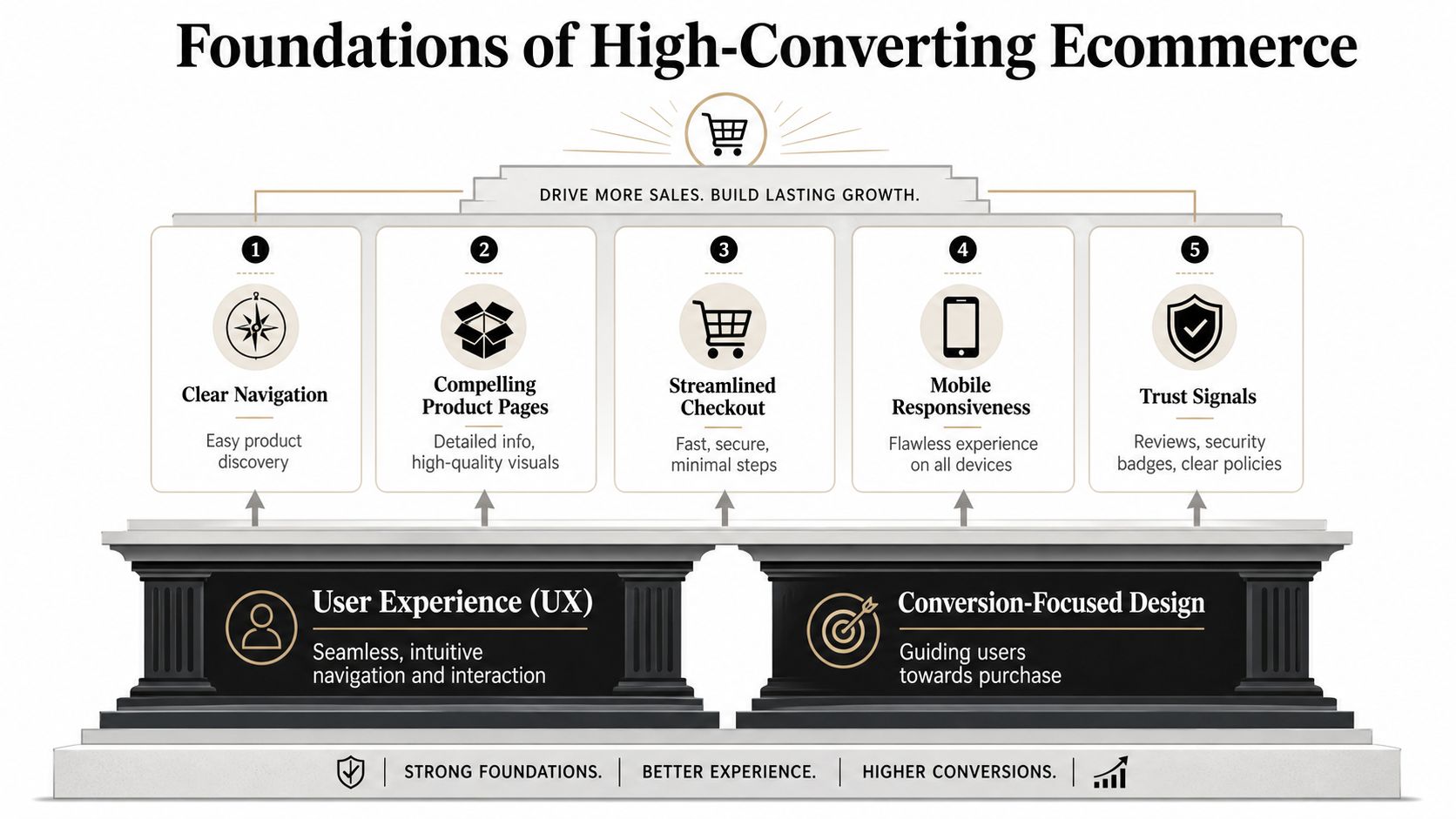
A high-converting site feels easy in the same way a good physical shop feels easy. You walk in, you can tell what's sold there, you can find the right aisle, you can inspect the product, and when you're ready to buy, no one sends you through a maze.
Think like a shop owner not a page designer
Your navigation is your aisle signage. Your collection pages are the display tables. Your product page is the shelf talker plus the salesperson. Your checkout is the till.
In practice, the strongest ecommerce website design usually gets the boring things right:
Navigation that names things clearly instead of trying to sound clever
Product categories with logic so shoppers don't have to guess where items live
Calls to action that stand out without shouting like a market trader at closing time
Page layouts that prioritise decisions instead of decoration
Small businesses often underestimate how much friction hides in tiny choices. A vague menu label. A filter that doesn't help. A product page that forces people to hunt for delivery info. Individually, each one feels minor. Together, they chip away at trust.
Design for movement not admiration
In the UK, mobile isn't a side consideration. Smartphones account for roughly two-thirds of ecommerce traffic according to Figma's web design statistics resource. That means your site needs to work for thumbs, short attention spans, and shoppers who are half-distracted on the sofa with the telly on.
A mobile-first ecommerce website design should prioritise:
Readable product pages with enough spacing, contrast, and hierarchy
Tap-friendly buttons that don't make people feel they need surgeon-level precision
Shorter decision paths so users don't bounce between pages to answer basic questions
Checkout forms that ask for less, not more
There's a strong conversion reason for that. Global cart abandonment averages about 70.19%, and design-related causes include extra costs, forced account creation, and complicated checkout flows, based on Baymard findings referenced here.
That's why conversion work matters more than cosmetic tinkering. If you want a plain-English explanation of how these small changes add up, this guide to conversion rate optimisation is a helpful companion.
Remove one unnecessary field from checkout before you spend another afternoon debating button radius.
Trust is content made visible
Trust isn't just a badge in the footer. It's how quickly someone can verify that buying from you won't become a headache.
UK shoppers are especially sensitive to delivery and returns clarity. Recent UK retail data shows 58% of shoppers expect free delivery and nearly half expect delivery within two days, as outlined in this ecommerce design discussion. That means policy clarity belongs in the design itself, not hidden in a legal page no one wants to excavate.
A strong trust setup usually includes:
Delivery messaging on product pages
Returns information near the buy button
Visible contact details
Consistent trust cues, such as secure payment indicators and customer reviews
Plain English policy wording, because legal fog doesn't reassure anyone
Must-Have Features for Your 2026 Online Store
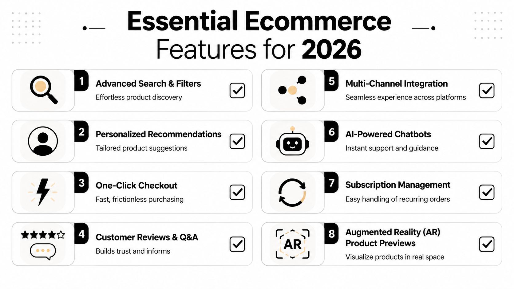
Features are where strategy becomes real. This is the part where a business owner usually asks, “What needs to be on the site?” Fair question. Not every shiny add-on deserves space, and some “advanced” features do less for sales than a simple product page written properly.
This checklist-style visual gives the broad picture first.
Product pages that answer buying questions
Most ecommerce stores don't lose the sale because the product is bad. They lose it because the page leaves work for the customer.
A product page should do the job of a knowledgeable in-store assistant:
Show the product clearly. Use strong photography that covers angle, detail, scale, and use.
Explain what matters fast. Lead with the core benefit, then support with specifics.
Handle objections. Materials, sizing, compatibility, care, shipping, and returns shouldn't feel hidden.
Use reviews properly. Social proof works best when it supports a decision, not when it's dumped in a hard-to-find tab.
A weak product page says, “Here's the thing, buy it if you fancy.” A strong one says, “Here's what it is, who it's for, how it works, and what happens next.”
Navigation and search that reduce frustration
If your catalogue has more than a small handful of products, search and filtering become part of the sales process. People don't browse forever. They narrow.
Useful navigation usually means:
Clear top-level categories
Filters based on how customers shop, such as size, colour, type, use, or price
Search that tolerates imperfect typing
Collection pages with enough information to compare options quickly
The moment a shopper says, “I'll look later,” what they often mean is, “Your site made this harder than it needed to be.”
For stores with broader ranges, recommendation tools, subscriptions, chat support, or even AR previews can be worthwhile. But they only help when the basics are already working. Fancy extras on a confusing shop are like installing mood lighting in a building with no front door sign.
Later in the buying journey, product discovery gives way to payment confidence. That's where many stores falter.
Checkout features that match real behaviour
In the UK, checkout design now needs to reflect how people pay, not how designers assume they pay. In 2024, 57% of UK consumers used digital wallets for online purchases, and 24% abandoned a purchase because their preferred payment method was unavailable, according to this review of ecommerce website trends.
So yes, your checkout needs to look clean. But beyond aesthetics, it needs to support the payment methods your customers expect.
Prioritise these checkout features:
Guest checkout, so people aren't forced into a relationship before they've made the first purchase
Digital wallet support, surfaced clearly rather than tucked away
A short, obvious flow, with minimal fields and no odd surprises
Early cost visibility, including shipping, so trust doesn't collapse at the last step
This video gives a useful overview of modern ecommerce thinking before you lock in your feature list.
Choosing Your Platform Wix vs Shopify vs WooCommerce
Choosing a platform is less about finding the “winner” and more about deciding which problems you want to deal with. Every option is a trade-off between convenience, control, speed, cost, and technical responsibility.
If you want a broader merchant perspective before deciding, this ecommerce platform showdown is worth a read.
Wix for design flexibility with less technical drag
Wix suits small businesses that care about presentation, want more visual flexibility, and don't want to manage a pile of technical components separately. For many owners, that's attractive because it keeps the website build closer to the business itself.
It tends to make sense when you want:
a more customized visual layout
a manageable editor
ecommerce functionality without building from parts
room to create a distinct brand feel without custom code
For businesses comparing content management approaches more generally, this explainer on what a CMS website is can help frame the platform decision properly.
Shopify for operational simplicity
Shopify is often the practical choice for businesses that want a commerce-first system with a large app ecosystem and a straightforward route to launching. It's built around selling, so many merchants like how quickly they can get core store functions live.
That said, design customisation can feel more structured. For some brands, that's a benefit. For others, it can feel like decorating a rented flat where you're not allowed to move the walls.
A service provider such as Baslon Digital can build custom ecommerce experiences on Wix Studio for businesses that want stronger design control without taking on a fully bespoke development project.
WooCommerce for control and responsibility
WooCommerce appeals to business owners who want deeper control and are comfortable with more moving parts. It can be powerful, especially if you already live in the WordPress world or need a custom setup.
But control comes with chores. Hosting, updates, plugin compatibility, security, maintenance, and troubleshooting don't sort themselves out while you make a cup of tea.
A simple way to choose is to ask:
Do you want convenience or custom control?
Do you want to edit content yourself often?
Are you comfortable managing technical maintenance?
Do you need a fast route to market, or a more bespoke build?
Optimising for Search Engines and Site Performance
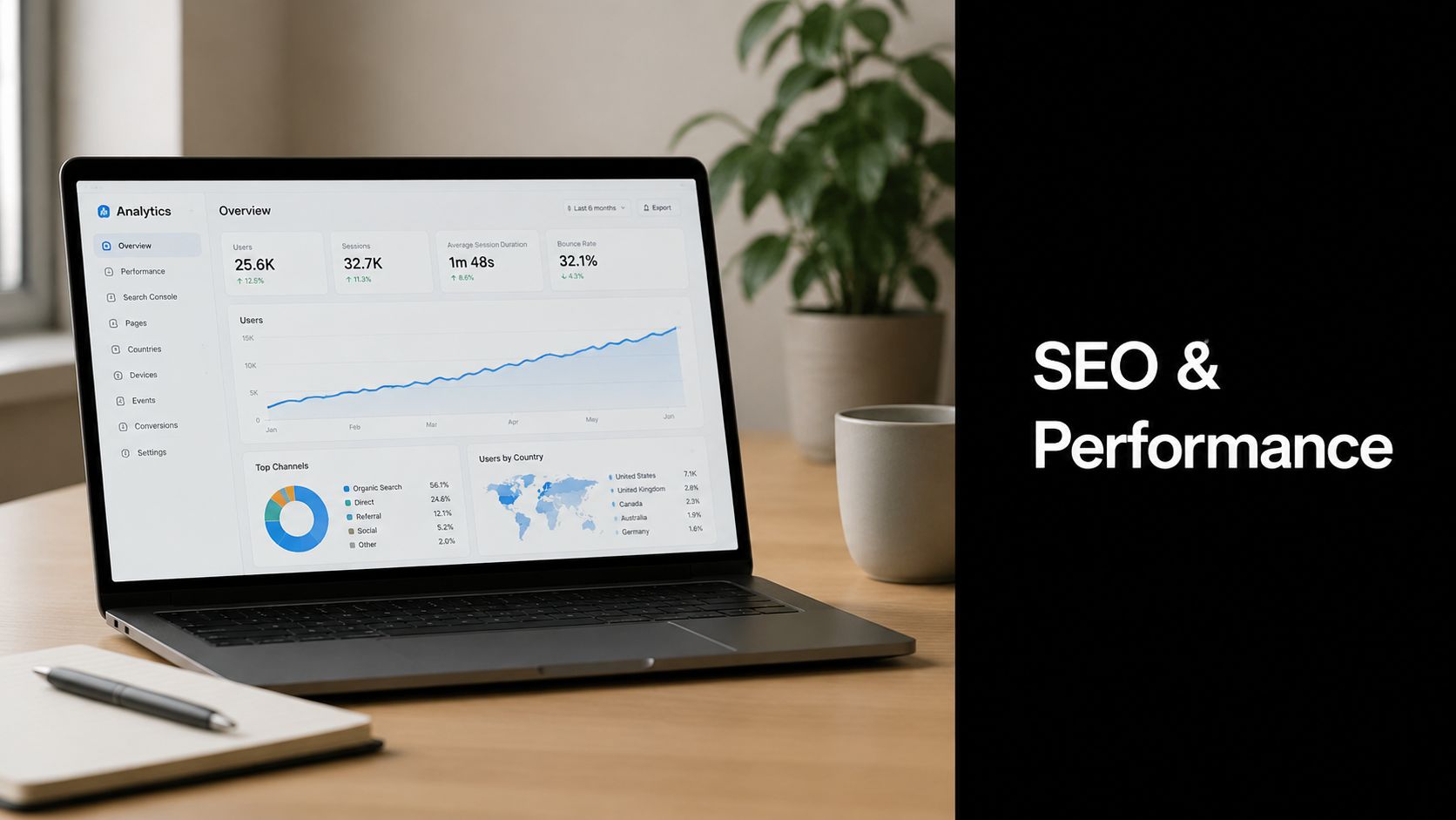
A visually polished store that loads slowly or is hard for search engines to understand has the commercial value of a gorgeous shop hidden down an unmarked alley. Design, SEO, and performance are tied together from the start.
Design choices affect visibility
Search engines rely on structure. So do people. A sensible ecommerce site usually has clean category organisation, descriptive page titles, proper heading hierarchy, and product pages with useful copy rather than manufacturer waffle pasted in and forgotten.
Image handling matters too. Product photography should be compressed sensibly, named properly, and given alt text that describes the image accurately. That helps accessibility and gives search engines more context.
Performance is part of the buying experience
Performance problems often start as design decisions. Huge image files, clumsy scripts, overbuilt animations, and bloated apps can all slow down the site.
Keep these habits in place:
Use lean media files without sacrificing image quality
Limit visual gimmicks that add more weight than value
Test mobile usability regularly
Choose reliable hosting and infrastructure that suits ecommerce traffic
If you're reviewing the technical side of the build, this guide to web hosting for ecommerce is useful for understanding what sits underneath performance.
Fast pages don't just please Google. They stop impatient humans from leaving.
The Big Decision DIY or Hire a Professional Agency
This is usually where optimism meets reality. On Monday, building your own store sounds simple. By Thursday, you're comparing checkout apps, resizing images, muttering at a theme editor, and wondering why the product grid has suddenly become haunted.
There are two honest paths here, and neither is morally superior.
The enthusiastic DIY route
The DIY route suits business owners who have time, patience, and enough curiosity to learn a platform properly. It can work well if your catalogue is small, your needs are straightforward, and you're comfortable testing, adjusting, and fixing issues as they appear.
The hidden cost isn't only money. It's decision fatigue. It's the hours spent on layout, templates, apps, copy, policies, and mobile fixes when you could be sourcing stock, serving customers, or doing actual business.
A smart DIYer keeps the scope controlled. They don't start by trying to build the Harrods of handmade candles.
The strategic business owner route
Hiring an agency makes sense when speed, clarity, and commercial thinking matter more than tinkering. A good agency doesn't just assemble pages. It helps shape structure, messaging, user flow, trust points, and the technical setup needed for the store to function properly.
If you sell in a niche with very specific search behaviour, it can also help to see how specialist industries handle visibility. For example, this jewelry store SEO guide is a useful reminder that product-led businesses often need content and category strategy, not just pretty product photos.
DIY vs Agency Which Path Is Right for You
Consideration | DIY Path | Agency Path |
|---|---|---|
Time | Lower cash outlay, higher time demand | Faster progress if the brief is clear |
Design quality | Depends on your eye and discipline | More structured and conversion-focused |
Technical setup | You handle platform quirks and fixes | The team handles build decisions and implementation |
Strategy | Often reactive and pieced together | Usually planned around business goals |
Flexibility | Full hands-on control | Collaborative control with expert guidance |
Risk | Easier to make hidden usability mistakes | Lower execution risk, but requires budget |
A simple self-check helps. DIY may suit you if you can answer yes to most of these:
Do you have real time to spend on the build each week?
Can you write clear sales copy and organise information logically?
Will you test the site on mobile, not just admire it on desktop?
Are you comfortable fixing problems after launch?
If most answers are no, hiring help is usually cheaper than rebuilding later.
Your Ecommerce Website Design Next Steps
Good ecommerce website design isn't about making a store look expensive. It's about making buying feel safe, simple, and obvious. That means clear navigation, strong product pages, mobile-friendly layouts, policy visibility, sensible platform choices, and a checkout that doesn't ask customers to jump through hoops.
Keep this short checklist in mind:
Make trust visible early
Design for mobile behaviour, not desktop habits
Reduce checkout friction
Choose features that support buying decisions
Pick a platform that matches your skills and time
Treat SEO and performance as design work
If your current store feels clunky, or you're planning a new one, don't start by asking which font feels premium. Start by asking what's stopping a customer from buying.
If you want help turning these ideas into a working store, Baslon Digital can help you plan, design, and build an ecommerce website that supports sales, trust, and day-to-day usability for your business.


Comments