User Experience Audit for Small Business Wix Sites

You launched your Wix site, checked it on a laptop, admired the new colours, and moved on to serving customers. Months later, enquiries are inconsistent, visitors abandon the booking form, and paid traffic produces plenty of visits but few sales. The site may still look polished. That doesn't mean it helps people complete the actions that keep your business running.
A user experience audit examines those actions from the visitor's point of view. For a small business Wix site, that means following the full route from landing page to service page, form, booking confirmation, product basket, and checkout. The useful question isn't whether the homepage looks tidy. It's whether a real customer can understand the offer, trust it, and complete the next step without hesitation.
Table of Contents
Why Your Wix Site Needs a User Experience Audit - Look beyond the homepage
Preparing for the Audit Without Spinning Your Wheels - Prepare real-world observation - Write hypotheses before opinions take over
Heuristics and Criteria That Actually Catch Friction - Inspect the components customers use - Treat accessibility as part of usability
Tools and Metrics for a Wix Audit - Compare the tool options
Sample Findings and the Fixes That Worked - A booking journey that loses intent - A mobile menu that hides the business - A polished page that doesn't answer objections
Deliverables, Next Steps, and When to Bring in an Agency - Decide whether DIY is enough
Why Your Wix Site Needs a User Experience Audit
A Wix website can be built quickly, which is one of its strengths. Templates, responsive scaling, galleries, animations, booking tools, forms, and third-party apps make it possible to publish without a development team. The trade-off is that decisions made during launch often remain untouched long after the business, offer, audience, and customer questions have changed.
Visual polish can hide practical friction. A layered hero section may push the first useful action below the fold. A decorative animation may delay the moment a visitor sees the price. A booking flow can ask for information the customer has already supplied, while a contact form may offer no clear explanation when submission fails. These defects rarely appear in a report focused only on spacing, colour, and alignment.
Practical rule: Audit the task, not the screenshot.
Start with the three actions that matter commercially. A service business may need visitors to book, request a quote, or call. An online shop may need them to inspect a product, add it to the basket, and complete checkout. Follow those journeys on mobile and ask whether the visitor can find the right page, understand the choice, and move forward in three taps or fewer where the task allows it.
Look beyond the homepage
The homepage attracts attention, but interior pages often carry the sale. Product details, pricing pages, booking screens, enquiry forms, delivery information, and help content answer the questions that determine whether someone commits. A homepage can look excellent while a product page omits availability or a form loses every submission after an unclear error.
The UK accessibility evidence makes this risk difficult to dismiss. In a 2025 WebAIM review, UK home pages averaged 40.4 accessibility errors, compared with 51 across the global sample, yet most issues still occurred beyond the homepage because interior pages are more numerous and contain the components where customers act. The WebAIM Million 2025 UK analysis supports a practical conclusion for Wix owners: review templates and journeys, not just the landing page.
A falling conversion rate isn't the only warning. Watch for visitors leaving interior pages, abandoning forms before submission, returning rarely, or arriving from adverts without taking the intended action. If your current content system no longer supports the way customers browse and buy, this guide to choosing a content management system provides useful context before you consider a rebuild. A customer-journey view, rather than a page-by-page beauty check, is also central to customer journey optimisation.
Preparing for the Audit Without Spinning Your Wheels
The day before testing, resist the temptation to open the Wix Editor and start changing things. First establish whether your evidence is trustworthy. Wix Analytics and Google Analytics 4 should record the events that reflect your commercial goals, including form submissions, important button clicks, Calendly or Wix Bookings actions, and Wix Store add-to-cart activity.
Check each event yourself. Submit a test form, click the main booking button, add an item to the basket, and confirm that the recorded event represents the completed action rather than a page view. A tracking setup that counts button clicks as bookings can make a weak journey look healthy.
Prepare real-world observation
Install a session-recording tool on the live domain and configure the cookie banner so it doesn't prevent normal scrolling or obscure the primary controls. Follow your privacy obligations and explain recording clearly. The recording is useful because it shows hesitation, repeated taps, dead ends, and unexpected scrolling that aggregate analytics can't explain.
Recruit five to seven actual customers or likely users, such as people who resemble your local audience. Give each person short, realistic tasks:
Booking task: Find a suitable service and book a convenient time.
Enquiry task: Request a quote for a defined need.
Shopping task: Find a product, check the relevant details, and add it to the basket.
The UK government's usability benchmarking guidance recommends no more than five tasks per participant, with up to 10 minutes per task, and recruitment of 30 to 60 actual or likely users for a formal benchmark. It also recommends measuring completion success, time, abandonment, and perceived difficulty or confidence on a 1–5 scale, then comparing behaviour with perception. See the GOV.UK usability benchmarking guidance for the complete method. A small owner-led audit won't reproduce that benchmark, but it should borrow the discipline.
Write hypotheses before opinions take over
Create a short list tied to business outcomes. For example, “Visitors don't understand which service includes an initial consultation” is testable. “The page feels dated” isn't. Keep hypotheses about booking completion, enquiry volume, add-to-cart behaviour, trust, accessibility, or task clarity.
Run a simple pre-flight check:
Incognito browsing: Confirm the journey works for a fresh visitor.
Real cellular data: Test mobile loading away from your office Wi-Fi.
Keyboard access: Tab through menus, fields, buttons, and confirmations.
Screen reader check: Use VoiceOver, Narrator, or another available reader.
Cleared cache: Remove the advantage of previously loaded assets.
Build comparison: Check the live site against a fresh Wix Editor preview.
Record the version tested, device, browser, date, and journey. That small habit prevents arguments later about whether a defect was fixed, introduced, or overlooked.
Heuristics and Criteria That Actually Catch Friction
A useful heuristic review starts with Nielsen's ten usability heuristics, but a small business audit needs a sharper commercial lens. “The system should speak the user's language” becomes “Does this service page use the words customers use when choosing?” “Visibility of system status” becomes “Does the booking flow show what has been selected, what remains, and whether the request succeeded?”
Inspect the components customers use
Check navigation depth and labels on interior pages. A menu item called “Solutions” may make sense internally but leave a visitor looking for “Book a consultation”. Open the mobile menu above and below the fold. Confirm that nested links are scannable, the close control is obvious, and the persistent call or booking action remains available without covering content.
Forms deserve a field-by-field review. Count the information requested, remove anything the business doesn't need, and test blank, invalid, and unusual entries. Error messages should identify the field and explain how to correct it. A confirmation should state what happened and what the customer can expect next, rather than displaying a generic success banner.
Service and product pages need more than attractive photography. Look for:
Offer clarity: Can a visitor tell who the service is for and what outcome it provides?
Pricing transparency: Is the price, starting point, or quotation process explained near the action?
Trust placement: Do reviews, credentials, examples, guarantees, or delivery details appear where doubts arise?
Contact choice: Can a hesitant customer use the most comfortable route, such as a phone call, form, email, or booking?
Next-step language: Does the button say “Book an appointment”, “Request a quote”, or “Add to basket”, rather than “Send” or “Learn more” without context?
The conversion test is simple: can a hesitant visitor complete the primary task on mobile in under 90 seconds? That isn't a universal benchmark, but it is a useful pressure test. If the answer is no, identify whether the delay comes from unclear content, unnecessary fields, slow interaction, trust gaps, or an awkward sequence.
Treat accessibility as part of usability
For UK government digital services, an accessibility audit must happen before a service enters public beta, and it must assess WCAG 2.2 AA. The audit brief should identify the service, users, journeys, assistive technologies, browser combinations, and timescale, as described in GOV.UK accessibility audit guidance.
Small businesses may not follow the same public-sector process, but the underlying checks still matter. Test contrast in Wix theme colours, focus order after Velo or app integrations, meaningful alternative text, keyboard operation, form labels, error announcements, and motion settings. Since 23 September 2018, UK public-sector websites and mobile apps have had to meet accessibility standards and publish an accessibility statement, according to GOV.UK accessibility guidance. Accessibility isn't a decorative add-on. If someone can't understand, submit, or complete the journey, the journey has failed.
Tools and Metrics for a Wix Audit
Analytics tells you where behaviour changes. It rarely tells you why. A strong Wix audit combines recorded evidence, manual journeys, accessibility checks, and direct observation.
Begin with Wix Analytics, Google Analytics 4, and Google Search Console. Use them to identify traffic sources, devices, landing pages, search queries, important events, and funnel exits. Segment the evidence by device and entry route where possible. A paid visitor arriving directly on a service page has a different expectation from a returning customer who starts on the homepage.
Free tools provide a useful first pass. PageSpeed Insights and Lighthouse assess performance, accessibility, and basic SEO signals. WAVE and the axe DevTools browser extension help identify structural accessibility issues. Chrome DevTools shows responsive breakpoints, console errors, layout behaviour, and network conditions. These tools are fast and inexpensive, but they can't judge whether your pricing answers a customer's concern or whether “Our approach” is a clear navigation label.
Record the individual URL, not just a site-wide score. Wix templates, animations, scripts, booking components, and third-party apps can behave differently on a homepage, product page, form, and checkout screen. If image loading is creating a poor first impression, the practical guidance in this resource on lazy-loading images can help you investigate the relevant page rather than applying a blanket change.
Compare the tool options
Tool or method | Primary use | What it reveals |
|---|---|---|
Wix Analytics | Site and commerce behaviour | Events, traffic patterns, product and booking activity |
Google Analytics 4 | Funnel and audience analysis | Acquisition, journeys, device segments, conversions |
Search Console | Search visibility | Queries, landing pages, indexing signals |
Lighthouse and PageSpeed Insights | Technical screening | Performance, accessibility, SEO and page-level warnings |
WAVE and axe DevTools | Accessibility checks | Contrast, labels, structural and interaction issues |
DevTools and real devices | Responsive testing | Breakpoint failures, layout shifts, keyboard behaviour |
Hotjar or Microsoft Clarity | Behaviour observation | Recordings, heatmaps, hesitation and repeated interactions |
Moderated usability testing | Task research | Confusion, expectations, language, confidence and workarounds |
Paid tools add recording depth, heatmaps, filtering, and sharing. Usability platforms help organise moderated sessions, while accessibility subscriptions support recurring monitoring. They don't replace judgement. A high score can coexist with a confusing booking path, and a low automated score may point to a fix with little commercial relevance.
Track task completion, time on task, error rate, form abandonment, Core Web Vitals, exit rate, and conversion rate before and after changes. Put each observation into an evidence matrix linking the metric anomaly to a URL, user task, observed behaviour, proposed fix, owner, and success measure.
Prioritising Findings So You Fix What Matters First
An audit becomes valuable when it tells you what to repair first. A long list of red flags without an order leaves a small business owner with the same problem as before, only in a larger document.
Score every finding for impact, frequency, and effort, using a consistent 1–5 scale. Impact asks how seriously the issue affects bookings, enquiries, purchases, trust, or access. Frequency reflects how many visitors encounter it, including relevant devices and audience segments. Effort covers copy, design, Wix configuration, app settings, and development.
Group related defects before scoring. Five unclear labels on one booking form are one form-clarity problem, not five unrelated tickets. You can calculate a working priority with:
Priority = impact × frequency ÷ effort
Use a weighted version if protecting revenue or access matters more than visual refinement. Add an accessibility multiplier when an issue blocks keyboard or screen-reader use. Validate the score against analytics, recordings, support messages, and customer complaints rather than treating the formula as fact.
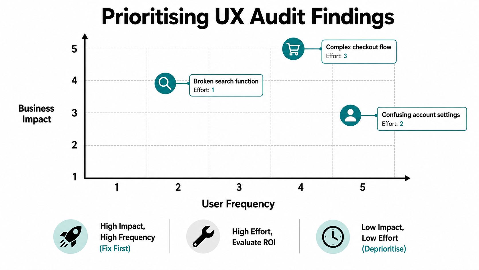
A practical 30-day backlog should separate immediate blockers from valuable improvements and later enhancements. Broken booking paths, missing form errors, misleading buttons, and checkout barriers come before spacing adjustments or animation refinements.
Use a clear sequence:
Immediate blockers: Fix failures that stop the core task or prevent access.
High-value improvements: Address trust, clarity, navigation, and form friction supported by evidence.
Quick wins: Make low-effort copy, label, and configuration changes that remove hesitation.
Later enhancements: Defer visual polish, secondary content, and ambitious experiments until the foundation works.
Confirm each change in Wix preview, publish safely where your process allows, and re-test the affected journey. Compare conversion rate, completion time, and abandonment with a defined baseline. The conversion optimisation tips are useful for turning prioritised findings into focused improvements rather than a general redesign.
The audit should produce decisions, not just observations. Keep the matrix visible to anyone responsible for copy, design, Wix settings, apps, or development.
Sample Findings and the Fixes That Worked
The most useful findings describe a customer attempting something specific. They show the moment of friction, the likely consequence, and the change that makes the next step clearer.
A booking journey that loses intent
A visitor selects a service and time, reaches the final form, and sees a button labelled “Send”. The form asks for details already provided, and a required field shows an error only after submission. The customer may not know whether the request was booked, sent for review, or lost.
The fix is practical. Change the button to “Book appointment”, remove repeated questions, split necessary information into a progressive sequence, and show validation beside the relevant field. Preserve the selected service and time. The confirmation should state the date, time, location, price, and cancellation terms, then explain what happens next. Test the entire path on a real phone, not only in the Wix Editor.
A mobile menu that hides the business
A mobile menu can open successfully and still damage the journey. The logo and call button disappear, nested links are difficult to scan, and a fixed banner pushes the useful controls below the first view. A visitor who arrived ready to contact you now has to interpret the interface before taking action.
Simplify the hierarchy and retain one persistent phone or booking action. Give tappable controls enough spacing, avoid an auto-closing menu that interrupts exploration, and reduce motion that can disorient or slow navigation. Check the menu with a keyboard and screen reader as well as touch.
A polished page that doesn't answer objections
Product and service pages often receive attention but fail to convert because they show visual quality without decision-making information. Prospects need the price or quotation process, availability, delivery or timing details, proof, and answers to the questions that create risk.
Rewrite the opening around the customer's outcome. Place price and availability close to the primary action, add credible reviews and relevant examples, and clarify returns, timings, inclusions, or what happens after enquiry. Don't bury critical reassurance at the bottom of a long page.
Document every recommendation with the original observation, user consequence, evidence, proposed change, owner, effort, and success measure. “Worked” means better task completion, lower abandonment, more qualified enquiries, or more sales. A cleaner screenshot is not proof of a better experience.
Deliverables, Next Steps, and When to Bring in an Agency
A small business owner should finish with something that can be acted on immediately, not a large PDF that sits in an inbox. The essential deliverables are a one-page summary, a prioritised backlog with an owner and deadline, annotated evidence for important findings, and a follow-up plan using the same measures as the original audit.
Fix the top three issues in the first week. Re-test the affected pages in the second week, then either move down the backlog or pause to evaluate the evidence. Review the same journeys again at 30 and 90 days, keeping the comparison consistent. If the site has changed substantially, restart the critical flows rather than assuming earlier conclusions still apply.
Decide whether DIY is enough
DIY works when the owner understands the customer journey, can access the analytics, has time to test real devices, and can make Wix changes safely. It becomes less suitable when the audit spans several templates, booking integrations, commerce features, accessibility concerns, and contradictory evidence.
Use this decision framework:
Factor | DIY audit | Agency audit |
|---|---|---|
Scope | A few critical journeys | Multiple templates, devices, flows and integrations |
Skills | Owner can interpret evidence and edit Wix | Specialist covers UX, accessibility, analytics and implementation |
Time | Testing and fixes fit around normal work | Dedicated audit process with structured reporting |
Evidence | Basic analytics and manual checks | Combined analytics, recordings, task testing and prioritisation |
Risk | Low-risk informational site | Sensitive data, complex booking, commerce or accessibility exposure |
Outcome | Practical short backlog | Findings, repair plan, implementation support and re-testing |
Bring in an agency when the findings exceed 10 items, your team lacks a designer or developer, monthly traffic is over 5,000 and conversion pain remains, or the site handles sensitive data where WCAG or legal exposure matters. When three or more signals are present, specialist support is usually more rational than asking an already stretched owner to interpret every issue alone.
Look for a Wix specialist that can show the path from evidence to fix. Ask whether the scope includes interior pages, forms, booking flows, product pages, keyboard checks, WCAG 2.2 review, analytics validation, and post-fix testing. A report that only recommends a redesign has missed the commercial opportunity.
Baslon Digital offers Wix design, maintenance, SEO, and UX-focused website reviews for small businesses that need clearer messaging, navigation, and calls to action. Visit Baslon Digital to discuss a 30-minute audit scoping call, share your site URL and a traffic screenshot, and request a fixed-fee quote within five business days.
Comments