Small Business Website Development That Works

You've launched a tidy Wix website, shared the link on social media, and waited for enquiries. The pages look respectable, yet the phone stays quiet. That's a familiar position for UK small businesses. The problem usually isn't that the site needs more decoration. It's that the development work started with a template instead of a customer decision.
The opportunity is substantial. UK government estimates put the SME population at 5.5 million at the start of 2024, representing 99.8% of the UK business population, with SMEs accounting for 16.6 million jobs, 60% of total employment, £2.8 trillion in turnover and £107.9 billion in exports. That scale makes small business website development core business infrastructure, not a side project. (UK government evidence on small and medium-sized businesses)
A website should help the right visitor understand your offer, trust you and take the next sensible step. The practical route is to diagnose common failures, plan the buyer journey, choose a platform that fits the operation, build for conversion and accessibility, then measure what happens after launch.
Table of Contents
Where Most Small Business Websites Go Wrong - Make the fix before adding features
Planning Your Site Before You Touch a Template - Build the sitemap around buying intent - Gather assets before production starts
Choosing the Right Platform for Your Business - Wix works when speed and ownership matter - WordPress and Shopify earn their complexity in specific situations
Design, Content and SEO That Actually Convert - Create a visual system people can follow - Give every page a search purpose
E-Commerce, Bookings and Lead Capture Essentials - Bookings need operational rules
Pre-Launch Testing and Accessibility Checklist - Test the experience people actually use - Use a fixed release checklist
Timelines, Costs and Post-Launch Growth - Establish a rhythm after launch - Pin this 90-day plan above your desk
Where Most Small Business Websites Go Wrong
A Bristol café owner launches a Wix site that looks tidy on a laptop. The logo is centred, the colours are pleasant and the gallery shows attractive drinks. A week later, the site gets twelve visitors, nobody can tell whether the café takes bookings, and the owner concludes that websites don't work.
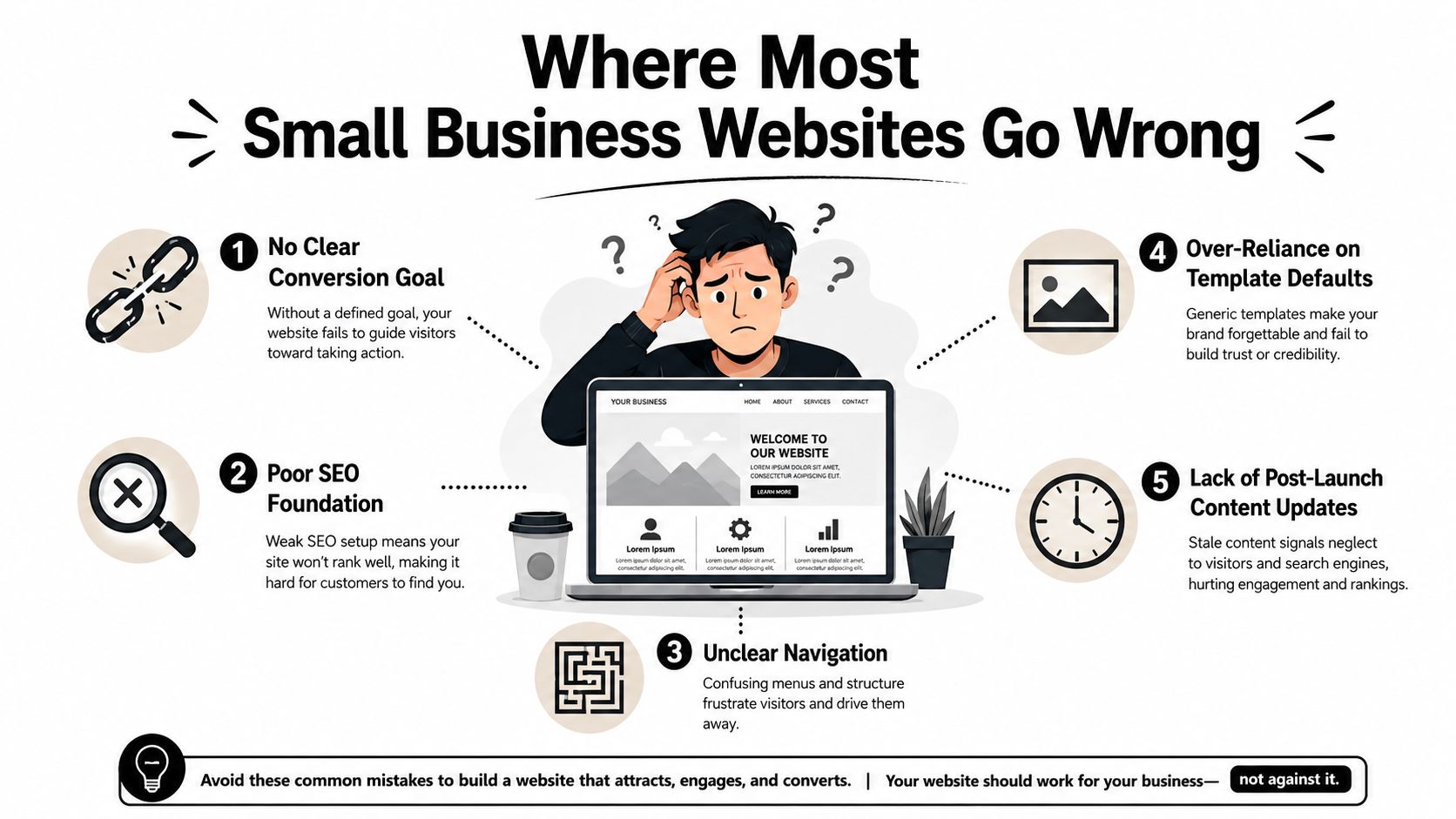
The platform isn't the issue. Across hundreds of small business builds, the same failures appear repeatedly:
No clear primary action: Visitors see several competing buttons, such as “Learn more”, “Follow us” and “Get in touch”, without knowing which one matters. Choose one main conversion, then make it visually dominant.
Buried contact details: A phone number hidden on a separate page creates friction when someone is ready to enquire. Put the preferred contact route in the header, the hero section and the footer.
Generic stock imagery: A smiling person in a hard hat doesn't prove that your local plumbing team turns up on time. Use real staff, premises, work and products wherever possible.
Slow mobile load: Large images, animated backgrounds and unnecessary apps make a phone user wait. Remove decorative weight before you spend money on more traffic.
A sitemap based on the organisation chart: Customers don't think in departments. They think, “Can you solve my problem in my area, and how do I book?” Structure the site around those questions.
Make the fix before adding features
A tidy interface can't rescue unclear positioning. Start by writing one sentence that states who you help, what you provide and what the visitor should do next. Then remove any page section that doesn't support that decision.
Practical rule: Every important page should make one next step obvious without asking the visitor to interpret your navigation.
The rest of the build follows a manageable sequence. First, define the business goal and customer journey. Next, choose Wix, WordPress or Shopify according to the work the site must handle. Then shape the design, copy and SEO around a measurable action. Finally, test forms, accessibility, mobile behaviour and tracking before launch.
That approach prevents a common waste of time, adding booking tools, pop-ups and blog categories before the site can explain its basic offer. A smaller, sharper website usually gives an owner a better foundation than a larger site assembled from unused features.
Planning Your Site Before You Touch a Template
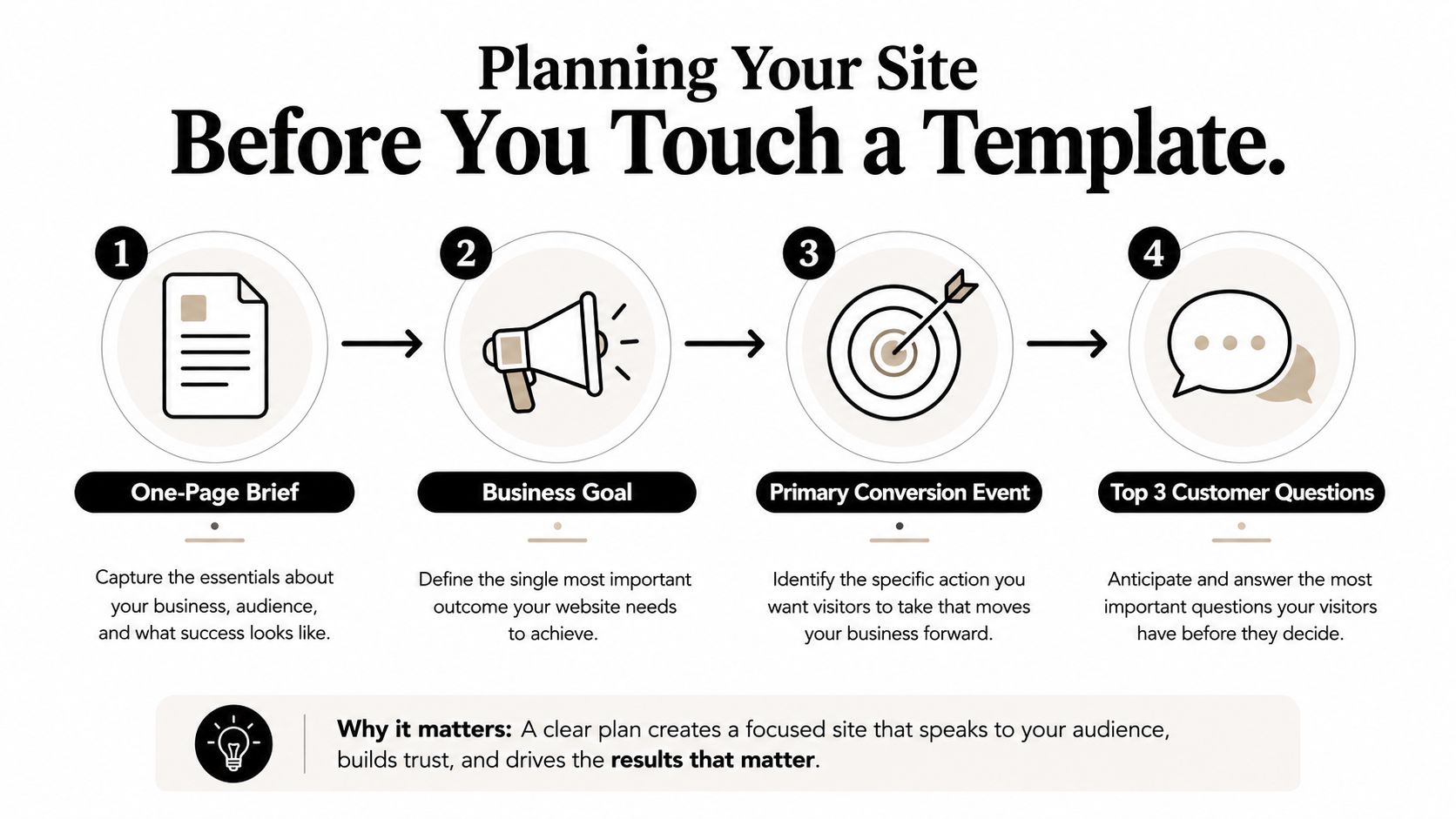
Open a blank document and write a one-page brief before browsing Wix templates. Keep it practical. Record the business goal, the primary conversion event and the three questions the homepage must answer.
For a local plumber, the brief might look like this:
Business goal: Generate qualified repair enquiries in the service area.
Primary conversion event: A phone call or completed enquiry form.
Three homepage questions: What problems do you fix? Where do you work? How quickly can a customer contact you?
That brief gives every later decision a job. The hero section can direct people to call. The services page can explain common repairs. The service areas page can capture local search intent. Reviews can reduce uncertainty, while the contact page can make the final action straightforward.
Build the sitemap around buying intent
A useful starting sitemap for that plumber is Home, Services, Service Areas, About, Reviews and Contact. It reflects the questions a prospective customer asks, rather than the internal structure of the business.
Before building the pages, sketch a simple wireframe showing the order of content and actions. This guide to what a wireframe is in web design is useful if the term is unfamiliar. The point isn't to create polished artwork. It's to decide what appears first, what supports the decision and where the visitor can act.
Write short persona sketches for the main customer types. Note their problem, urgency, location, likely objection and preferred contact method. Then scan three local rivals. Look at their page structure, offer clarity, proof, calls to action and gaps you could fill. Don't copy their colours or wording. Use the exercise to understand the standard customers already see.
Gather assets before production starts
Create folders for logos, brand colours, staff photographs, project images, testimonials, certificates, service descriptions and legal content. Label each item as ready, needs writing, needs approval or can be repurposed.
A useful afternoon worksheet has five columns:
Asset or page | Status | Owner | Source material | Next action |
|---|---|---|---|---|
Homepage copy | Needs writing | Business owner | Existing brochure | Draft customer questions |
Service photos | Ready | Designer | Shared folder | Select strongest images |
Reviews | Needs approval | Business owner | Google profile | Request permission |
About page | Can be repurposed | Business owner | Staff document | Rewrite for customers |
Planning resources can also help you keep up with practical site and content workflows. For broader product and process updates, LunaBloom AI updates can be a useful reference, but don't let tools replace customer interviews or a clear brief. Strategy comes from understanding the business. Software only helps you organise and execute it.
Choosing the Right Platform for Your Business
Platform choice is a trade-off between control, maintenance and the work your website must perform. Wix is often the sensible choice for a UK service business that needs a professional site, visual editing and a manageable handover. WordPress offers more room for extensive content and custom functionality, while Shopify is built around product operations rather than brochure-style service pages.
Criterion | Wix | WordPress | Shopify |
|---|---|---|---|
Time to launch | Fast, especially for a focused service site | Slower when themes, plugins and hosting need configuration | Fast for a shop, slower if the site needs extensive non-shop content |
Ongoing maintenance | Managed platform with an app and settings burden | Higher, particularly with self-hosted themes, plugins, security and updates | Managed platform, with app and catalogue administration |
E-commerce depth | Suitable for straightforward small shops | Flexible with the right configuration | Strongest fit when stock, fulfilment and product variants dominate |
Design flexibility | Strong visual flexibility, especially with Wix Studio | Broadest overall flexibility, with more technical responsibility | Flexible storefront design, but less natural for service-led websites |
SEO ceiling | Sufficient when pages, content and technical settings are handled well | High ceiling for content marketing and complex publishing | Strong for product-led SEO, with a shop-first structure |
Three-year ownership | Predictable platform cost, plus selected apps and professional work | Hosting, development, security, maintenance and plugin costs require careful budgeting | Platform, payment, app and operational costs need modelling |
Wix works when speed and ownership matter
Wix gives non-technical owners a visual editing environment and a broad set of integrated features. Wix Studio adds more granular control for designers and agencies, but it isn't the same experience as the simpler editor. That distinction matters during handover. A business owner who wants to change a heading shouldn't receive a system that feels like a developer tool.
Wix becomes the wrong choice when the business needs unusually complex content relationships, a very large publishing operation or a specialist commerce workflow that the platform and its apps can't support cleanly. A contractor comparing options may find a practical guide to building a contractor website useful, particularly when deciding how much of the site should support enquiries rather than catalogue browsing.
WordPress and Shopify earn their complexity in specific situations
WordPress wins when content marketing, long-term SEO scale and custom publishing requirements justify ongoing technical care. It becomes a poor fit when the owner expects a set-and-forget site but has no reliable maintenance process. Themes and plugins can expand capability, but each addition creates another thing to review.
Shopify wins when stock, fulfilment, product variants and checkout operations dominate the brief. It becomes overkill for a consultant, tradesperson or local professional whose main job is to explain services and generate conversations. For a practical overview of the decision, see this small business website builder comparison.
Verdict: Choose Wix for the typical UK service business that values speed, visual control and straightforward management. Choose Shopify for a product-led business where store operations are the centre of the company. Choose WordPress when publishing depth or custom functionality is important enough to justify the maintenance burden.
Design, Content and SEO That Actually Convert
A Wix template is raw material, not a finished website. The first job is to rewrite the area above the fold so a visitor can understand who you serve, what you do and what to do next within a quick glance.
Use one clear H1, two supporting headlines, one primary call to action, a trust row and one relevant image. A cleaning company might lead with a direct service promise, show a small review or accreditation row, then offer “Request a quote”. It shouldn't make the visitor choose between an Instagram feed, a generic “discover more” button and three unrelated services.
Create a visual system people can follow
Keep the palette restrained, usually two brand colours supported by neutrals. Set a consistent type scale and preserve generous spacing. Wix's design system and brand kit help keep those decisions consistent across pages, which is important when an owner adds content later.
Service pages should follow a problem, solution and proof structure:
Problem: Name the situation in the customer's language.
Solution: Explain what you do, how the process works and what the customer receives.
Proof: Add relevant reviews, project images, qualifications or clear evidence.
Real photography beats generic stock because it gives visitors a reason to believe the page represents your business. Tighten the copy until each paragraph earns its space, and aim for a Flesch reading ease of 60 or higher as a practical editorial target. That isn't a substitute for clarity, but it catches sentences that have become too formal or dense.
Give every page a search purpose
Assign one keyword cluster to each important page. A service page should target the service and location intent that belongs there, while a blog post should answer a specific customer question instead of repeating the homepage.
Write unique title tags and meta descriptions. Use Wix's built-in schema options where they fit the page. Compress images to WebP under 200KB when quality allows, and connect relevant service pages to useful blog posts with descriptive internal links. Avoid creating a dozen thin location pages that say the same thing with towns swapped in. They create maintenance work without giving customers useful information.
Accessibility belongs in the same workflow. Maintain at least 4.5:1 contrast, use visible focus states, write descriptive alt text and keep semantic headings in order. These choices help people use the site with different needs, and they also make the structure easier for search engines and future editors to understand.
UK ecommerce benchmark data cited in 2026 puts average conversion at 1.93%, with around 2% to 3% described as a solid result for a small shop, 4.8% as a strong general level and 2.1% and below flagged as weak. Those figures come from CM Beyer's UK 2026 marketing benchmarks. Treat them as a diagnostic, not a promise. A page with a clear offer, fast loading experience, relevant proof and a direct CTA has a better chance of moving the funnel than a visually polished page that measures nothing.
E-Commerce, Bookings and Lead Capture Essentials
Decide what the website must transact before configuring Wix. Is it selling products, taking appointments or qualifying enquiries? Each job needs a focused engine. Adding every available feature produces a busy backend and a confusing customer experience.
For Wix Stores, keep the catalogue manageable at launch. Write original product descriptions of at least 120 words, enable suitable product schema and connect Stripe or Wix Payments with GBP pricing and UK tax settings. Give customers a transparent shipping table, abandoned-cart recovery and a one-page checkout where the configuration supports it. The copy should answer practical objections, including delivery, returns, sizing, materials and availability.
Bookings need operational rules
For a service business, Wix Bookings should reflect the actual diary rather than an idealised one. Add buffer time between appointments, send automatic confirmation emails, sync the schedule with Google Calendar and use deposits when they fit the service model. The plan notes for this workflow include a benchmark that deposits cut no-shows by roughly 30 percent, but that figure isn't present in the verified data supplied for this article, so treat deposits as a sensible test rather than a guaranteed reduction.
Lead-generation sites need a different form strategy. Replace “Name, email, message” with questions that qualify the enquiry at the right stage. Ask about the service required, location, timing and relevant budget or project context only when those answers help someone respond properly. Route submissions to the CRM, WhatsApp and email, with a named owner responsible for follow-up.
Keep a contact or booking element available on every page, but don't let it obscure the content on mobile. Create a dedicated landing page for each primary offer, then track the journey in Wix Analytics and Google Analytics 4 with properly mapped events.
Review the funnel monthly:
Traffic to form view.
Form view to submission.
Submission to qualified lead.
That sequence tells you where to investigate. A high form-view rate with few submissions suggests friction or weak confidence. Plenty of submissions with poor qualification suggests the offer or questions need refinement.
Pre-Launch Testing and Accessibility Checklist
Launch is a gate, not a date in the calendar. Run automated checks first, then test manually with a keyboard and screen reader. Automated tools catch only part of the issue set, so a green scan isn't permission to stop.
Start with Lighthouse, axe DevTools and WAVE. Check contrast, missing alt text, heading order, form labels, link names and obvious performance problems. Then use the site without a mouse. Press Tab through every page and confirm that the focus ring remains visible, logical and easy to follow.
Test the experience people actually use
Use a screen reader to move through forms and verify that every input has an accessible name, clear instructions and useful error feedback. Check that menus, accordions, carousels and pop-ups can be operated without relying on sight or a pointer.
UK government guidance recommends a workflow of automated checks, manual keyboard-only testing and screen-reader testing because automated tools don't identify every accessibility problem. The same guidance points teams towards WCAG 2.2 AA, semantic HTML, visible focus states, proper labels and text that reflows at 200%. Read the UK government accessibility guidance and tools before approving the build.
The Public Sector Bodies (Websites and Mobile Applications) (No. 2) Accessibility Regulations 2018 apply to UK public-sector websites and mobile apps. They came into force on 23 September 2018, require content to be perceivable, operable, understandable, and effective, and require an accessibility statement. (Government guidance on equality and accessibility regulations) Private businesses should still treat the same principles as a sensible baseline.
Use a fixed release checklist
Browser coverage: Check the latest two versions of Chrome, Safari, Firefox and Edge, plus iOS Safari and Android Chrome on real devices.
Forms: Test valid submissions, missing fields, long entries, unusual characters, duplicate submissions and useful error messages.
Failure pages: Make the 404 and 500 pages branded, understandable and capable of directing people back to a useful destination.
Redirects: Map old URLs to relevant new pages with 301 redirects so existing search visibility isn't abandoned.
Performance: Enforce SSL, keep mobile page weight under 2MB and target Largest Contentful Paint under 2.5 seconds on 4G as release criteria.
Measurement: Verify Google Search Console and GA4, submit the sitemap and validate structured data in Rich Results Test.
Feedback: Add a page and a feedback widget so post-launch problems have somewhere to surface.
The regulations also cover intranet and extranet websites, while some content is exempt, including certain pre-recorded media published before 23 September 2020, older documents and archived websites not needed for public services. The government guidance on accessibility statements and exemptions explains those boundaries. A small private business shouldn't use exemptions as an excuse for an unusable customer journey.
For a launch process that turns these checks into a sequence rather than a last-minute scramble, use this new website launch checklist.
Timelines, Costs and Post-Launch Growth
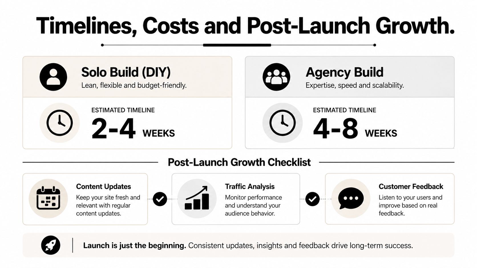
A focused five-page Wix site can take 2 to 4 weeks as a DIY project, or 4 to 8 weeks with a freelancer. A multi-product ecommerce build can take 6 to 12 weeks, depending on catalogue preparation, integrations and approvals. Those are planning ranges, not guarantees. Delayed copy, missing images and changing decisions usually cause more slippage than the Wix editor.
Typical UK budgeting ranges are:
DIY Wix: £0 to £30 per month, plus a domain.
Freelancer build: £1,200 to £3,500.
Agency build: £3,500 to £12,000+, excluding content and photography.
Treat cost as a combination of strategy, production, technical setup and future responsibility. A cheaper build can become expensive if nobody owns updates, tracking or accessibility fixes.
Establish a rhythm after launch
A website needs an operating routine:
Weekly: Check GA4 and Wix Analytics for traffic sources, conversions, broken journeys and unusual drops. Review new enquiries so tracking matches reality.
Monthly: Refresh one useful content area, inspect top landing pages and use Hotjar to look for rage clicks, dead areas and mobile hesitation. Wix Ascend can help manage customer communications and follow-up.
Quarterly: Review search queries in Google Search Console, update pages that are gaining impressions but weak clicks, and check whether services, locations and FAQs still match the offer.
Twice yearly: Run a speed review, remove unused apps, inspect integrations and revisit accessibility.
Annually: Refresh outdated design elements, photography, testimonials, positioning and conversion paths.
Social activity should send people to a useful destination rather than fill a feed. A modern social media plan for small brands can help connect recurring content with the pages and offers that need attention.
Pin this 90-day plan above your desk
Days 1 to 30: Confirm tracking, fix broken forms, improve the homepage CTA, compress the heaviest images and record the starting conversion journey.
Days 31 to 60: Improve the highest-traffic service or product page, add proof where visitors hesitate, publish one useful customer-led article and review search queries in Search Console.
Days 61 to 90: Test one alternative headline or offer, improve the weakest funnel stage, remove an unused feature and document the monthly maintenance process.
The weekly checklist is simple: test the main form, click the primary CTA, check the mobile header, review new enquiries, inspect analytics, look for broken links and write down one improvement. Small business website development works best when launch marks the beginning of disciplined iteration, not the end of the project.
Baslon Digital provides custom Wix website design, development, redesign, maintenance and SEO support for small businesses that need clearer messaging, stronger user journeys and practical post-launch improvement. If your current site looks acceptable but isn't generating the right actions, visit Baslon Digital to discuss a focused Wix build or an evidence-led redesign.
Comments